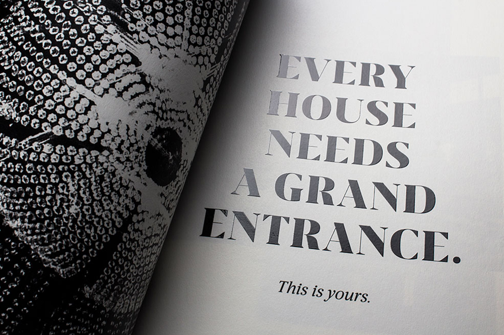
Question
How can a skin and hair clinic go beyond appearances?
Answer
By addressing the concept of inner beauty.
Oliva Gets a Facelift
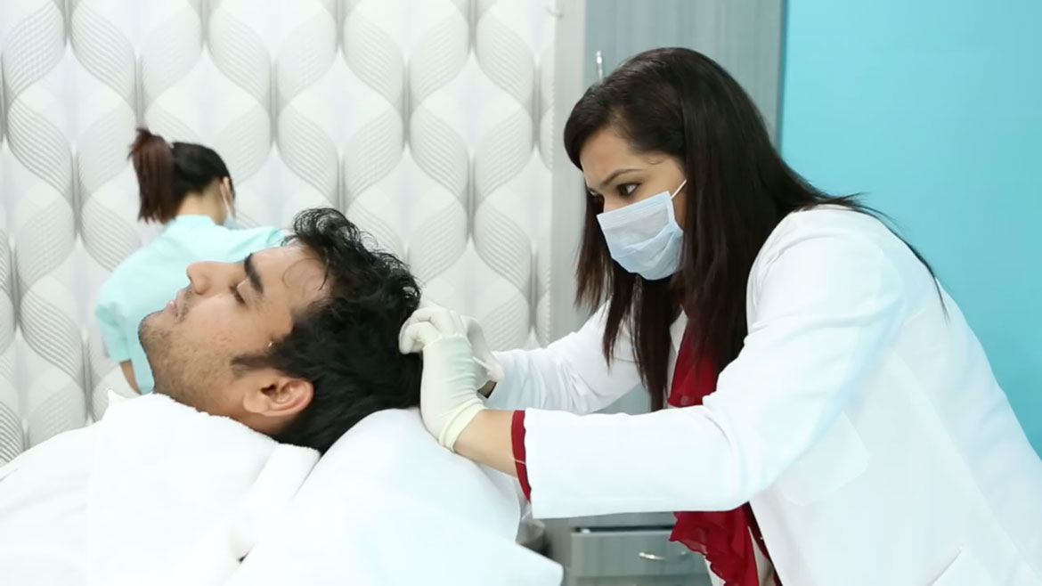
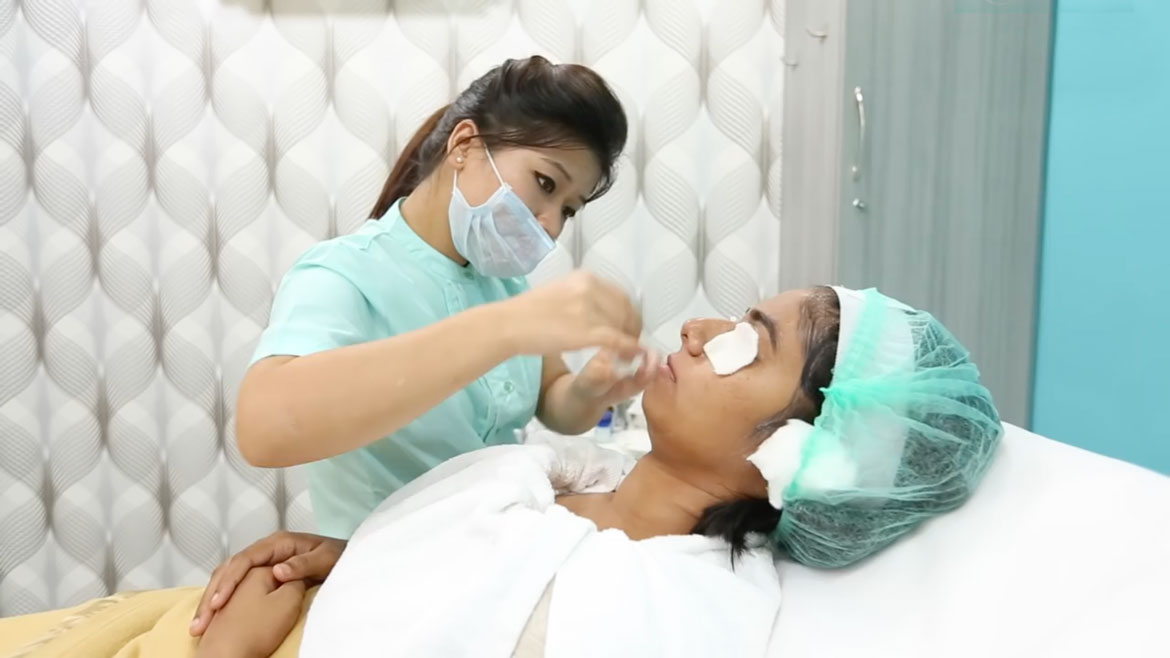
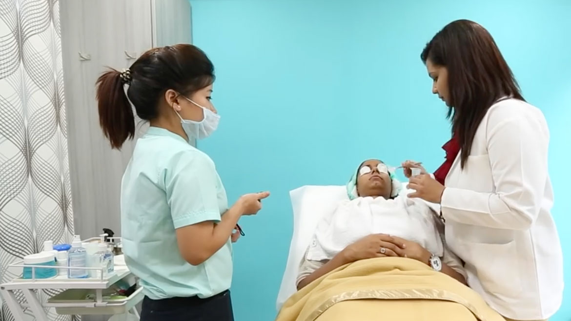
Oliva is a medico-aesthetic clinic. What sets it apart? The fact that it has qualified cosmetic dermatologists and trichologists who closely monitor any issue you may have with your skin or hair.
NH1 Design was commissioned to create a new identity system to communicate the medical edge the brand has to offer above other skin and hair brands, which primarily focus on beauty.
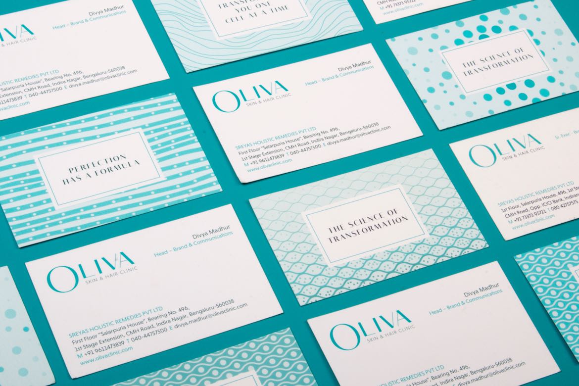
SERVICES BRANDING | DESIGN LANGUAGE | DESIGN STRATEGY
CLIENT SREYAS HOLISTIC REMEDIES PVT LTD
SECTOR HEALTHCARE
BEFORE
AFTER
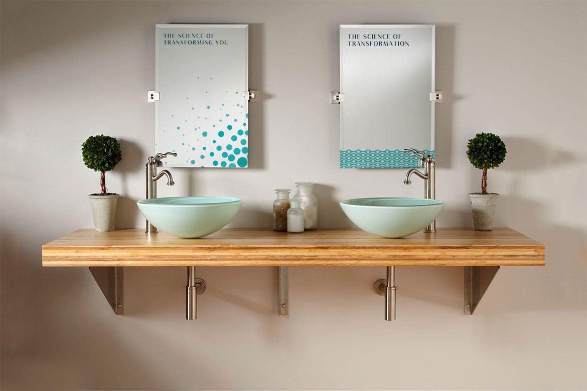
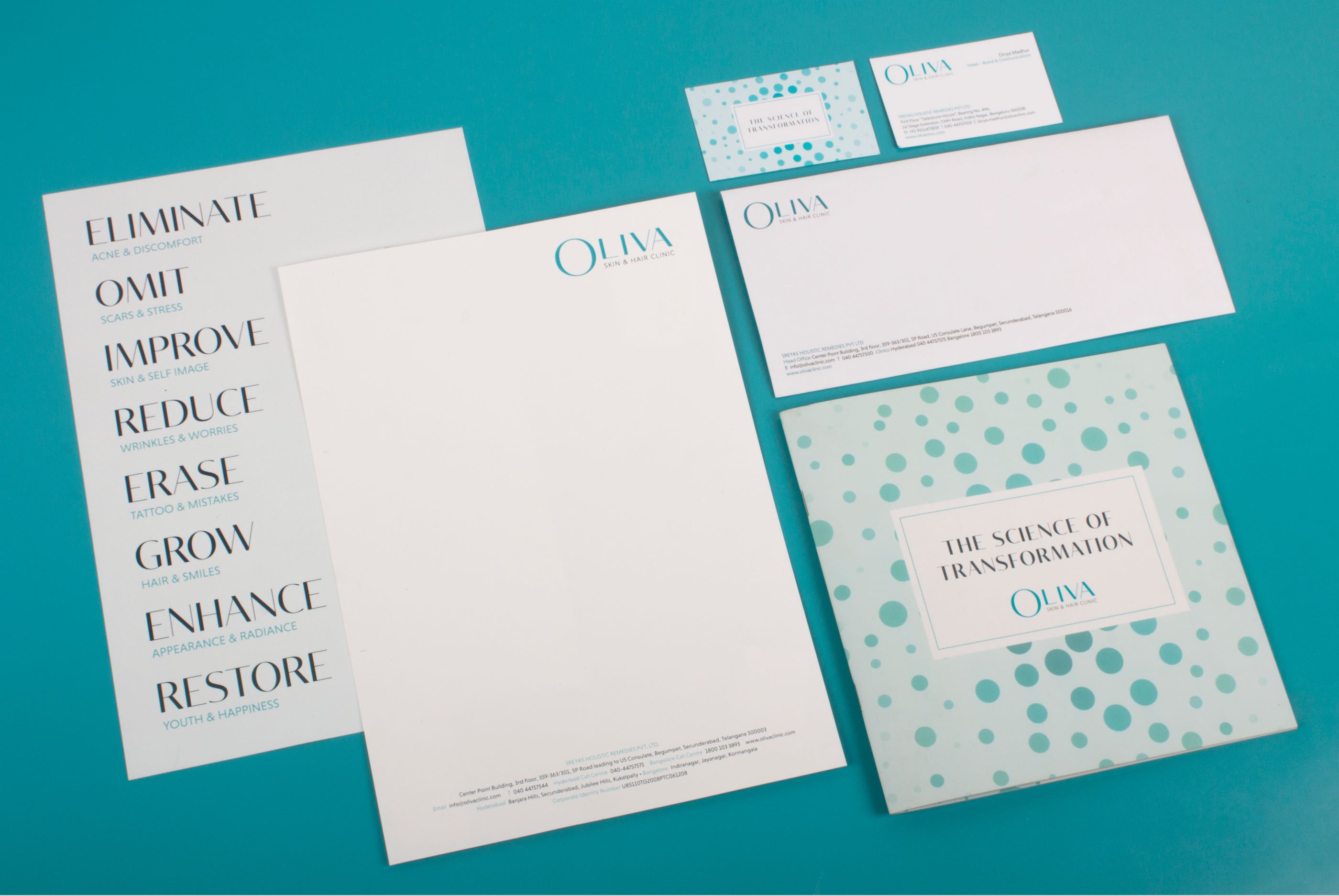
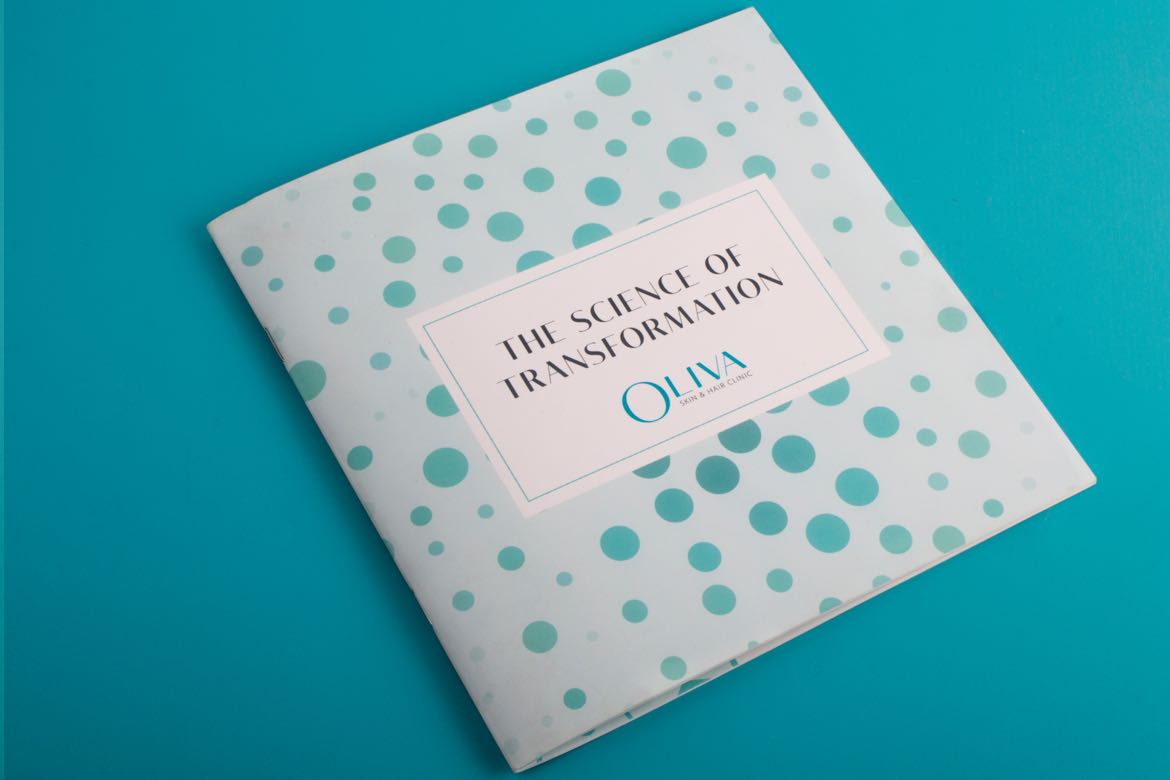
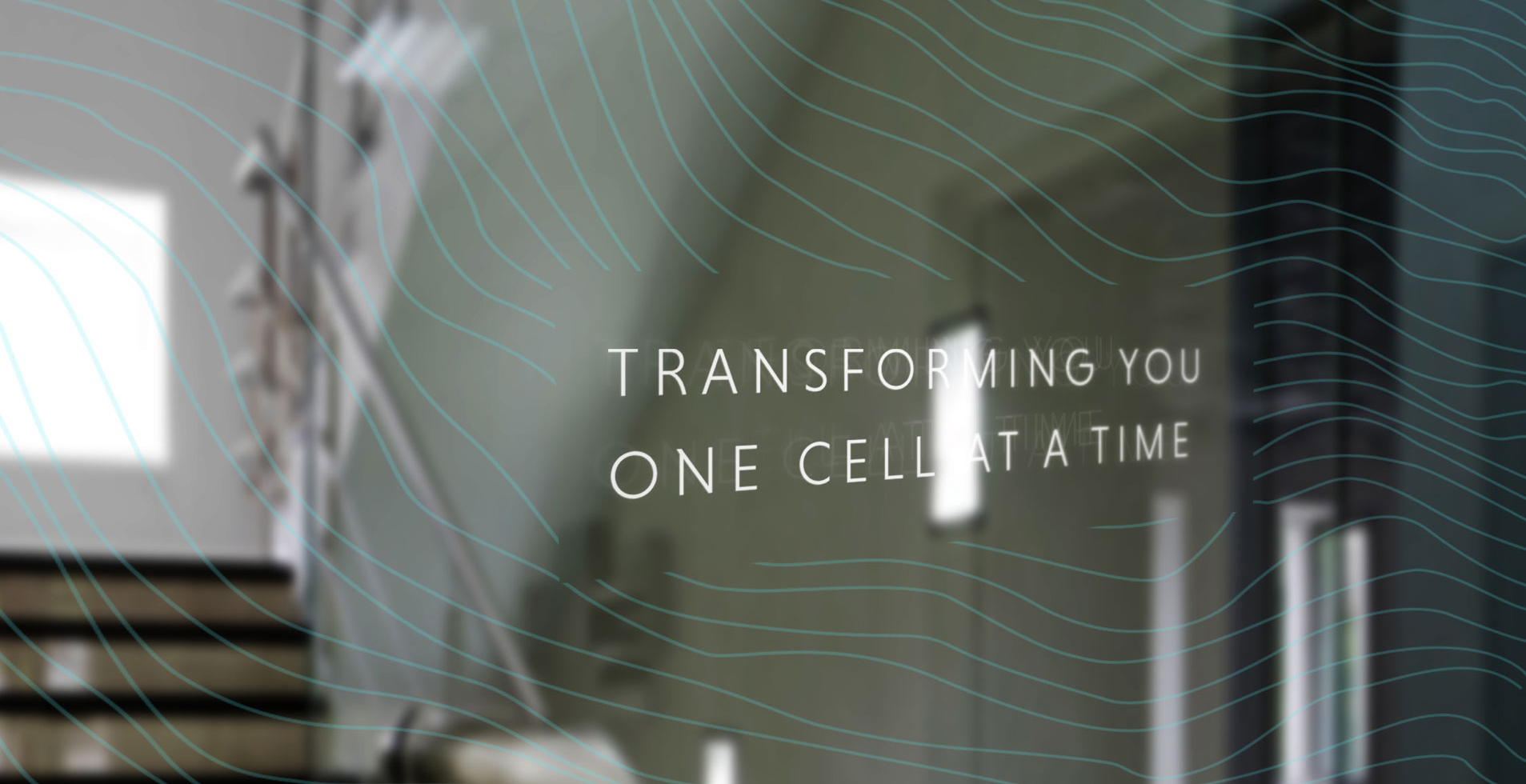
The Science of Transformation
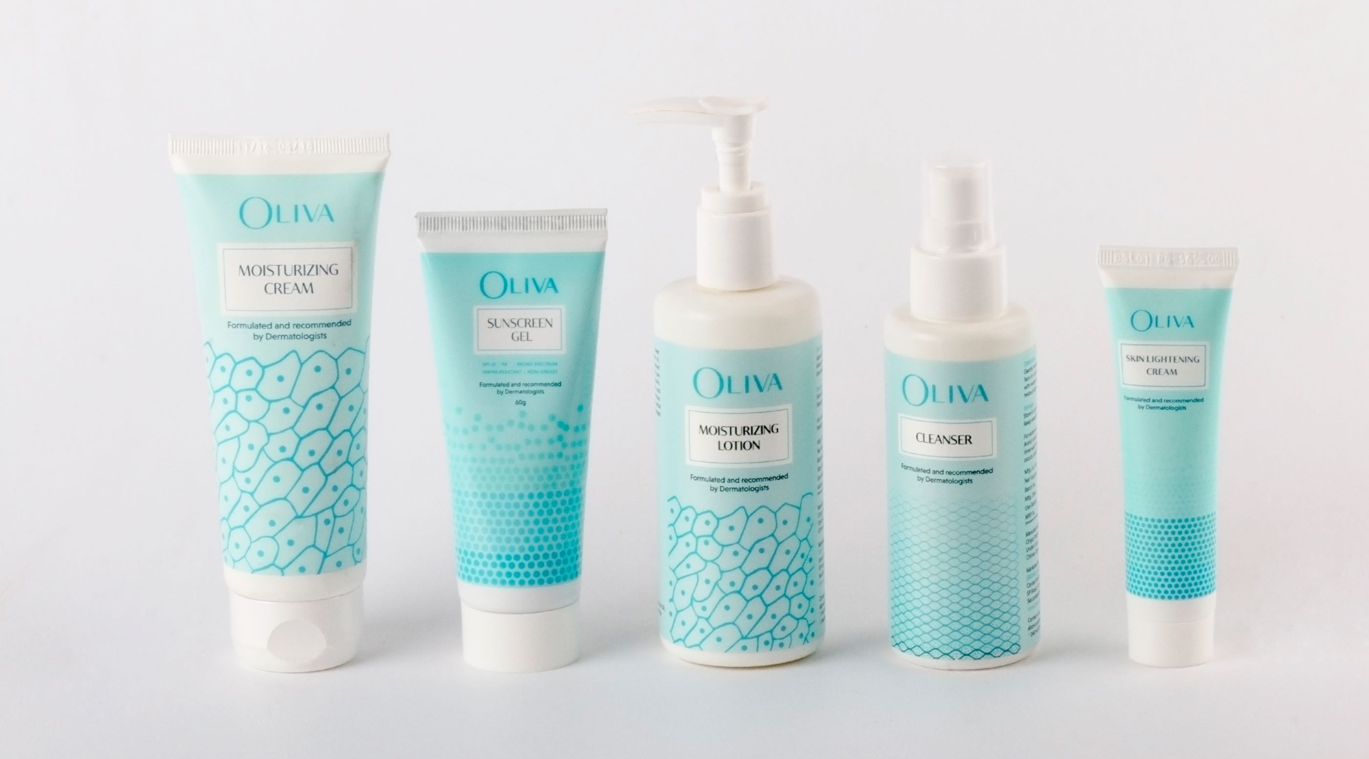
Oliva’s design strategy stems right from the science of advanced medicine and the aesthetics of transformation. The teal colour had embodied Oliva’s brand values since its inception. It was the face of the brand, so we kept the existing brand colour and instead modernised the wordmark.
The new typeface in the logotype combines the principles of both serif and sans-serif, satisfying the need of the brand to be both elegant and clinical, thus complementing the underlying concept of Oliva as a brand—The Science of Transformation.
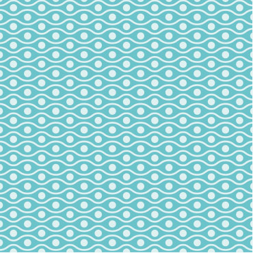
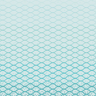
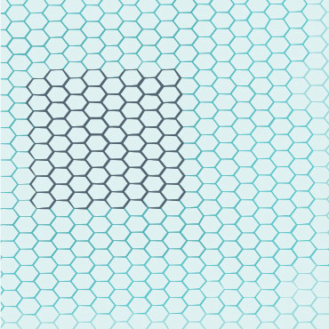
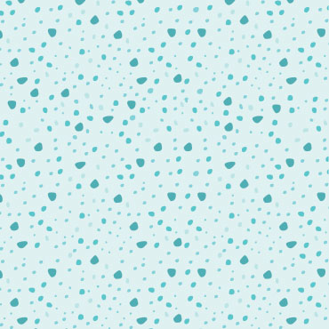
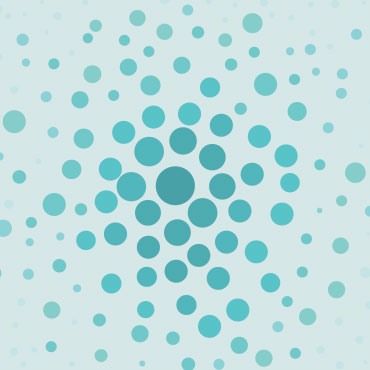
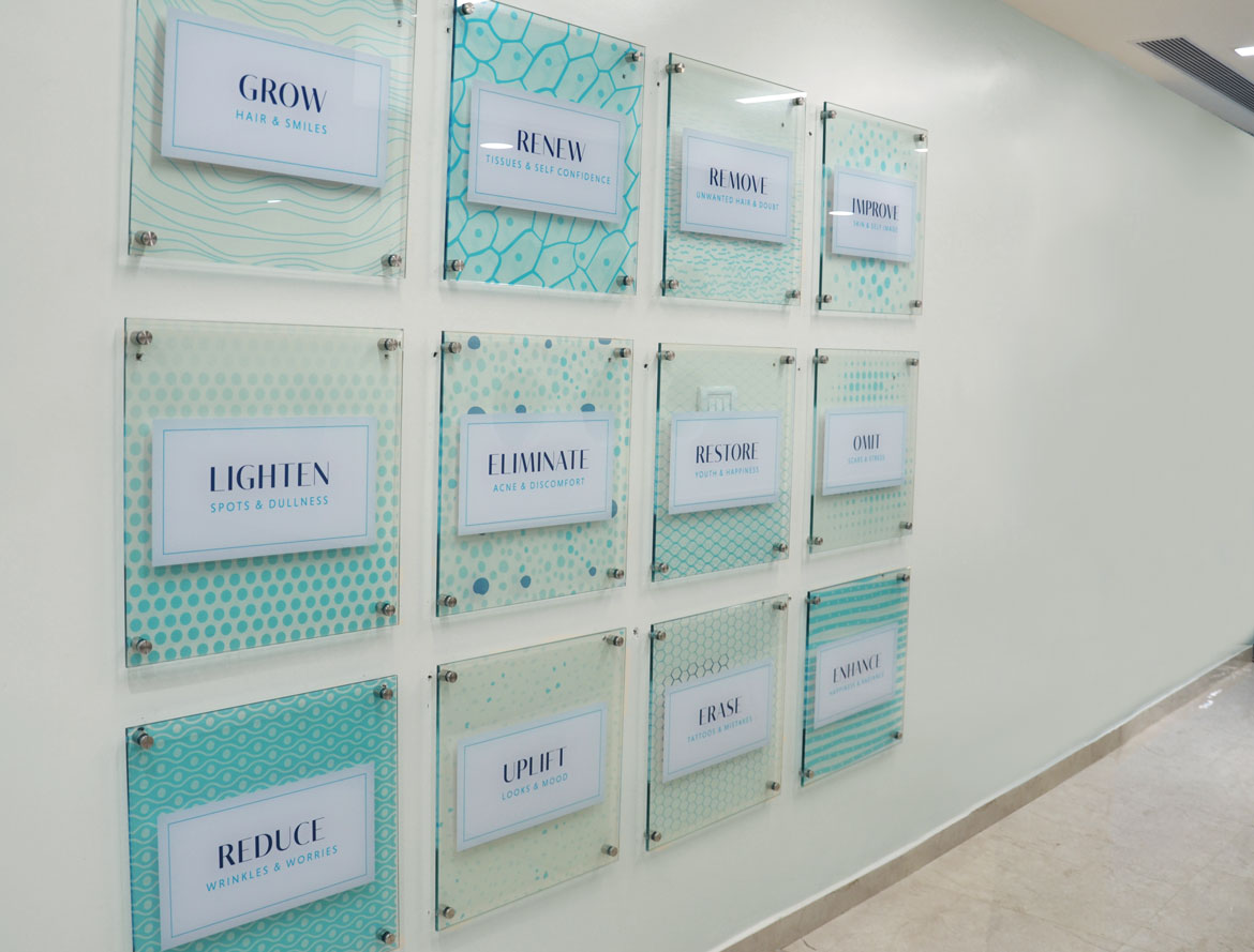
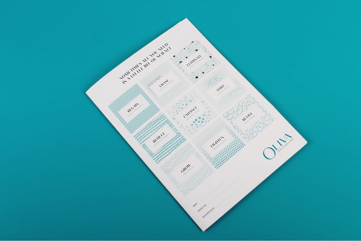
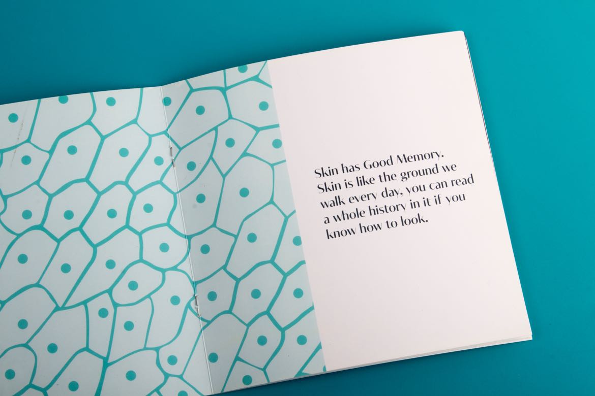
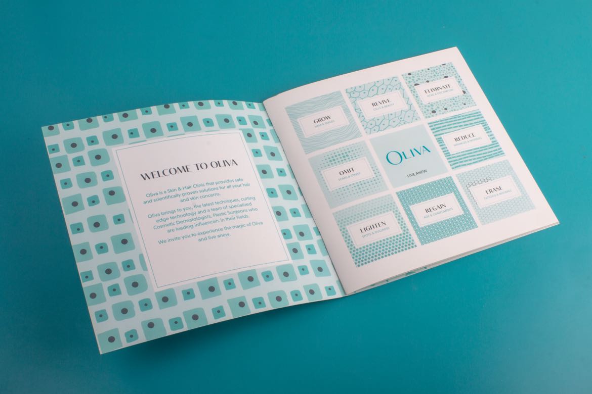
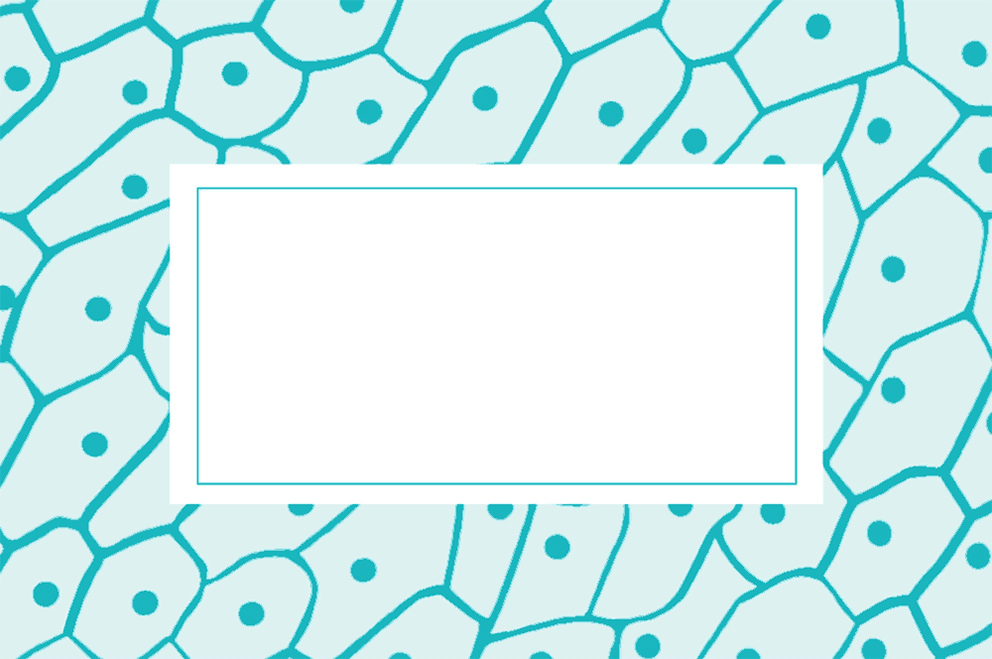
The Science of Transformation explained using the Science of Patterns
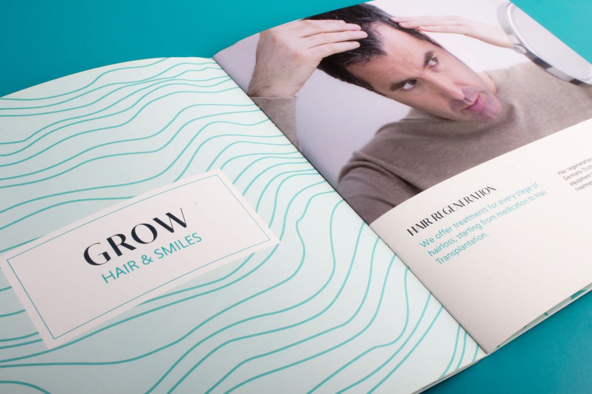
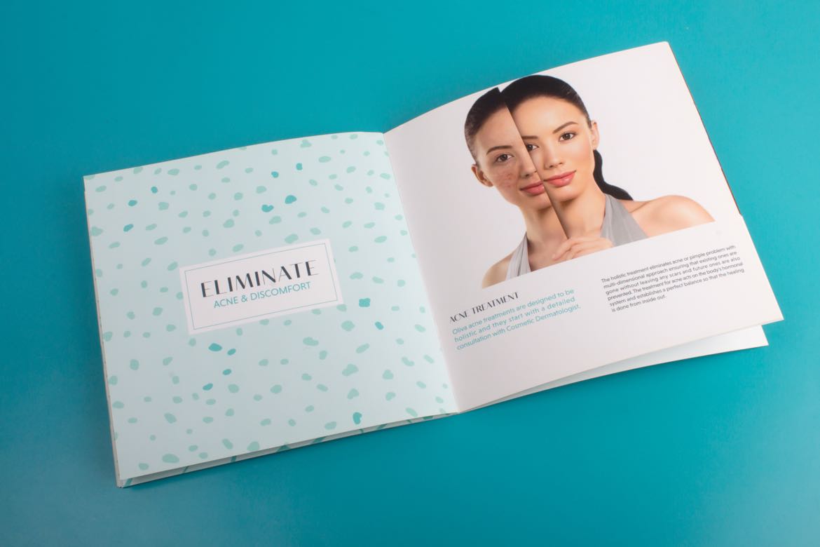
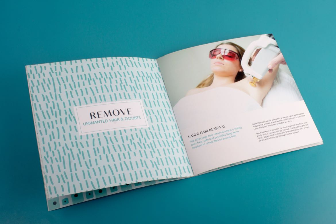
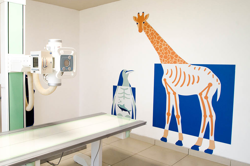
Defining the visual design language, a set of customised patterns have been created for each of the specialised skin and hair services offered by Oliva. They are a graphic and scientific representation of skins cells and hair follicles, used to create a visual story in the interiors of the clinics.
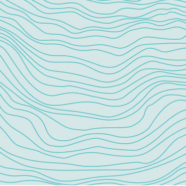
Hair
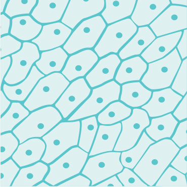
Skin Cells
Anti-Aging
Skin Peel
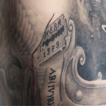
Tattoo Removal
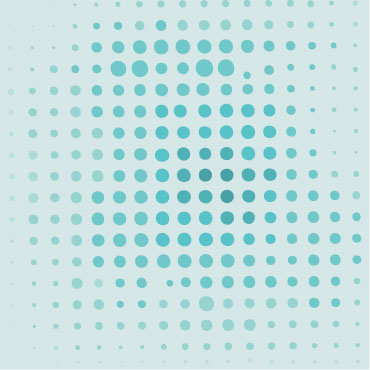
Acne Marks

Skin Lightening
Skin Tag Removal
Pigmentation
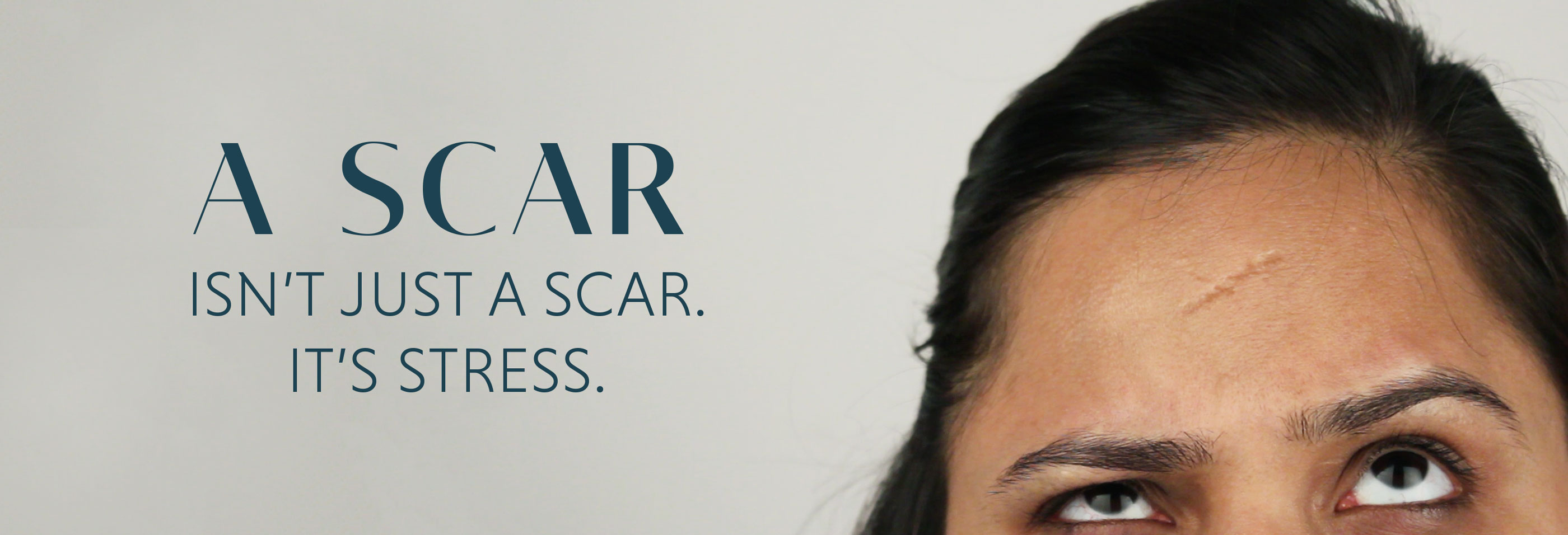
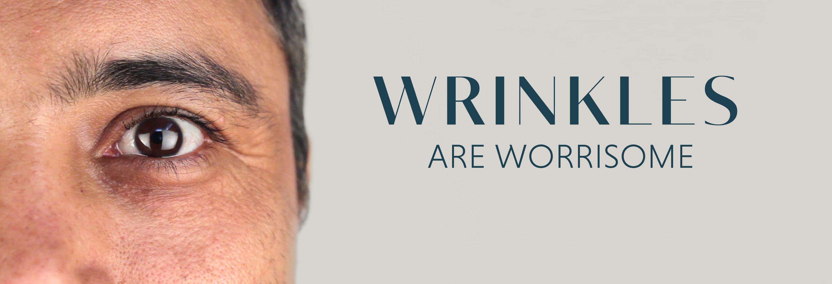
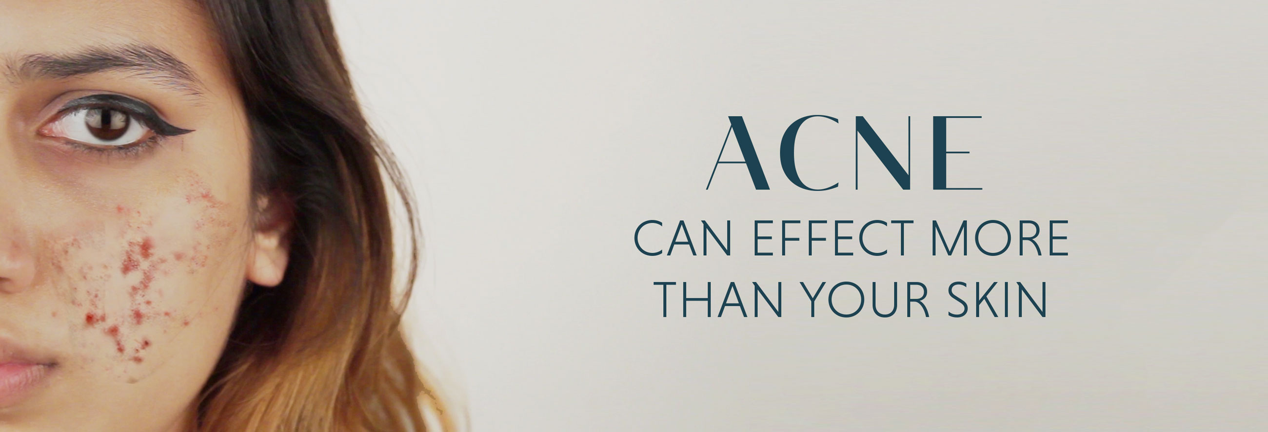
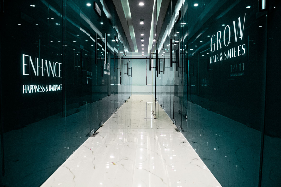
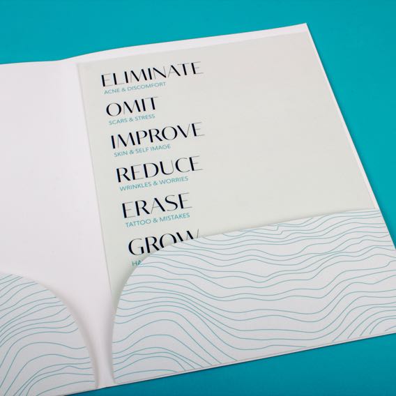
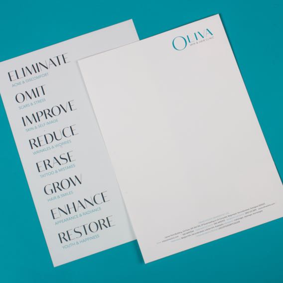
The verbal language addressed the insecurities associated with Skin and Hair related concerns
Oliva is not just about improving skin and hair conditions but also helps restore individuals’ self-confidence and self-esteem. The verbal language connects with patients emotionally by omitting scars, we help alleviate stress.
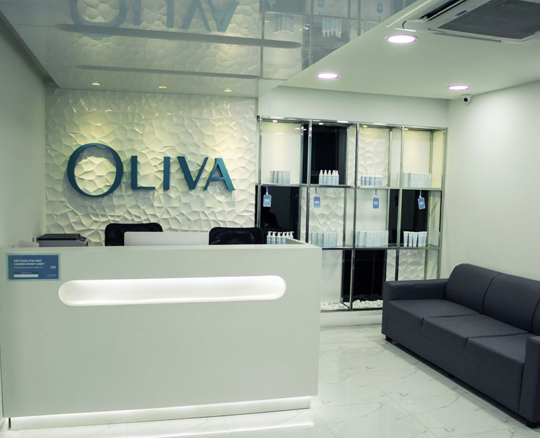
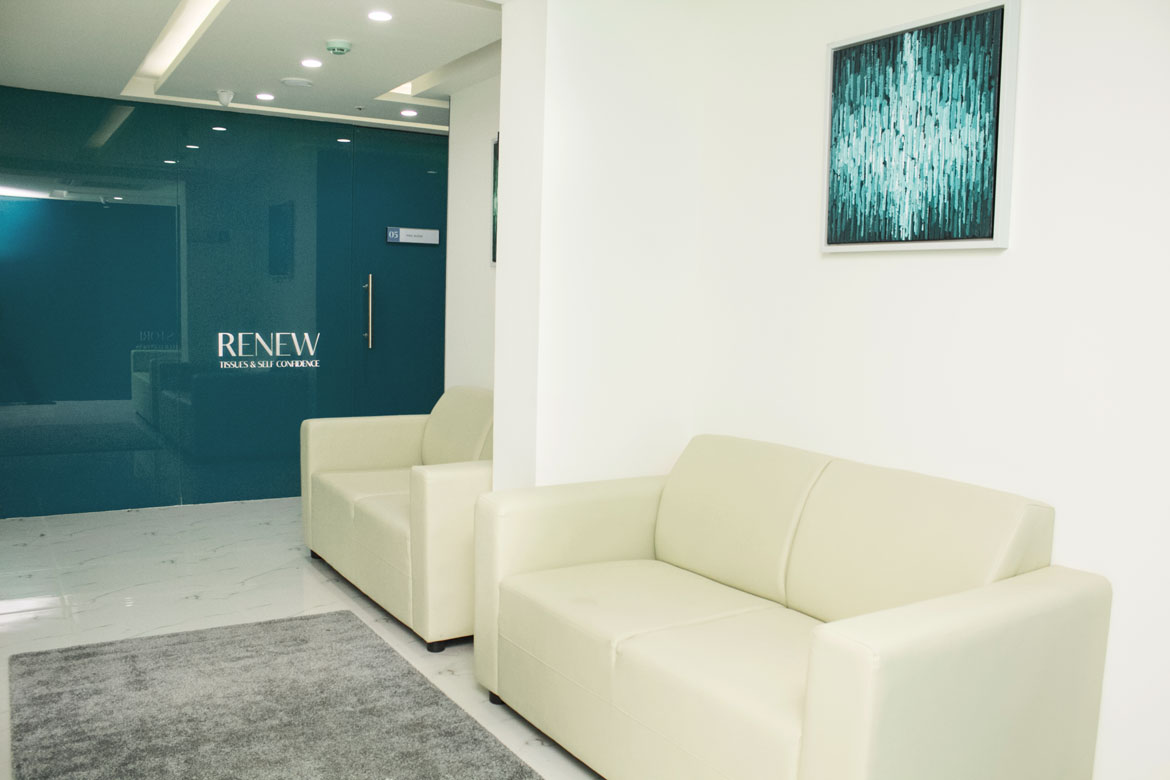
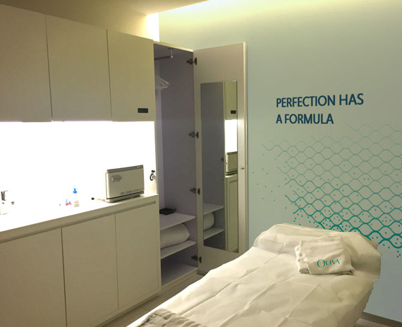
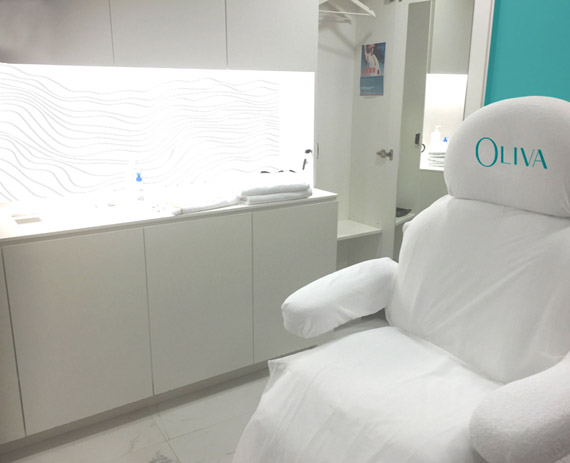
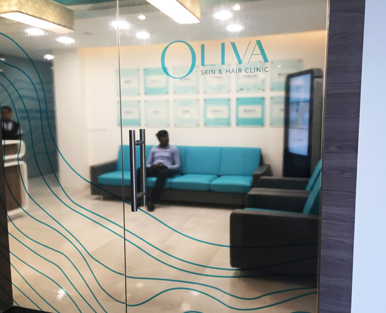
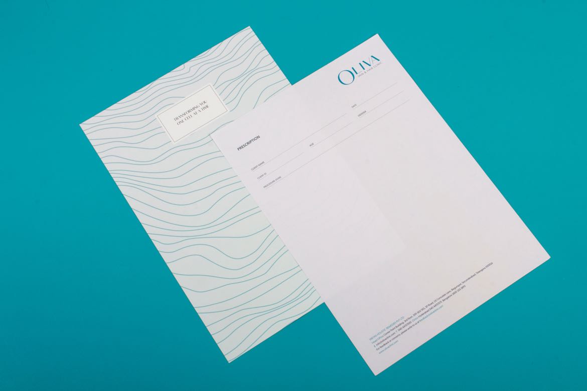
The visual and verbal Story was extended to the Clinic’s interiors and other collaterals
Oliva’s revamped identity has been rolled out in 14 clinics across Bangalore, Chennai, Hyderabad and more cities.
All Projects

SunsureRe-Branding an energy as a service brand
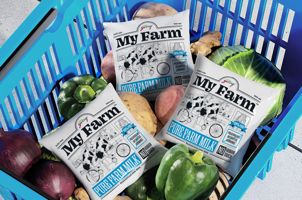
Godrej My FarmBranding a premium niche dairy brand for Godrej
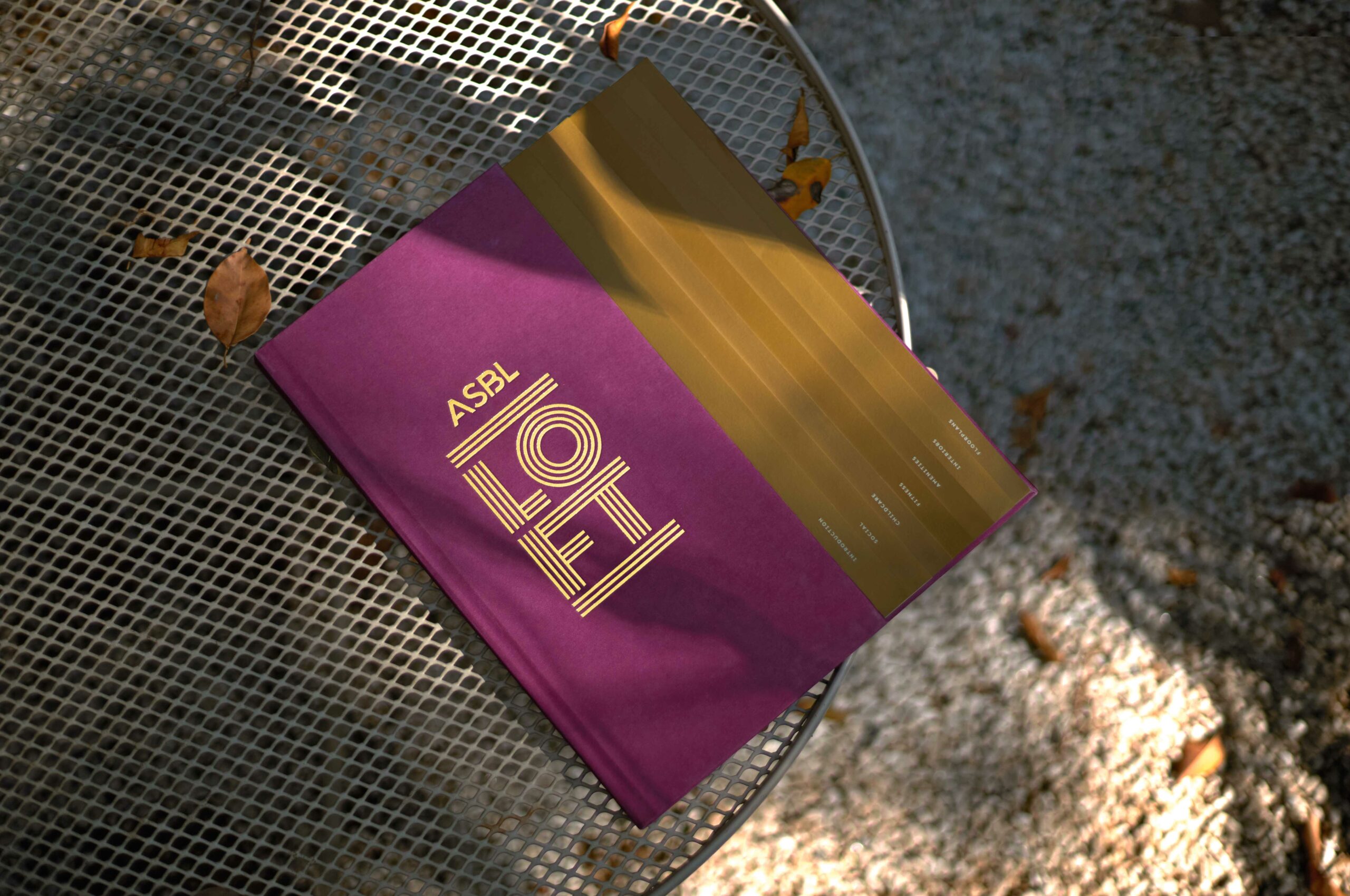
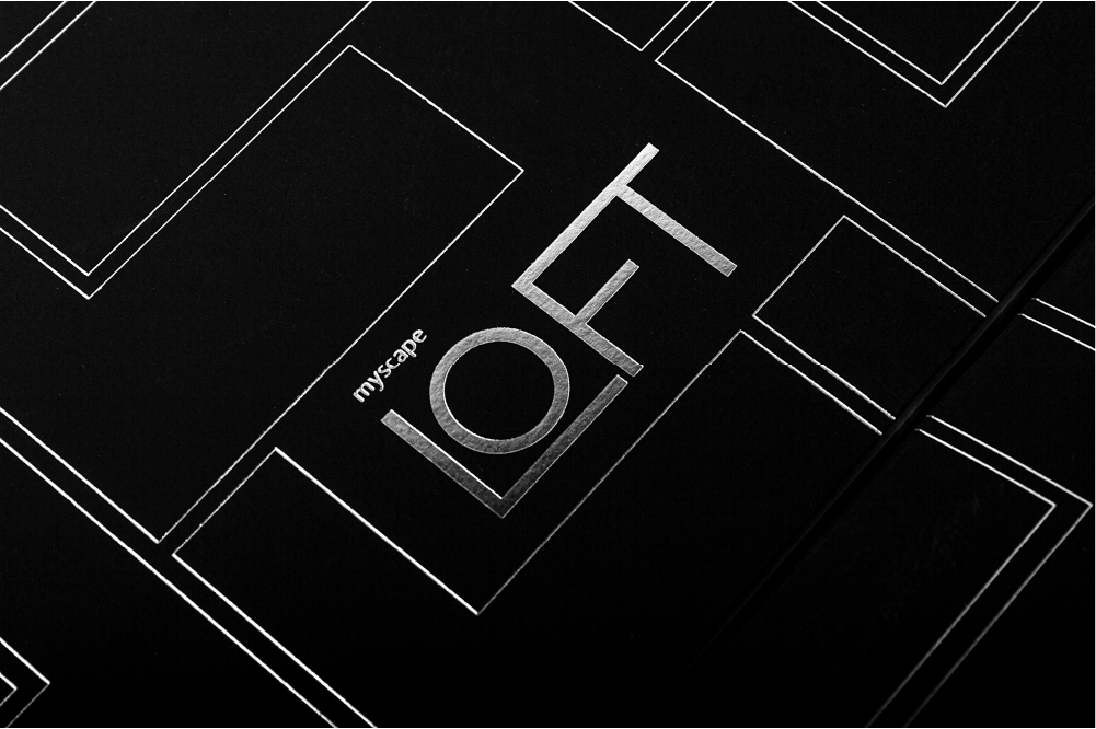
ASBL LOFTResidential property brochure
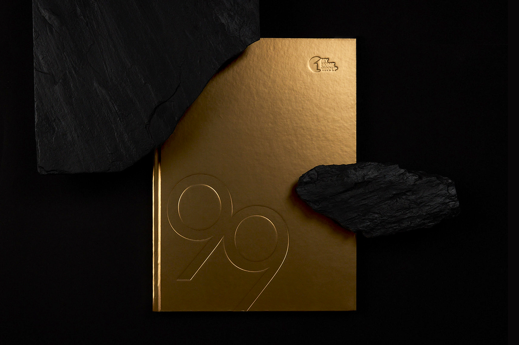
MyHome 99Residential property brochure
HROneBranding a HRMS platform
FlexipleBranding a global tech talent network
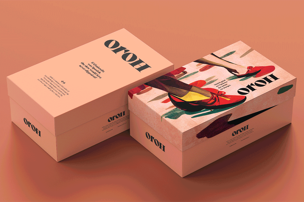
OrohBranding an Indian D2C footwear brand
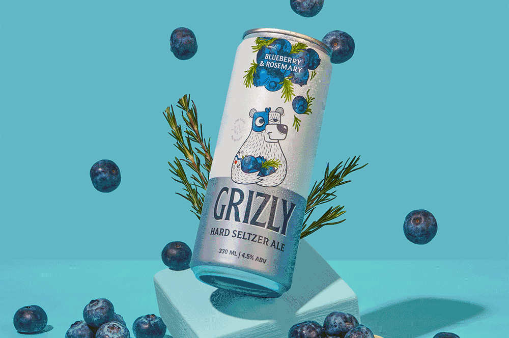
Grizly Hard Seltzers AleBranding & packaging design | House of Bira 91
Red.HealthRebranding India's largest emergency response company

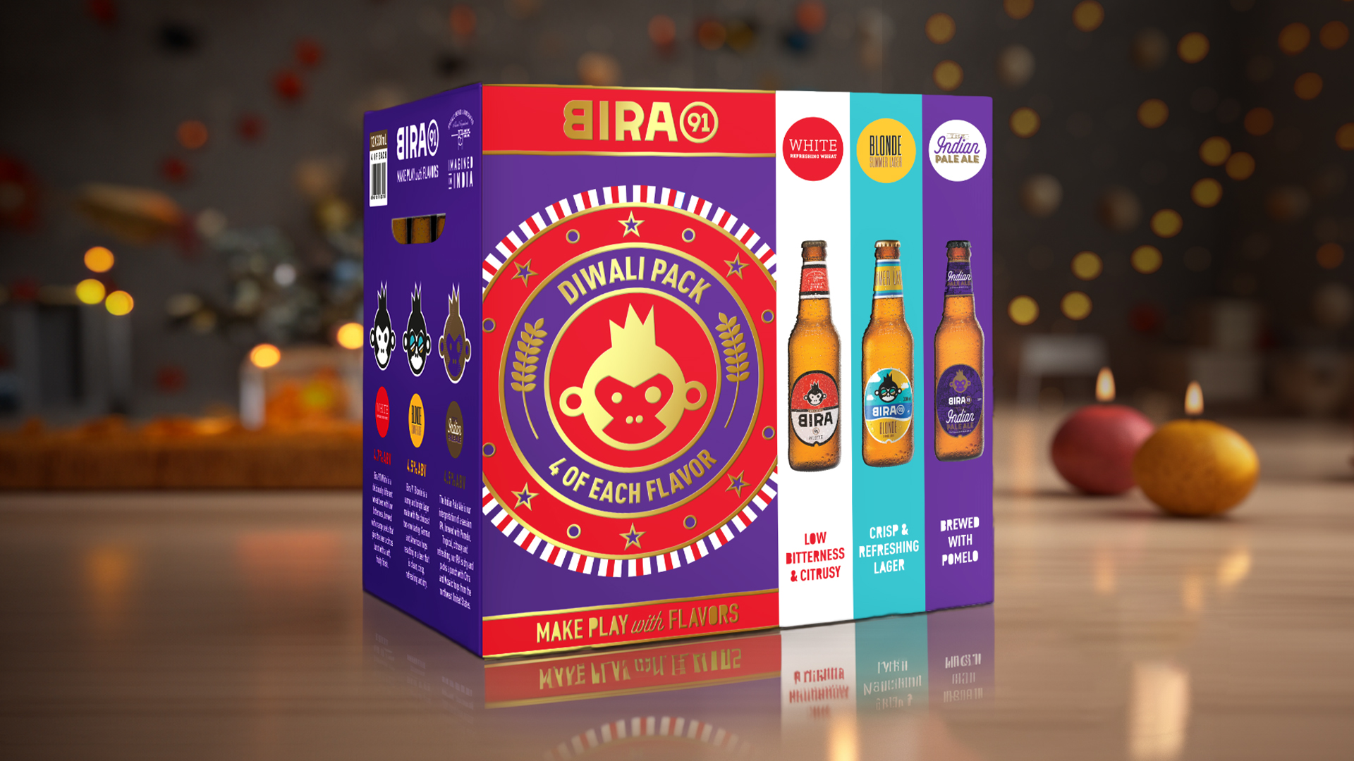
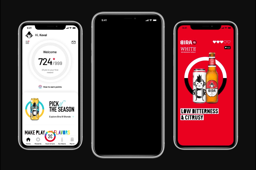
Bira 91 Make Play with FlavorsDefining the brand world for a beer brand
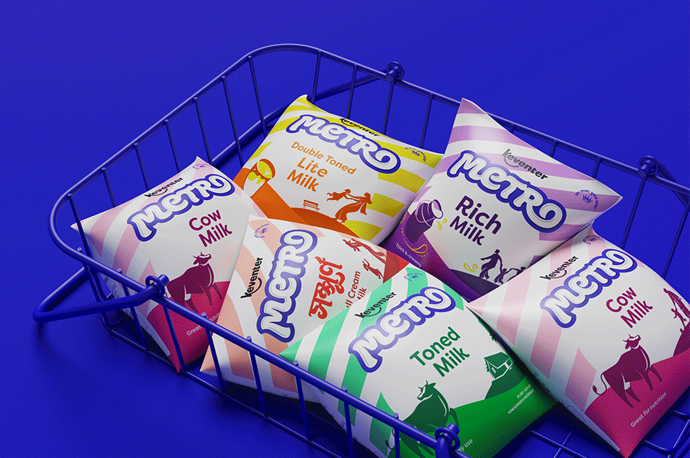
Keventer MetroRebranding a dairy brand in West Bengal
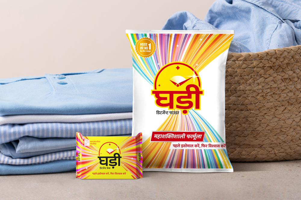
Ghadi by RSPL GroupRe-packaging an iconic detergent brand
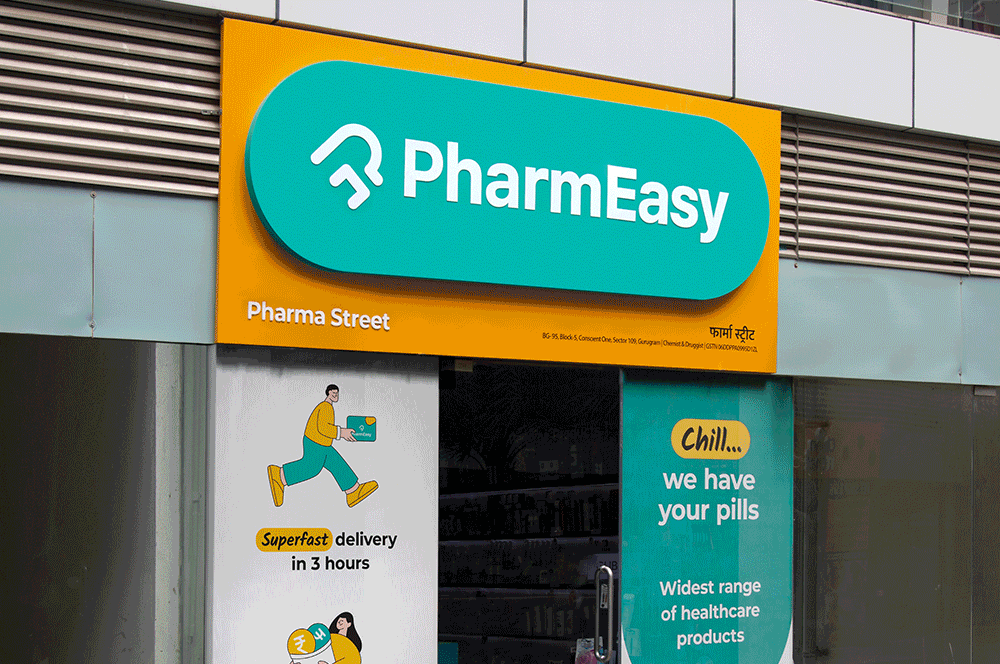
PharmEasyRedesigning an omnichannel brand experience
Celebrate with Every SipFestive & special edition packs for Bira 91
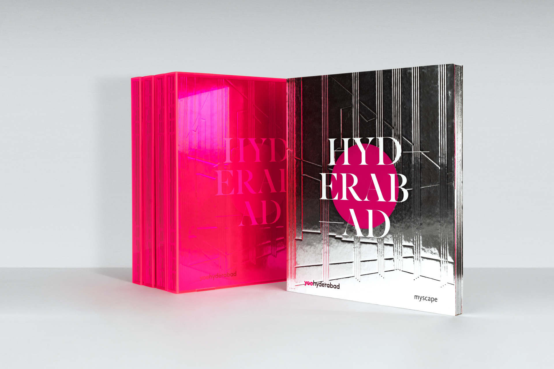
Myscape YOOSelling branded residences
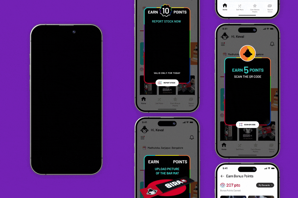
Bira 91 | Customer Loyalty AppUI design for brand advocacy
Bira 91 | Counter Sales Managers AppB2B channel partner UI Design
LifioBranding a clinical research and trial company
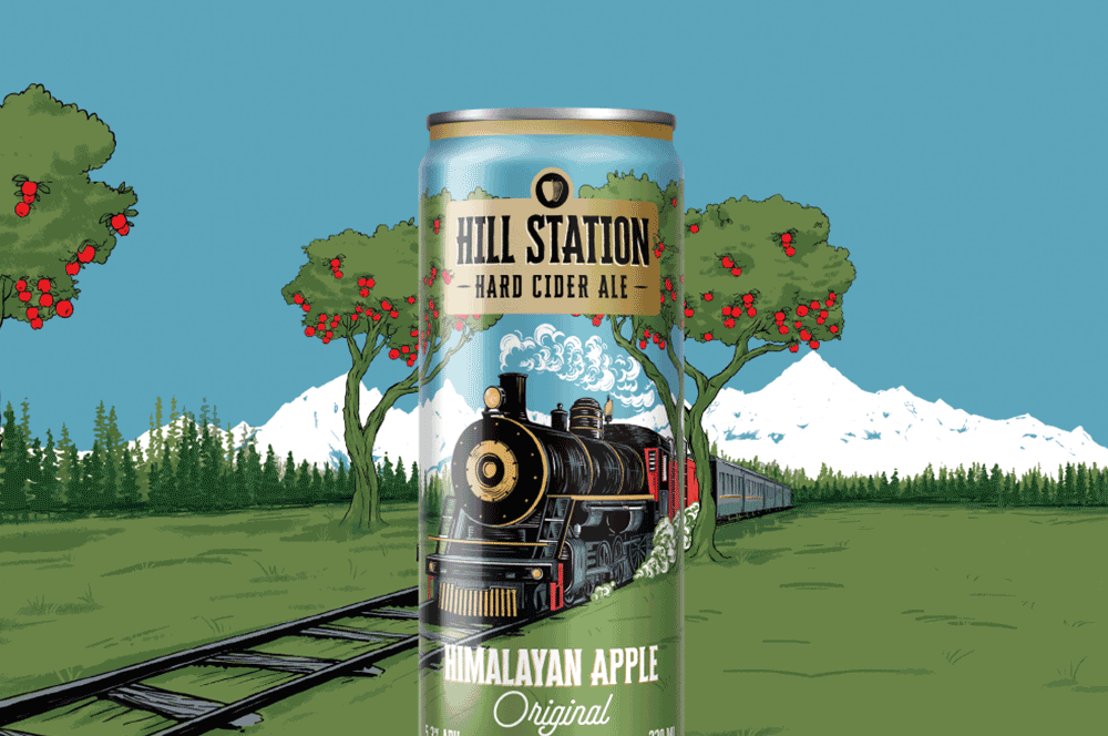
Hill Station Hard Cider AleBranding & Packaging Design | House of Bira 91
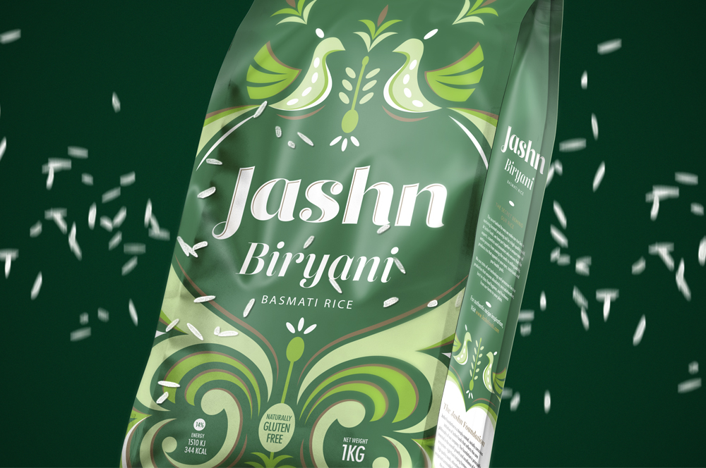
Jashn FoodsPackaging design for basmati rice
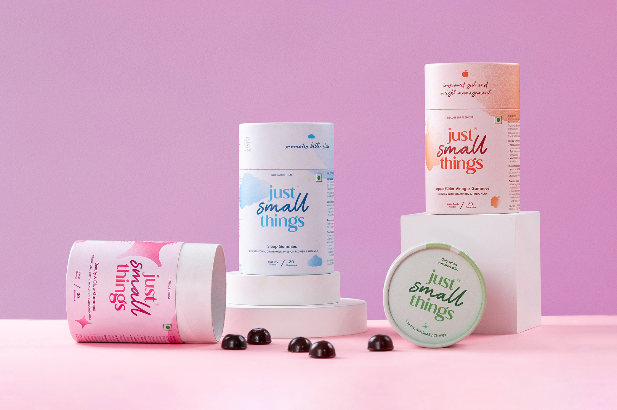
Just Small ThingsDesigning a personal care nutraceutical brand
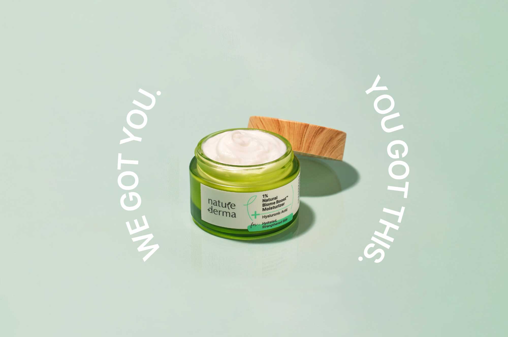
Nature DermaCommunications for active skincare

DoozeBranding & UI design for an alcohol delivery app
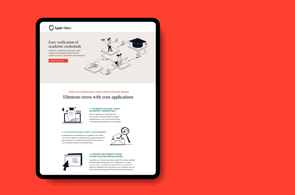
Apply Once and Veri OnceBranding a new age educational navigator
eFarmarket by AP markfedDesigning an identity for an agritech platform
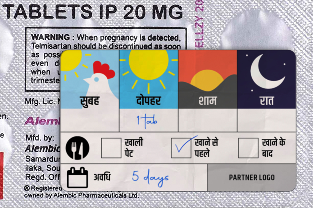
Stickers to Monitor Drug DosageSelf Initiated Project

AzlyaBranding a cultural yet contemporary fashion Label
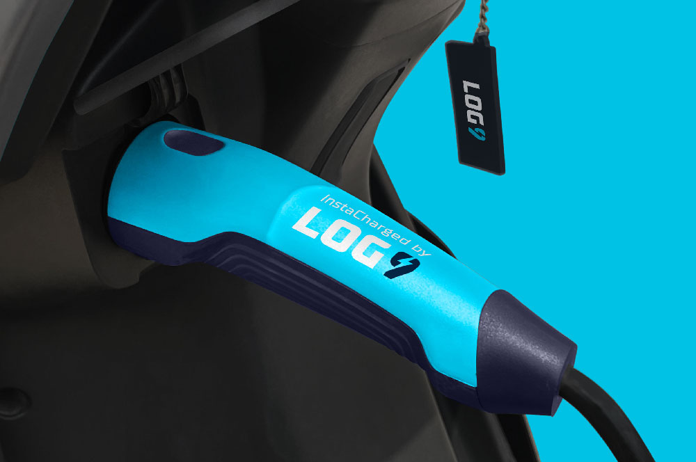
Log9 MaterialsRebranding an energy solutions company

Science of HimMale wellness treated with science
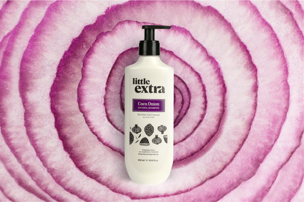
Little ExtraAll natural personal care
Pristyn CareRebranding short stay surgery
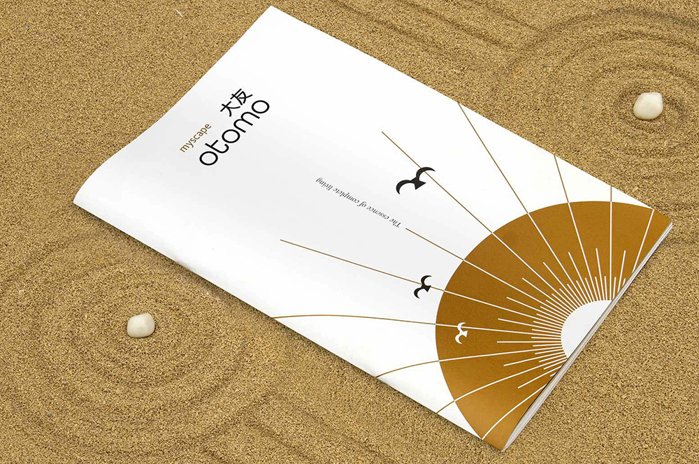
Myscape OtomoResidential property brochure
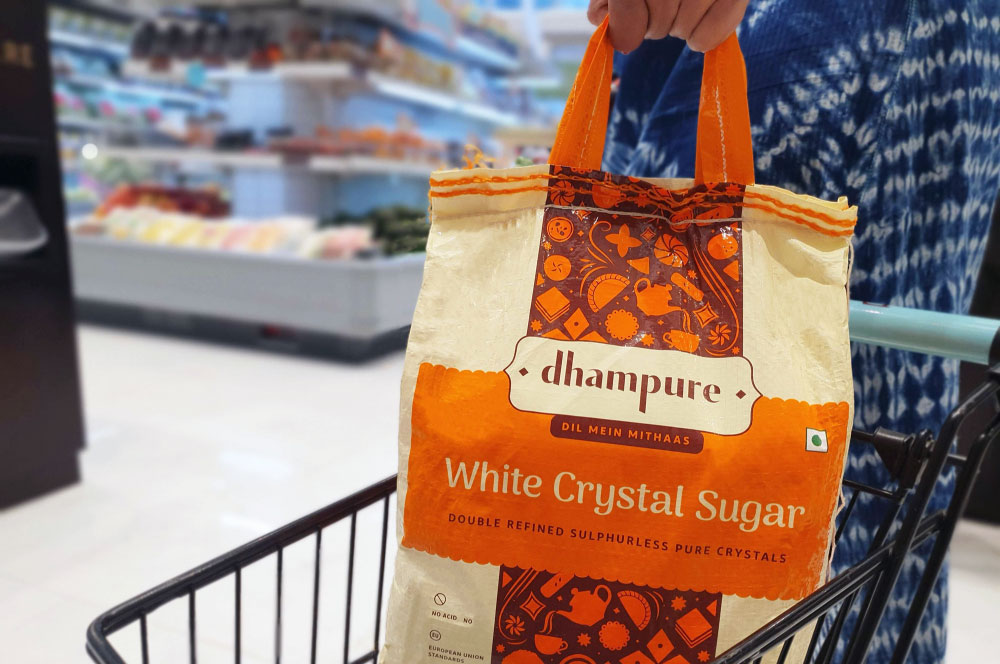
DhampureRebranding a Pioneer Sugar Brand
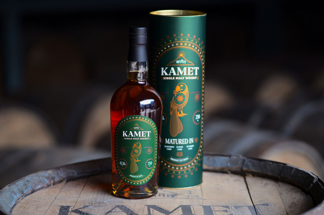
Kamet by Peak SpiritsWhisky Label
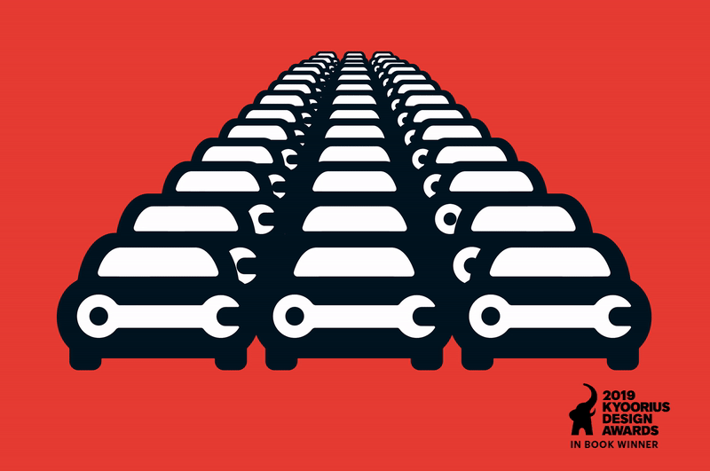
Go MechanicBranding a Multi-Brand Car Service Startup
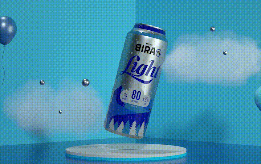
Bira 91 LightPackaging Refresh & Positioning

Bira 91 Sustainability ReportMission To Zero
BirthplaceBranding a Maternity Hospital
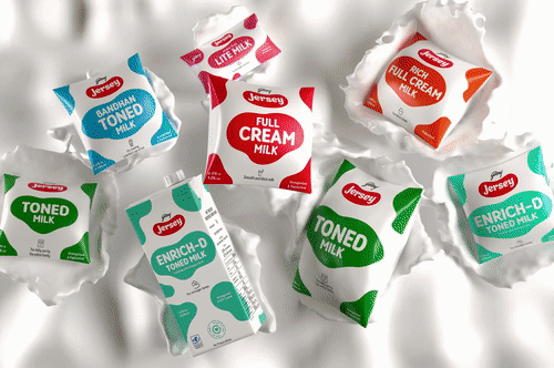
Godrej JerseyRevamping a Legacy Brand
Hyderabad FCRebranding a Football Club
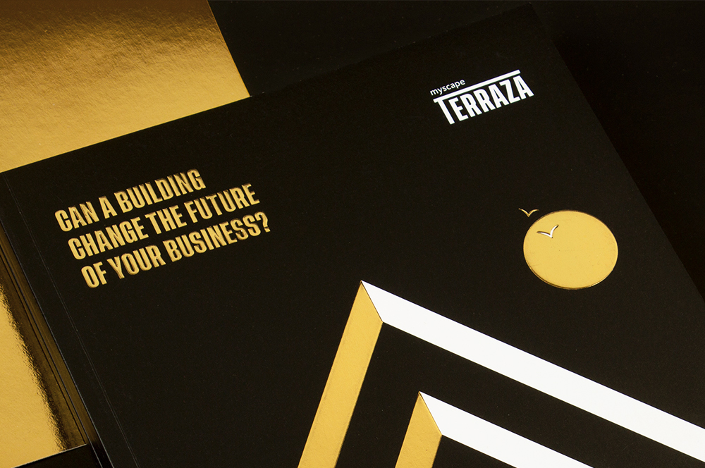
Myscape TerrazaCommercial Property Brochure
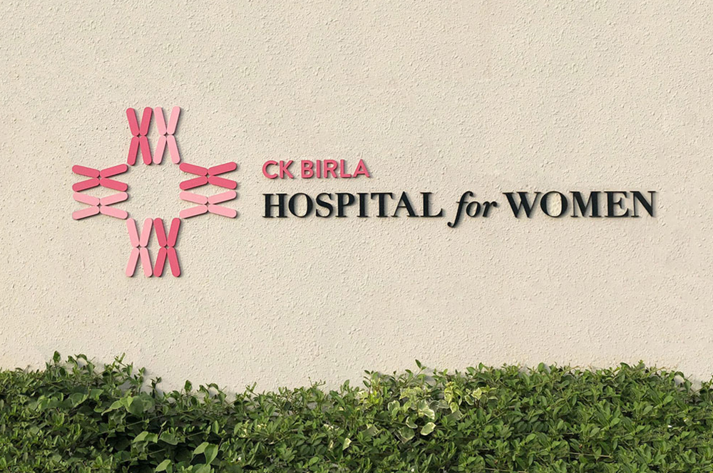
CK Birla GroupBranding a Women's Hospital
HousrDesigning for a Mega Co-living Brand
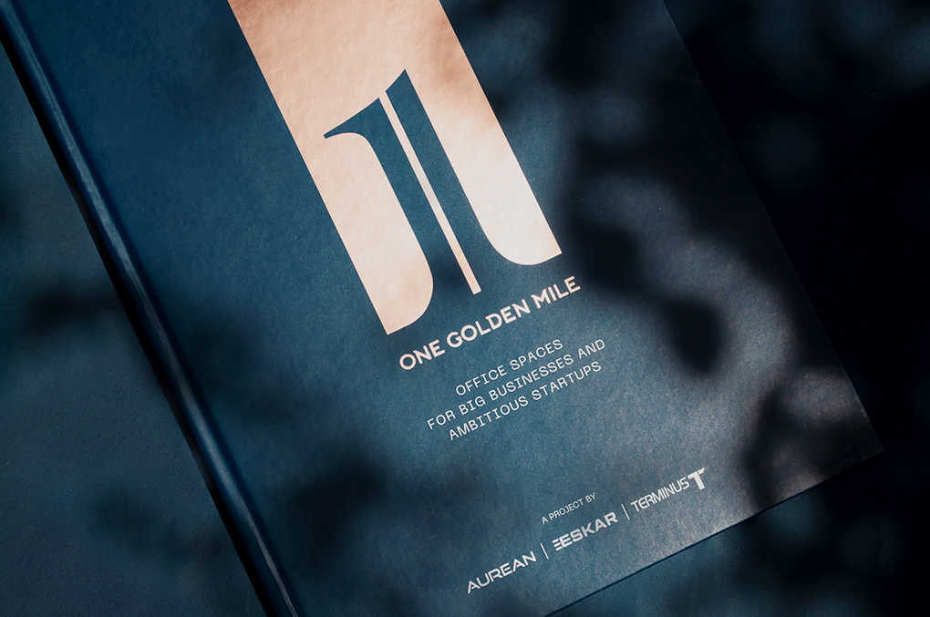
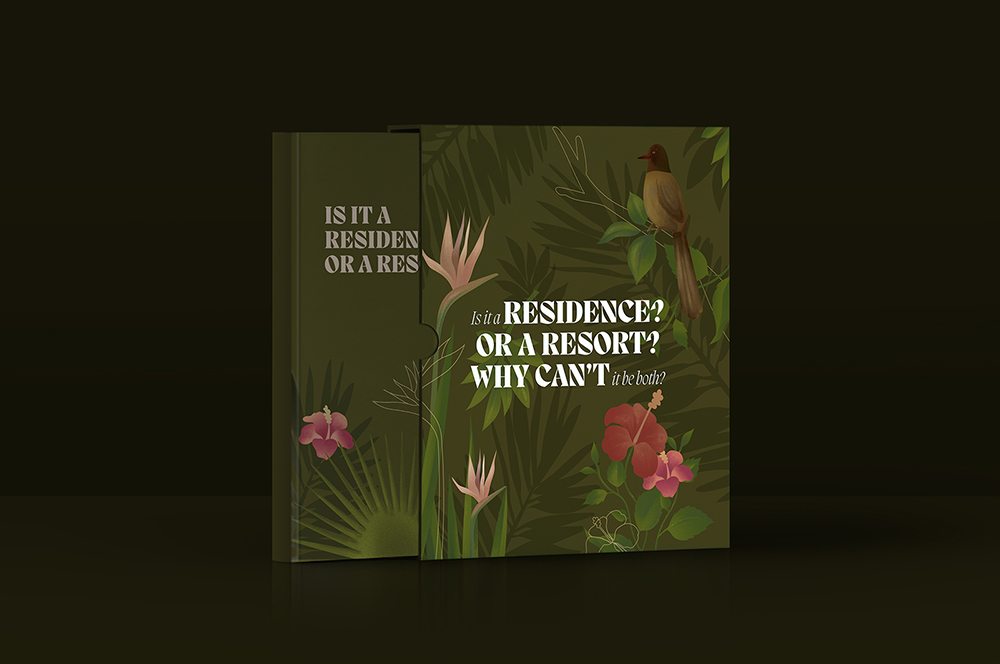
One Golden MileCommerical Brochure for Aurean| Eskar| Terminus
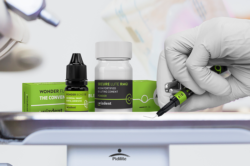
Wizdent by PidiliteIndia's Youngest Dental Consumables
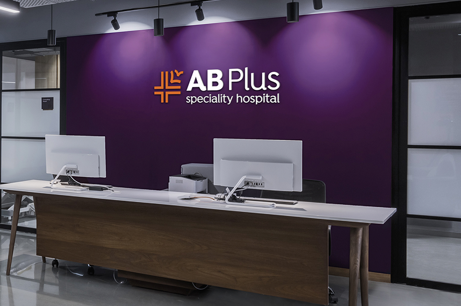
AB Plus Speciality HospitalBranding a boutique Hospital
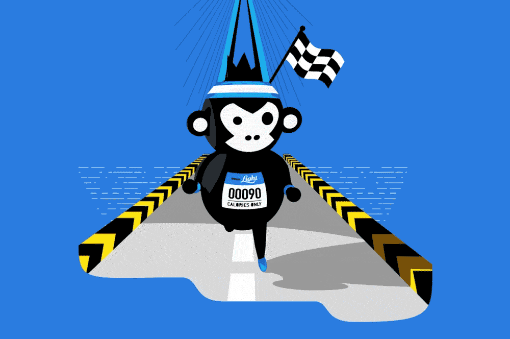
Bira 91 LightAssociating Beer with Fitness
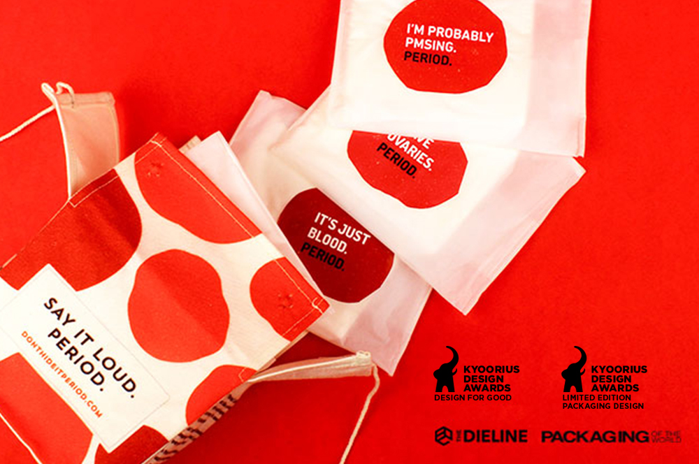
Don't Hide it. PeriodSanitary Pad Packaging
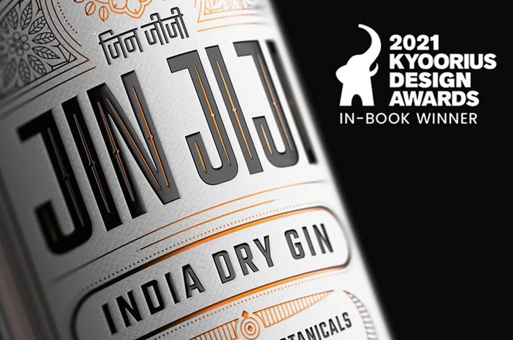
Jin JijiPackaging Indian Gin
AinqaHumanising data
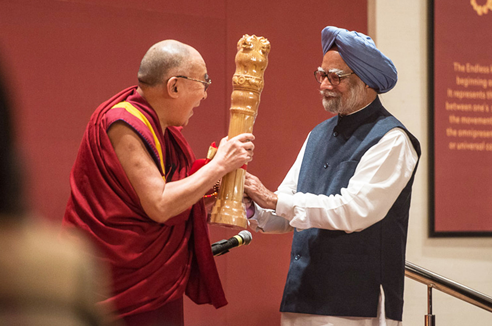
The Dalai LamaCelebrating His Holiness
Bhagirathi Neotia HospitalEnvironmental Graphics
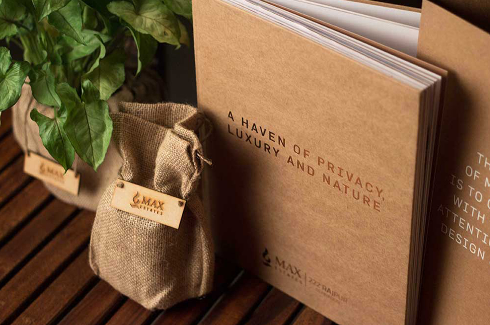
Max Estates, DehradunResidential Property Brochure & Communications
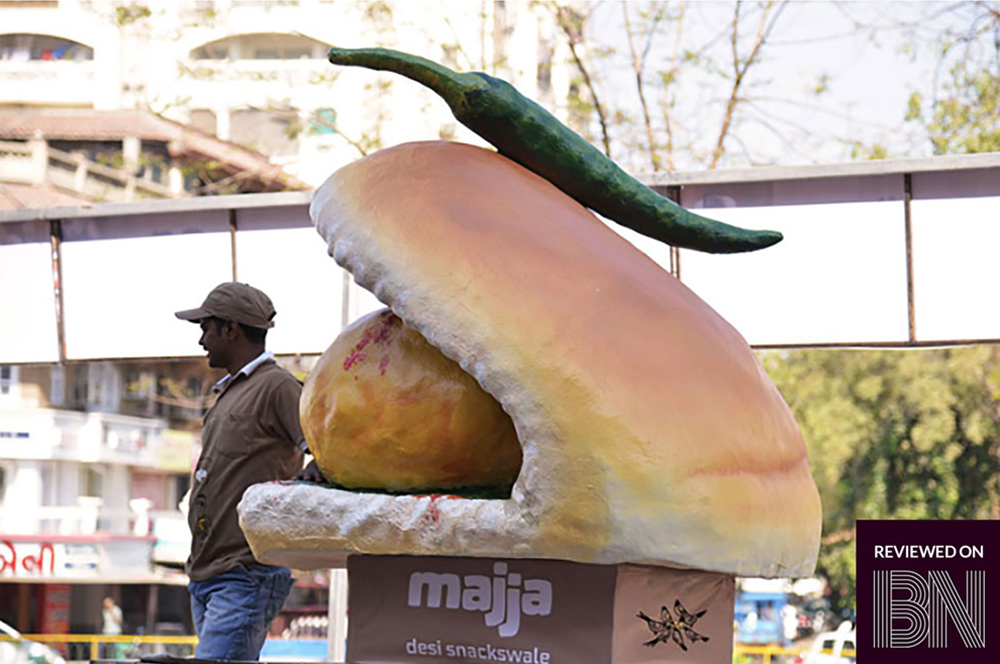
MajjaBranding a Chain of QSR in Ahmedabad

QuaQuaBranding a Virtual Travel Platform
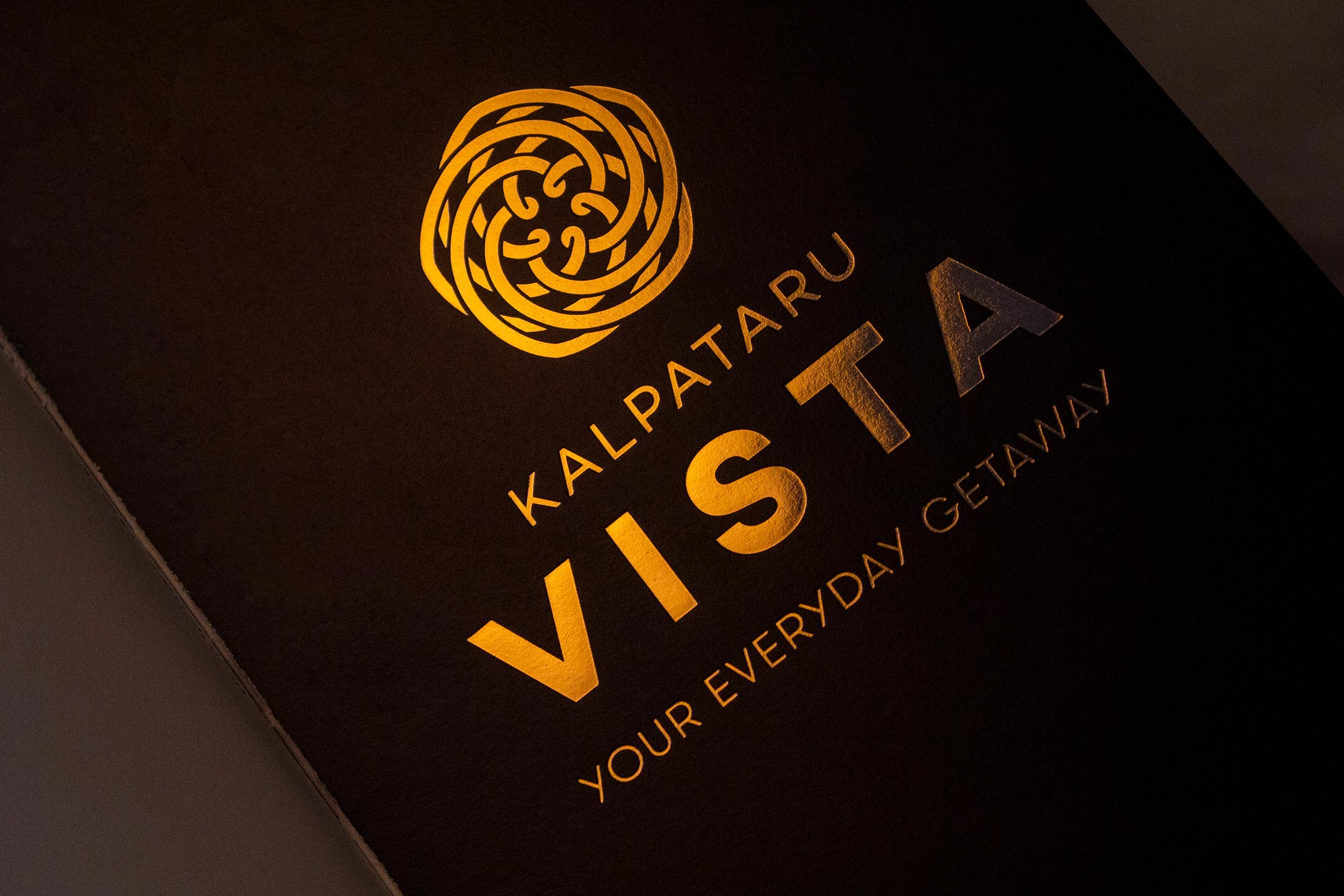
Kalpataru VistaResidential Property Brochure & Communications
Myscape LoftResidential Property Brochure

Fuel BuddyBranding India's First Fuel Delivery Platform
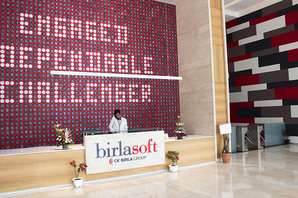
BirlasoftRebranding a Global IT Service Provider
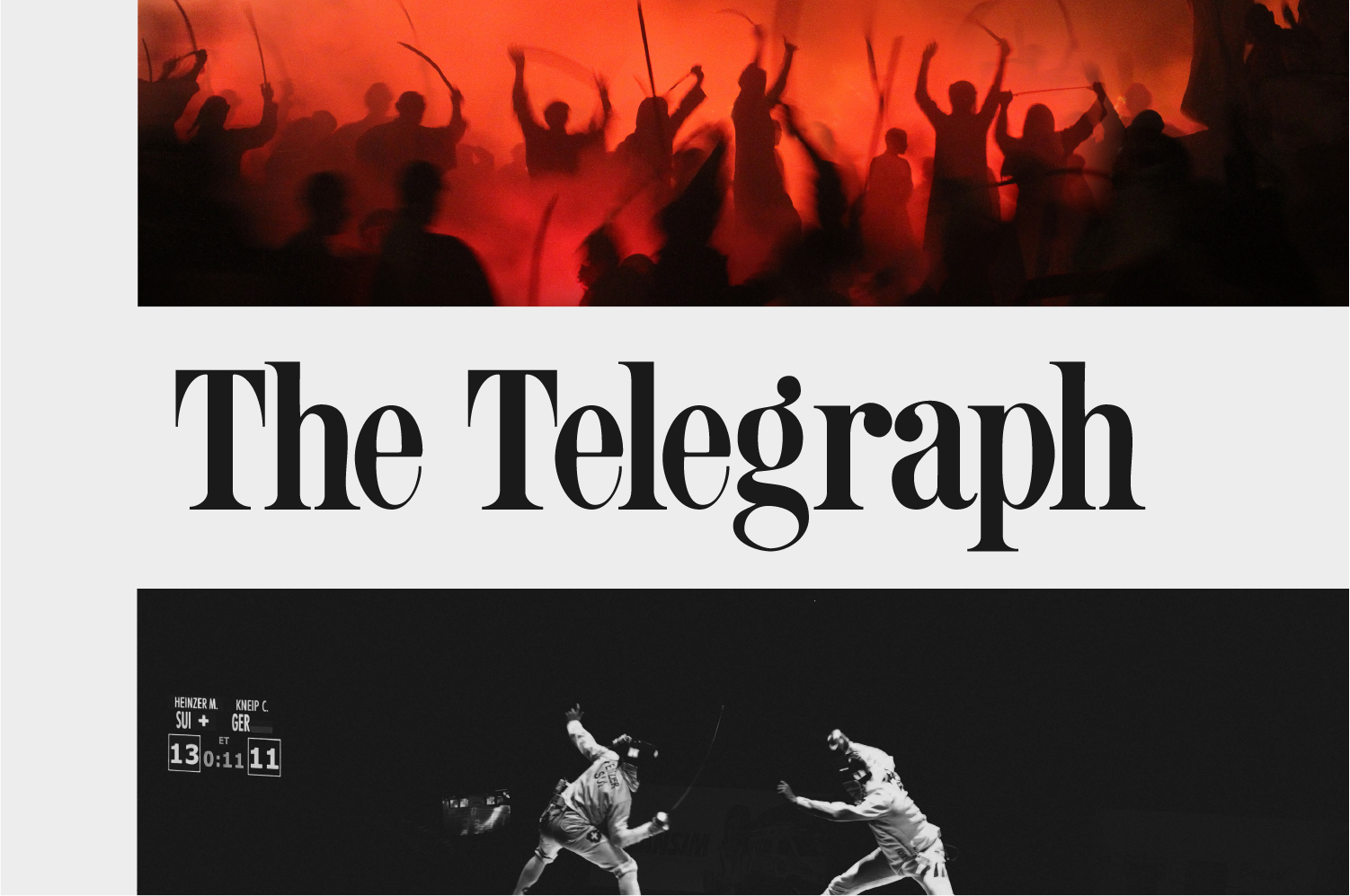
The Telegraph OnlineDesign Language
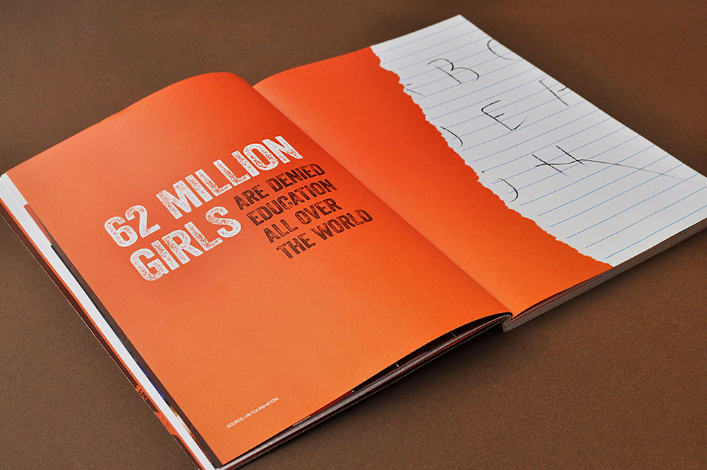
Danone EcosystemWomen Empowerment Brochure
Central Square FoundationDesign for Non-Designers
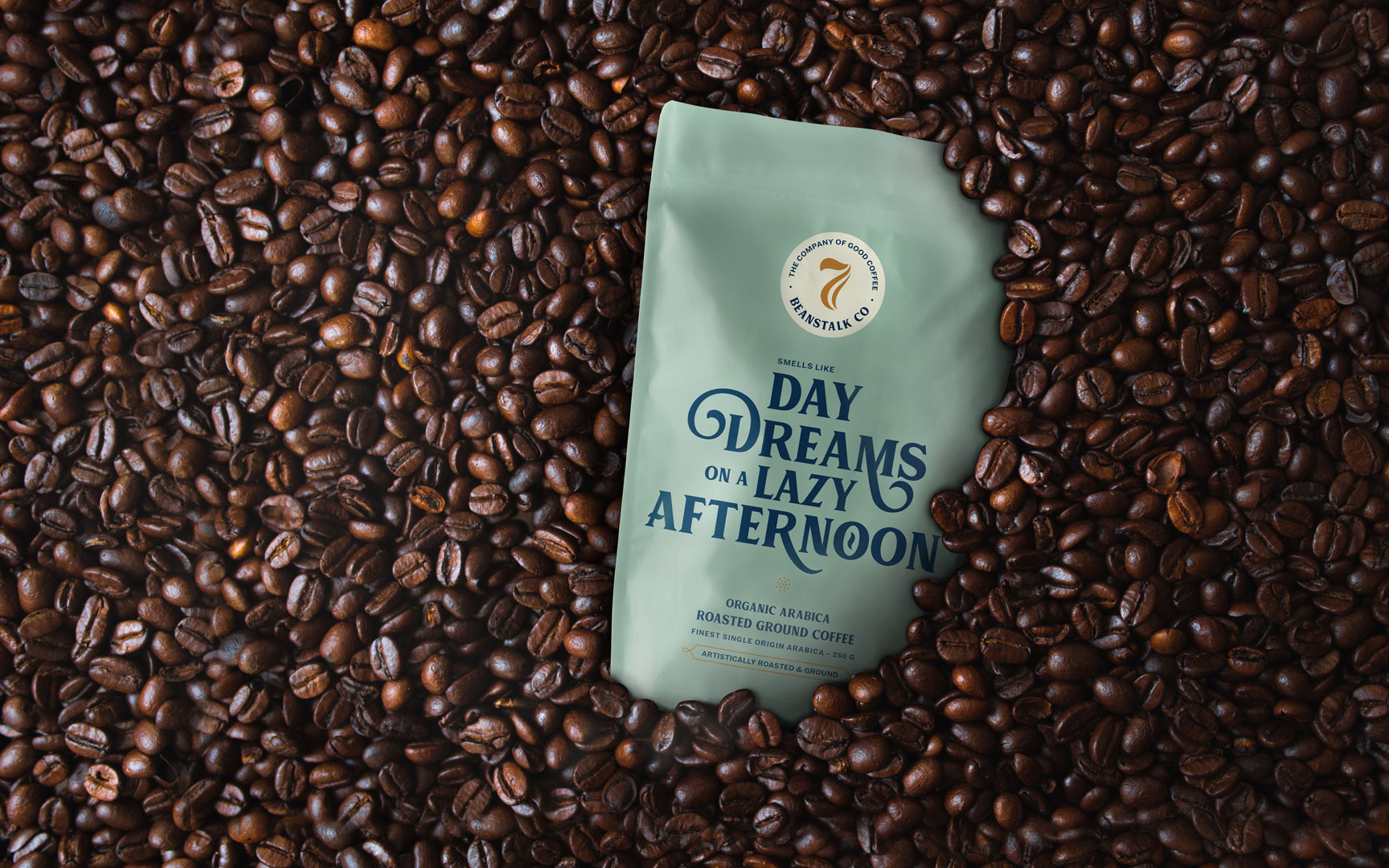
Seven BeanstalkCoffee Packaging

SlingshotDesigning for an Ed-tech Brand

CareCoverBranding a Pre-approved Medical Loan Card
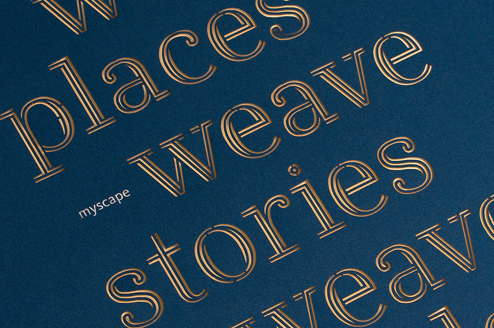
Myscape WeaveCommercial Property Brochure
NumberzBranding a Fintech Startup
SunshineBranding a Multi Speciality Hospital

The Tooth CompanyBranding a Dental Clinic

MedicsBranding Lucknow's Super Speciality Hospital
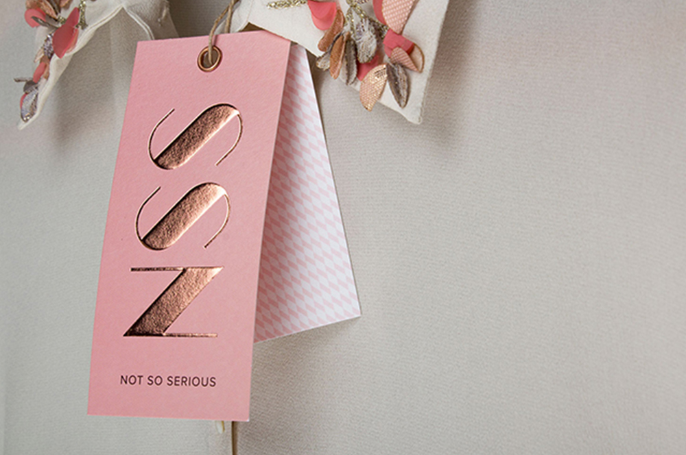
Not So SeriousRebranding a Luxury fashion label
OlivaRebranding a Chain of Medico Aesthetic Clinics
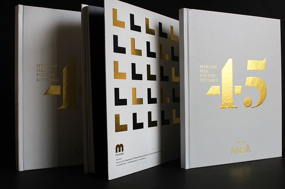
Myscape MeaResidential Property Brochure
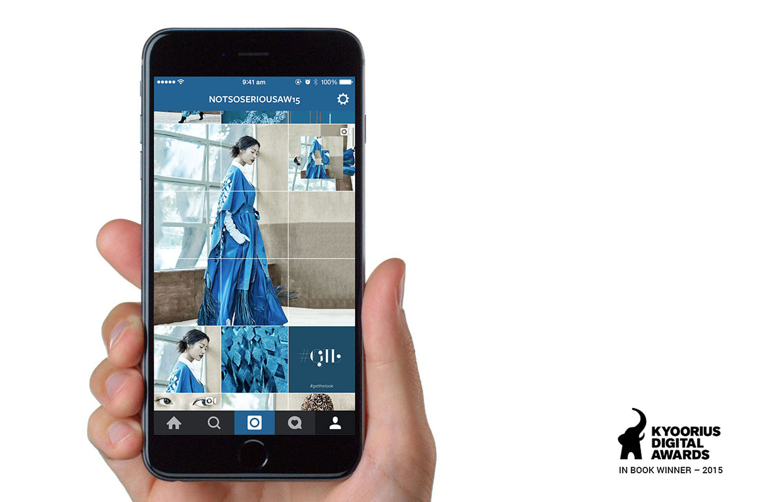
Not So SeriousAn Instagram Lookbook
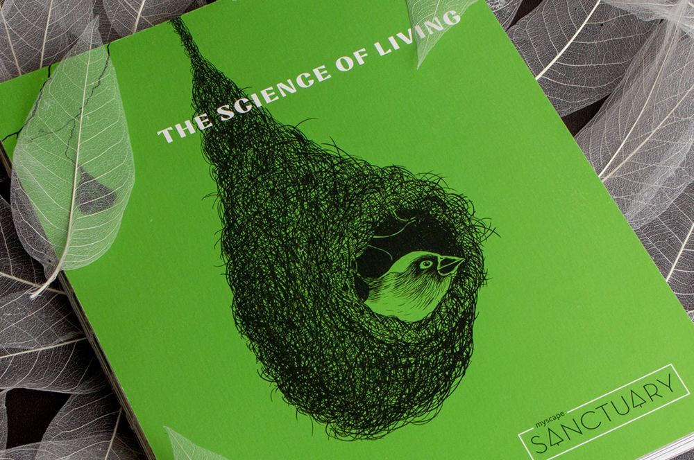
Myscape SanctuaryResidential Property Brochure & Communications
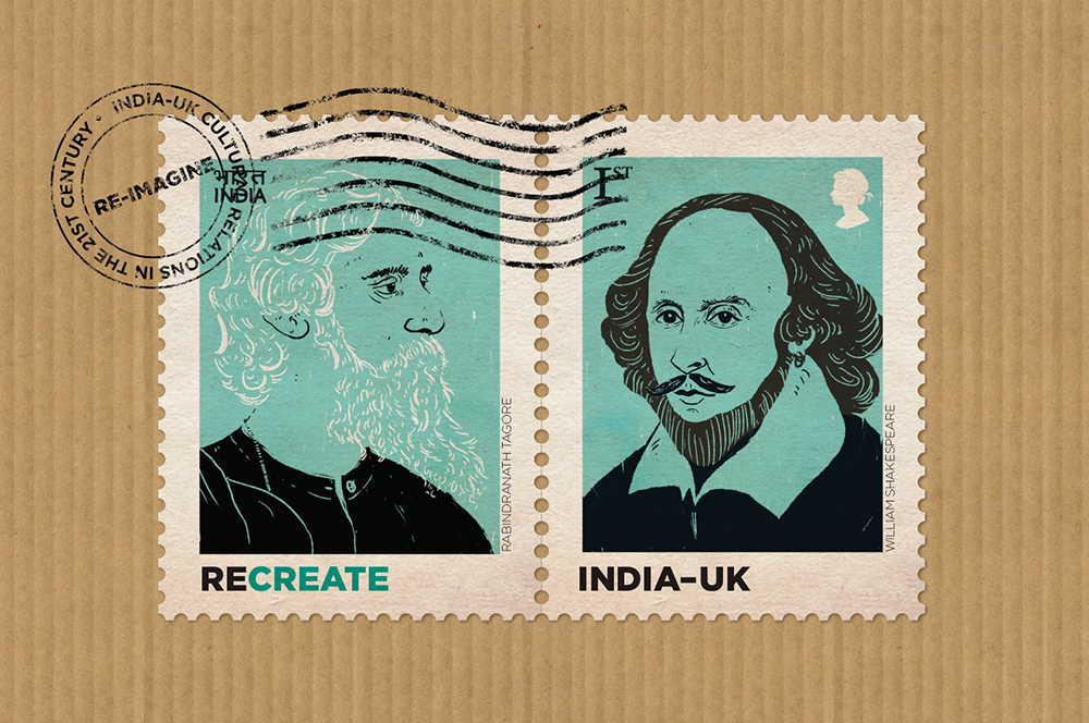
British CouncilIndia-UK relationship
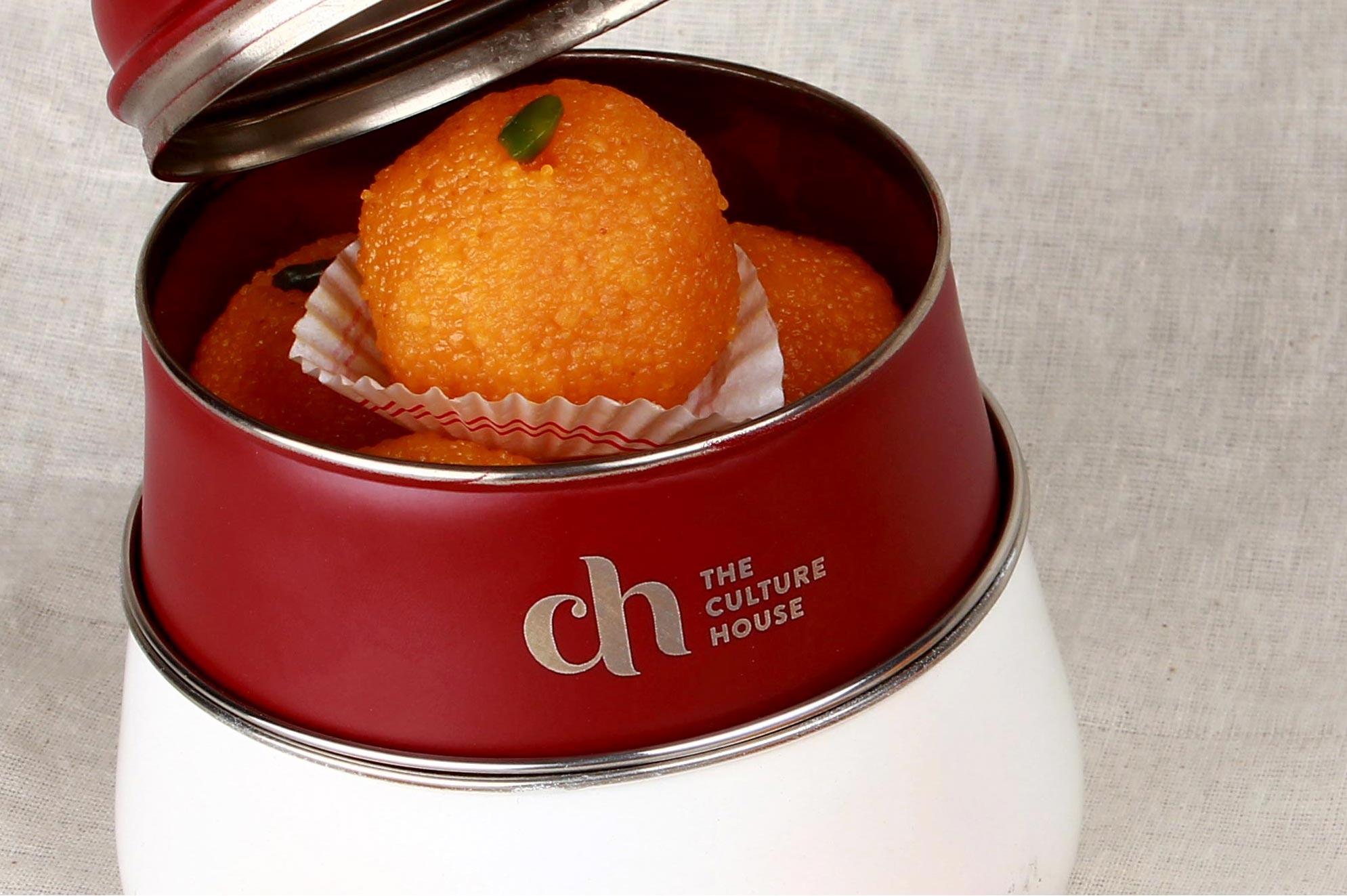
The Culture HouseRestaurant Branding
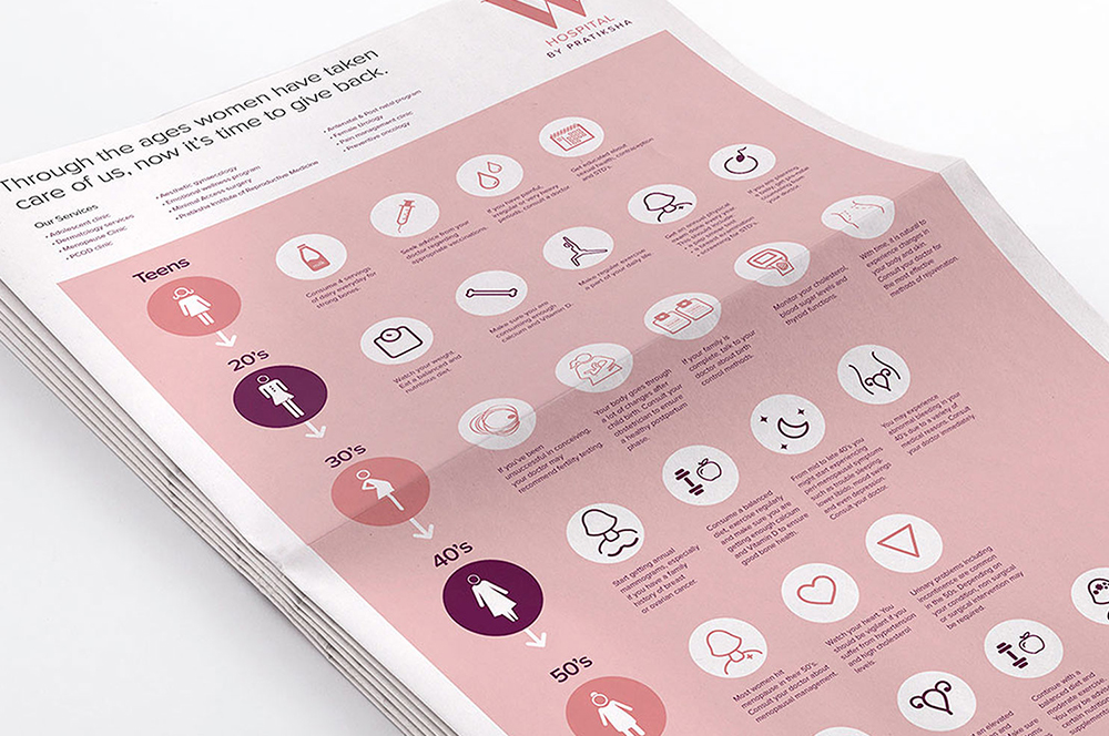
PratikshaBrand India’s Largest Hospital for Women
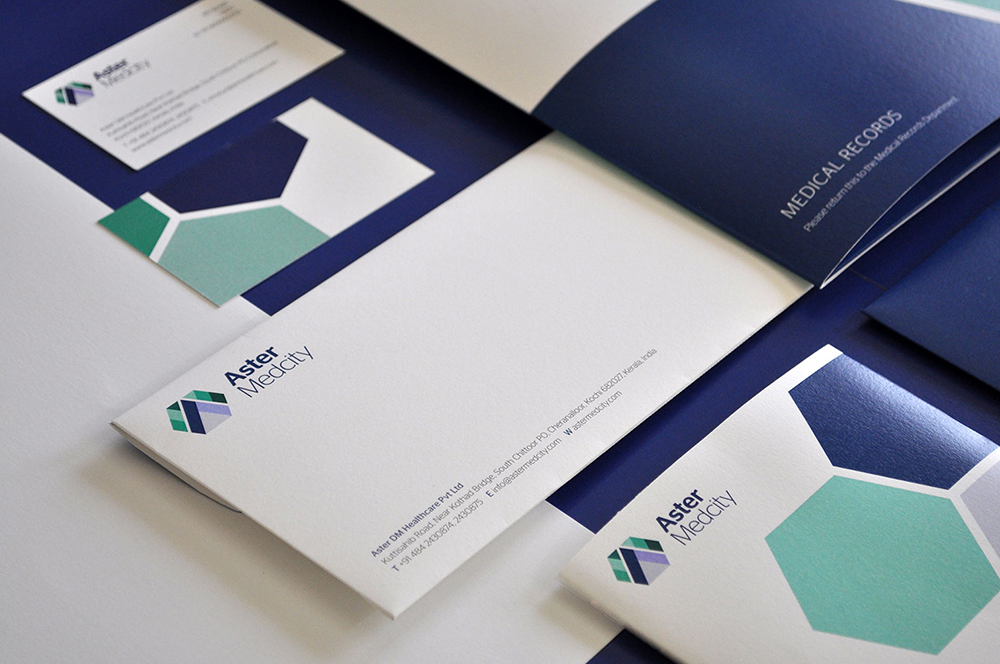
Aster MedcityBranding a Healthcare Destination
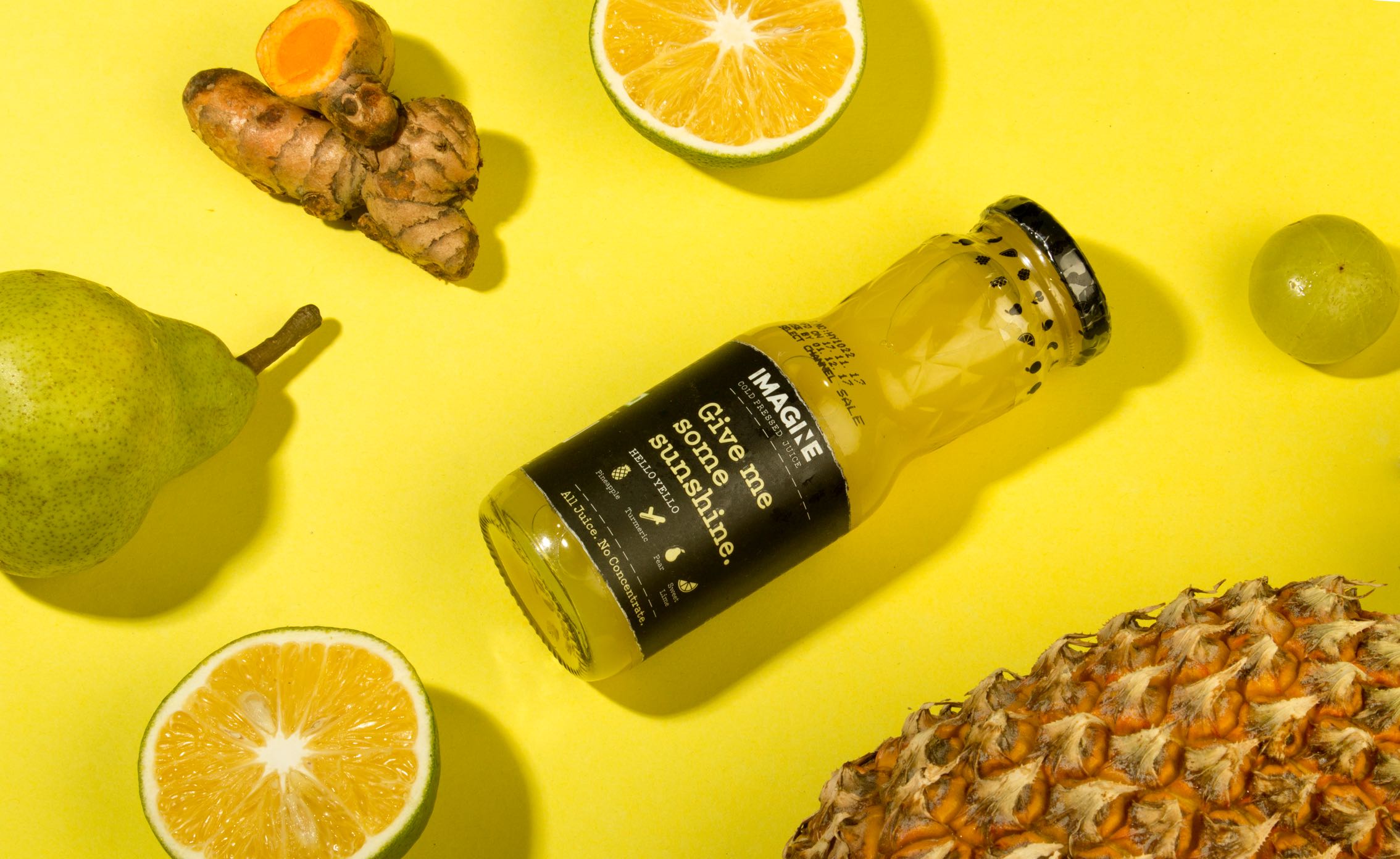
ImagineCold Pressed Juice Packaging
Nishada by My HomeResidential Property Brochure

TummyfullBranding a Homemade Food Tech Venture
Central Square FoundationAnnual Report

MedisyncBranding a B2B knowledge delivery platform
Intuit IndiaWhitepaper Design
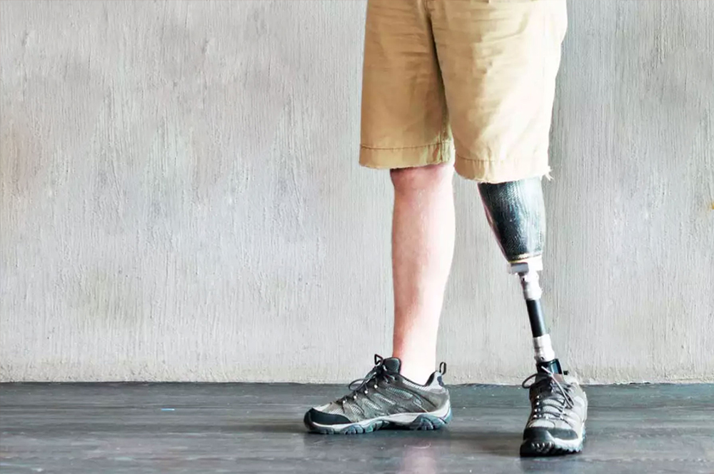
CPOBranding a Chain of Prosthetic Clinics
ORDReal Estate Branding
Myscape Isle of SkyResidential Property Brochure
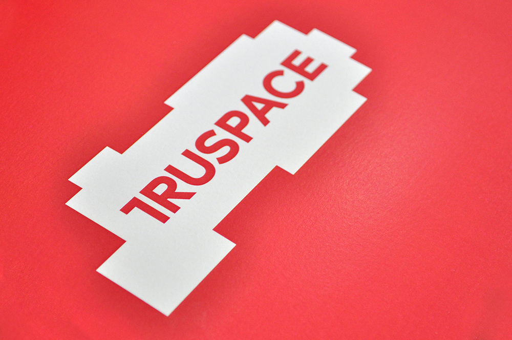
TruSpaceDynamic Real Estate Branding
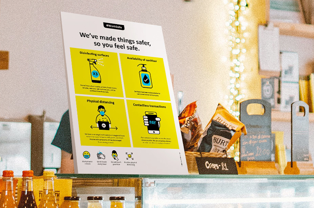
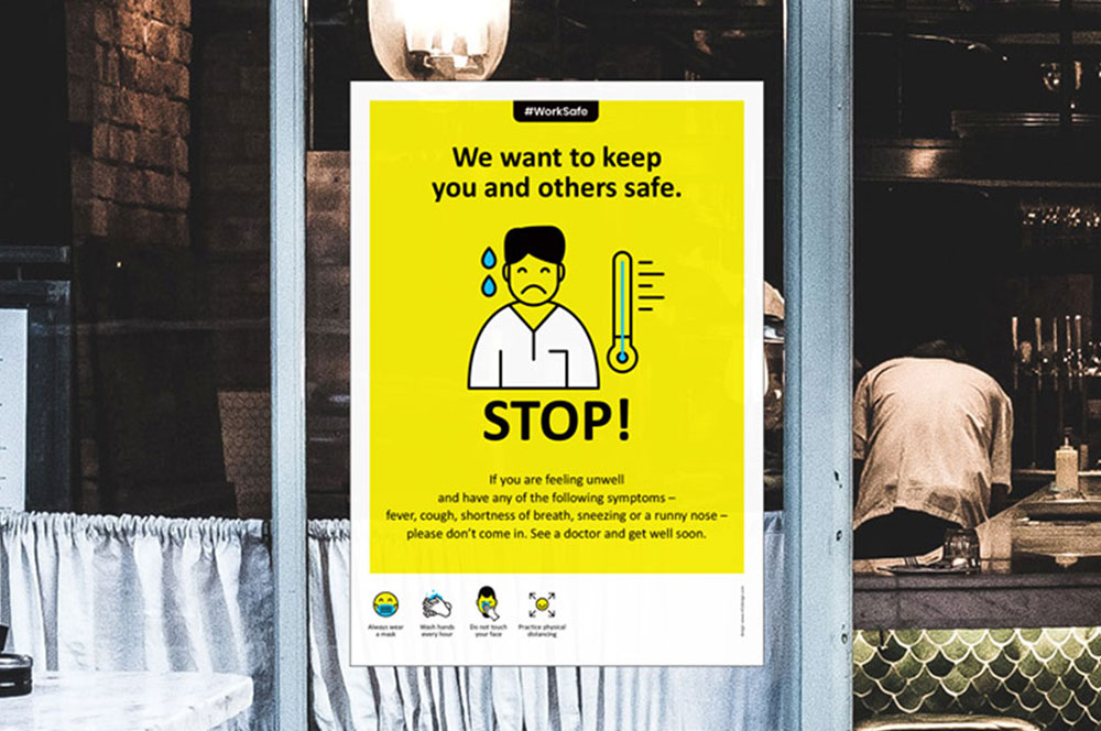
Work Safe Covid19 PostersSelf Initiated Project
Come & Go SafelyWork Safe Posters
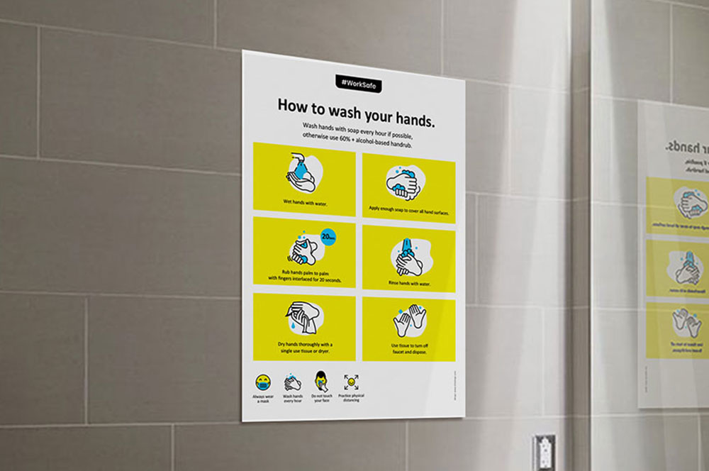
Community SafetyWork Safe Posters
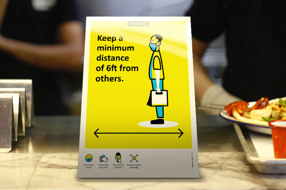
Individual SafetyWork Safe Posters
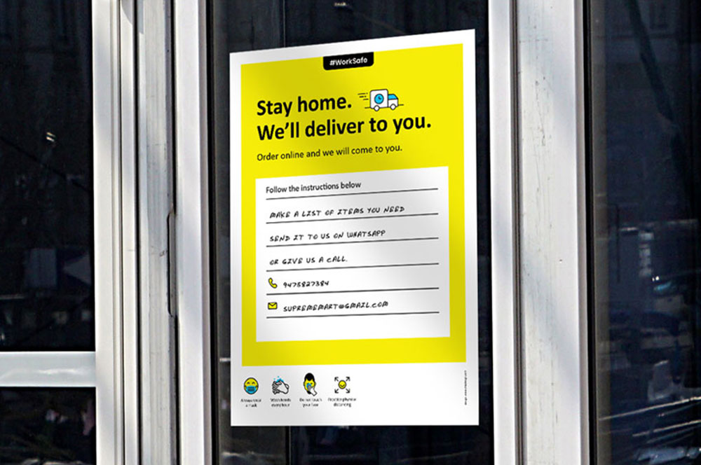
Business & Customer SafetyWork Safe Posters

StudentaccoBranding a Student Accommodation Portal
ShrachiDesigning a Notebook Brand for India
SWOTNotebook Cover Design
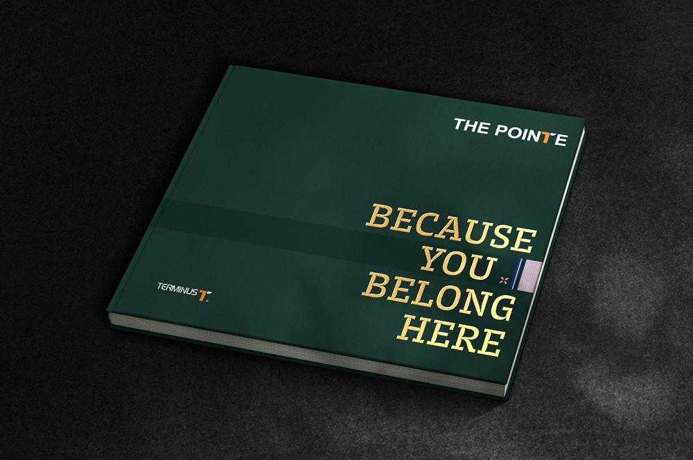
The Pointe by TerminusResidential Property Brochure
Asian BariatricsBranding a Bariatric Hospital
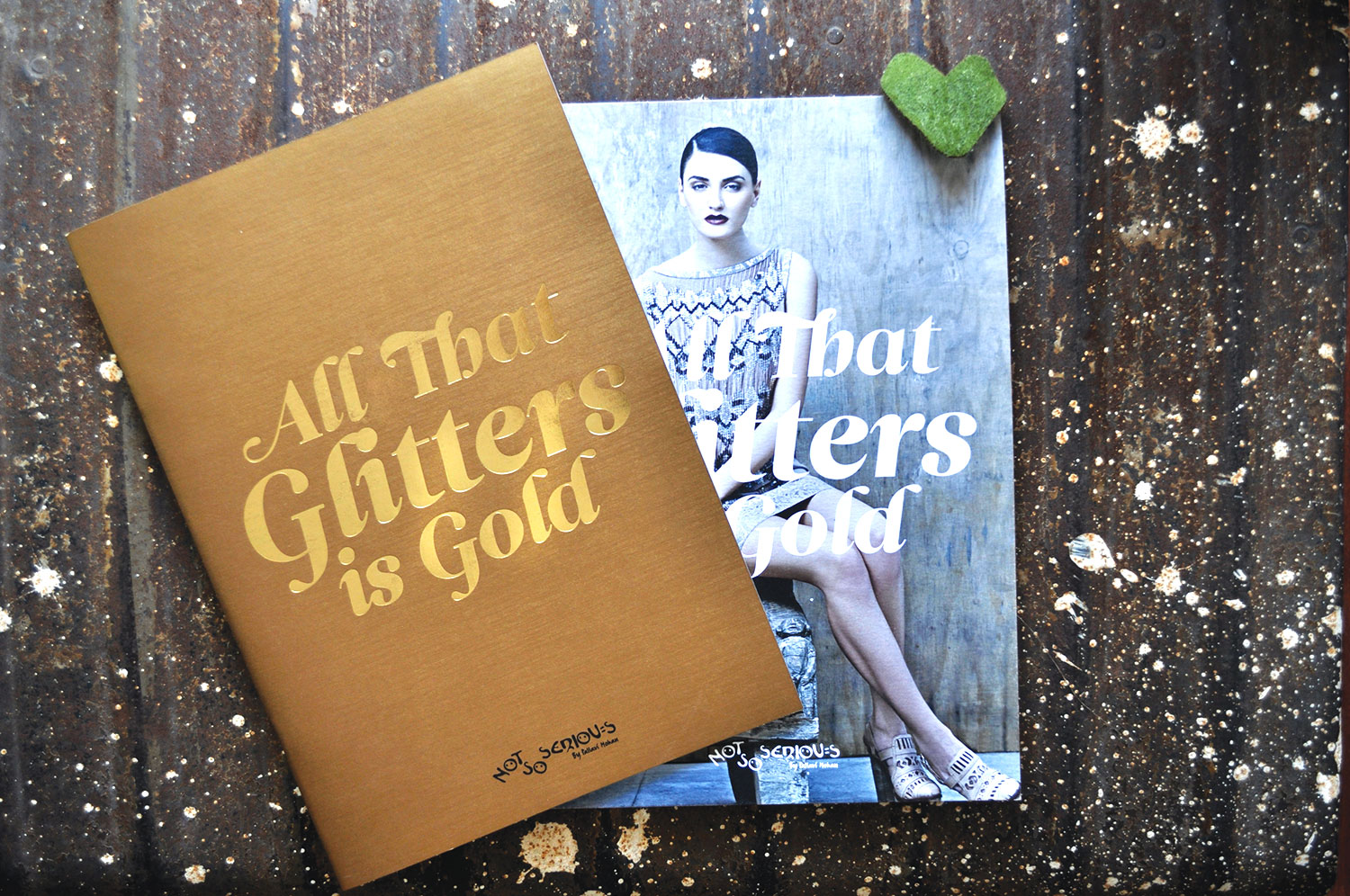
Not So SeriousFashion Lookbook
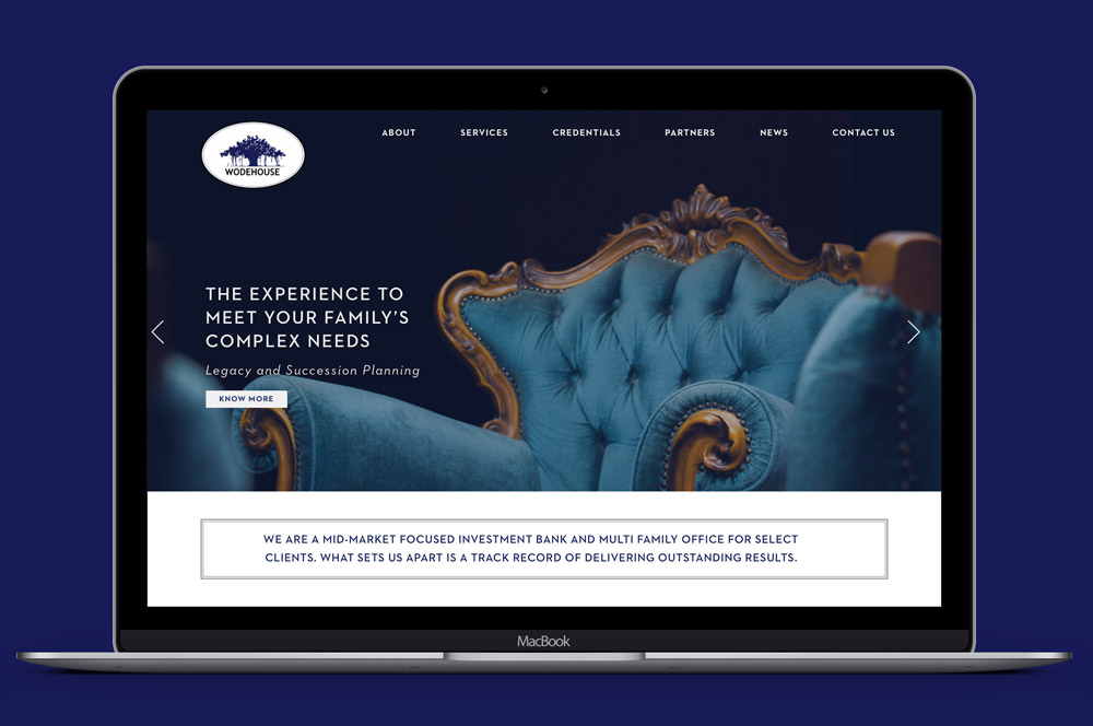
Wodehouse CapitalWebsite Design
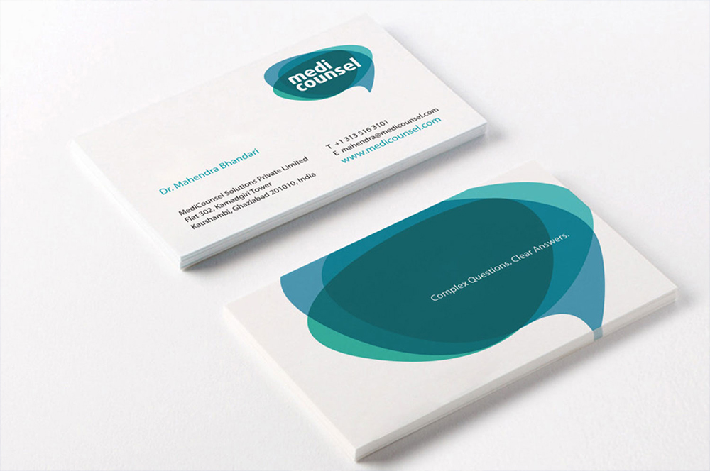
MediCounselBranding a Medical Portal
Subscribe to our Newsletter
Subscribe to our Newsletter
Subscribe to our Newsletter