Question
How does a dairy brand cater to younger discerning customers, without compromising its legacy?
Answer
By infusing its visual assets with freshness and modernity.
Question
How does a dairy brand cater to younger discerning customers, without compromising its legacy?
Answer
By infusing its visual assets with freshness and modernity.
Question
How does a dairy brand cater to younger discerning customers, without compromising its legacy?
Answer
By infusing its visual assets with freshness and modernity.
Question
How does a dairy brand cater to younger discerning customers, without compromising its legacy?
Answer
By infusing its visual assets with freshness and modernity.
Question
How does a dairy brand cater to younger discerning customers, without compromising its legacy?
Answer
By infusing its visual assets with freshness and modernity.
Keventer Metro
Keventer Metro
Keventer Metro
Keventer Metro
Keventer Metro
Headquartered in Kolkata, West Bengal, Metro Dairy is in the business of FMCG pure milk and value-added milk products. The brand was the first joint venture dairy project under Operation Flood Phase 3. It has been synonymous with milk since its inception 25 years ago and pioneered pouch milk in Eastern India, selling over 200,000 liters of milk every day. Keventer Agro acquired full control of Metro Dairy Ltd in 2018. In 2022, NH1Design was approached to revamp the Metro brand and create a unified family for its ever-expanding dairy and product portfolio. The challenge was to refresh the Metro brand while retaining its traditional cultural roots and decades-long legacy.
SERVICES REBRANDING | PACKAGING DESIGN AND PORTFOLIO ARCHITECTURE
CLIENT KEVENTER METRO
SECTOR FMCG
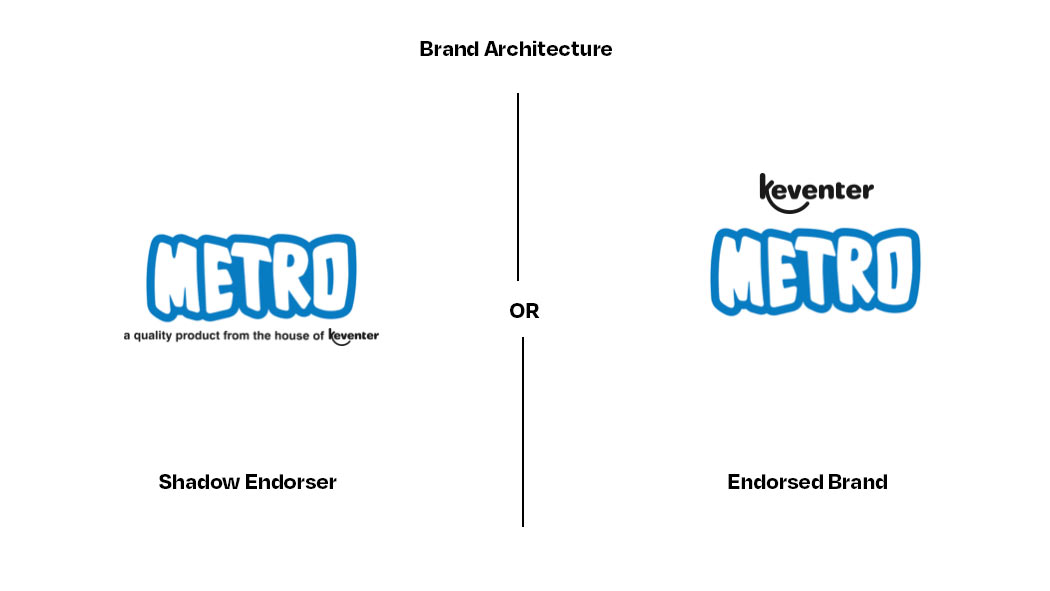
Brand Audit
Brand Audit
Brand Audit
Brand Audit
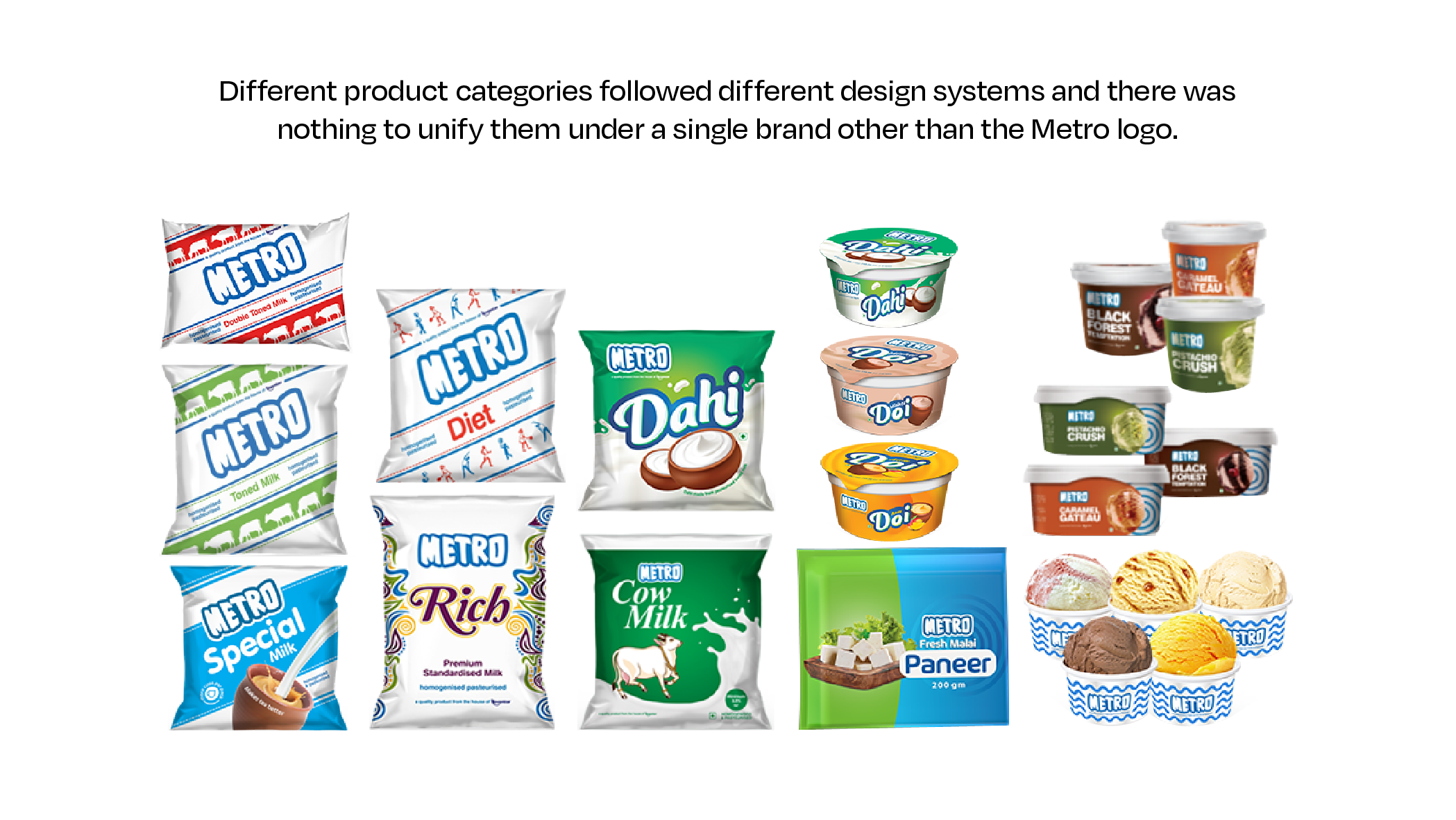
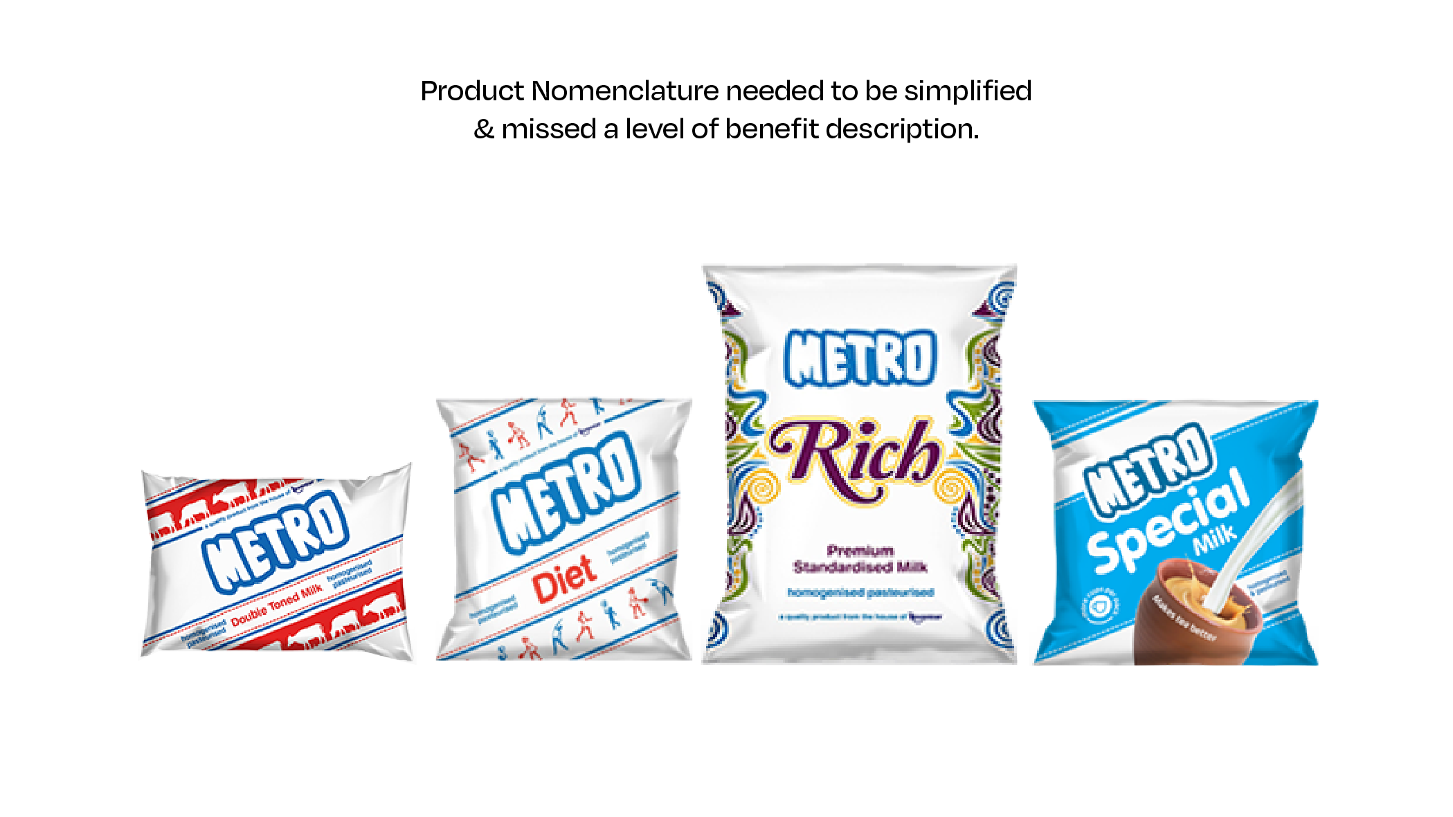
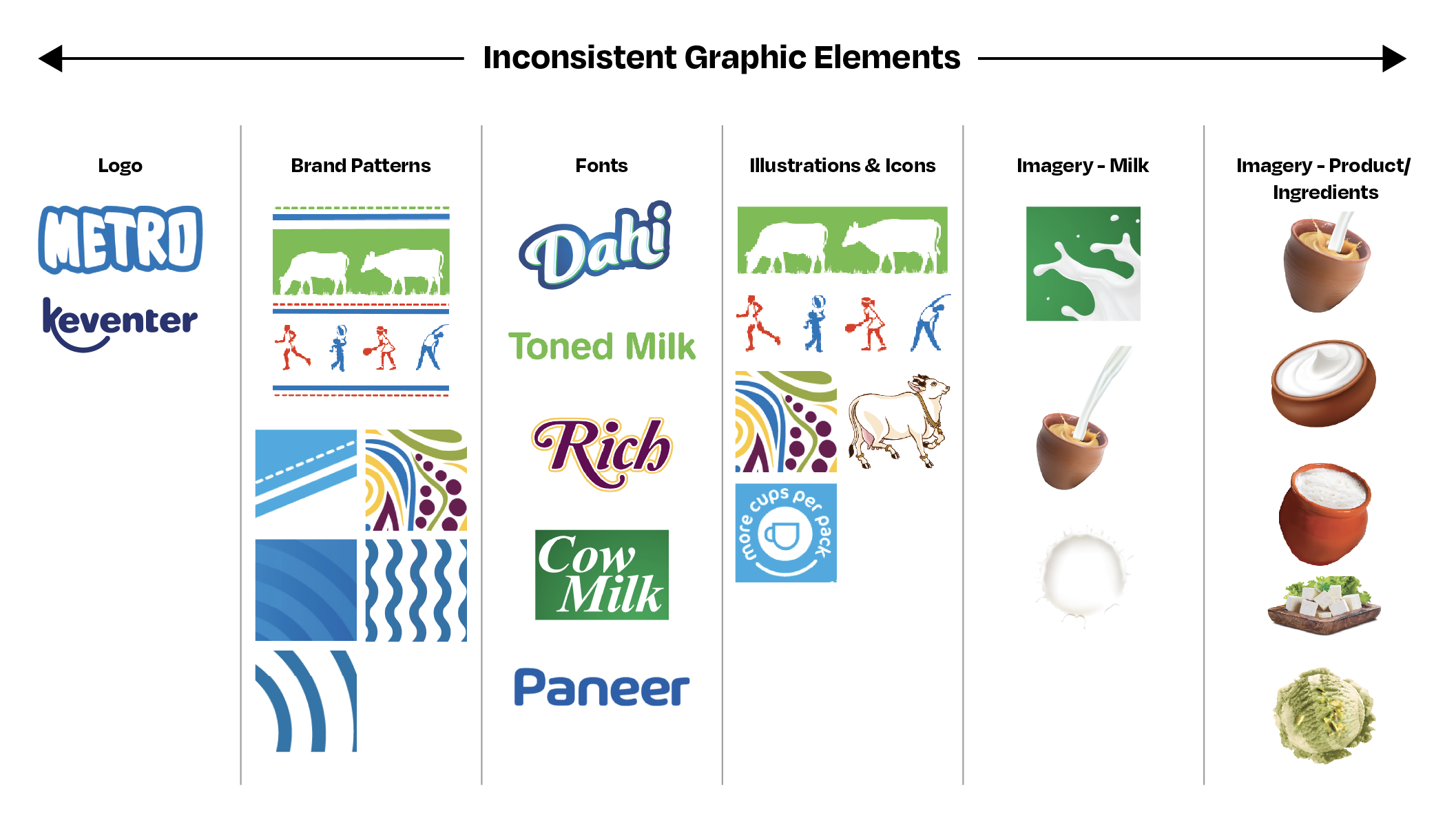
As a team tasked with creating a cohesive and appealing brand identity and packaging system for the dairy portfolio, the challenge was to resonate with both older and younger generations. Through a brand audit, it was discovered that the existing portfolio lacked a consistent design theme and consolidated architecture, emphasizing the importance of establishing Keventer as an umbrella brand to improve brand recognition and credibility. To address the challenge of appealing to younger millennials, the team crafted design strategies that refreshed the brand identity while preserving the traditional cultural roots and legacy of Metro Dairy. By balancing innovation with tradition, a unified brand family was created that is both relevant and authentic.
As a team tasked with creating a cohesive and appealing brand identity and packaging system for the dairy portfolio, the challenge was to resonate with both older and younger generations. Through a brand audit, it was discovered that the existing portfolio lacked a consistent design theme and consolidated architecture, emphasizing the importance of establishing Keventer as an umbrella brand to improve brand recognition and credibility. To address the challenge of appealing to younger millennials, the team crafted design strategies that refreshed the brand identity while preserving the traditional cultural roots and legacy of Metro Dairy. By balancing innovation with tradition, a unified brand family was created that is both relevant and authentic.
As a team tasked with creating a cohesive and appealing brand identity and packaging system for the dairy portfolio, the challenge was to resonate with both older and younger generations. Through a brand audit, it was discovered that the existing portfolio lacked a consistent design theme and consolidated architecture, emphasizing the importance of establishing Keventer as an umbrella brand to improve brand recognition and credibility.
To address the challenge of appealing to younger millennials, the team crafted design strategies that refreshed the brand identity while preserving the traditional cultural roots and legacy of Metro Dairy. By balancing innovation with tradition, a unified brand family was created that is both relevant and authentic.
Brand Identity
Brand Identity Evolution
Brand Identity Evolution
Brand Identity Evolution
Brand Identity Evolution
The design of Metro's brand identity draws inspiration from the smooth flow and creamy texture of its milk products. The R-O ligature and lowercase 'e' were incorporated to create a warm and friendly feel. To ensure a consistent brand experience across regional touchpoints, a Bengali logo unit was also crafted. White Crow Design collaborated with us to develop the brand identity and bilingual adaptation.
The design of Metro's brand identity draws inspiration from the smooth flow and creamy texture of its milk products. The R-O ligature and lowercase 'e' were incorporated to create a warm and friendly feel. To ensure a consistent brand experience across regional touchpoints, a Bengali logo unit was also crafted. White Crow Design collaborated with us to develop the brand identity and bilingual adaptation.
The design of Metro's brand identity draws inspiration from the smooth flow and creamy texture of its milk products. The R-O ligature and lowercase 'e' were incorporated to create a warm and friendly feel. To ensure a consistent brand experience across regional touchpoints, a Bengali logo unit was also crafted. White Crow Design collaborated with us to develop the brand identity and bilingual adaptation.
The design of Metro's brand identity draws inspiration from the smooth flow and creamy texture of its milk products. The R-O ligature and lowercase 'e' were incorporated to create a warm and friendly feel. To ensure a consistent brand experience across regional touchpoints, a Bengali logo unit was also crafted. White Crow Design collaborated with us to develop the brand identity and bilingual adaptation.
The design of Metro's brand identity draws inspiration from the smooth flow and creamy texture of its milk products. The R-O ligature and lowercase 'e' were incorporated to create a warm and friendly feel. To ensure a consistent brand experience across regional touchpoints, a Bengali logo unit was also crafted. White Crow Design collaborated with us to develop the brand identity and bilingual adaptation.


BRAND TAGLINE
BRAND TAGLINE
BRAND TAGLINE
BRAND TAGLINE
BRAND TAGLINE
Inherited Loyalty, Igniting Emotions
Inherited Loyalty, Igniting Emotions
Inherited Loyalty, Igniting Emotions
Inherited Loyalty, Igniting Emotions
Inherited Loyalty, Igniting Emotions
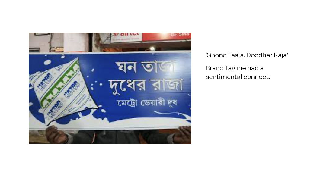
The brand's decades-old tagline of ‘Ghono Taaja, Doodher Raja’ had a deep emotional connection and nostalgic recall among its loyal customers. In light of this, the team decided to revive it and prominently feature it on every milk pack by earmarking the top right corner, complete with a crown unit to match. This strategy ensured that the brand's traditional cultural roots and legacy were preserved while also creating a refreshed and recognizable brand identity that resonated with consumers.
The brand's decades-old tagline of ‘Ghono Taaja, Doodher Raja’ had a deep emotional connection and nostalgic recall among its loyal customers. In light of this, the team decided to revive it and prominently feature it on every milk pack by earmarking the top right corner, complete with a crown unit to match. This strategy ensured that the brand's traditional cultural roots and legacy were preserved while also creating a refreshed and recognizable brand identity that resonated with consumers.
The brand's decades-old tagline of ‘Ghono Taaja, Doodher Raja’ had a deep emotional connection and nostalgic recall among its loyal customers. In light of this, the team decided to revive it and prominently feature it on every milk pack by earmarking the top right corner, complete with a crown unit to match. This strategy ensured that the brand's traditional cultural roots and legacy were preserved while also creating a refreshed and recognizable brand identity that resonated with consumers.
The brand's decades-old tagline of ‘Ghono Taaja, Doodher Raja’ had a deep emotional connection and nostalgic recall among its loyal customers. In light of this, the team decided to revive it and prominently feature it on every milk pack by earmarking the top right corner, complete with a crown unit to match. This strategy ensured that the brand's traditional cultural roots and legacy were preserved while also creating a refreshed and recognizable brand identity that resonated with consumers.
The brand's decades-old tagline of ‘Ghono Taaja, Doodher Raja’ had a deep emotional connection and nostalgic recall among its loyal customers. In light of this, the team decided to revive it and prominently feature it on every milk pack by earmarking the top right corner, complete with a crown unit to match. This strategy ensured that the brand's traditional cultural roots and legacy were preserved while also creating a refreshed and recognizable brand identity that resonated with consumers.
The World of Keventer Metro
The World of Keventer Metro
The World of Keventer Metro
The World of Keventer Metro
The World of Keventer Metro
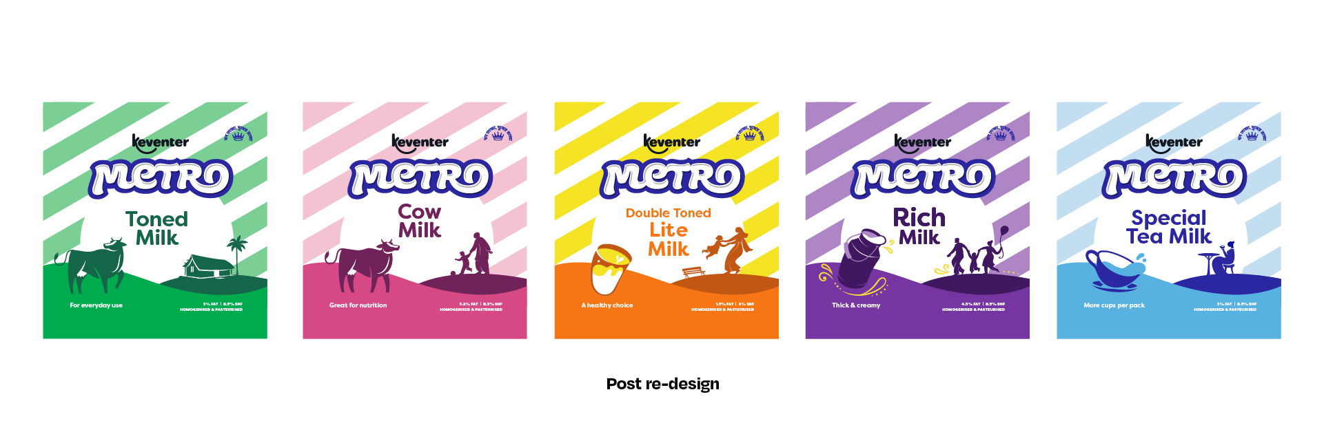
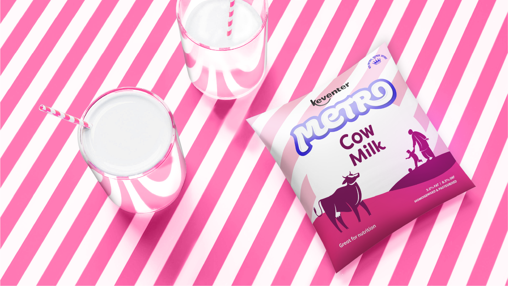
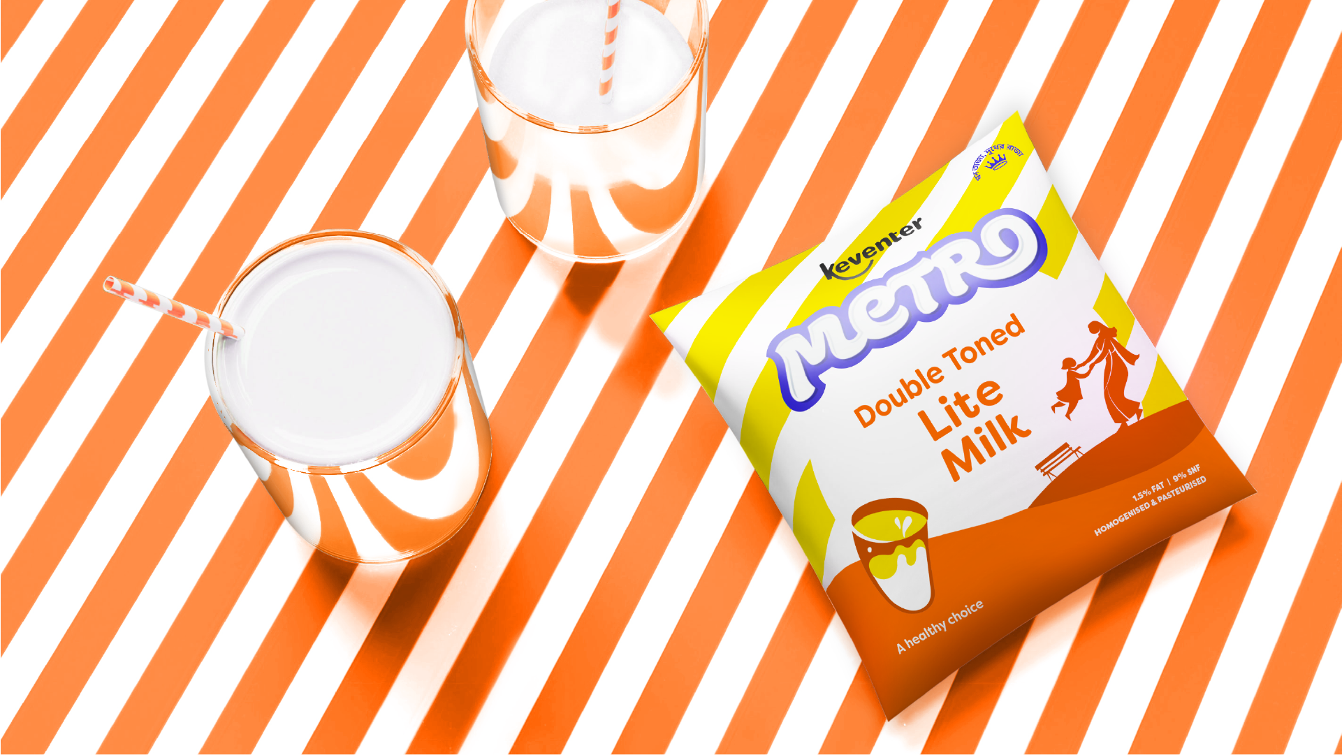
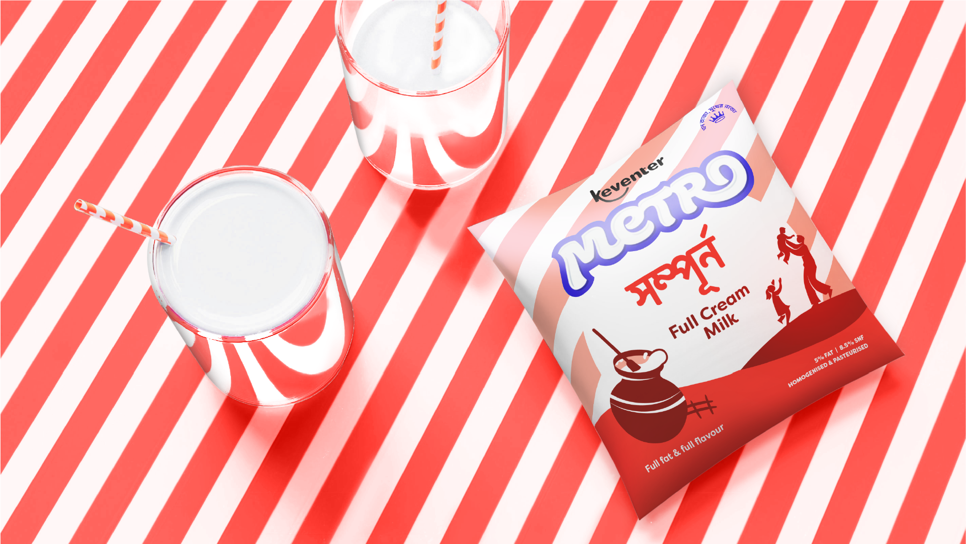
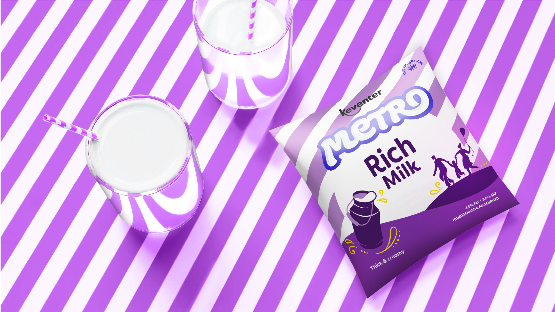
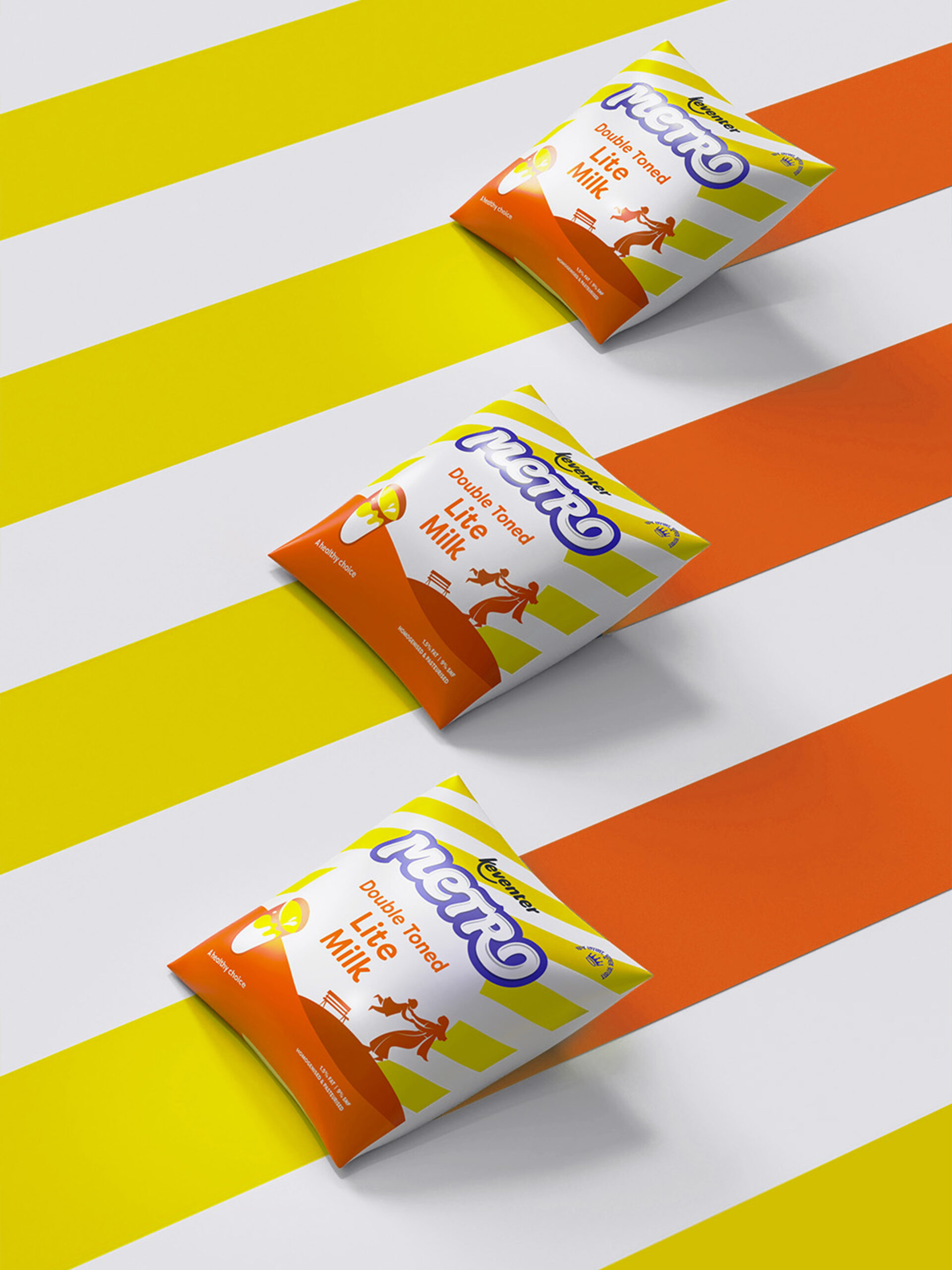
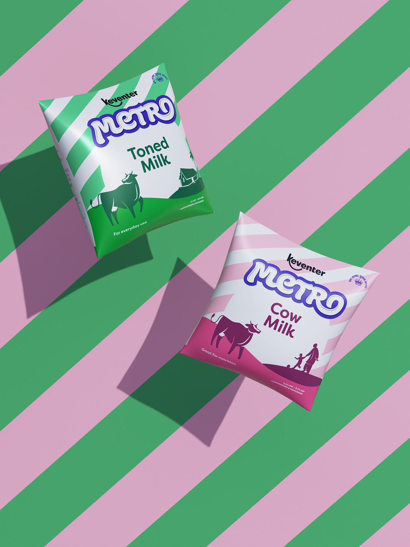
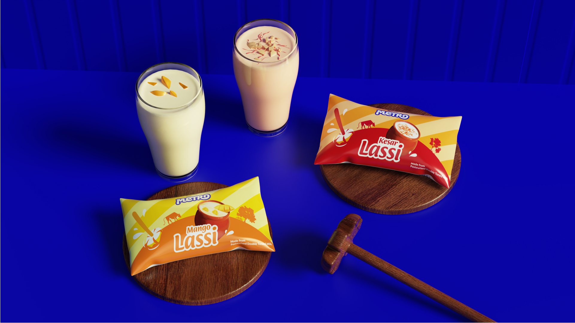
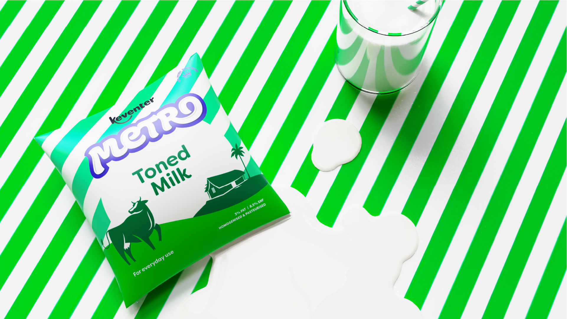
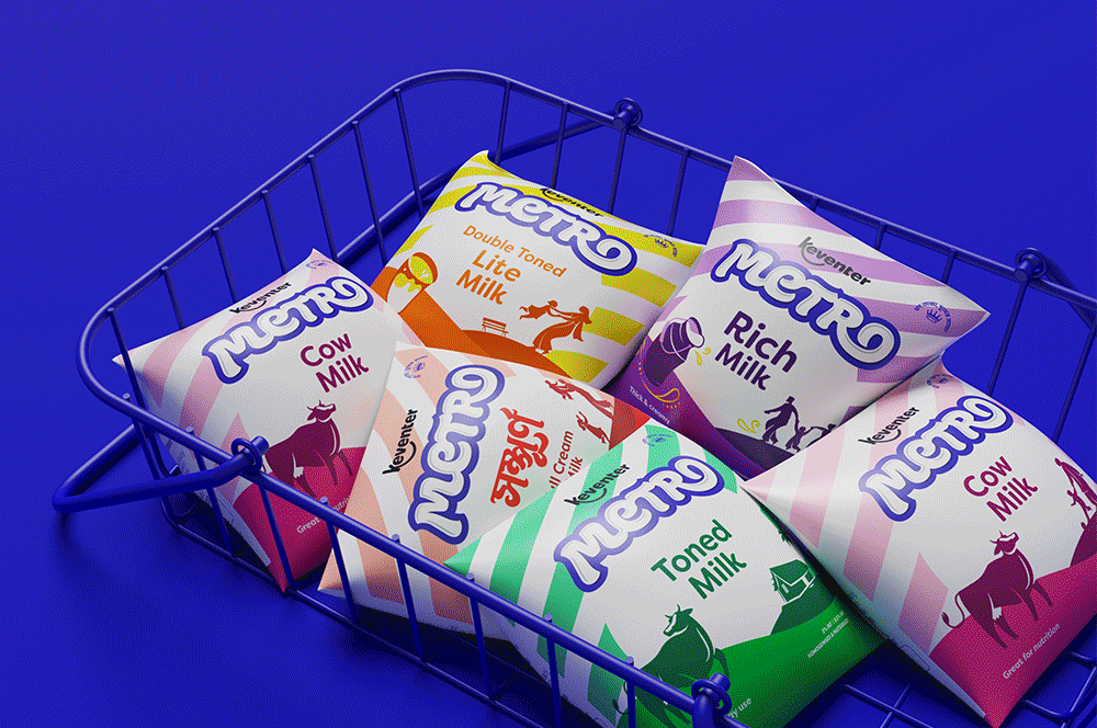
The packaging design system was inspired by the brand's legacy and visual assets.
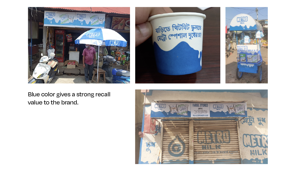
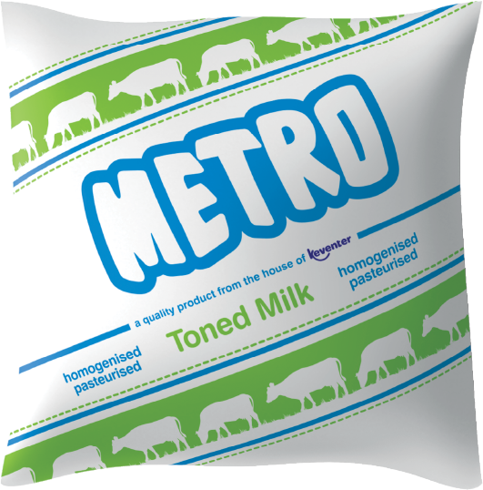
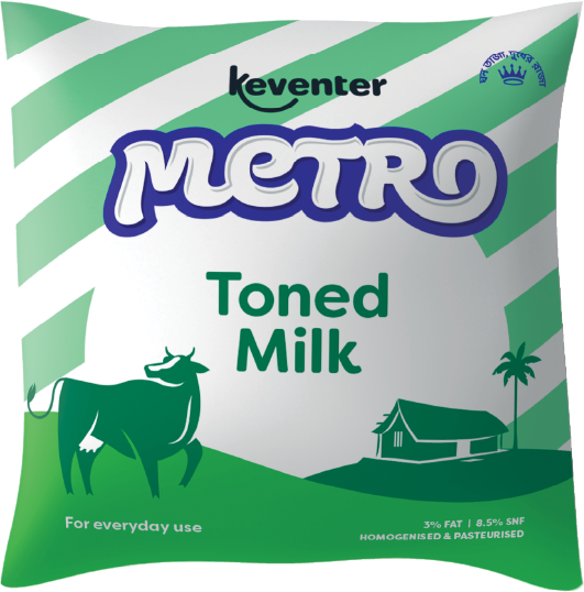
Over the years, the diagonal stripes and blue colour of the Metro logo on the pack with grazing cows have been a strong identifier for the brand.
These were modified and the modern stripes form a strong and memorable base for the packaging layout, ensuring a continued relationship with the loyal customer base. The Metro blue has also been retained, paired with scene setups involving object silhouettes, cows and a local landscape.
The packaging design system was inspired by the brand's legacy and visual assets.
Over the years, the diagonal stripes and blue colour of the Metro logo on the pack with grazing cows have been a strong identifier for the brand. These were modified and the modern stripes form a strong and memorable base for the packaging layout, ensuring a continued relationship with the loyal customer base. The Metro blue has also been retained, paired with scene setups involving object silhouettes, cows and a local landscape.
The packaging design system was inspired by the brand's legacy and visual assets.
Over the years, the diagonal stripes and blue colour of the Metro logo on the pack with grazing cows have been a strong identifier for the brand.
These were modified and the modern stripes form a strong and memorable base for the packaging layout, ensuring a continued relationship with the loyal customer base. The Metro blue has also been retained, paired with scene setups involving object silhouettes, cows and a local landscape.
The packaging design system was inspired by the brand's legacy and visual assets.
Over the years, the diagonal stripes and blue colour of the Metro logo on the pack with grazing cows have been a strong identifier for the brand.
These were modified and the modern stripes form a strong and memorable base for the packaging layout, ensuring a continued relationship with the loyal customer base. The Metro blue has also been retained, paired with scene setups involving object silhouettes, cows and a local landscape.
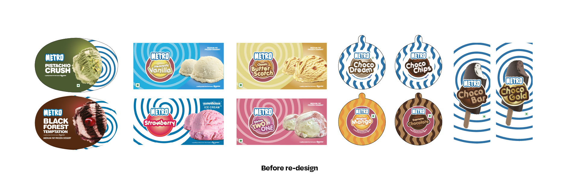
Old Pack Design
Old Pack Design
Old Pack Design
Old Pack Design
Old Pack Design
New Pack Design
New Pack Design
New Pack Design
New Pack Design
New Pack Design
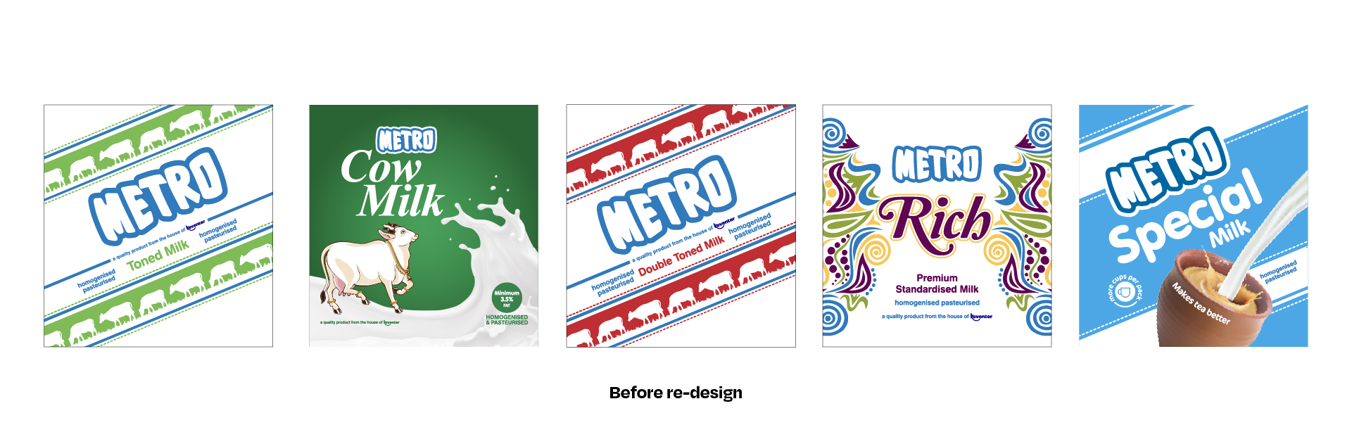
Strong sense of landscape scenery and a spotlight on product usage.
Strong sense of landscape scenery and a spotlight on product usage.
Strong sense of landscape scenery and a spotlight on product usage.
Strong sense of landscape scenery and a spotlight on product usage.
Strong sense of landscape scenery and a spotlight on product usage.
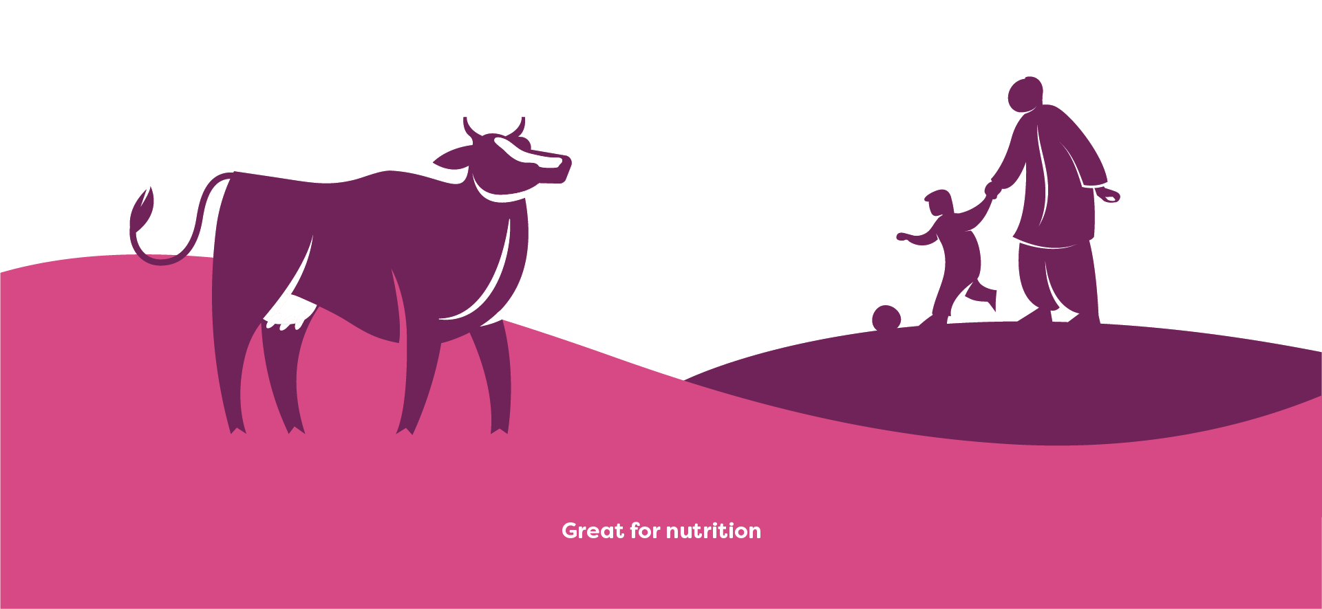
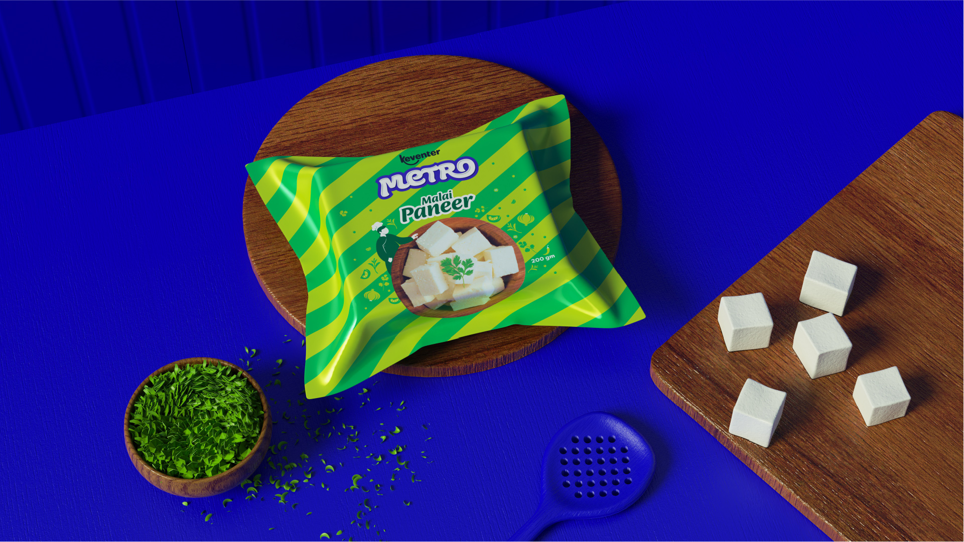
For the brand illustrations, we took a bold and high contrast approach, with illustrations that mimic the dynamism and flow of milk.
Care was taken to stay true to the Indian cow, with features such as the hump, and lack of patches. The illustration elements have been crafted to reflect the local Bengali context and landscape. Family focused and human figures in warm and endearing poses further add to the universality of an FMCG product.


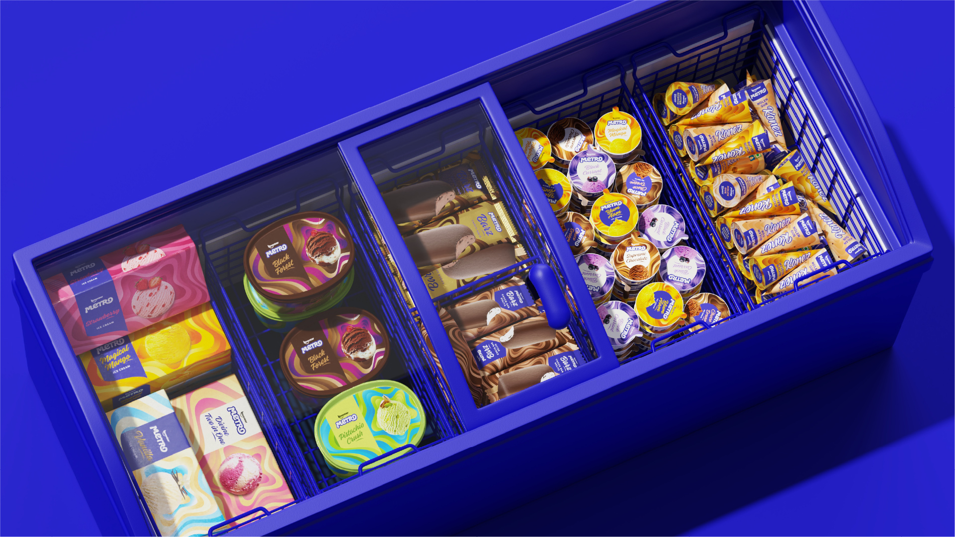
Flexible Packaging System
Flexible Packaging System
Flexible Packaging System
Flexible Packaging System
Flexible Packaging System
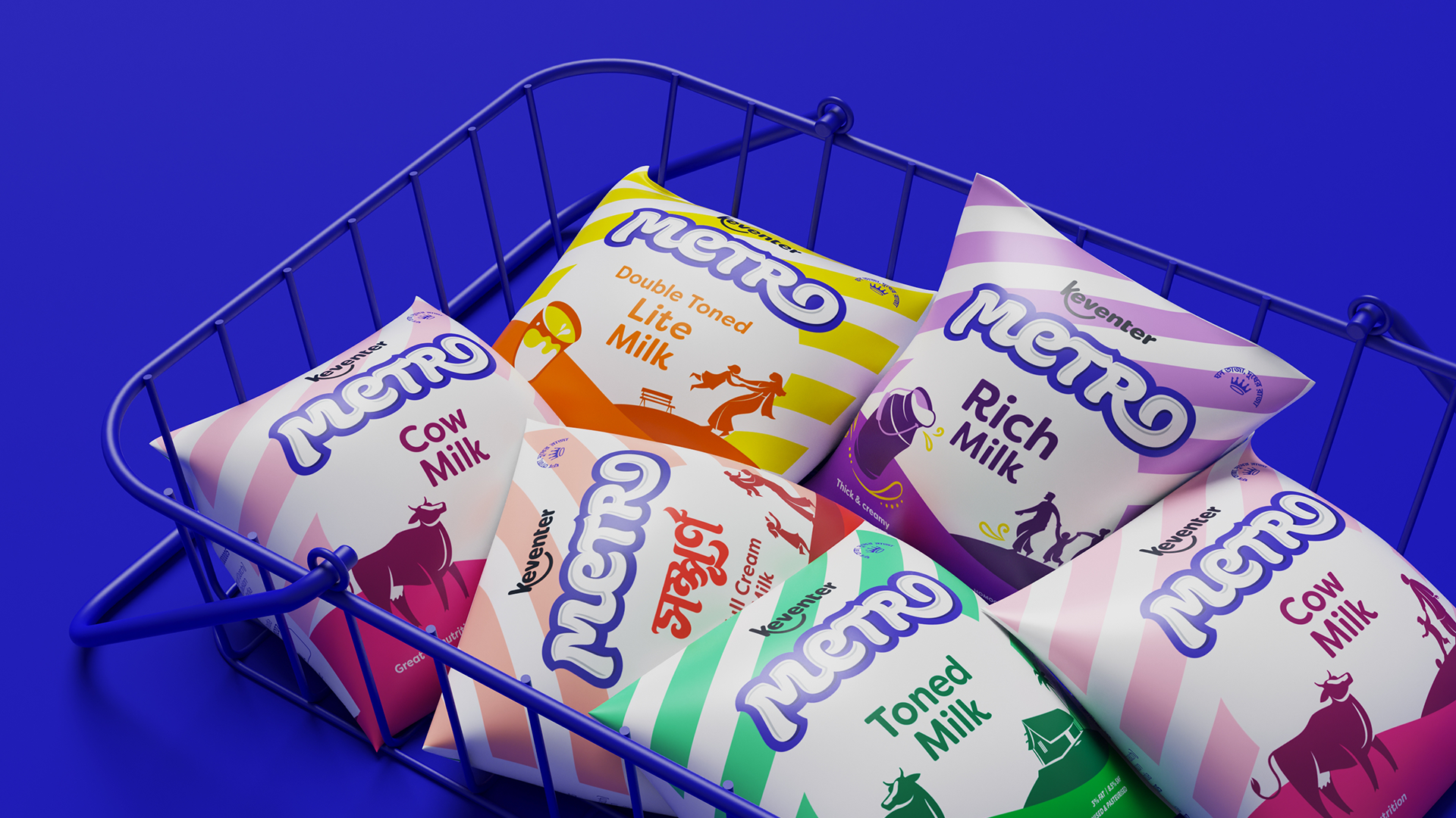
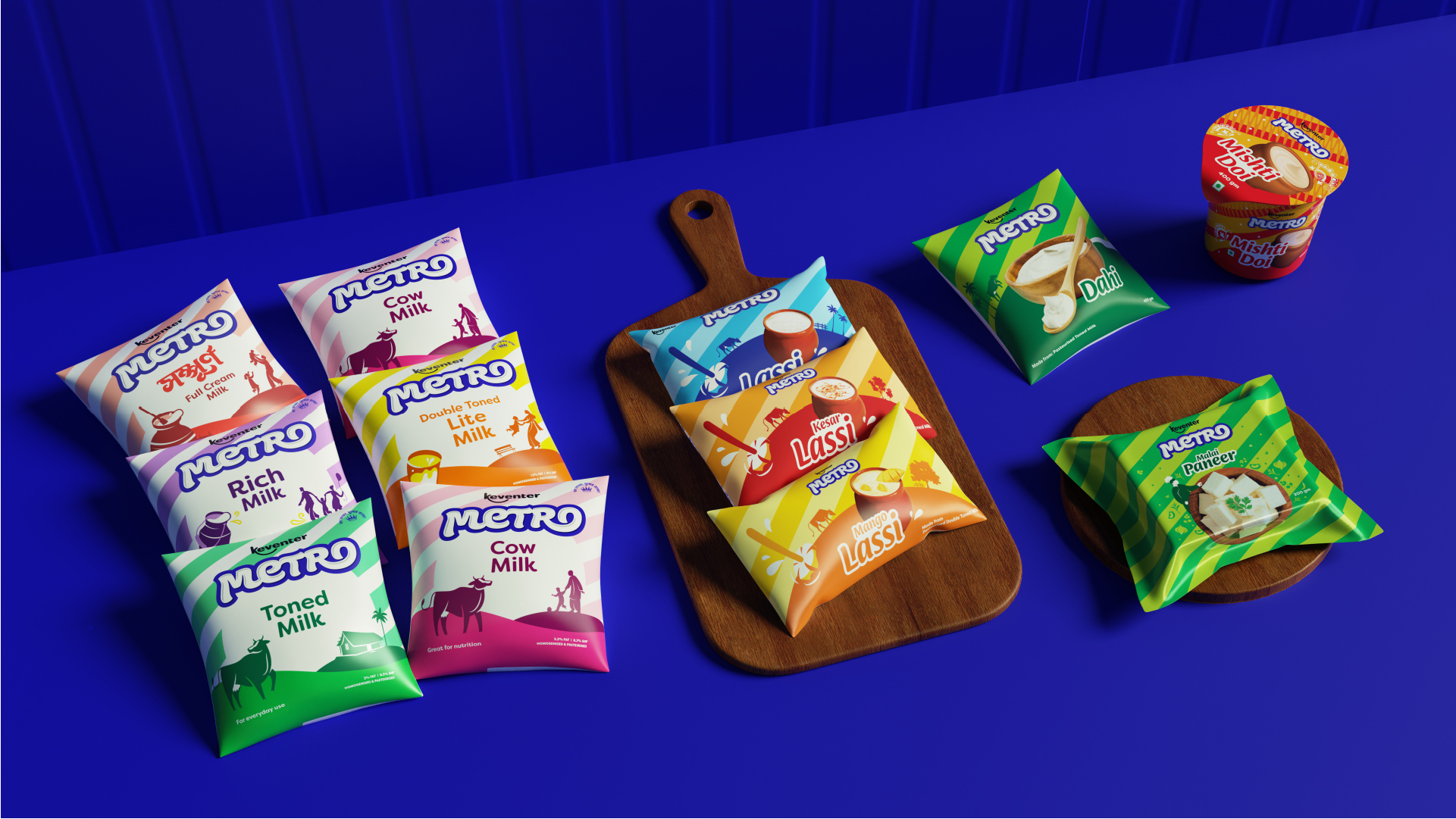
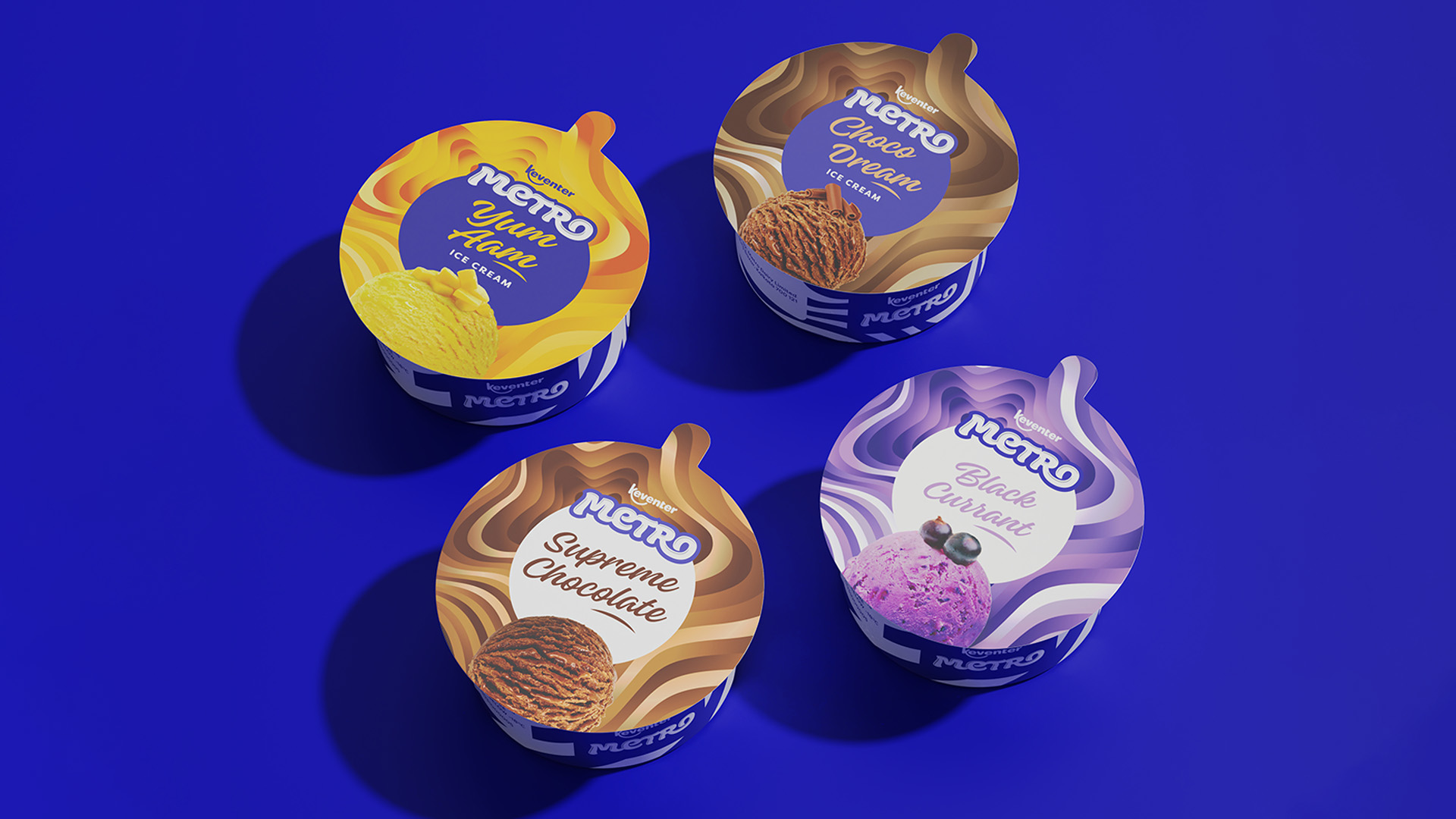
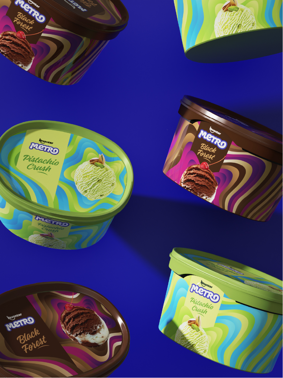
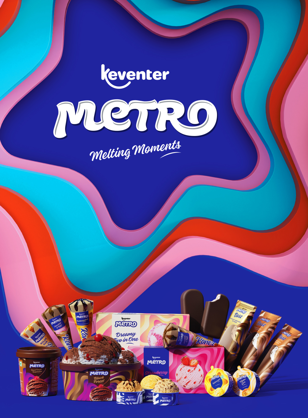
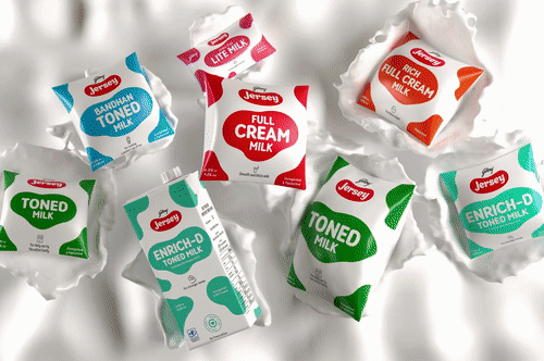
A seamless extension of the stripe pattern across all product categories has been maintained with the addition of background colours, illustration elements as well as product imagery.
A seamless extension of the stripe pattern across all product categories has been maintained with the addition of background colours, illustration elements as well as product imagery.
A seamless extension of the stripe pattern across all product categories has been maintained with the addition of background colours, illustration elements as well as product imagery.
A seamless extension of the stripe pattern across all product categories has been maintained with the addition of background colours, illustration elements as well as product imagery.
A seamless extension of the stripe pattern across all product categories has been maintained with the addition of background colours, illustration elements as well as product imagery.
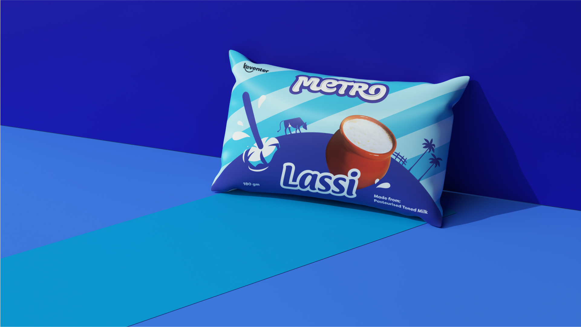
Milk Products
Milk Products
Milk Products
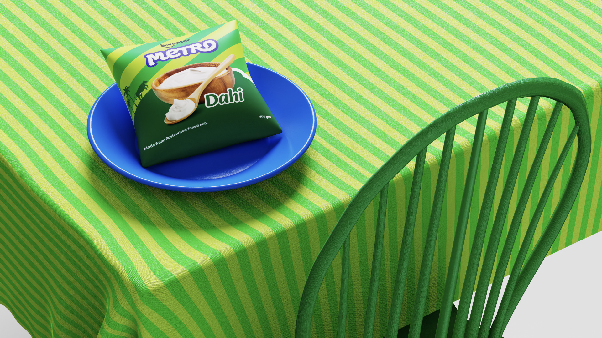
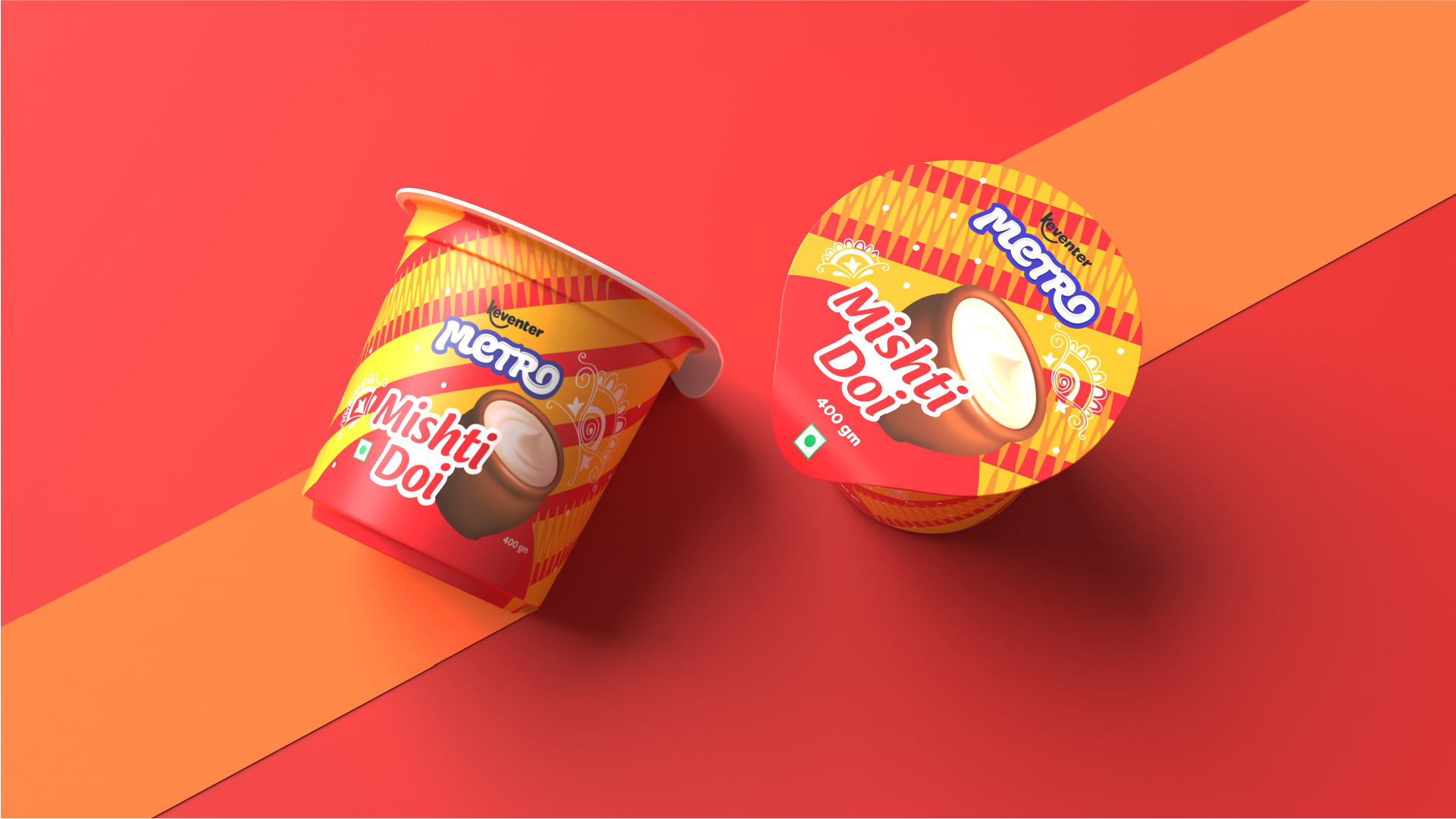
The Mishti Doi pack references the traditional Bengali 'alpana', a folk art style of motifs, patterns, and symbols that are painted on floors and walls with paints made from rice flour, on religious occasions.
The Mishti Doi pack references the traditional Bengali 'alpana', a folk art style of motifs, patterns, and symbols that are painted on floors and walls with paints made from rice flour, on religious occasions.
The Mishti Doi pack references the traditional Bengali 'alpana', a folk art style of motifs, patterns, and symbols that are painted on floors and walls with paints made from rice flour, on religious occasions.
The Mishti Doi pack references the traditional Bengali 'alpana', a folk art style of motifs, patterns, and symbols that are painted on floors and walls with paints made from rice flour, on religious occasions.
The Mishti Doi pack references the traditional Bengali 'alpana', a folk art style of motifs, patterns, and symbols that are painted on floors and walls with paints made from rice flour, on religious occasions.
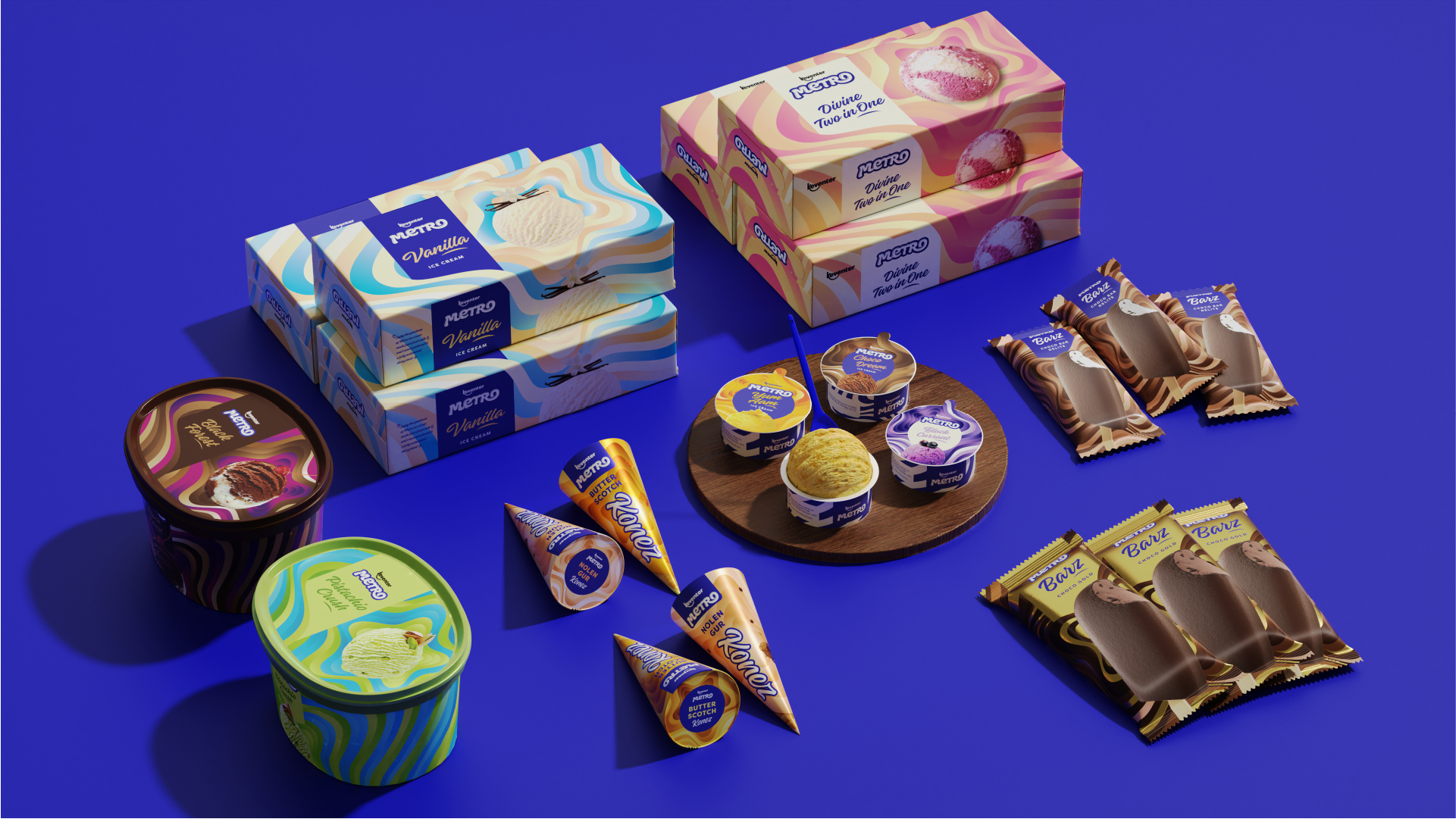
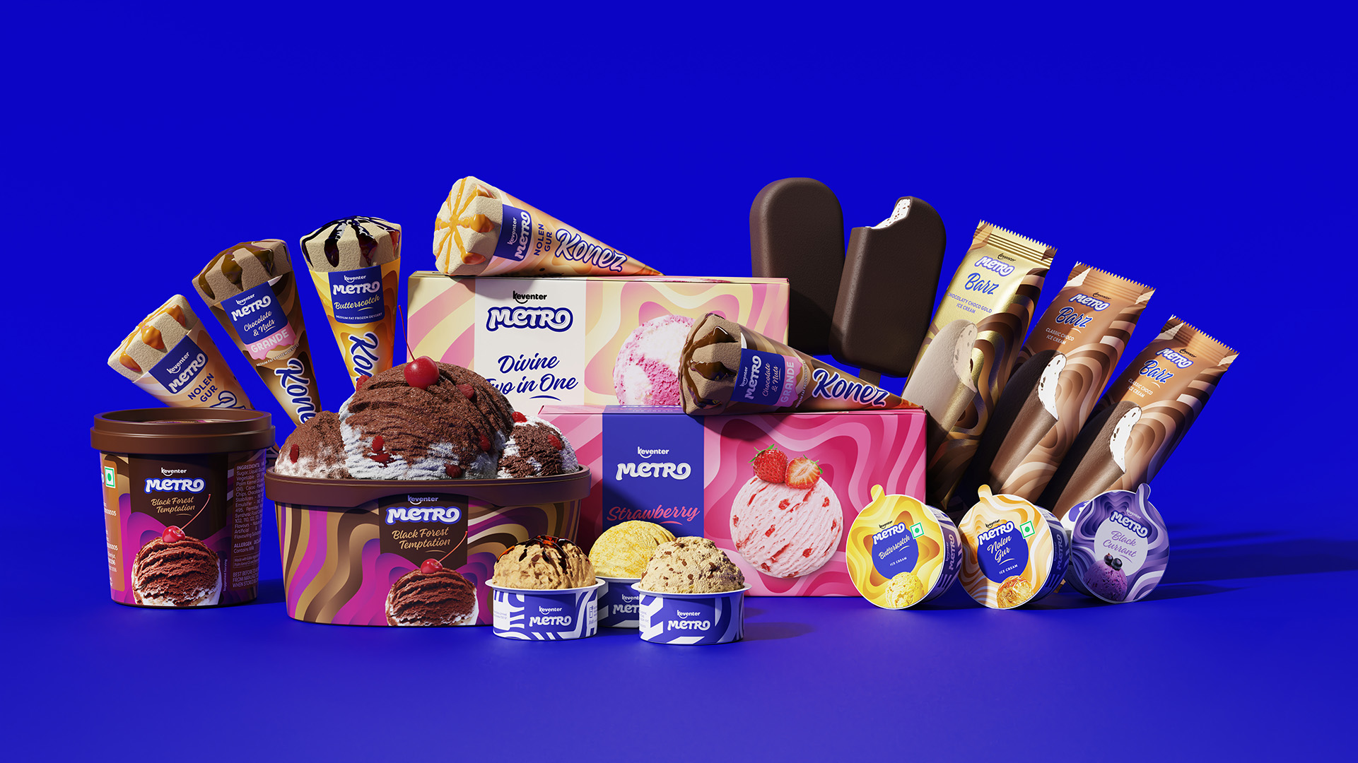
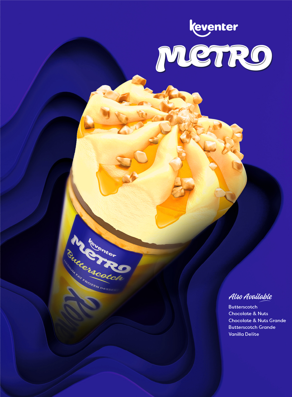
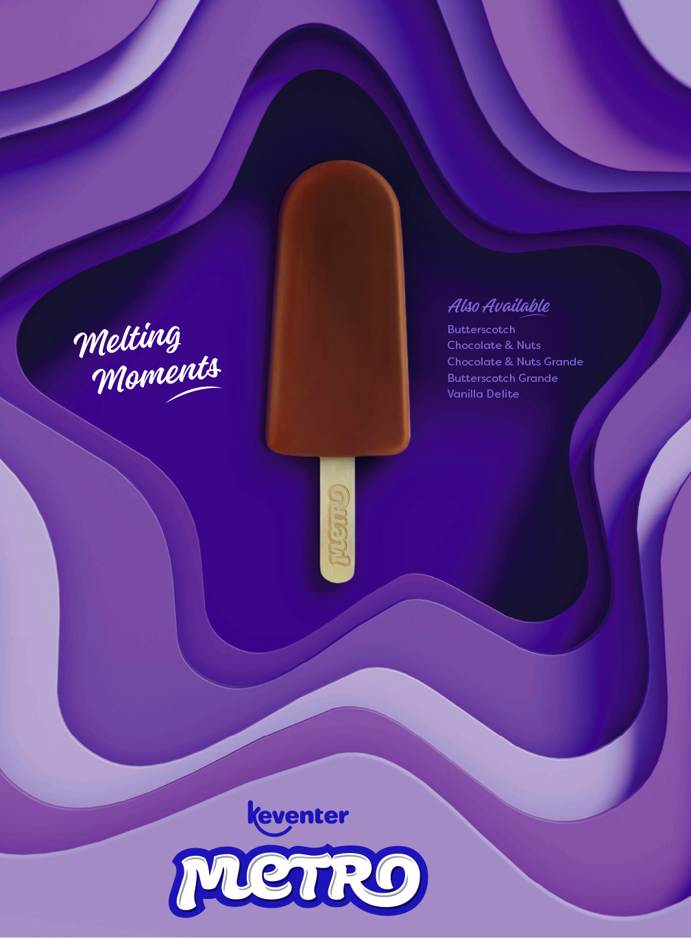
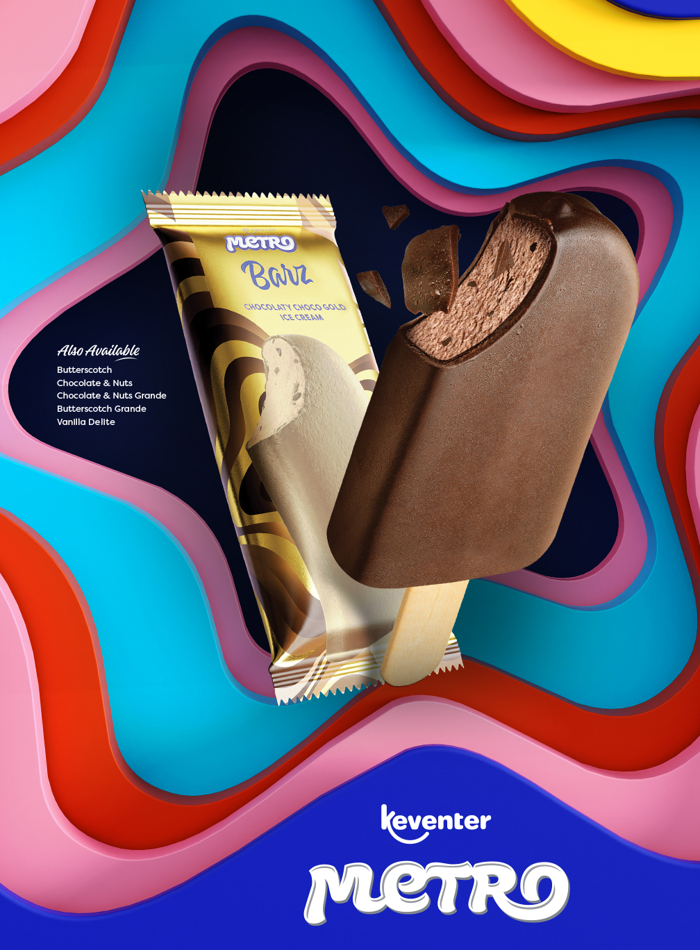
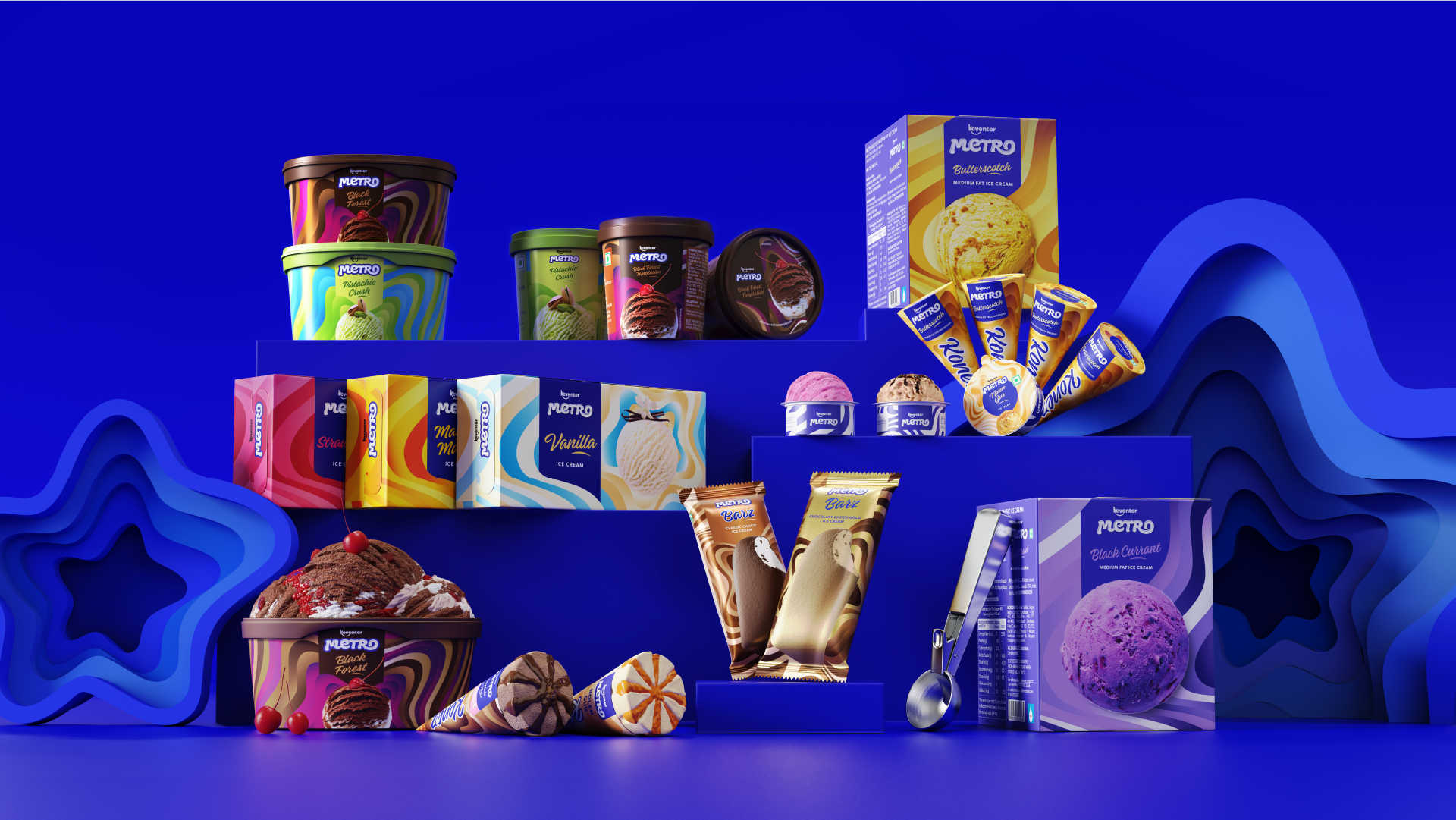
Ice Creams and Frozen Desserts
Ice Creams and Frozen Desserts
Ice Creams and Frozen Desserts
Ice Creams and Frozen Desserts
Ice Creams and Frozen Desserts
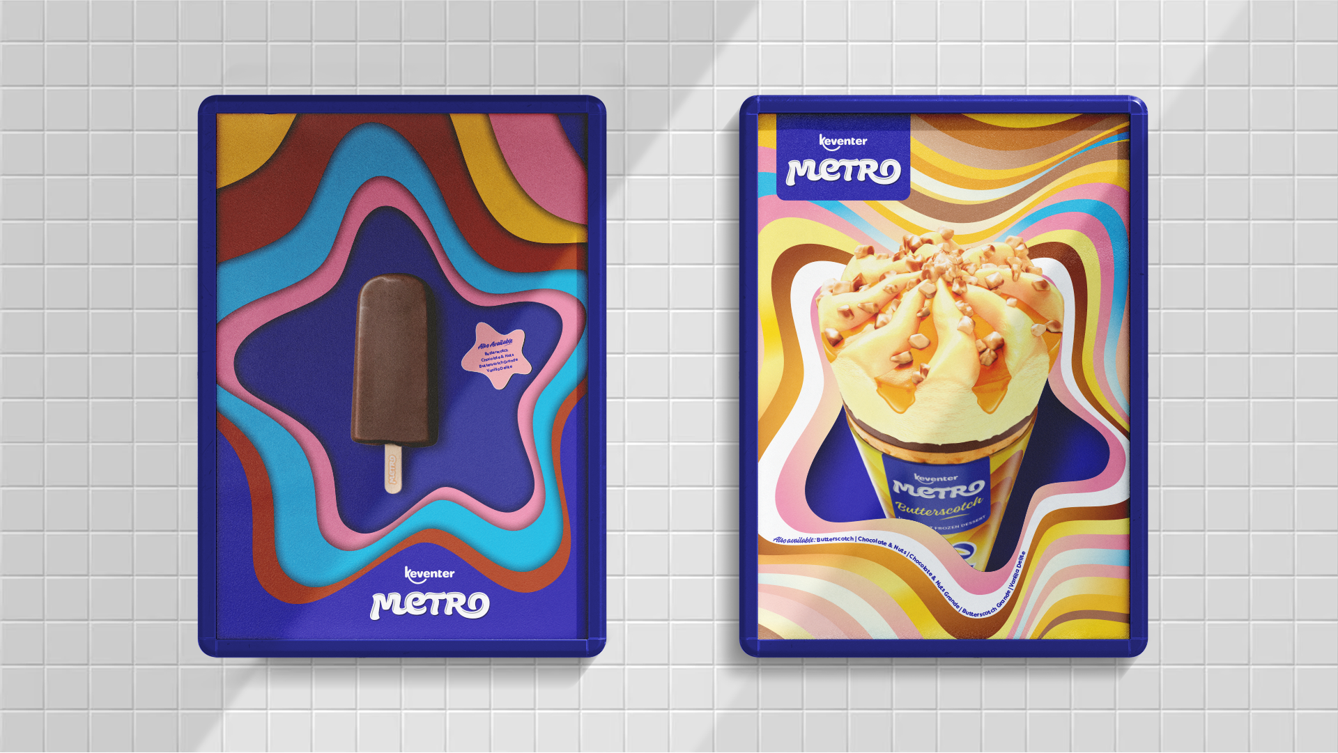
For an indulgent category such as ice creams and frozen desserts, we modified the stripes to reflect a melting goodness.
For an indulgent category such as ice creams and frozen desserts, we modified the stripes to reflect a melting goodness..
For an indulgent category such as ice creams and frozen desserts, we modified the stripes to reflect a melting goodness.
For an indulgent category such as ice creams and frozen desserts, we modified the stripes to reflect a melting goodness.
For an indulgent category such as ice creams and frozen desserts, we modified the stripes to reflect a melting goodness.
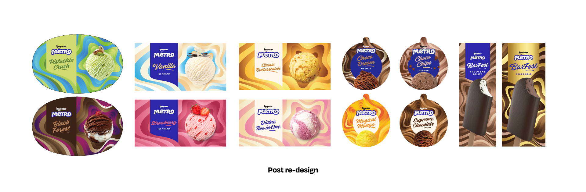
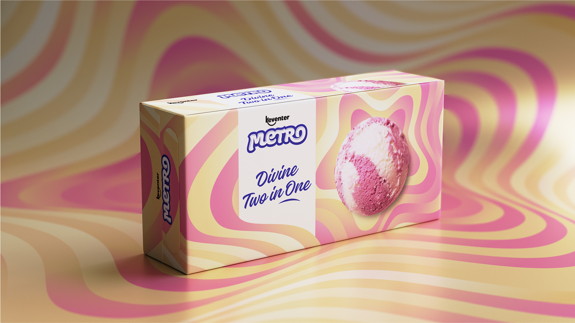
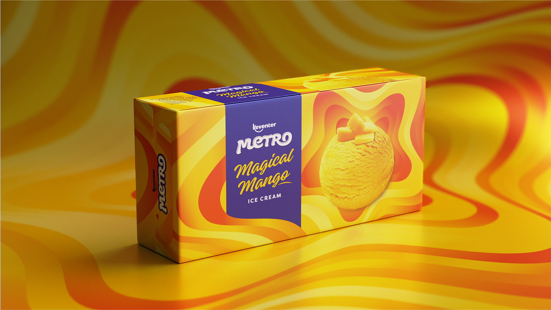
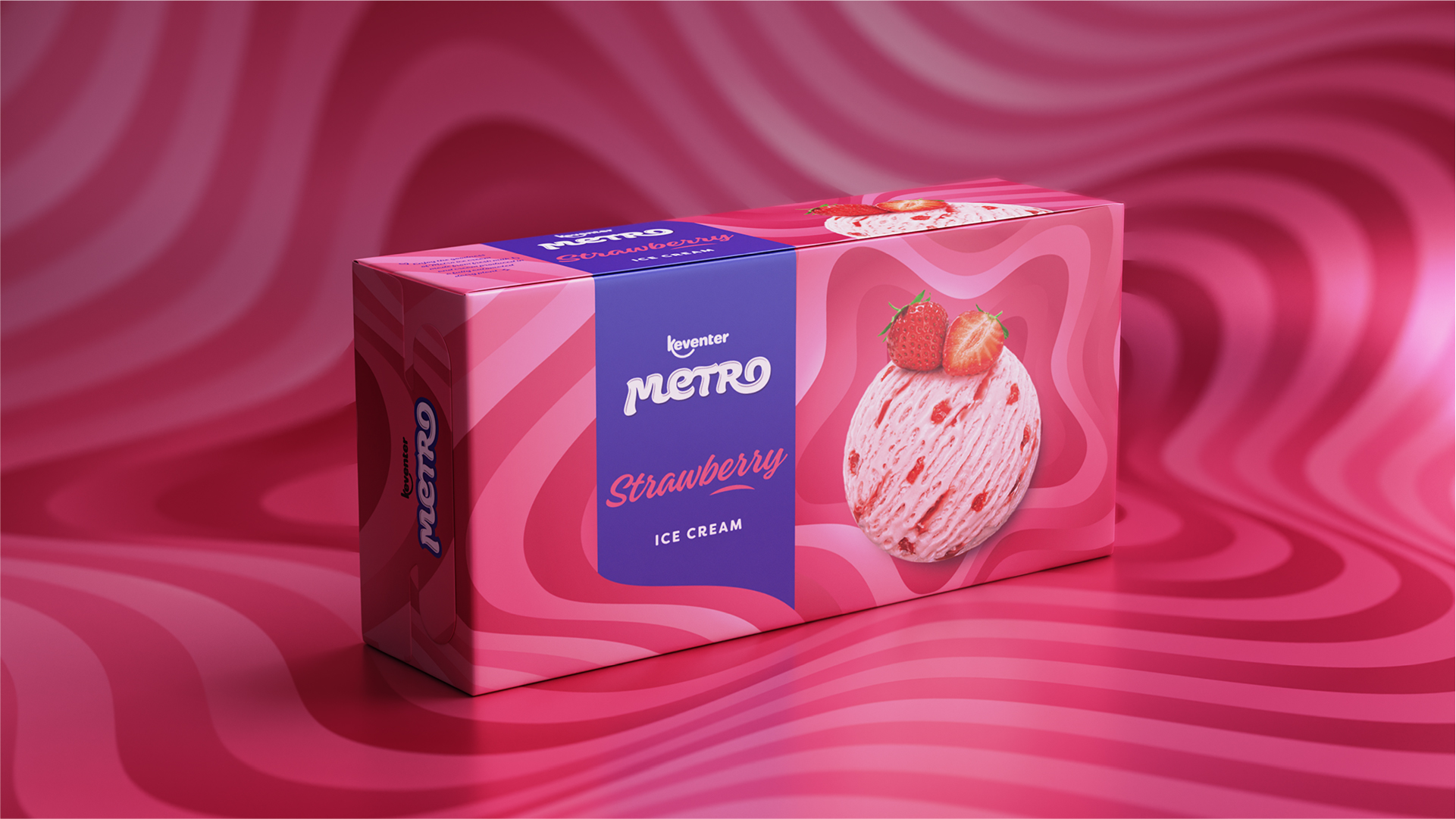
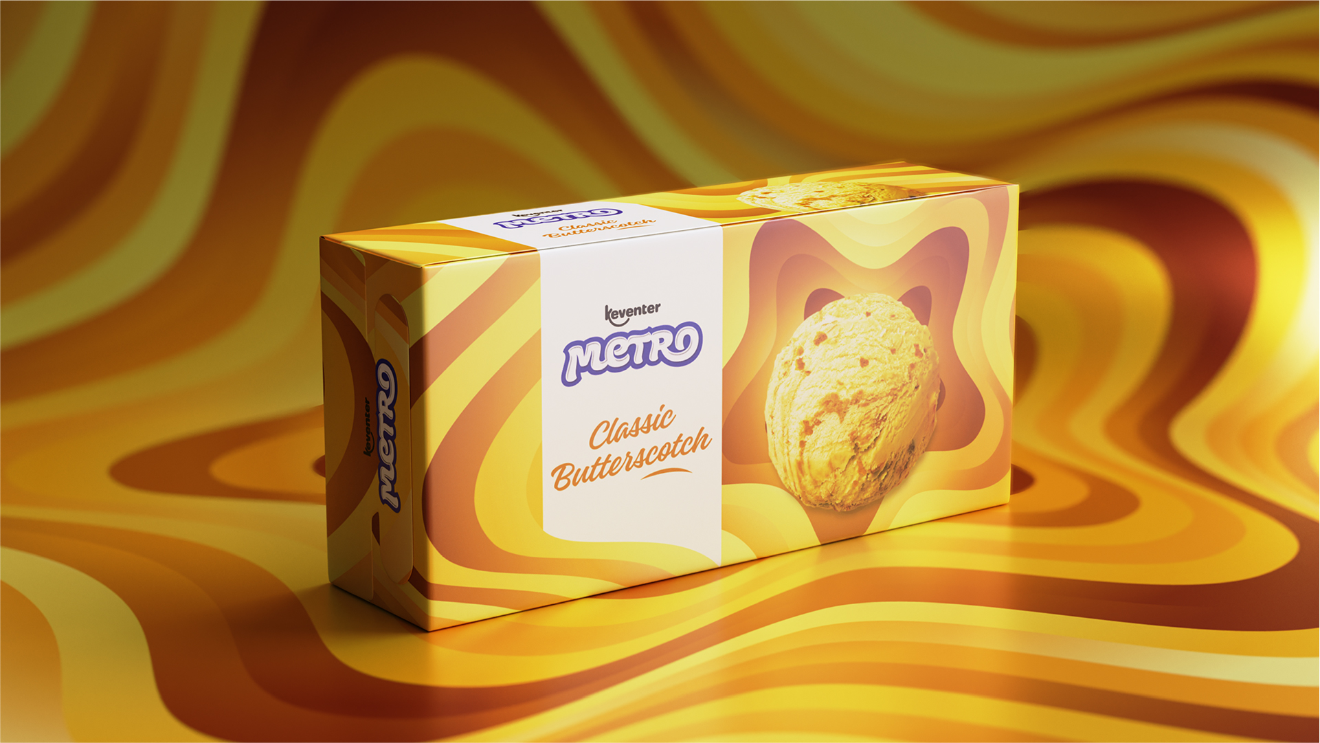
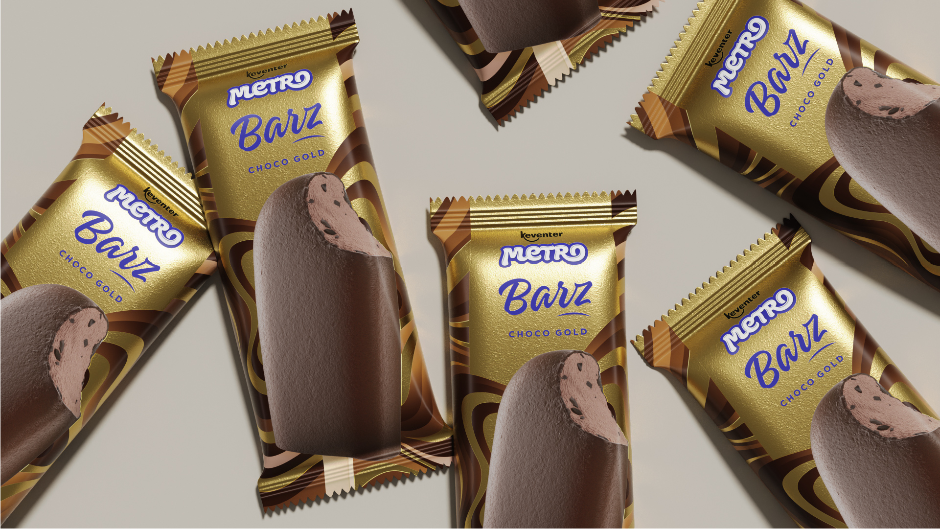
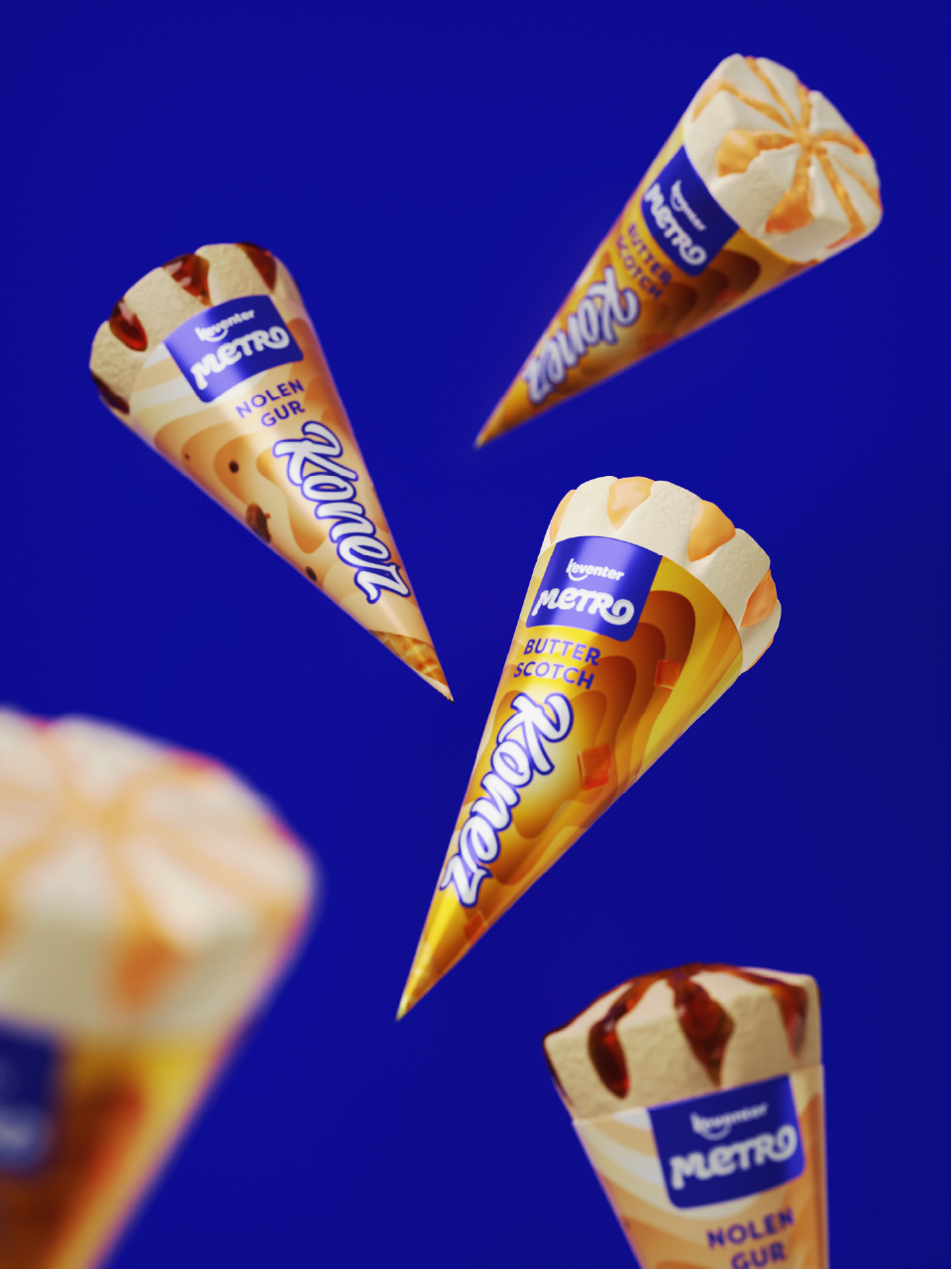
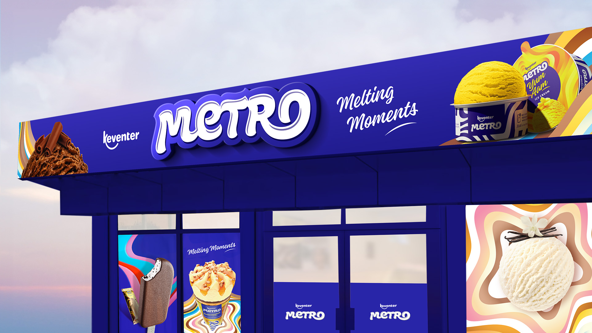
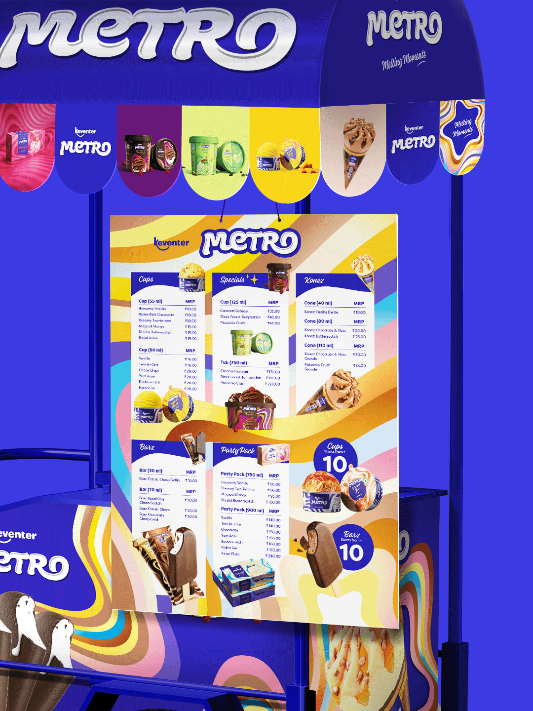
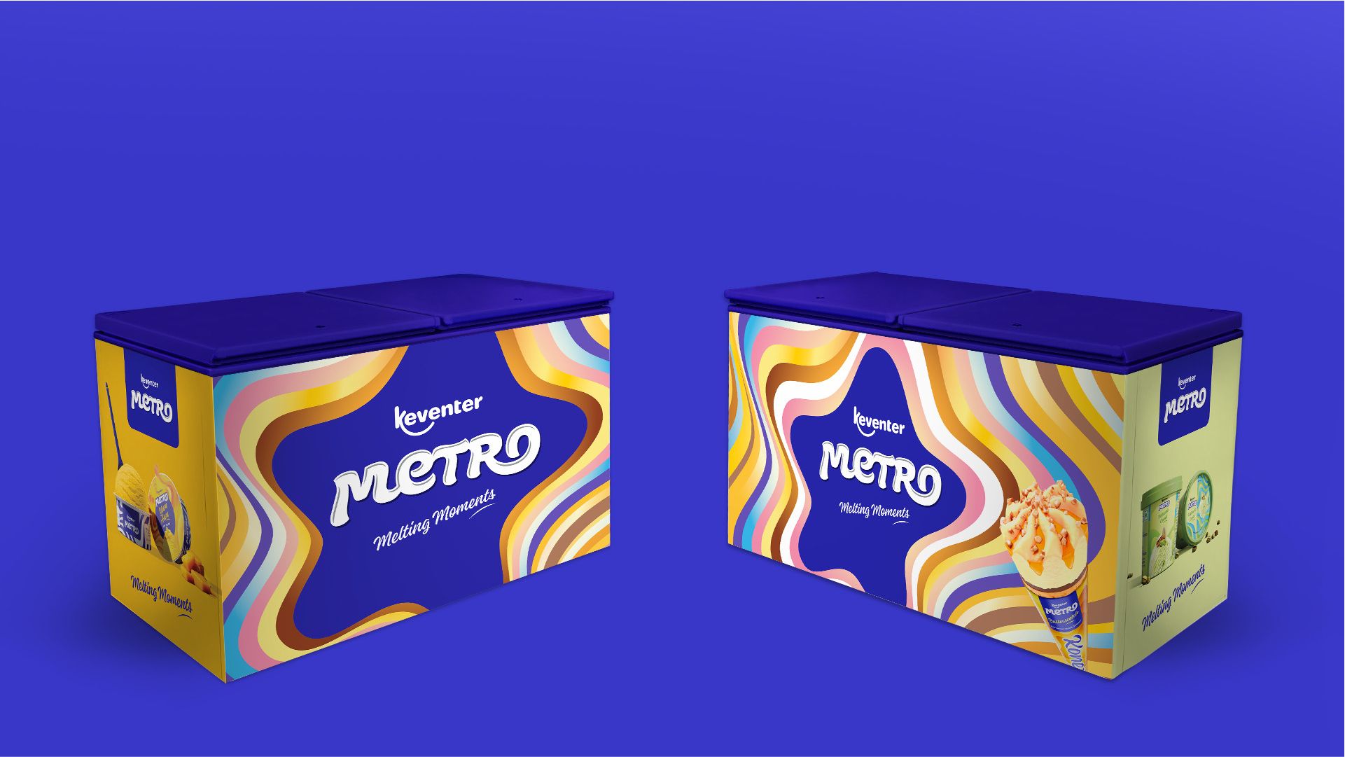
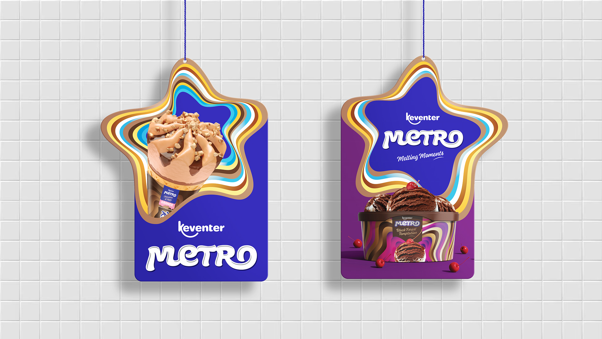
We further expanded the Keventer Metro design language for retail store branding, ice cream parlours and ice cream carts. The focus was to highlight the decadent ice creams, while also using the star shape as a hero brand asset for ice creams- adding pops of colour and melting goodness across every touch point.
For an indulgent category such as ice creams and frozen desserts, we modified the stripes to reflect a melting goodness..
For an indulgent category such as ice creams and frozen desserts, we modified the stripes to reflect a melting goodness.
For an indulgent category such as ice creams and frozen desserts, we modified the stripes to reflect a melting goodness.
For an indulgent category such as ice creams and frozen desserts, we modified the stripes to reflect a melting goodness.

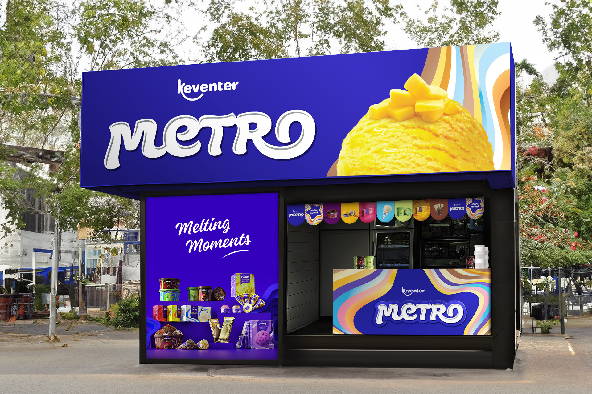
Welcome to the World of Keventer Metro!
Welcome to the World of Keventer Metro!
Welcome to the World of Keventer Metro!
Welcome to the World of Keventer Metro!
Welcome to the World of Keventer Metro!
All Projects

SunsureRe-Branding an energy as a service brand
Godrej My FarmBranding a premium niche dairy brand for Godrej
ASBL LOFTResidential property brochure
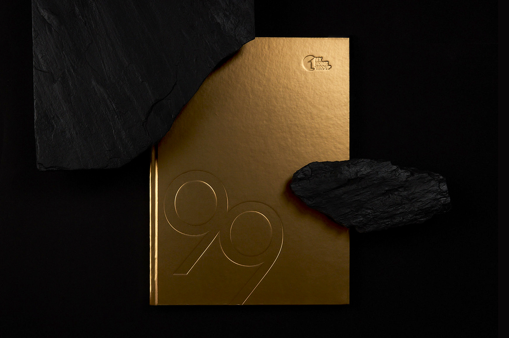
MyHome 99Residential property brochure
HROneBranding a HRMS platform

FlexipleBranding a global tech talent network
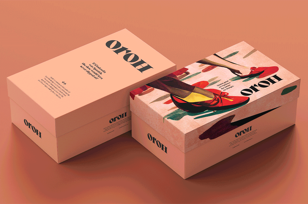
OrohBranding an Indian D2C footwear brand
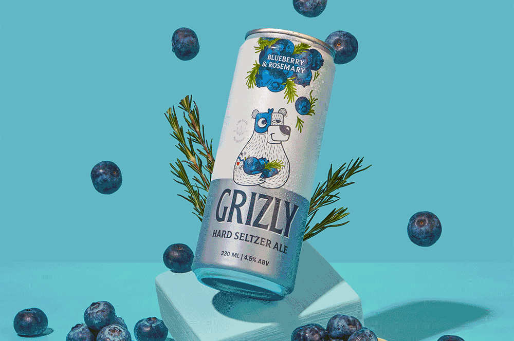
Grizly Hard Seltzers AleBranding & packaging design | House of Bira 91
Red.HealthRebranding India's largest emergency response company

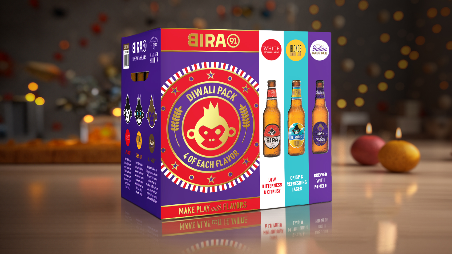
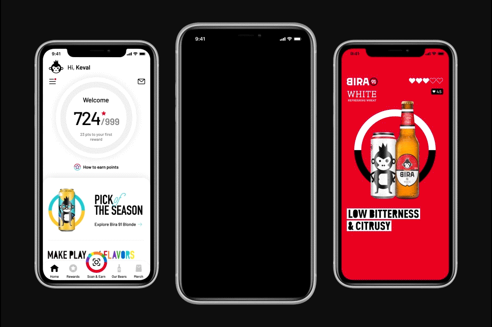
Bira 91 Make Play with FlavorsDefining the brand world for a beer brand
Keventer MetroRebranding a dairy brand in West Bengal
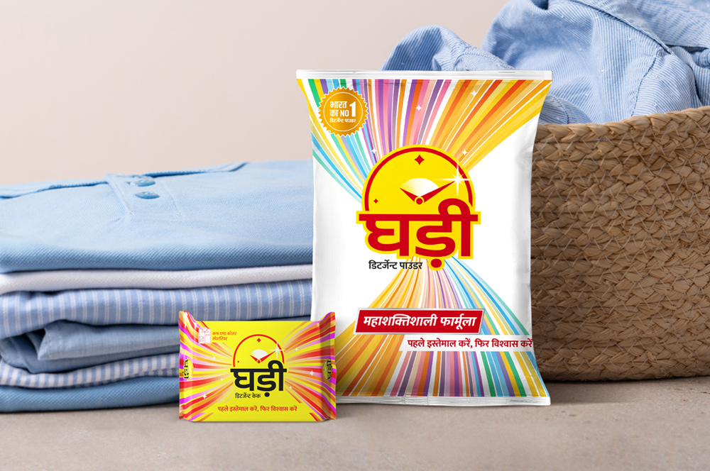
Ghadi by RSPL GroupRe-packaging an iconic detergent brand
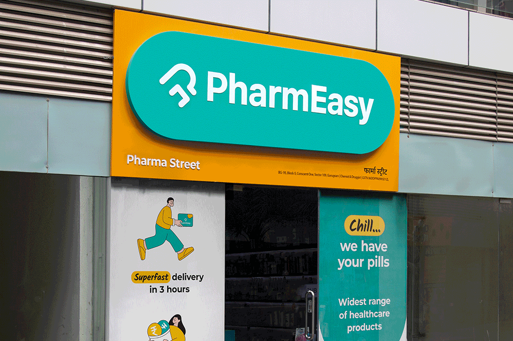
PharmEasyRedesigning an omnichannel brand experience
Celebrate with Every SipFestive & special edition packs for Bira 91
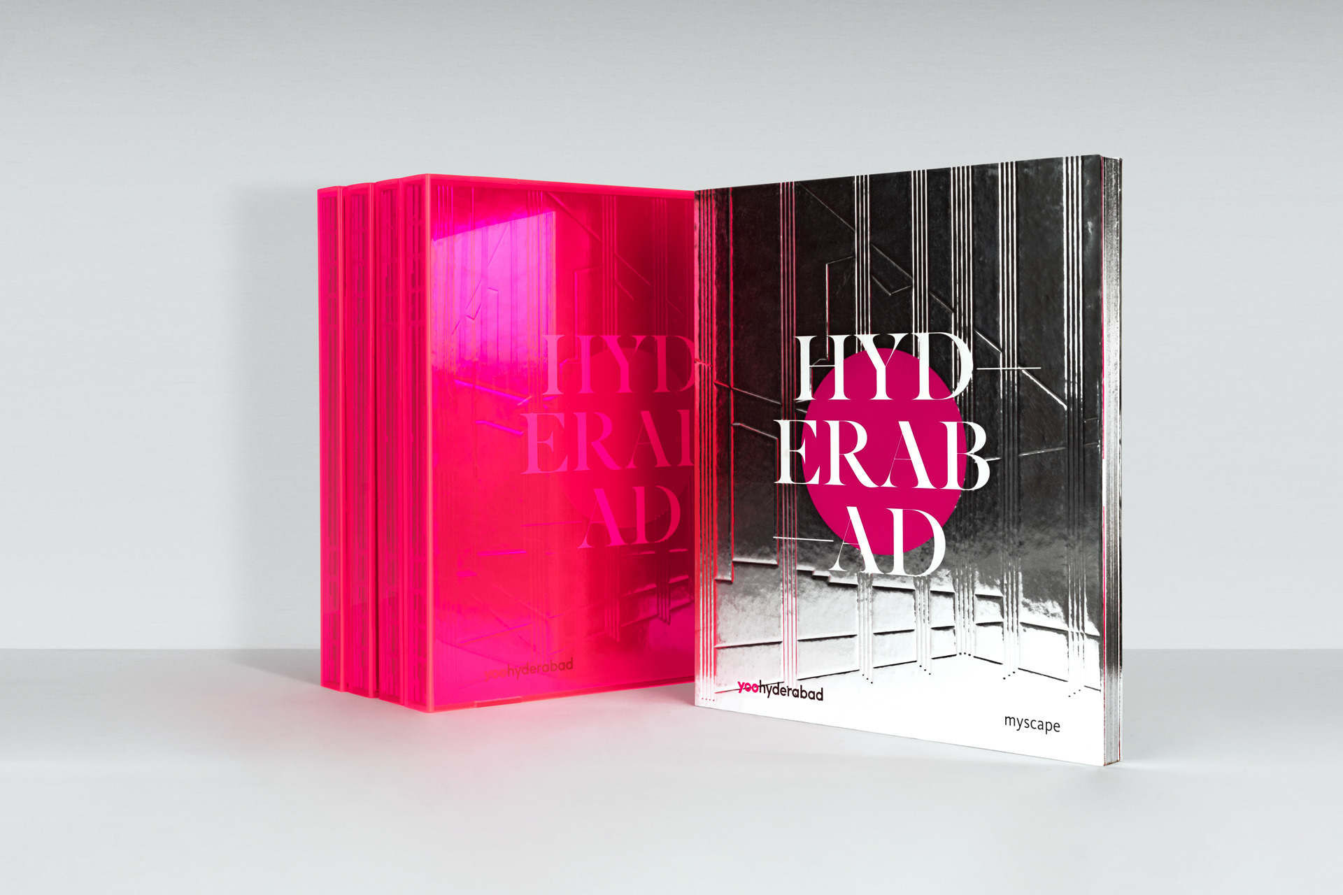
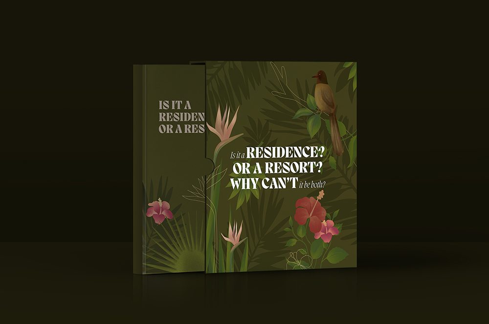
Myscape YOOSelling branded residences
Bira 91 | Customer Loyalty AppUI design for brand advocacy
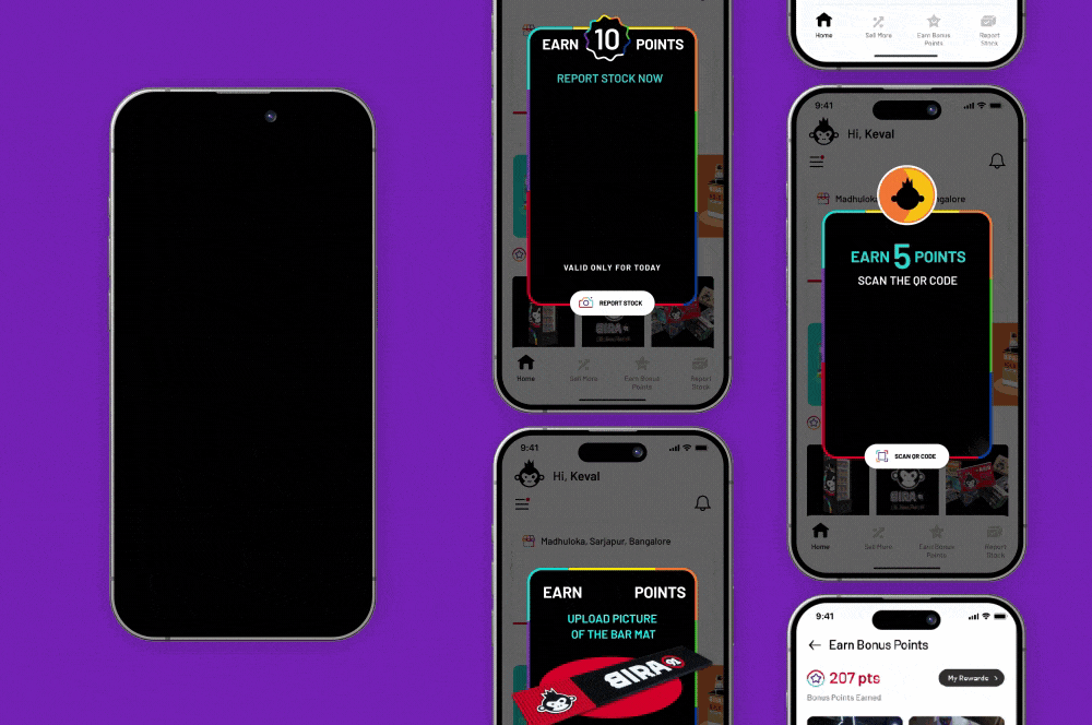
Bira 91 | Counter Sales Managers AppB2B channel partner UI Design
LifioBranding a clinical research and trial company
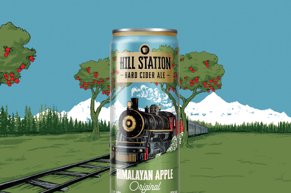
Hill Station Hard Cider AleBranding & Packaging Design | House of Bira 91
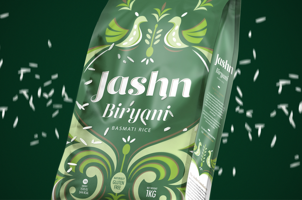
Jashn FoodsPackaging design for basmati rice
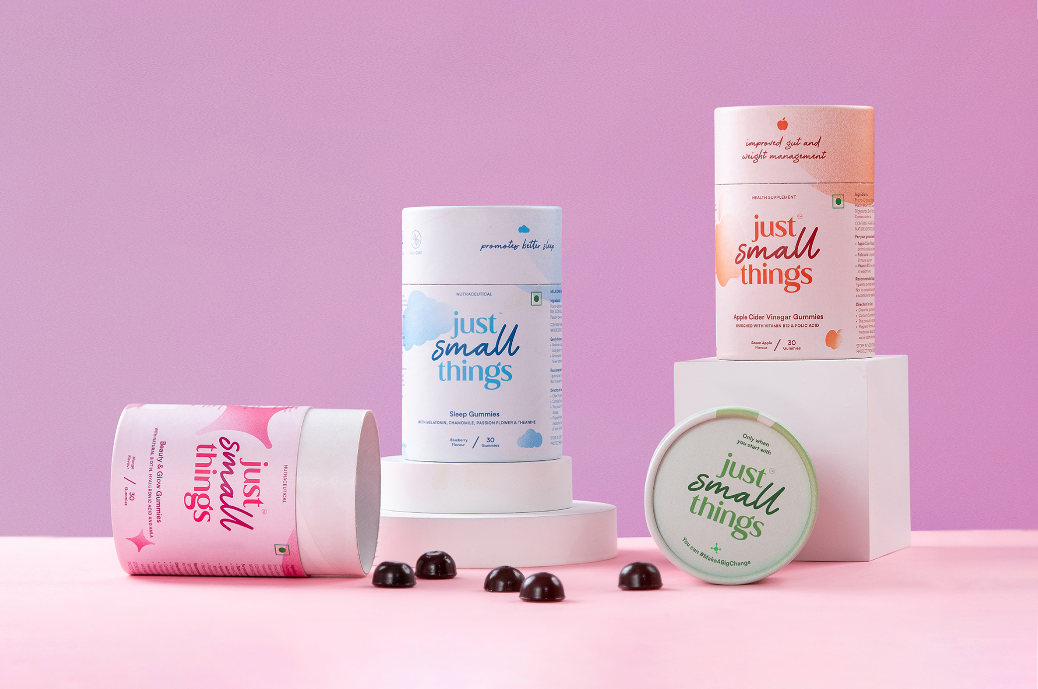
Just Small ThingsDesigning a personal care nutraceutical brand
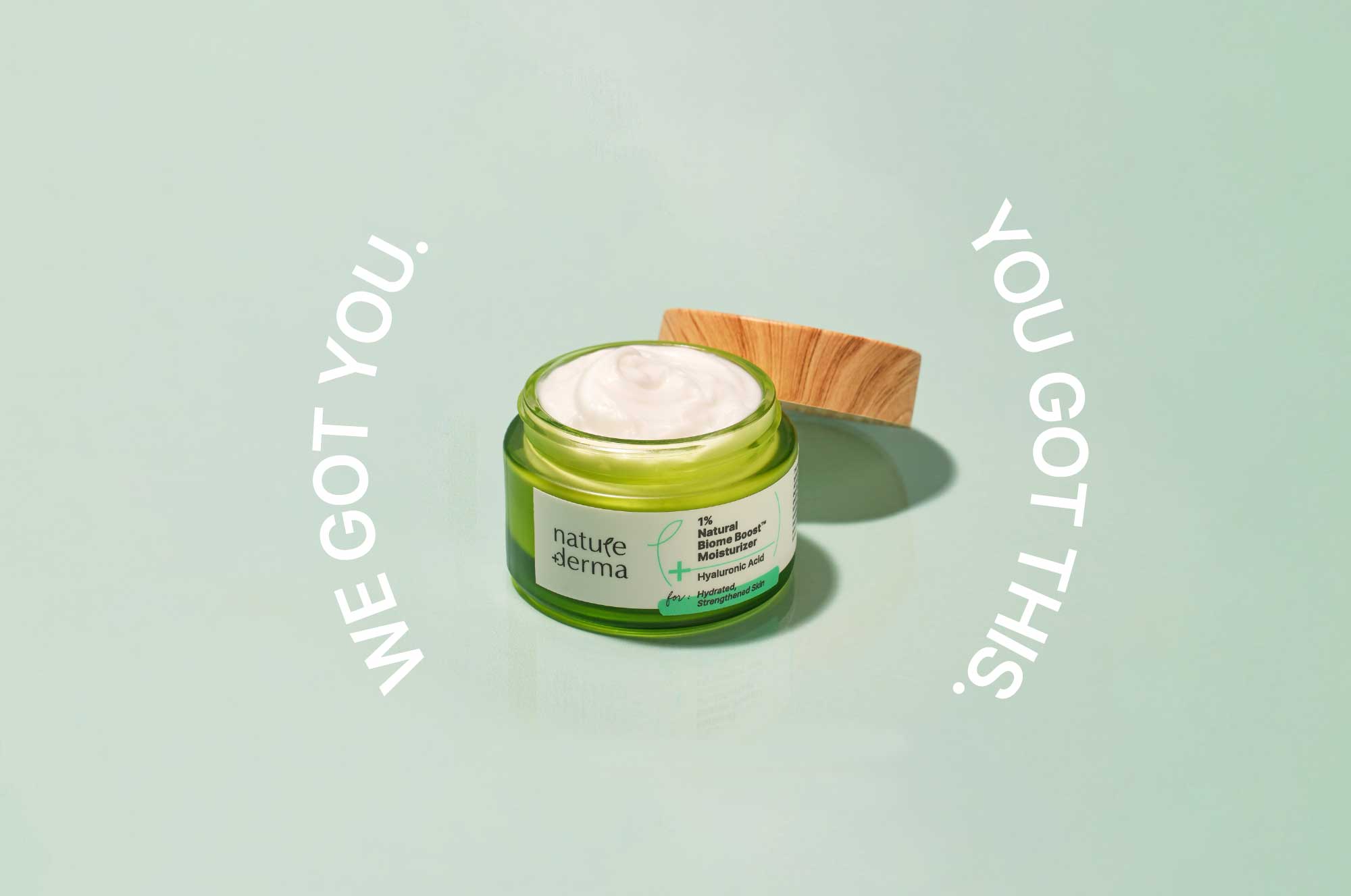
Nature DermaCommunications for active skincare

DoozeBranding & UI design for an alcohol delivery app
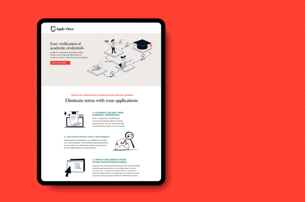
Apply Once and Veri OnceBranding a new age educational navigator
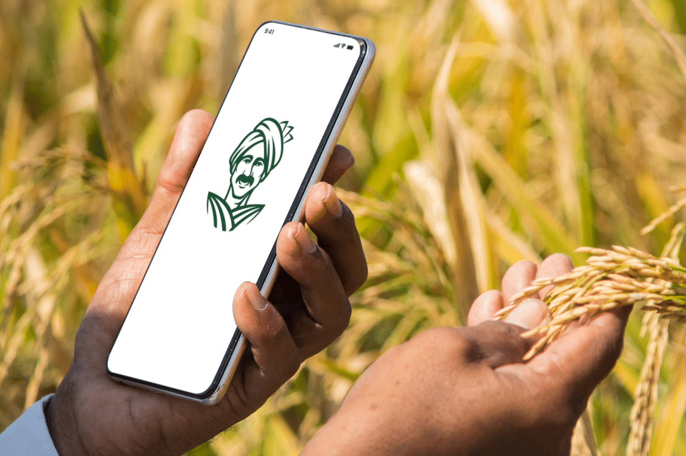
eFarmarket by AP markfedDesigning an identity for an agritech platform
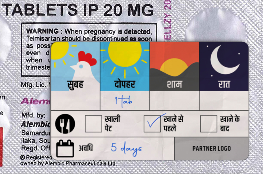
Stickers to Monitor Drug DosageSelf Initiated Project

AzlyaBranding a cultural yet contemporary fashion Label
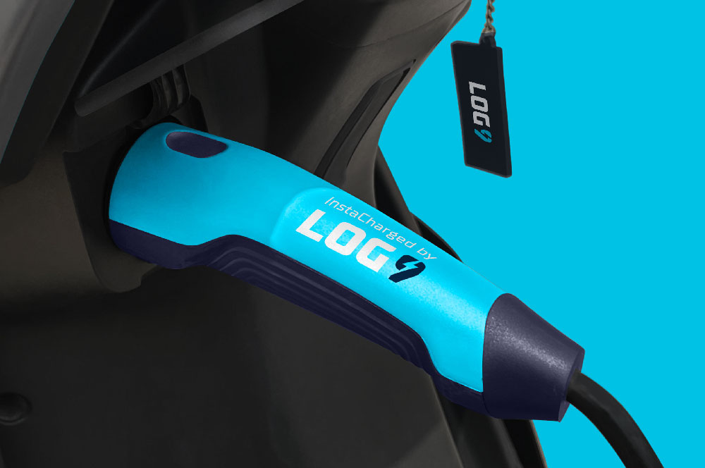
Log9 MaterialsRebranding an energy solutions company

Science of HimMale wellness treated with science
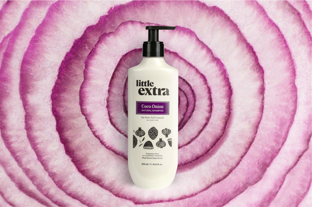
Little ExtraAll natural personal care

Pristyn CareRebranding short stay surgery
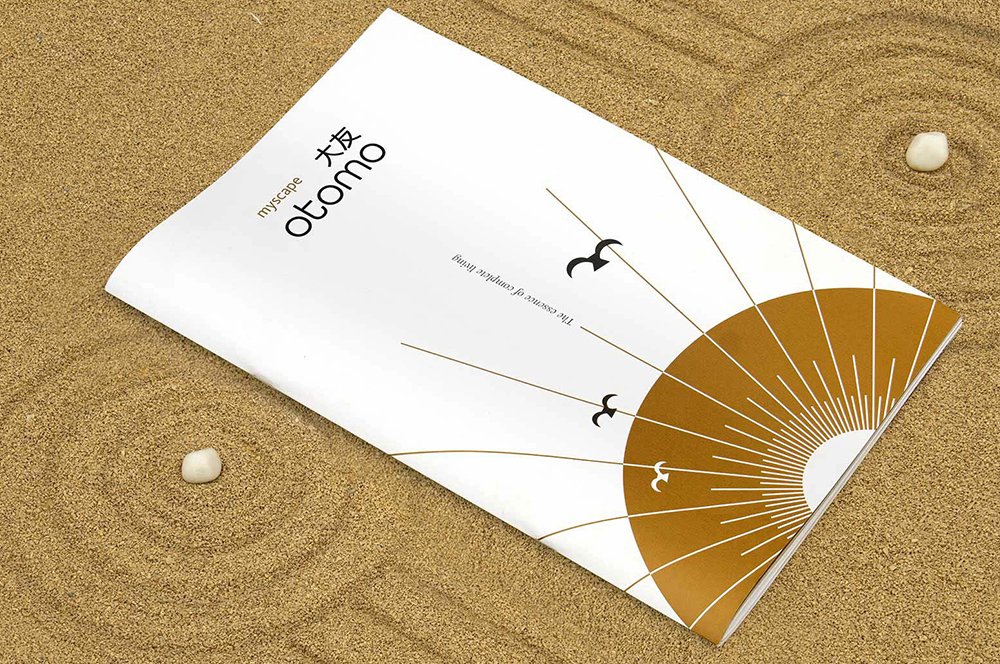
Myscape OtomoResidential property brochure
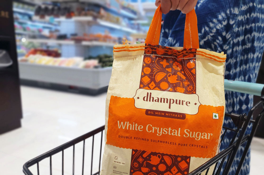
DhampureRebranding a Pioneer Sugar Brand
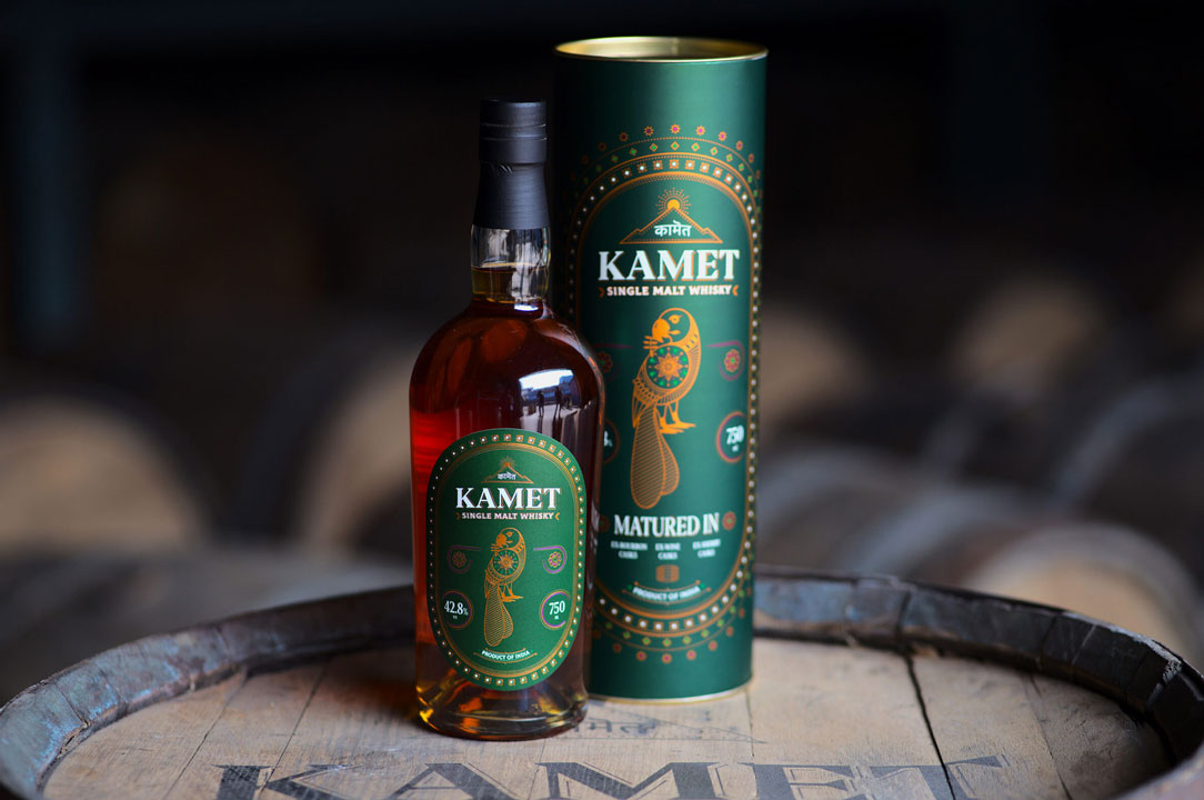
Kamet by Peak SpiritsWhisky Label
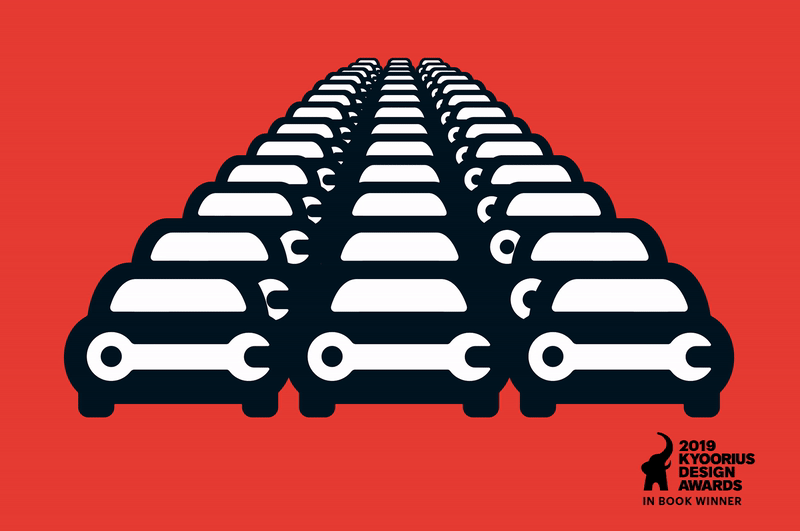
Go MechanicBranding a Multi-Brand Car Service Startup
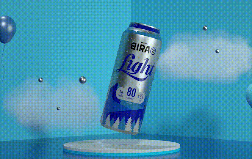
Bira 91 LightPackaging Refresh & Positioning

Bira 91 Sustainability ReportMission To Zero
BirthplaceBranding a Maternity Hospital
Godrej JerseyRevamping a Legacy Brand

Hyderabad FCRebranding a Football Club
Myscape TerrazaCommercial Property Brochure
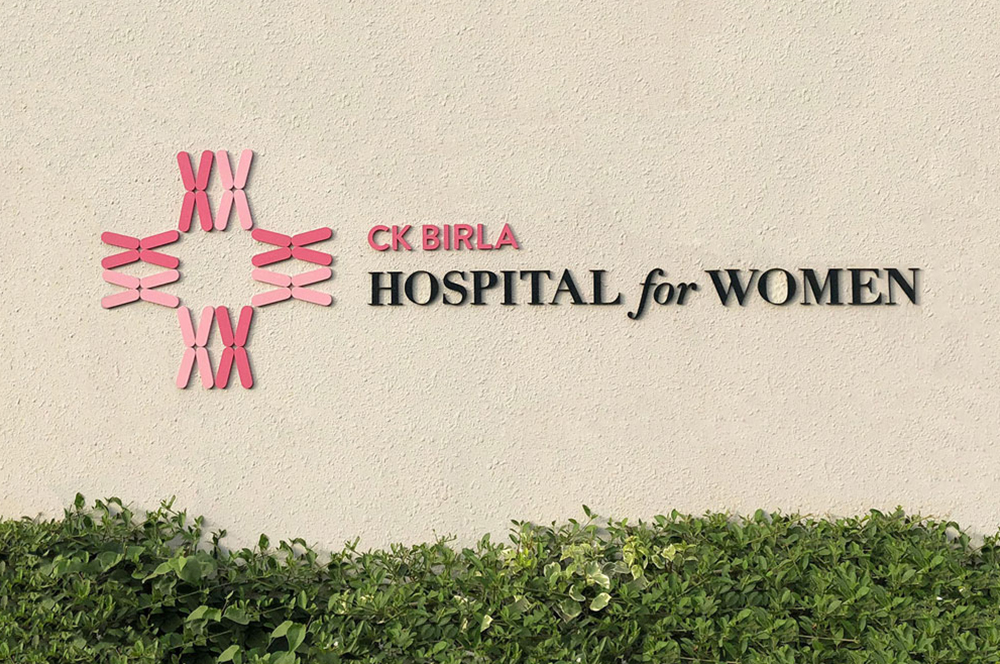
CK Birla GroupBranding a Women's Hospital
HousrDesigning for a Mega Co-living Brand
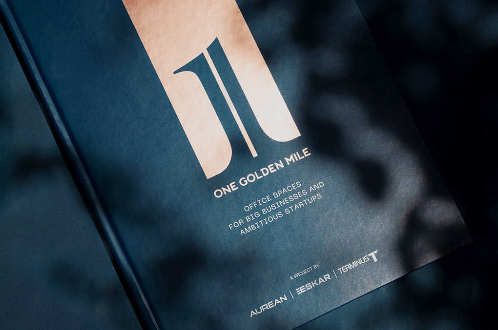
One Golden MileCommerical Brochure for Aurean| Eskar| Terminus
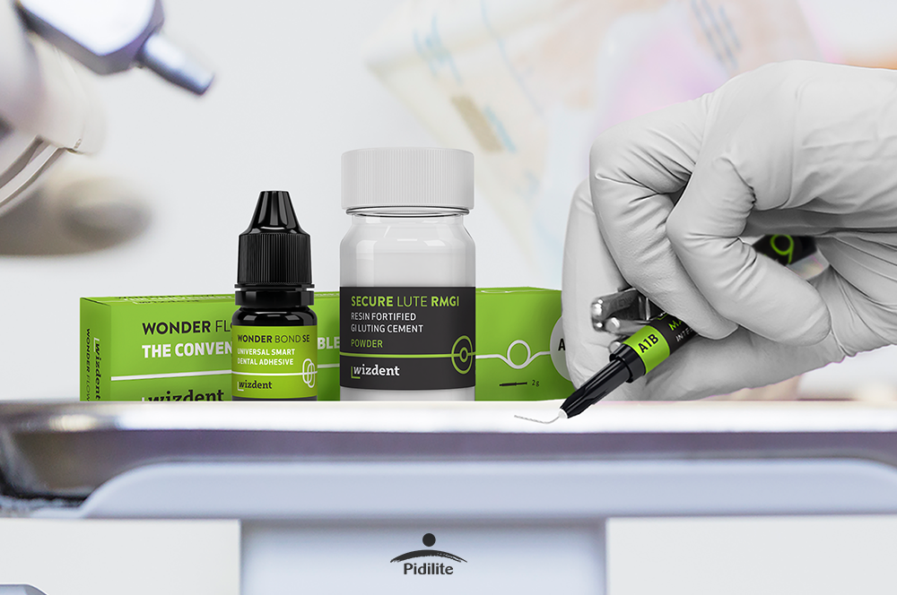
Wizdent by PidiliteIndia's Youngest Dental Consumables

AB Plus Speciality HospitalBranding a boutique Hospital

Bira 91 LightAssociating Beer with Fitness
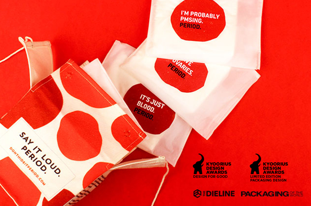
Don't Hide it. PeriodSanitary Pad Packaging
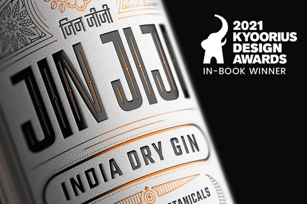
Jin JijiPackaging Indian Gin
AinqaHumanising data
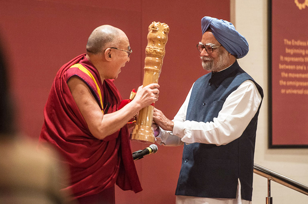
The Dalai LamaCelebrating His Holiness
Bhagirathi Neotia HospitalEnvironmental Graphics
Max Estates, DehradunResidential Property Brochure & Communications
MajjaBranding a Chain of QSR in Ahmedabad

QuaQuaBranding a Virtual Travel Platform
Kalpataru VistaResidential Property Brochure & Communications
Myscape LoftResidential Property Brochure

Fuel BuddyBranding India's First Fuel Delivery Platform
BirlasoftRebranding a Global IT Service Provider
The Telegraph OnlineDesign Language
Danone EcosystemWomen Empowerment Brochure
Central Square FoundationDesign for Non-Designers
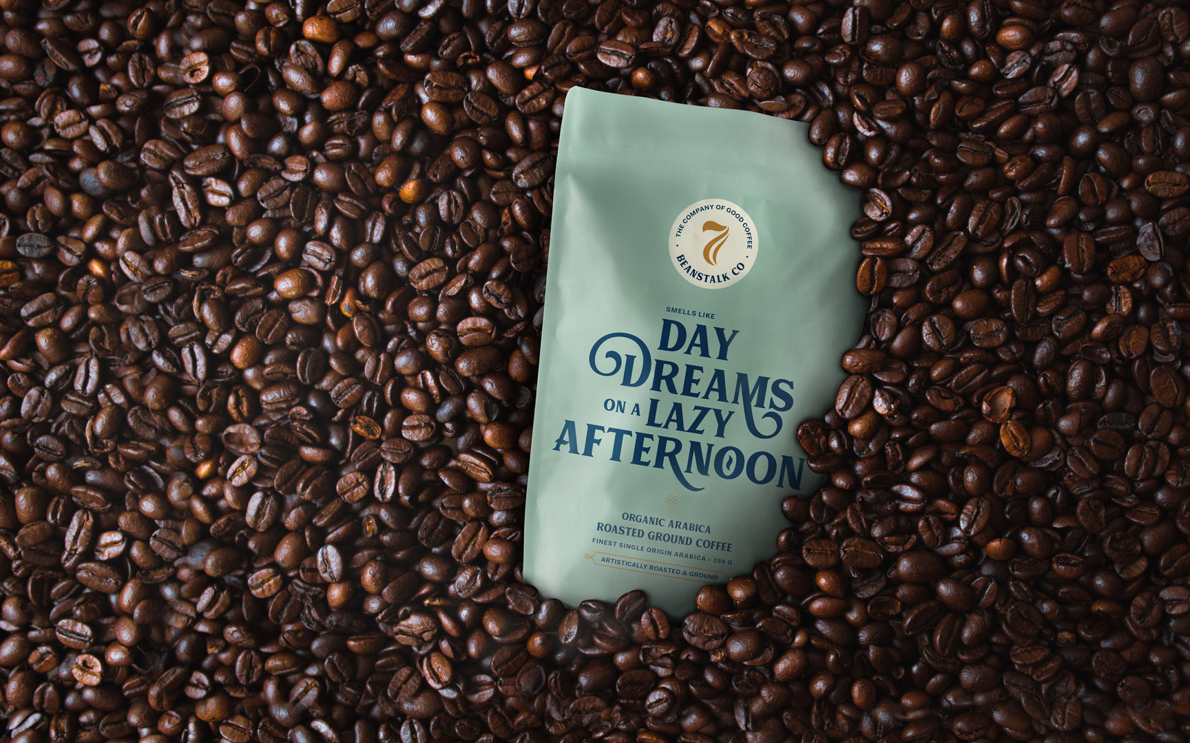
Seven BeanstalkCoffee Packaging

SlingshotDesigning for an Ed-tech Brand

CareCoverBranding a Pre-approved Medical Loan Card
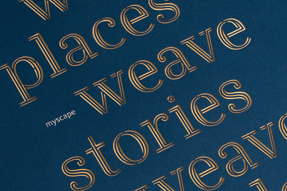
Myscape WeaveCommercial Property Brochure

NumberzBranding a Fintech Startup

SunshineBranding a Multi Speciality Hospital

The Tooth CompanyBranding a Dental Clinic

MedicsBranding Lucknow's Super Speciality Hospital
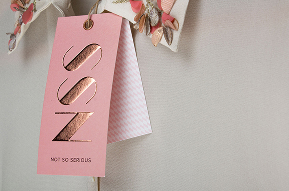
Not So SeriousRebranding a Luxury fashion label

OlivaRebranding a Chain of Medico Aesthetic Clinics
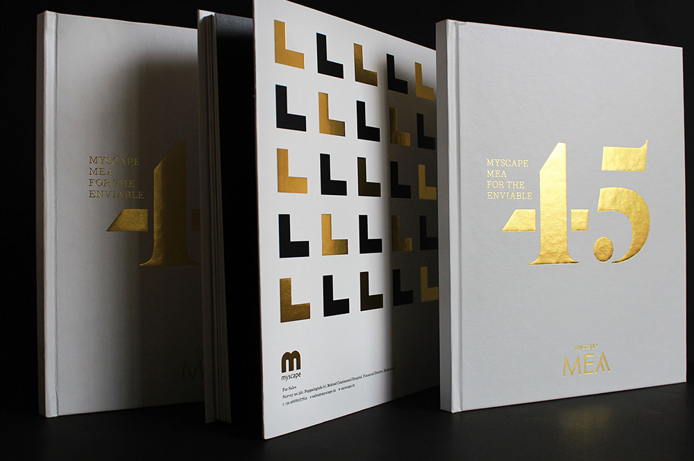
Myscape MeaResidential Property Brochure
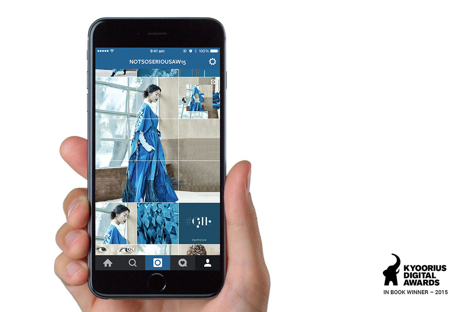
Not So SeriousAn Instagram Lookbook
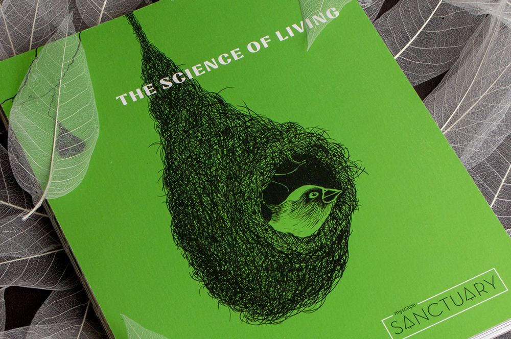
Myscape SanctuaryResidential Property Brochure & Communications
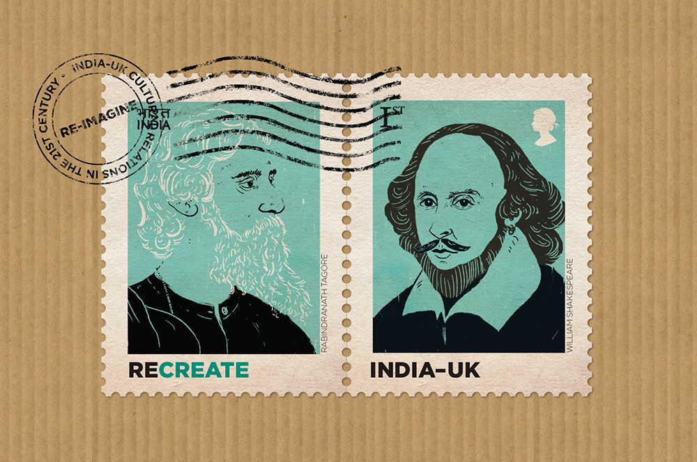
British CouncilIndia-UK relationship
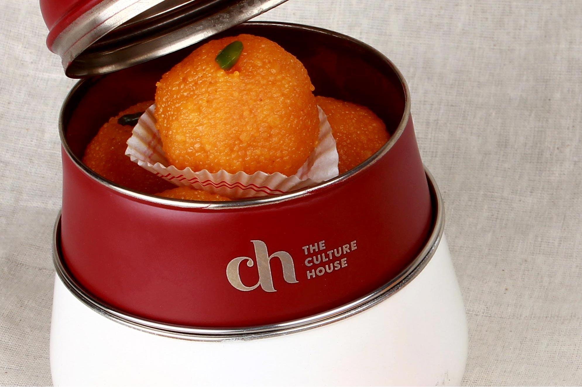
The Culture HouseRestaurant Branding
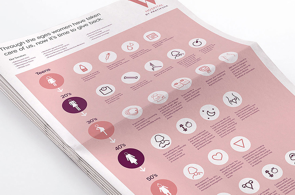
PratikshaBrand India’s Largest Hospital for Women
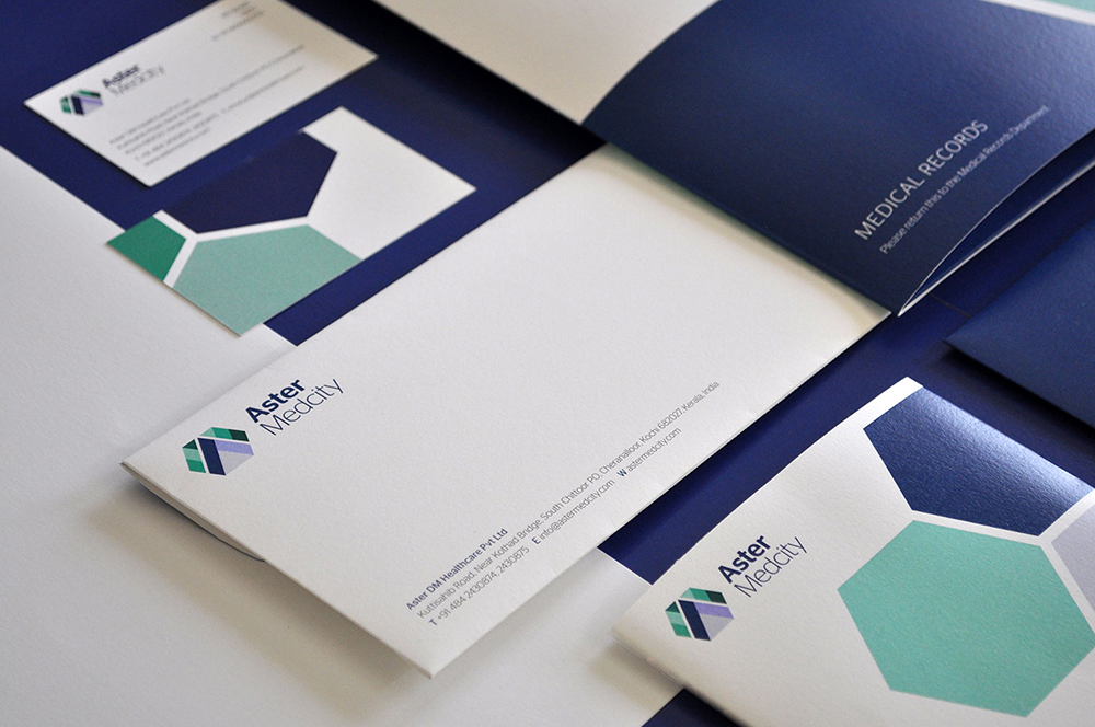
Aster MedcityBranding a Healthcare Destination
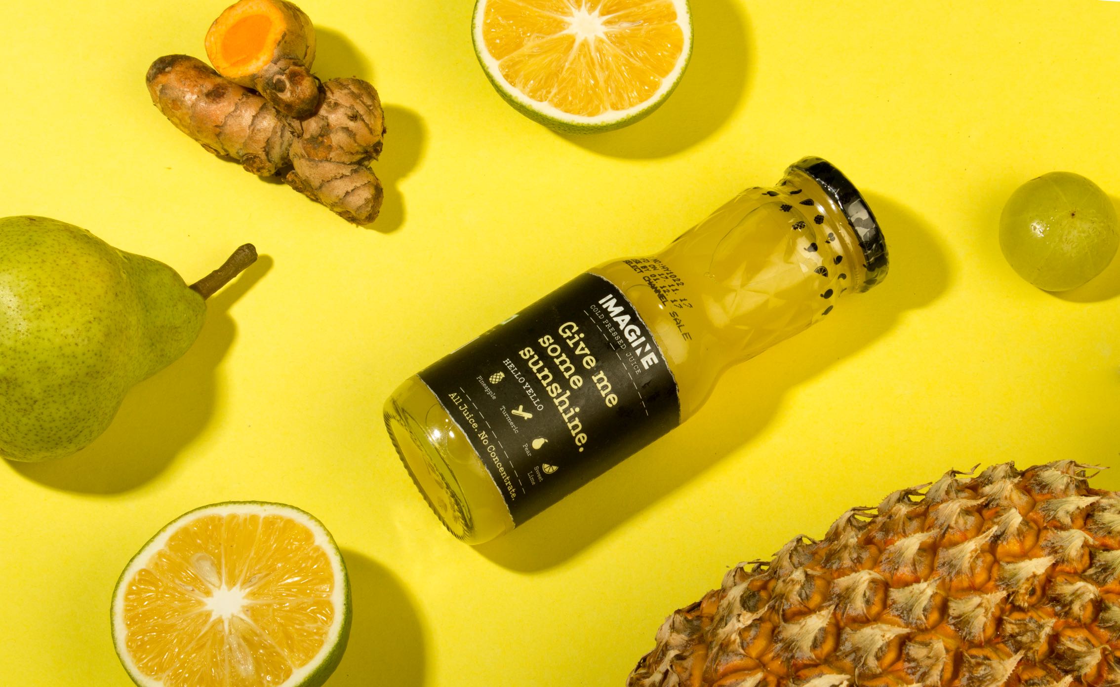
ImagineCold Pressed Juice Packaging
Nishada by My HomeResidential Property Brochure

TummyfullBranding a Homemade Food Tech Venture

Central Square FoundationAnnual Report

MedisyncBranding a B2B knowledge delivery platform
Intuit IndiaWhitepaper Design

CPOBranding a Chain of Prosthetic Clinics
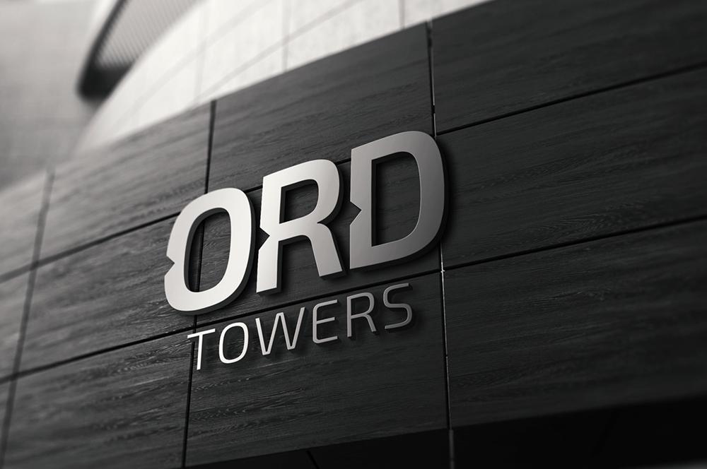
ORDReal Estate Branding
Myscape Isle of SkyResidential Property Brochure

TruSpaceDynamic Real Estate Branding
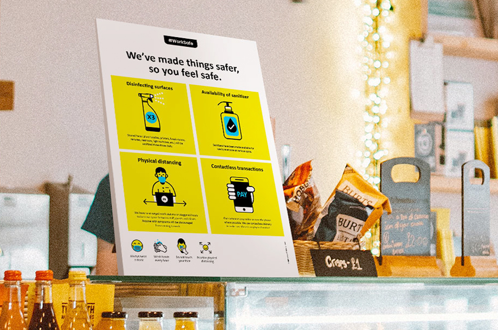
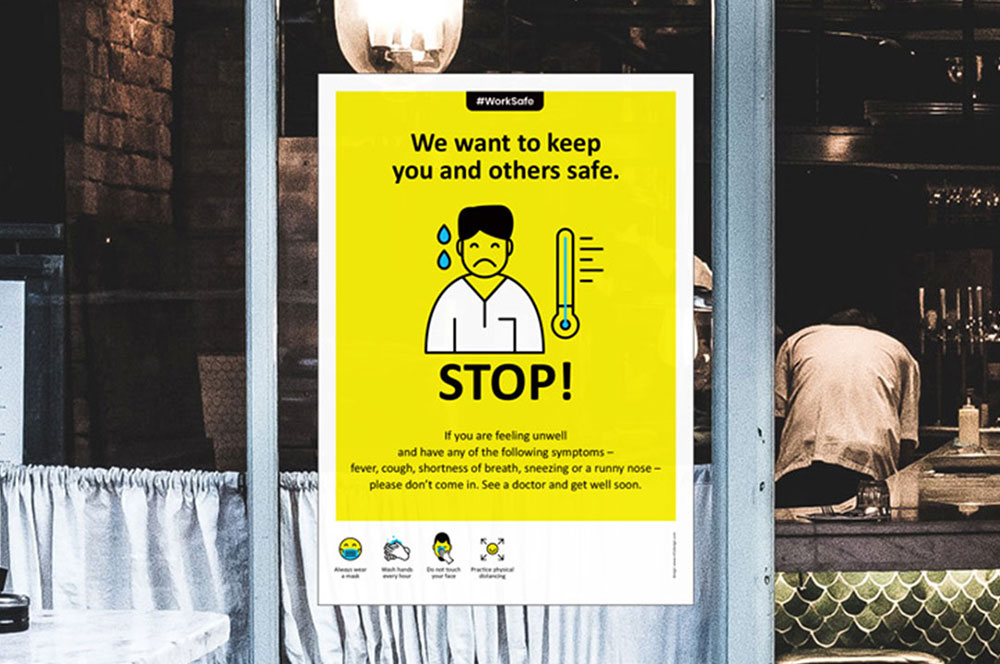
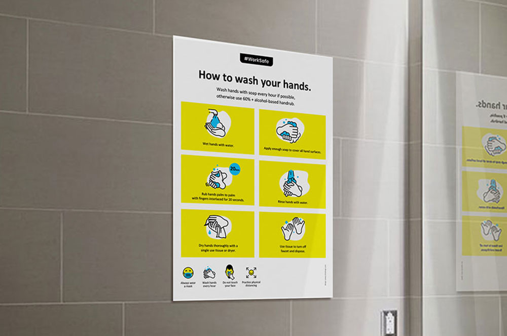
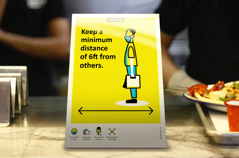
Work Safe Covid19 PostersSelf Initiated Project
Come & Go SafelyWork Safe Posters
Community SafetyWork Safe Posters
Individual SafetyWork Safe Posters
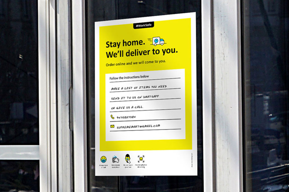
Business & Customer SafetyWork Safe Posters

StudentaccoBranding a Student Accommodation Portal
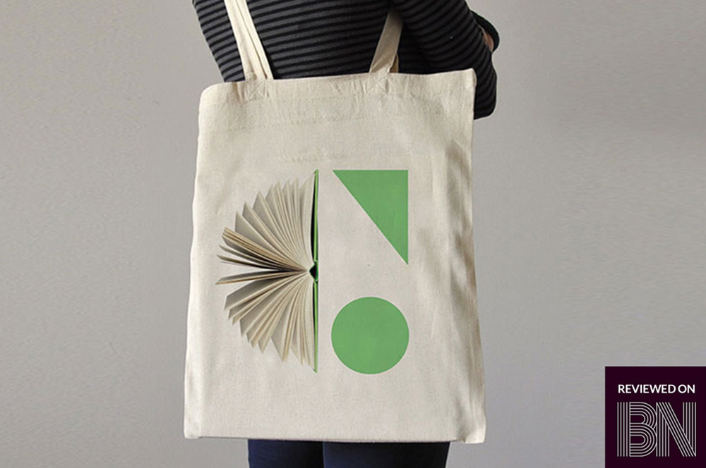
ShrachiDesigning a Notebook Brand for India
SWOTNotebook Cover Design
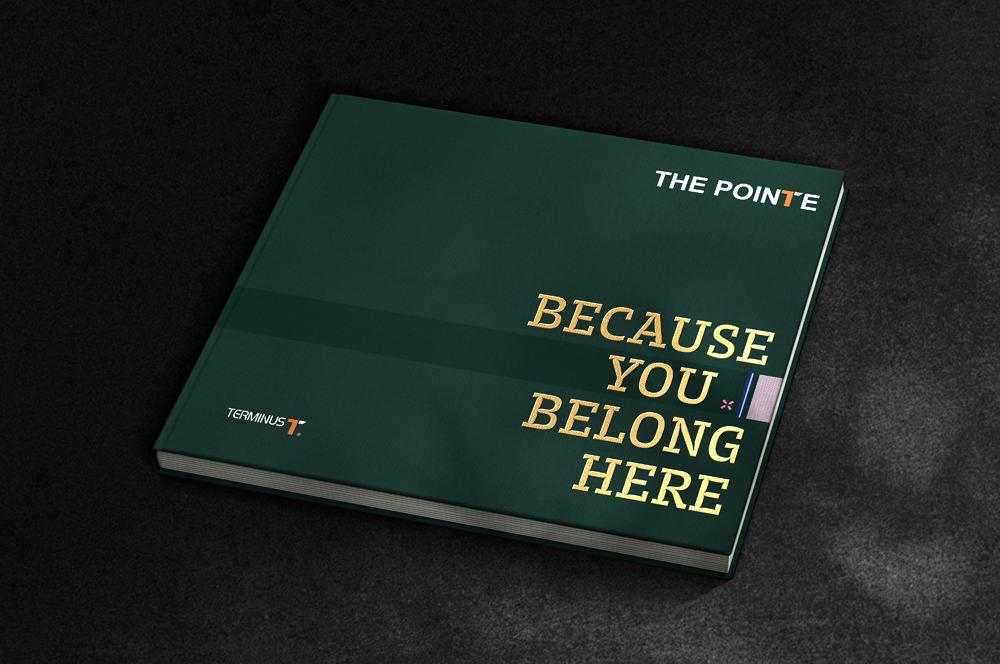
The Pointe by TerminusResidential Property Brochure
Asian BariatricsBranding a Bariatric Hospital
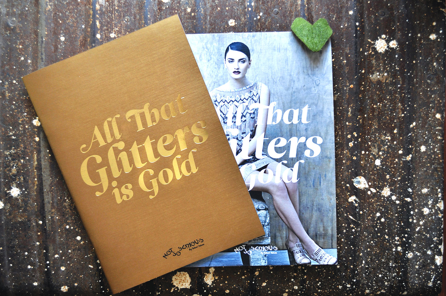
Not So SeriousFashion Lookbook
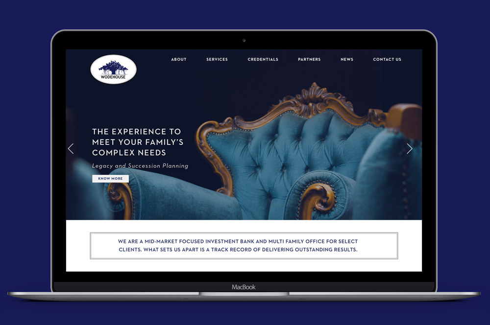
Wodehouse CapitalWebsite Design
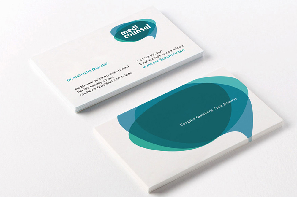
MediCounselBranding a Medical Portal
Subscribe to our Newsletter
Subscribe to our Newsletter
Subscribe to our Newsletter