Question
How do you redesign legacy?
Answer
By marrying the future with the past.
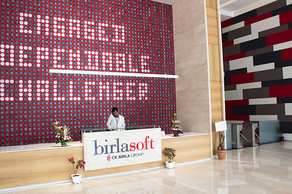
Birlasoft
Birlasoft is a globally trusted partner in IT transformation and services over the past two decades. As a part of the prestigious 150 year old CK Birla Group, Birlasoft started with a mission to help every company, small and large, run their businesses better. Its vertical domain knowledge and technological solutions are powering digitization across industries. Birlasoft has been behind the tech improvements of some of the biggest names in the aviation, banking and automotive industries.
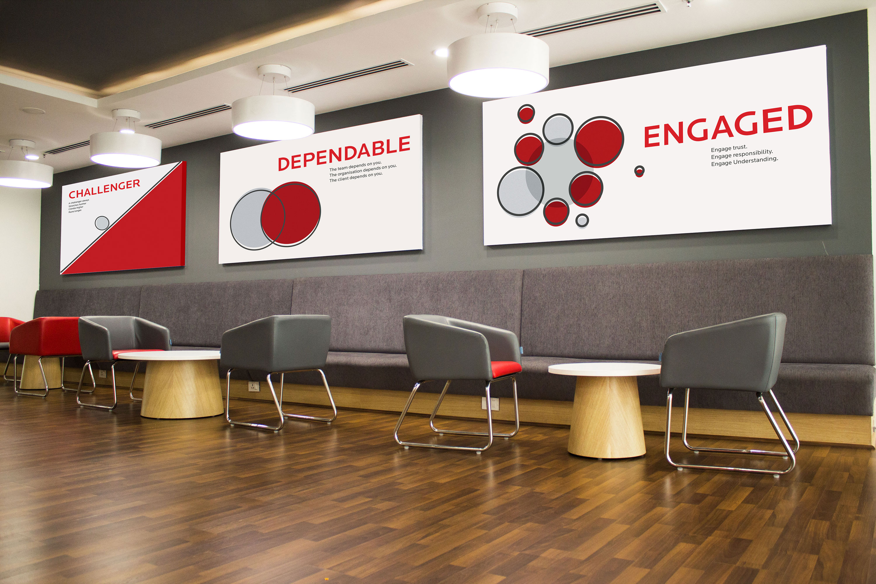
NH1 Design was commissioned to create the new identity to communicate Birlasoft’s energetic young force and approachable personality that embodies its brand values of being Engaged, Dependable and a Challenger.
SERVICES BRAND POSITIONING | BRANDING | DESIGN LANGUAGE | DESIGN STRATEGY
CLIENT BIRLASOFT (INDIA) PVT LTD.
SECTOR IT
BEFORE
AFTER
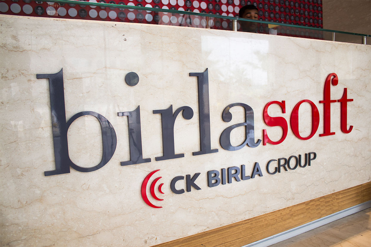
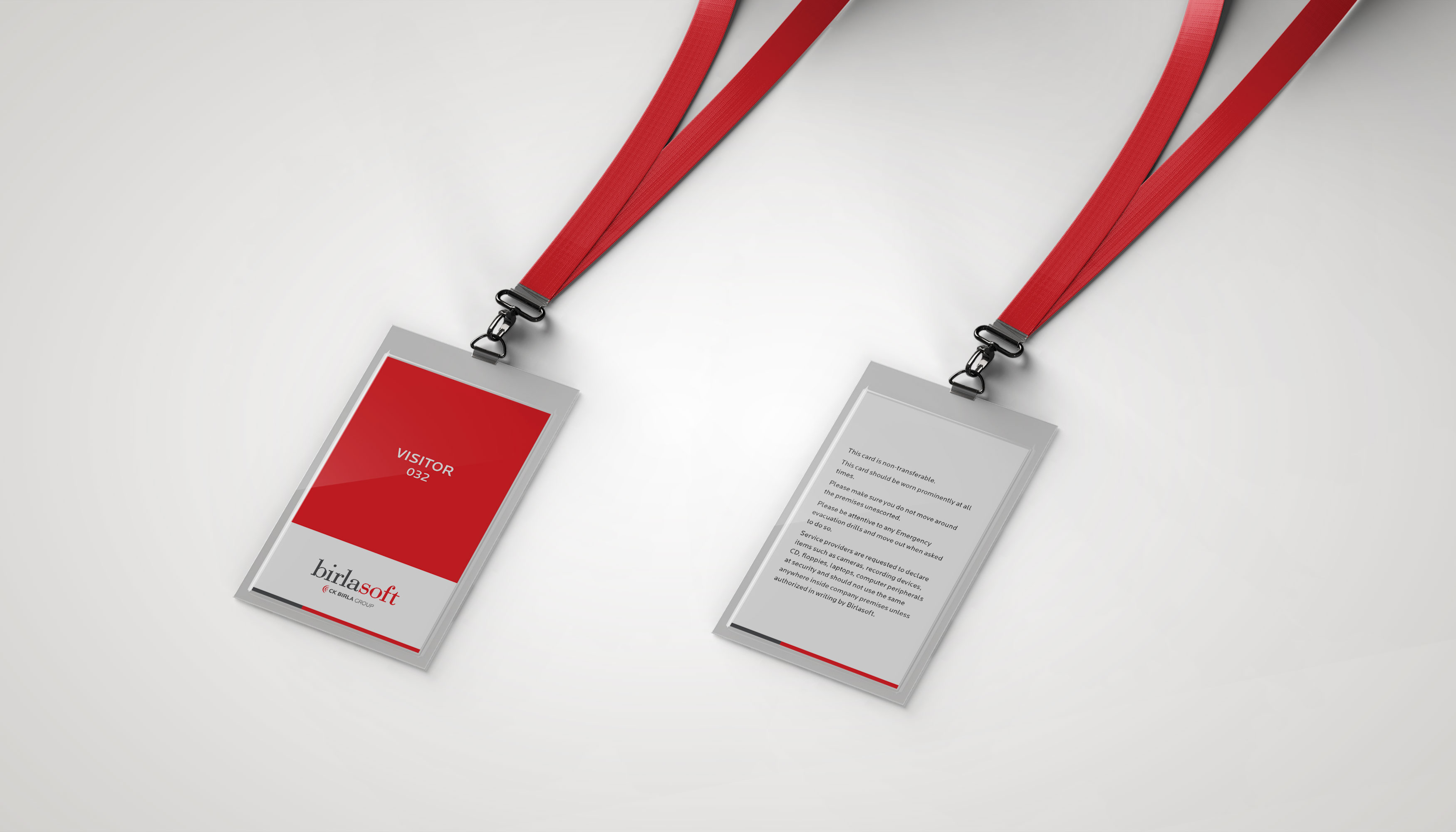
The technology industry has always been a fast paced, rapidly changing industry. With all that’s changing around, and within Birlasoft, the brief was to marry the future with the past, by means of a new identity that retains its 22-year legacy. The lowercase ‘b’ in the logo defines approachability and simplicity whereas the brighter red signifies youth and energy and purveys the voice of a challenger.
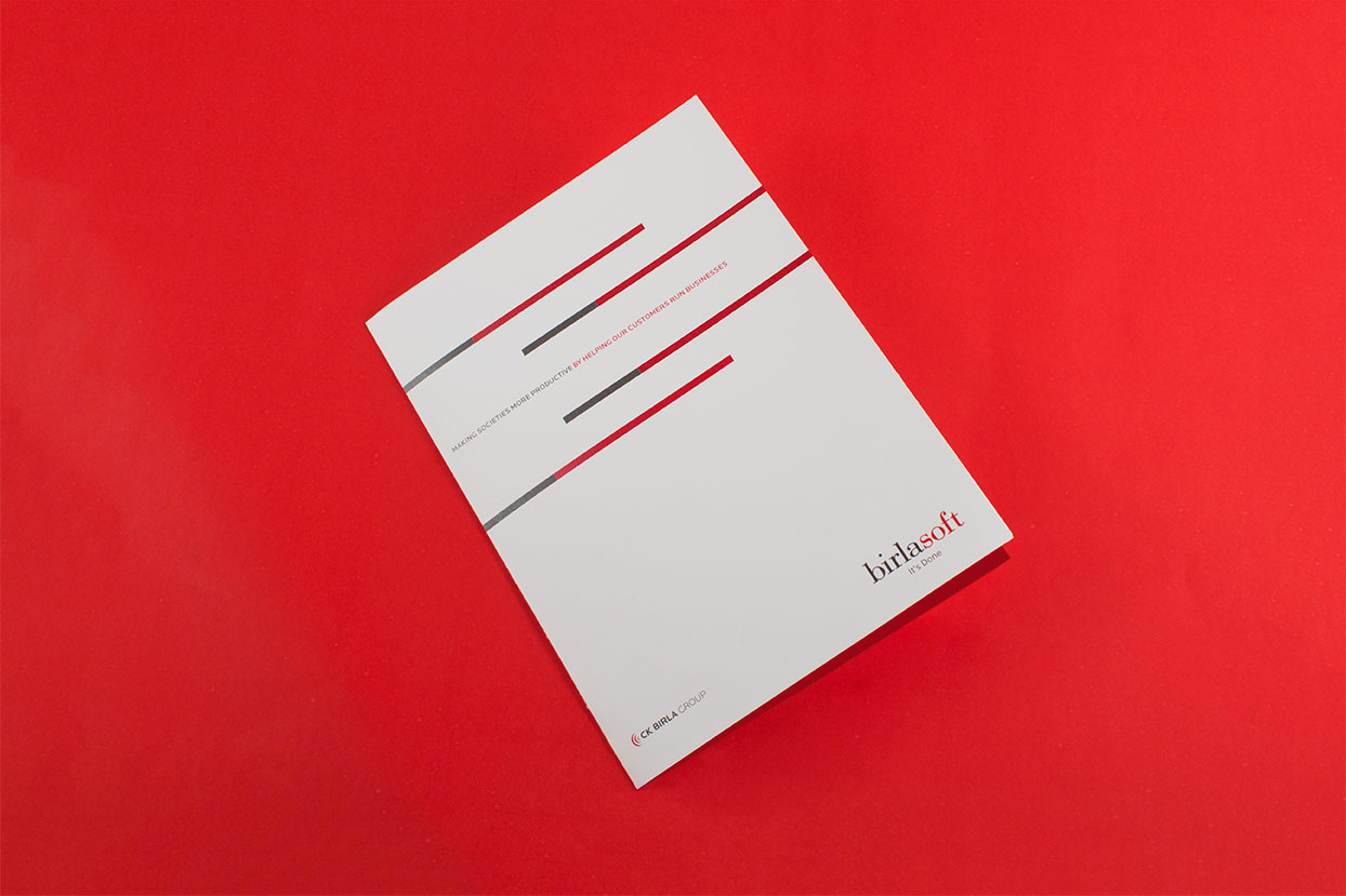
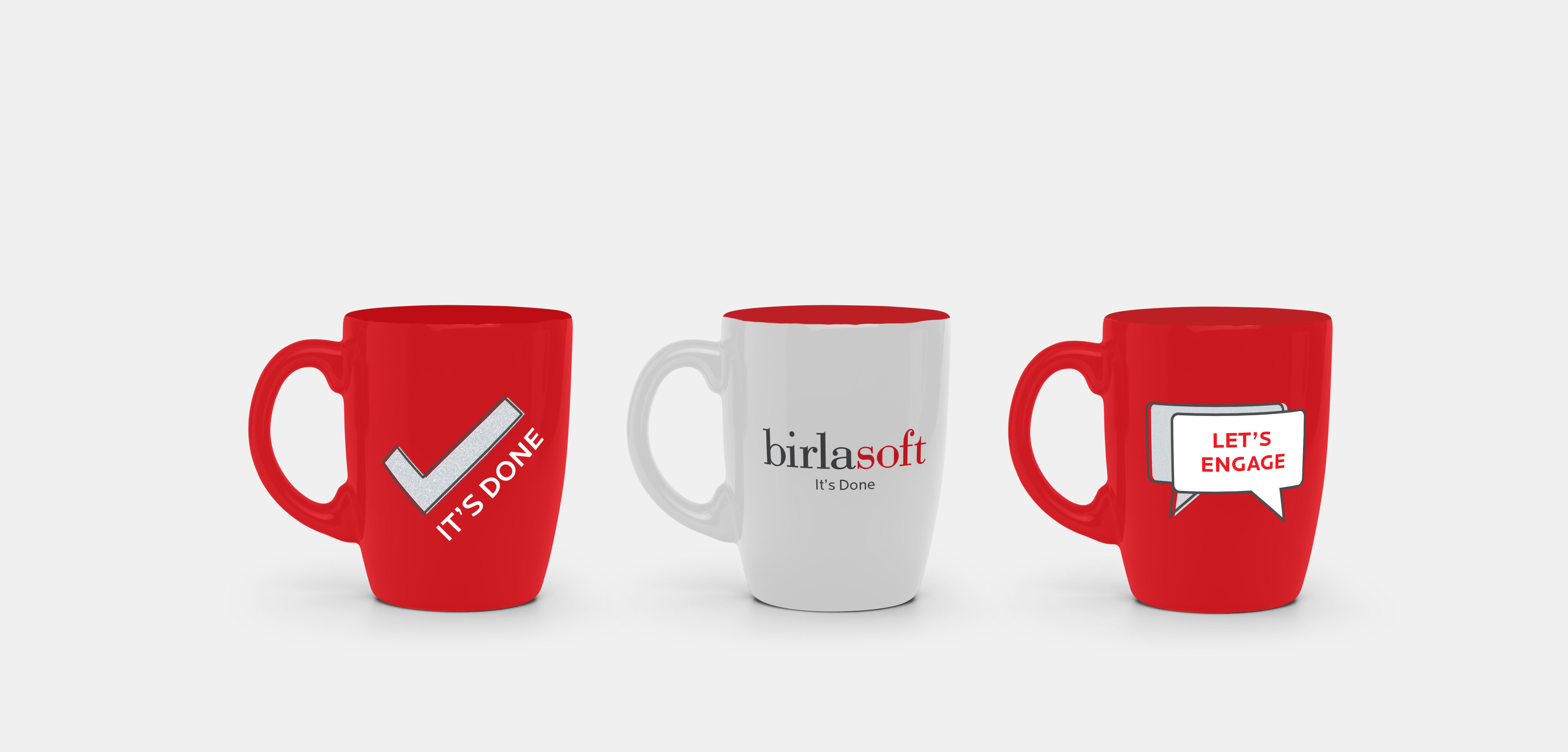
The tagline 'It's Done' is a simple expression of the brand promise and has a challenger spirit in it, talks about the dependability as the brand assures about completion of the task. 'It's Done' conveys positivism, confidence, dependability and experience.
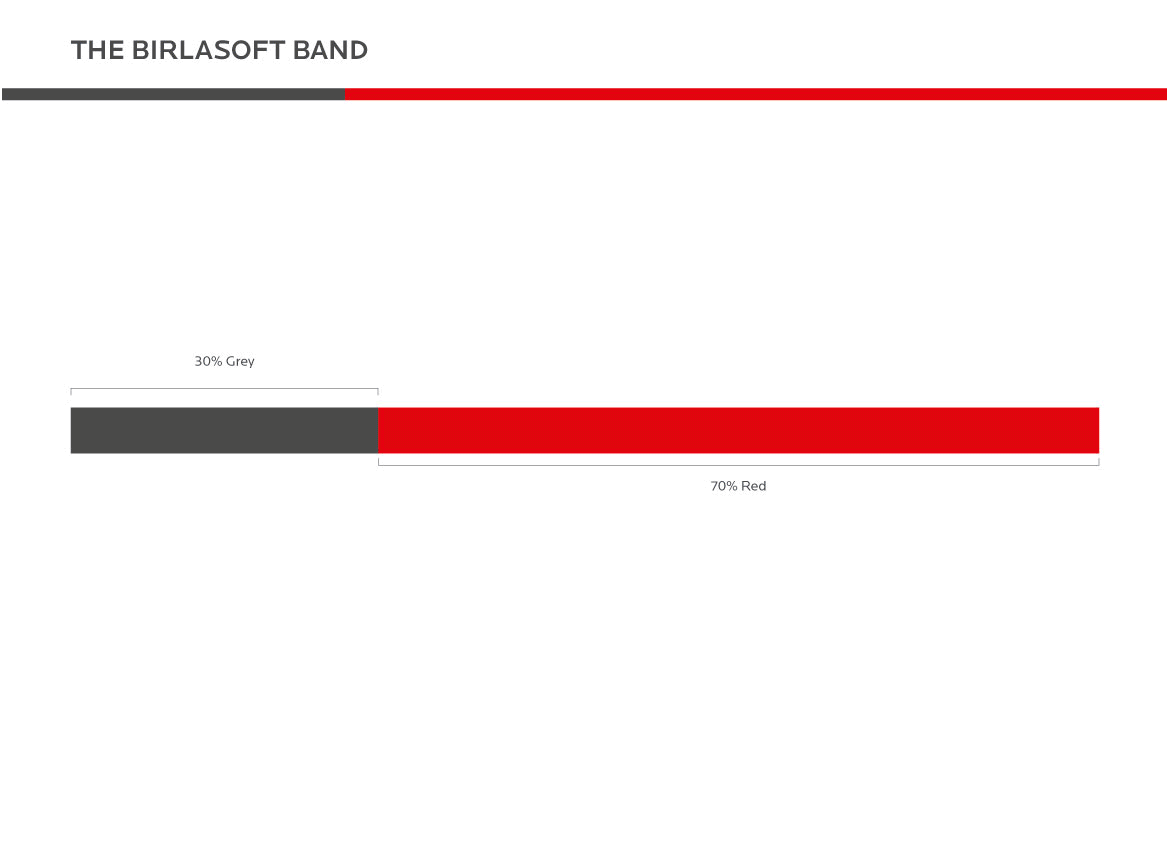
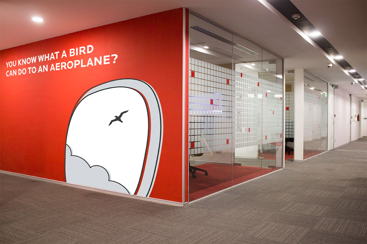
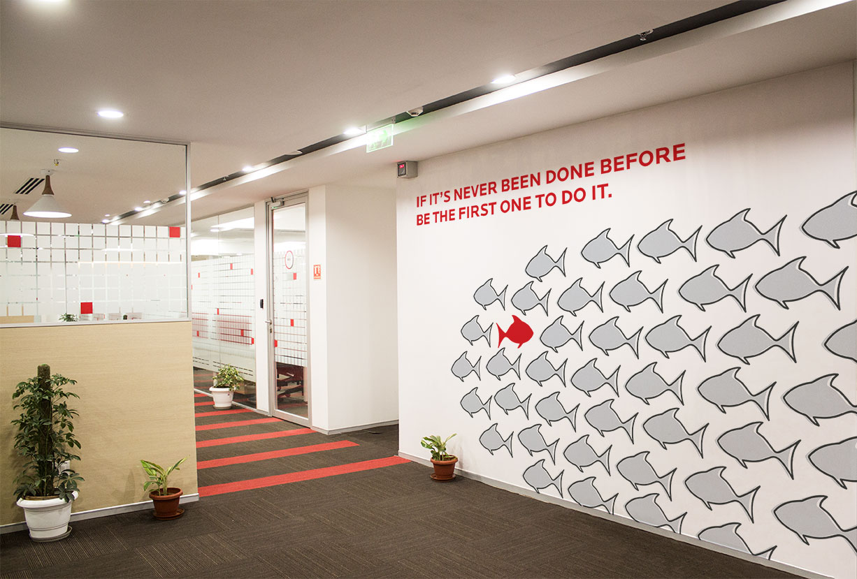
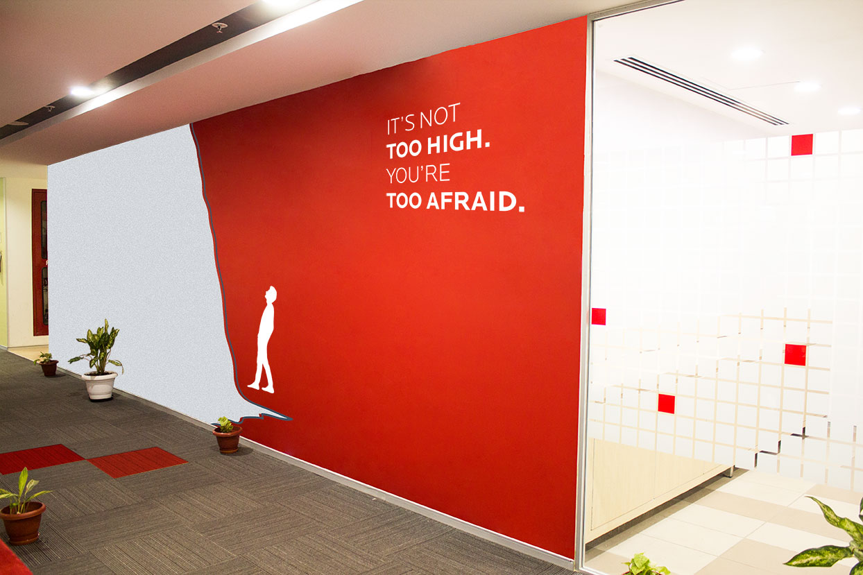
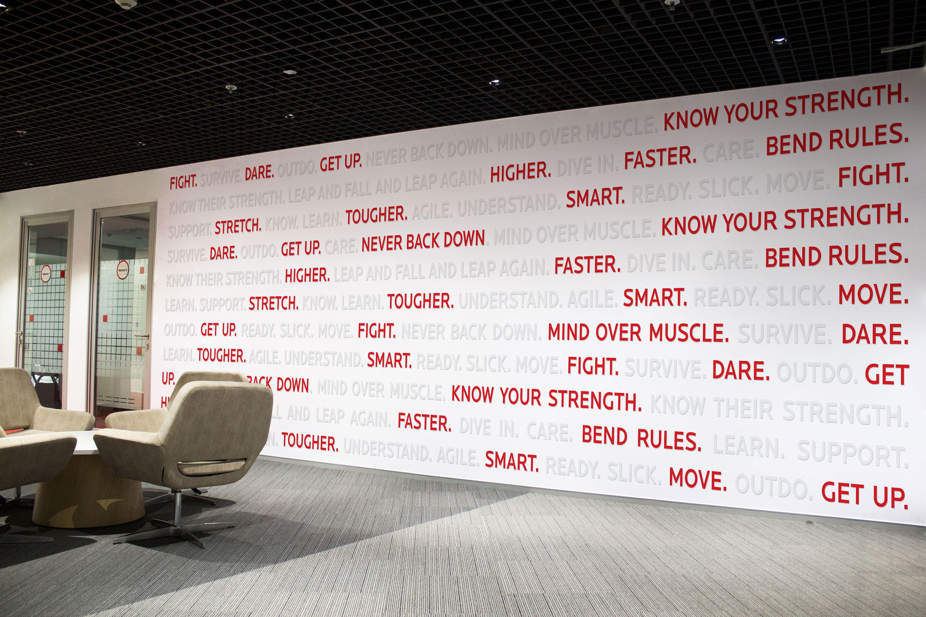
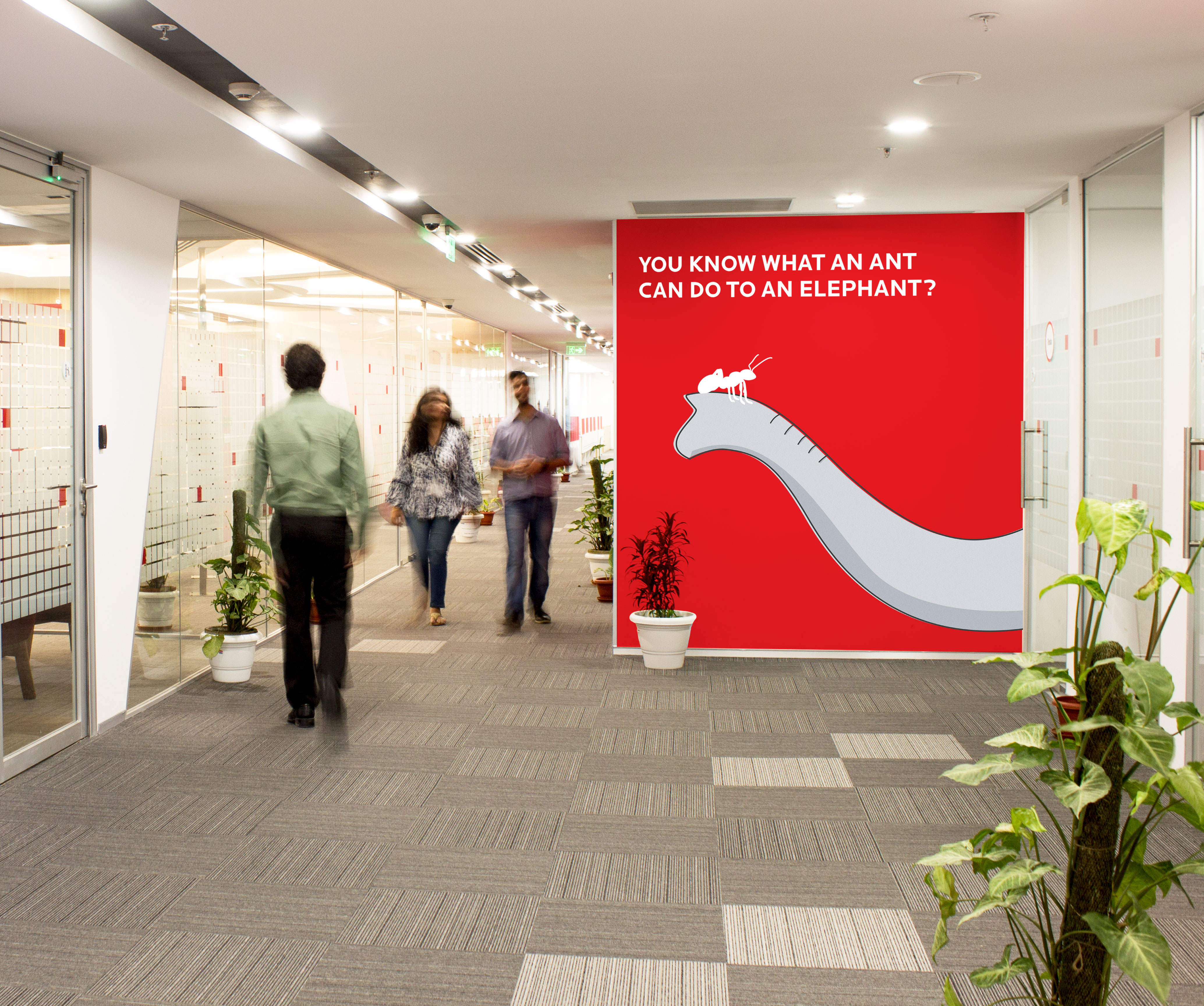
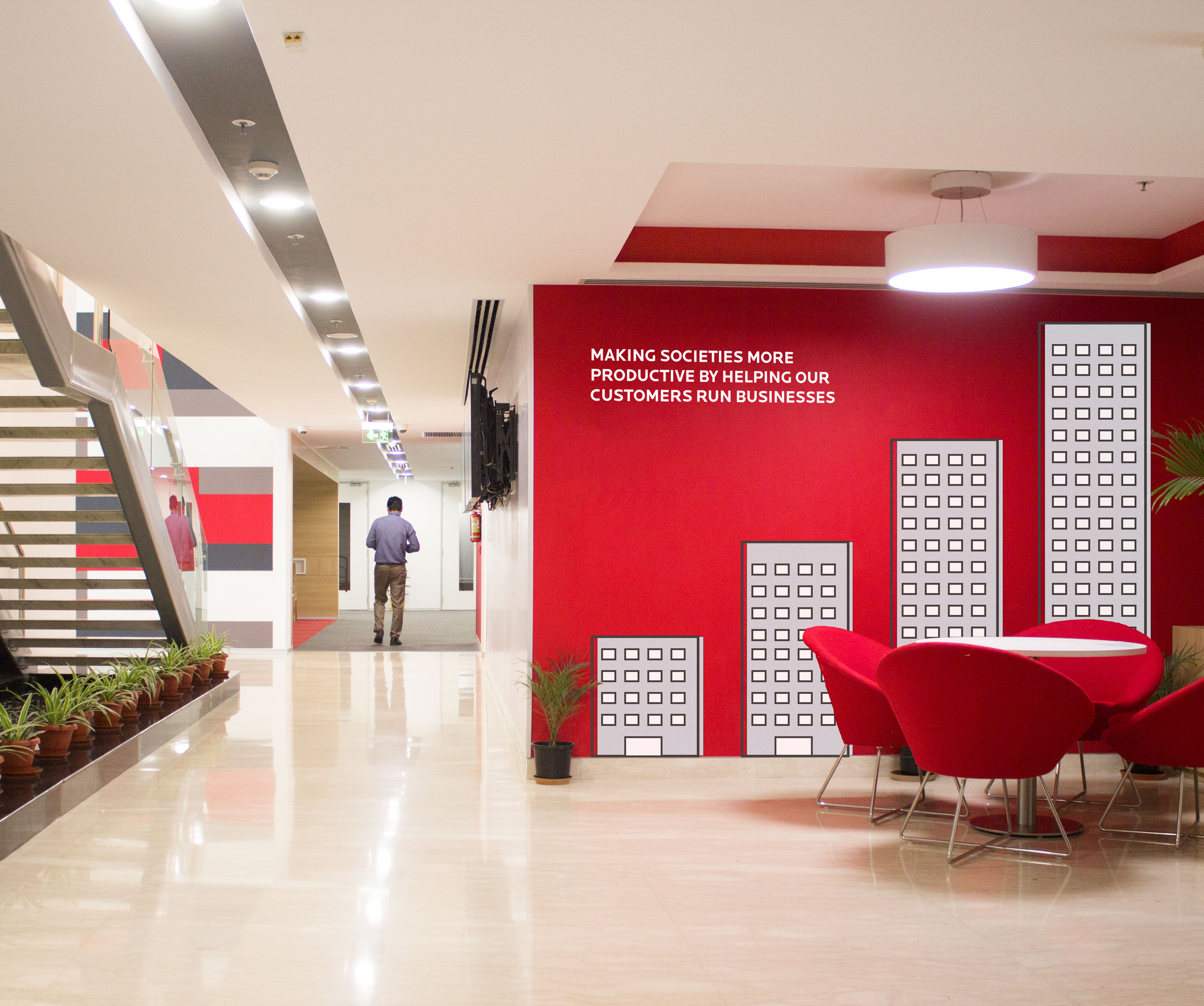
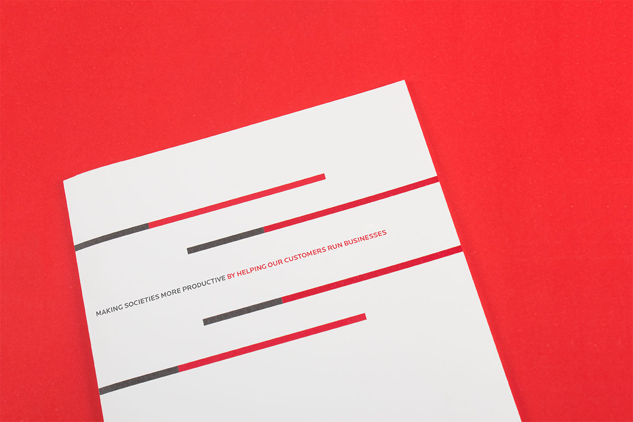
The "Birlasoft Band" is a prominent part of the brand’s design language and is inspired by the idenity system and the brand colours. A combination of grey texture along with red or grey stroke has been used as an illustration style across the brand collaterals.
The "Birlasoft Band" is a prominent part of the brand’s design language and is inspired by the idenity system and the brand colours. A combination of grey texture along with red or grey stroke has been used as an illustration style across the brand collaterals.
The "Birlasoft Band" is a prominent part of the brand’s design language and is inspired by the idenity system and the brand colours. A combination of grey texture along with red or grey stroke has been used as an illustration style across the brand collaterals.
The 'Birlasoft Band' is a prominent part of the brand’s design language and is inspired by the idenity system and the brand colours. A combination of grey texture along with red or grey stroke has been used as an illustration style across the brand collaterals.
The "Birlasoft Band" is a prominent part of the brand’s design language and is inspired by the idenity system and the brand colours. A combination of grey texture along with red or grey stroke has been used as an illustration style across the brand collaterals.
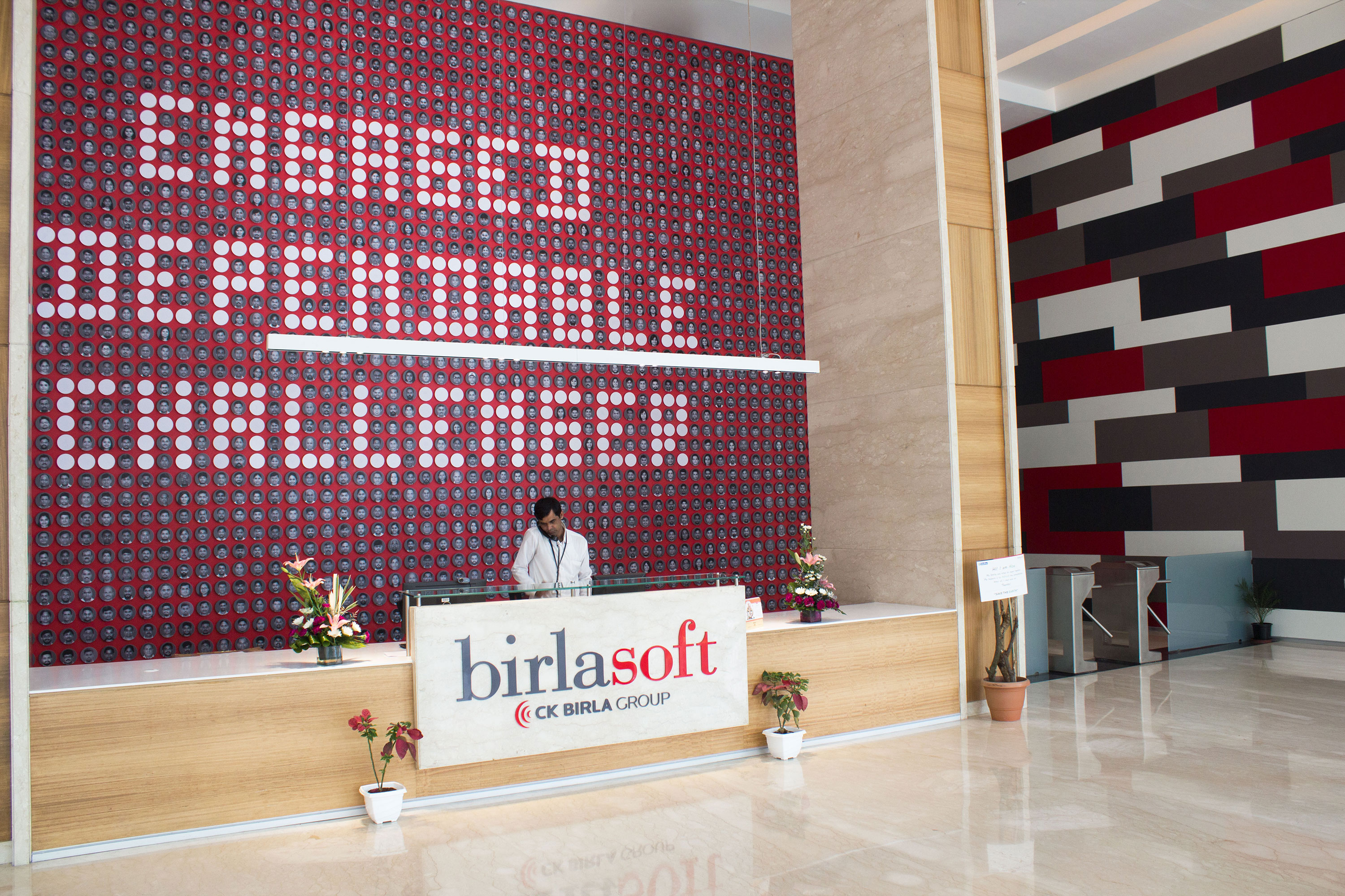
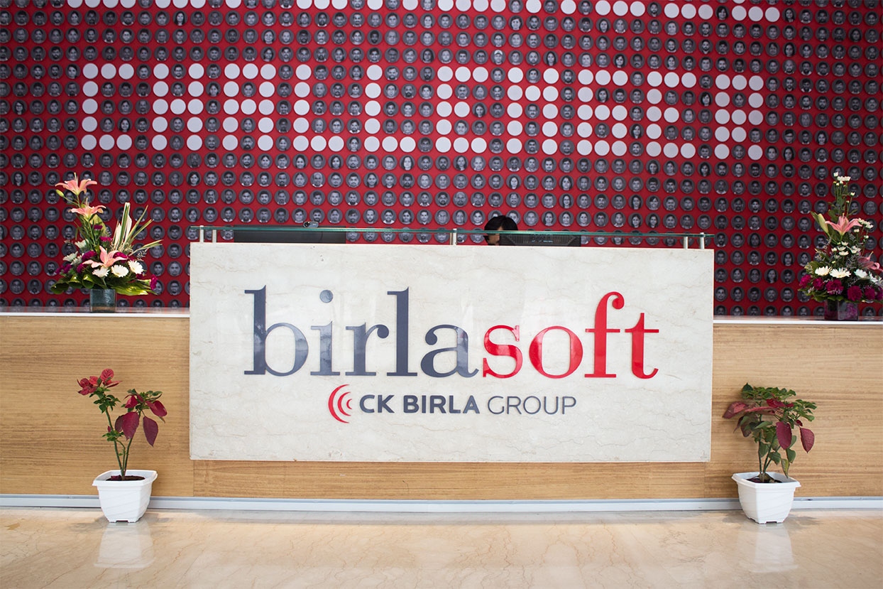
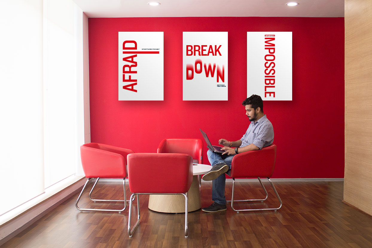
Brand Values - Engaged, Dependable and Challenger have been embodied into the space graphics.
Brand Values - Engaged, Dependable and Challenger have been embodied into the space graphics.
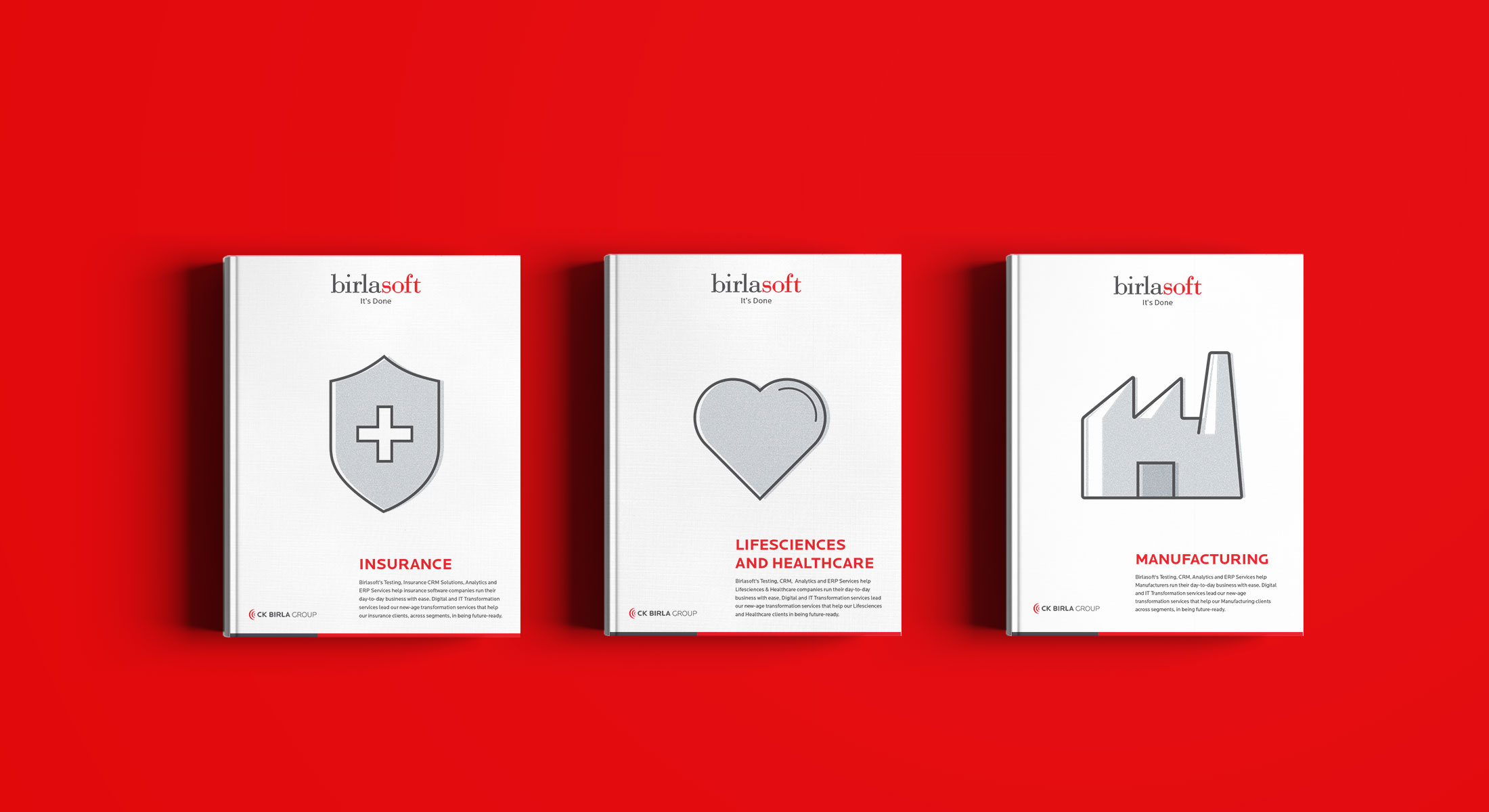
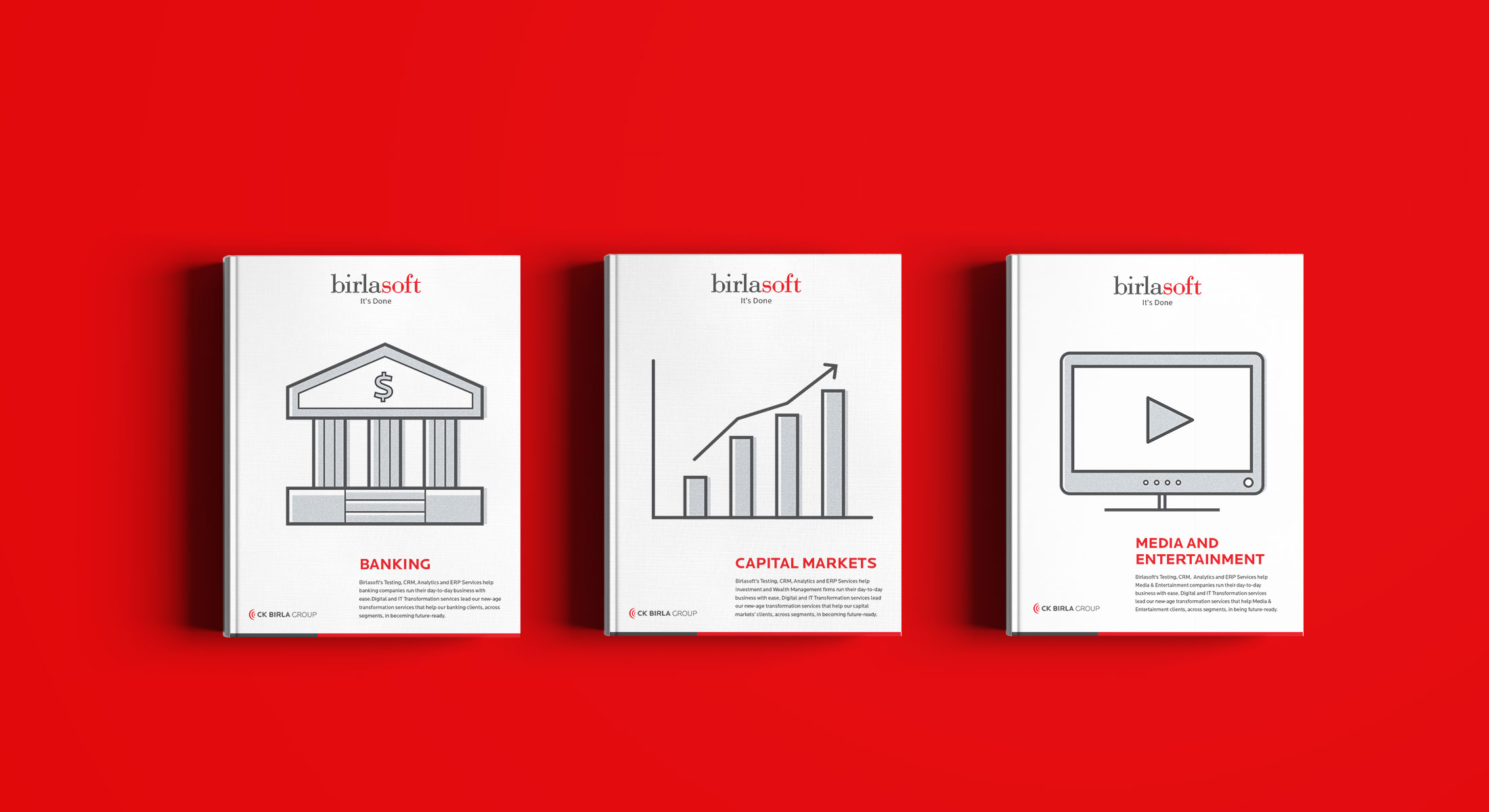
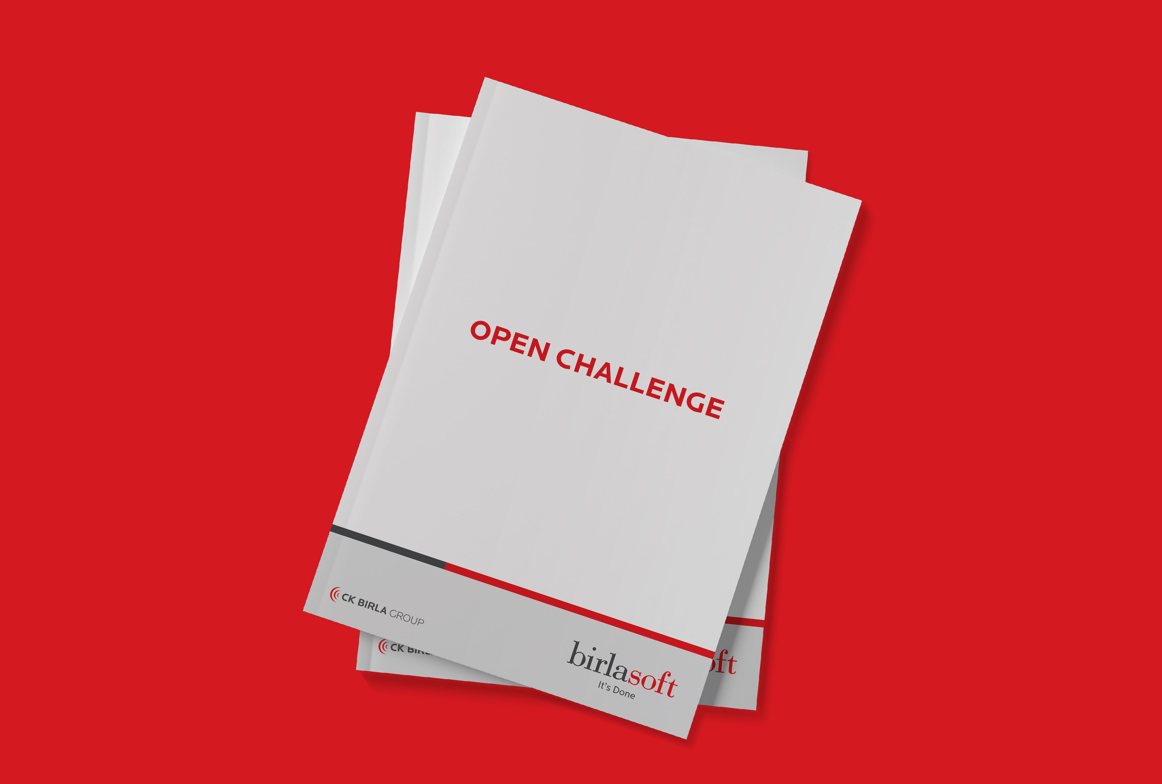
Services Brochures
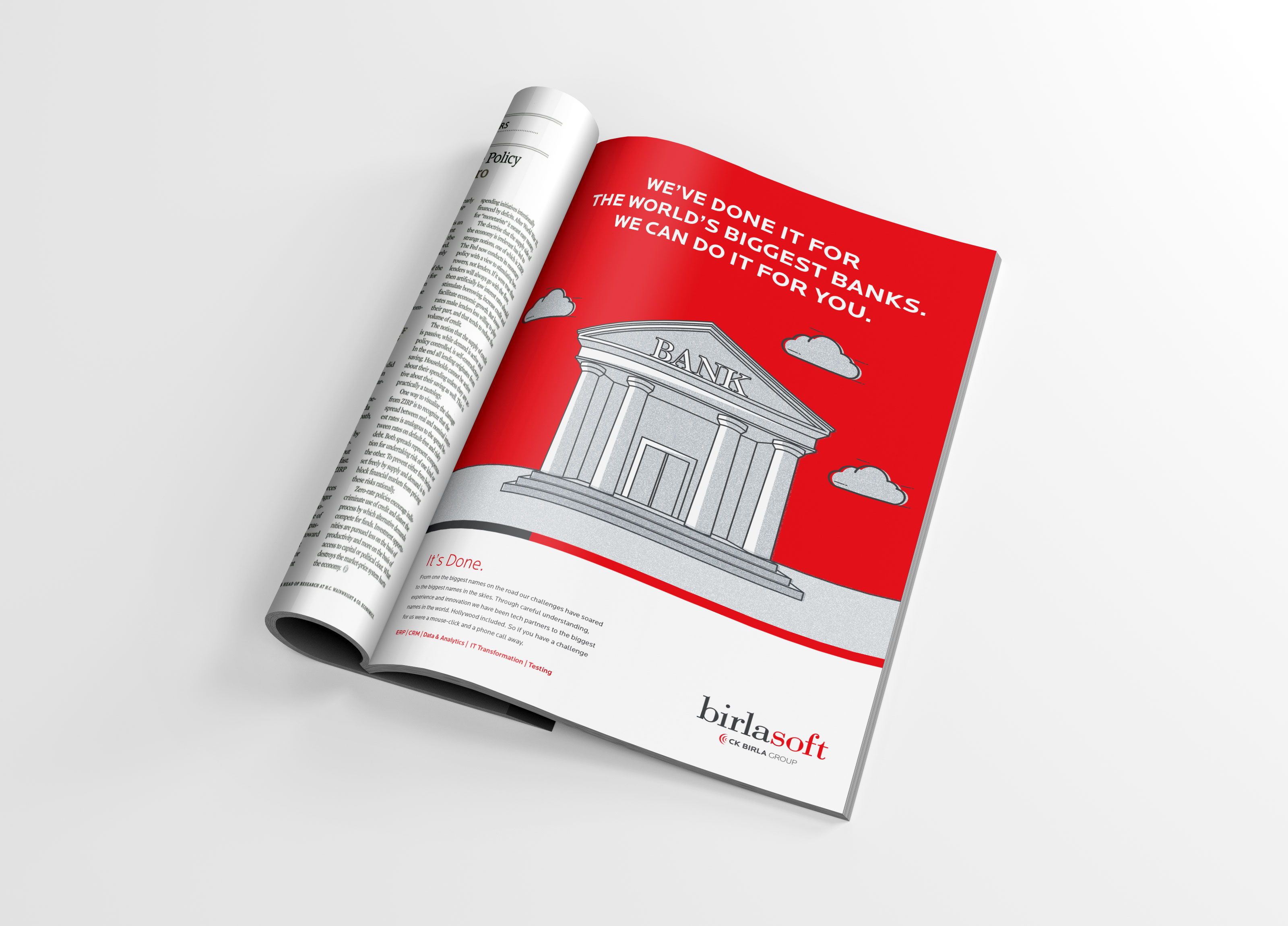
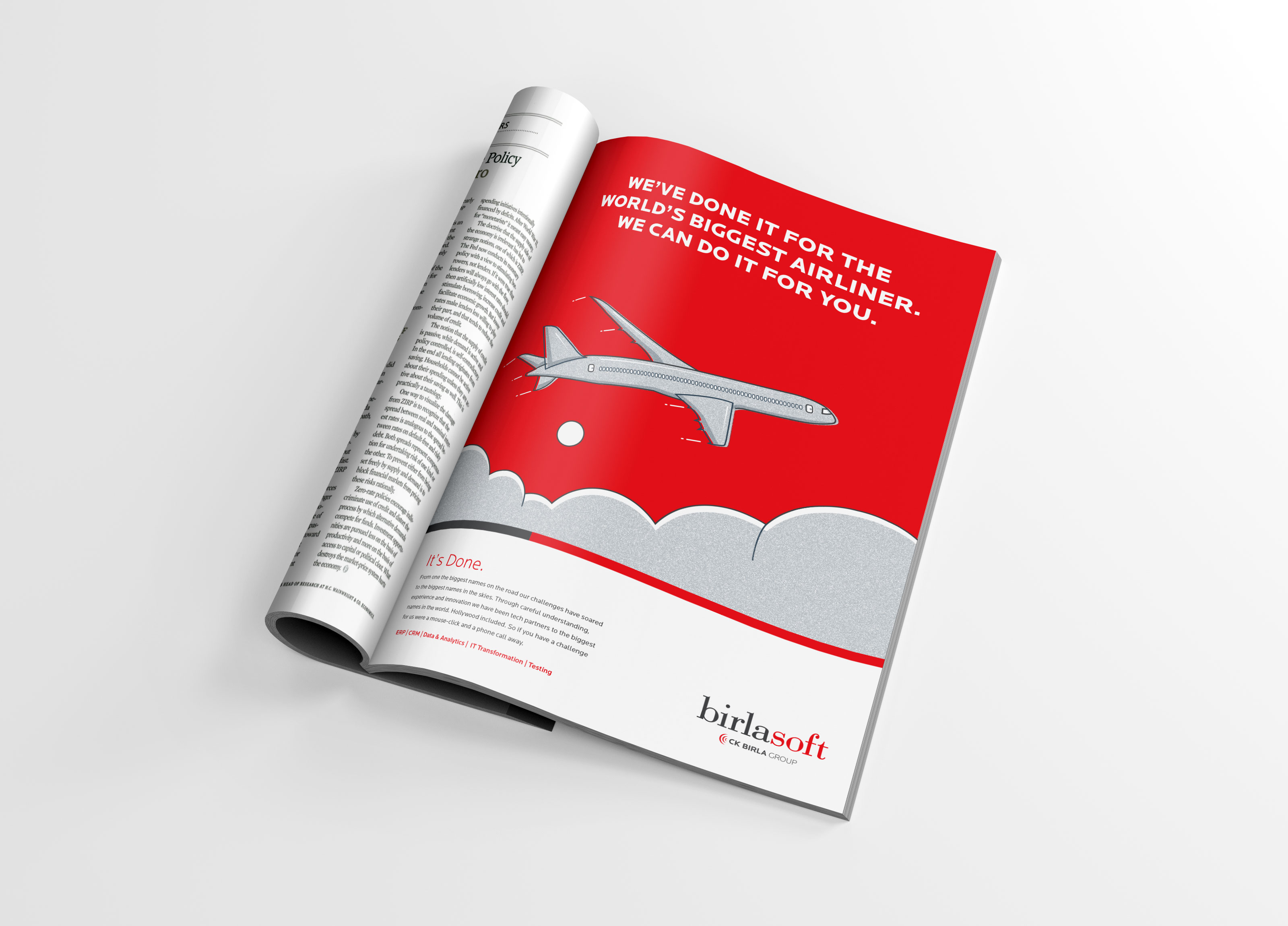
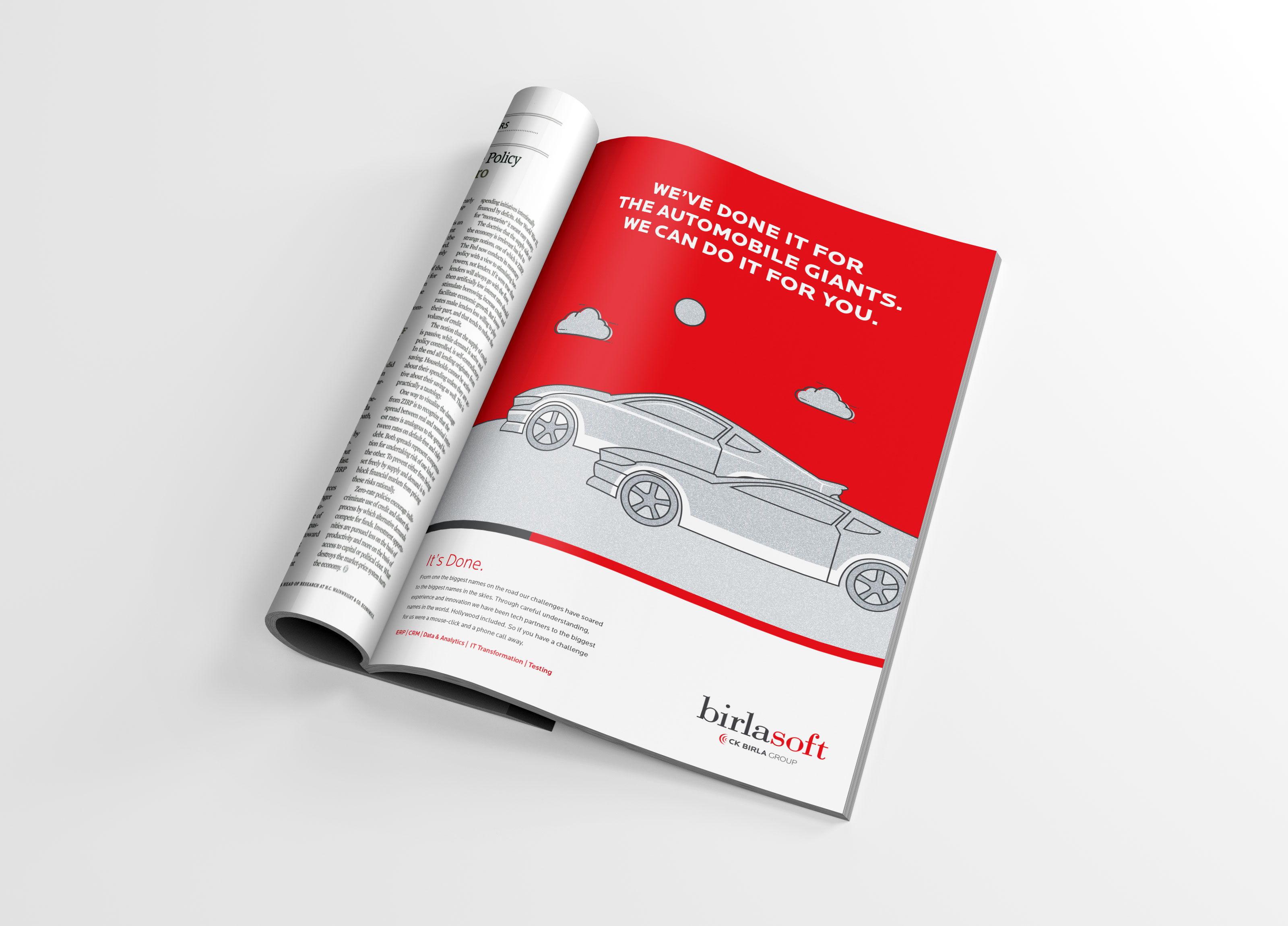
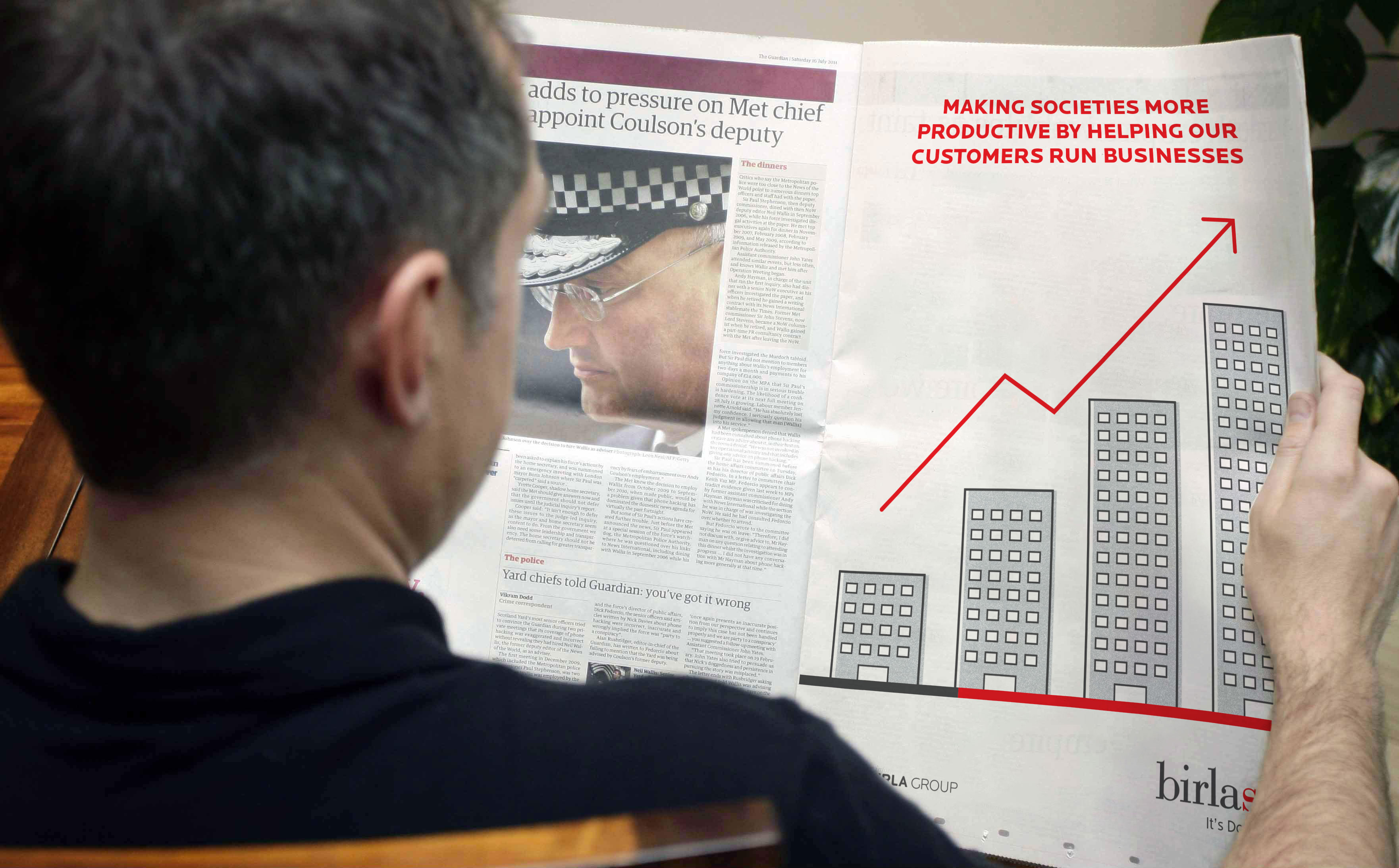
Magazine Advertisements
Launch Advertisement
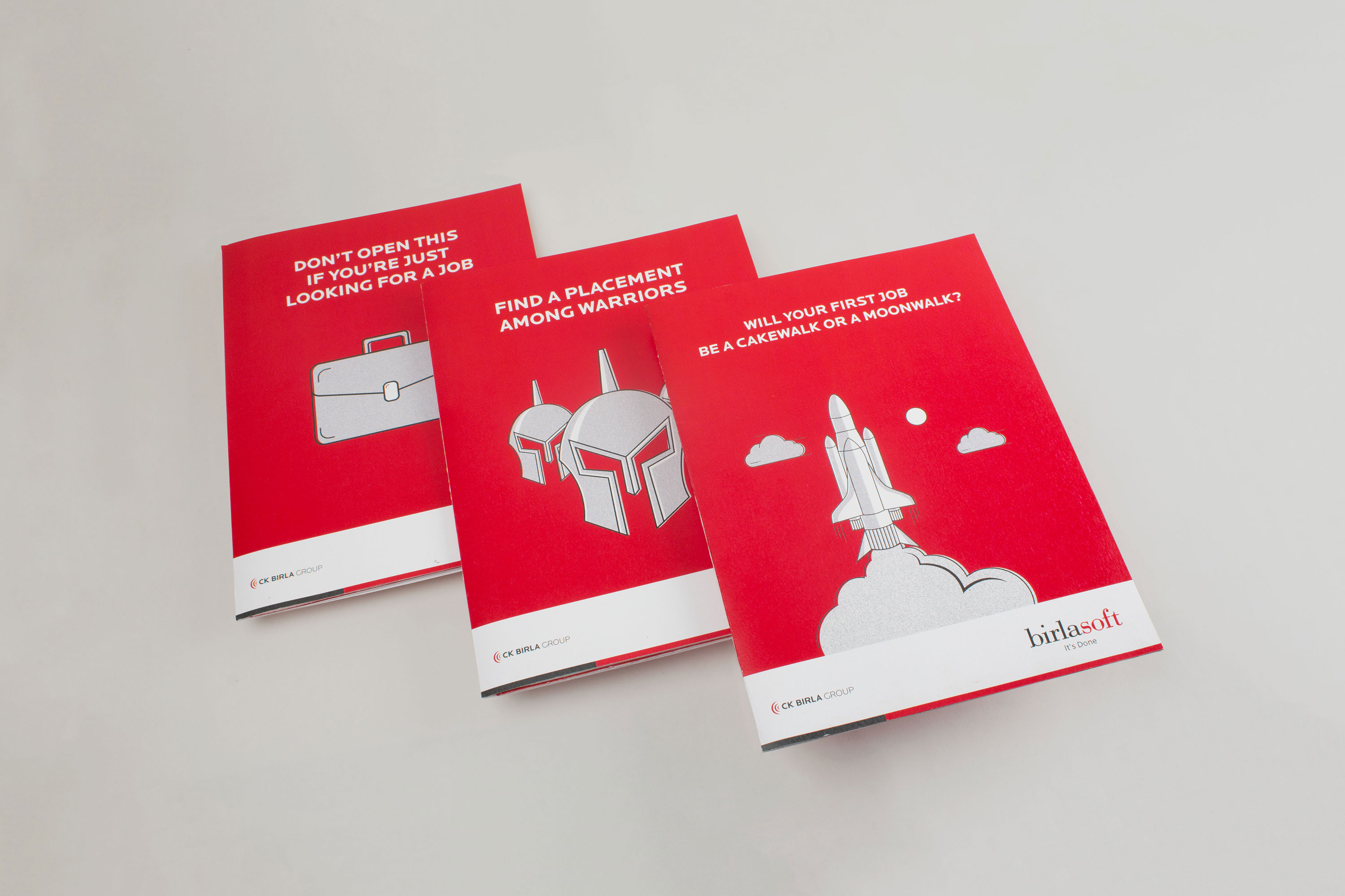
Graduate Recruitment Folders
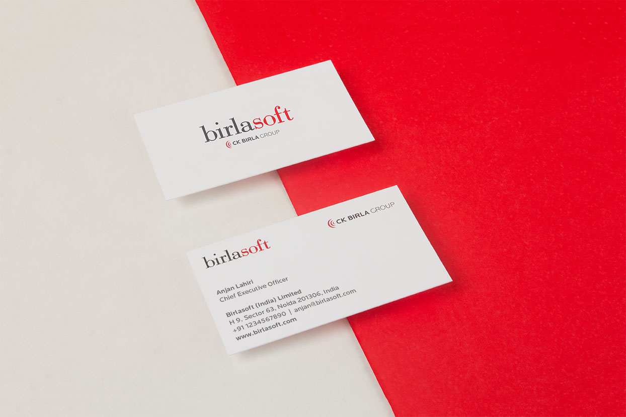
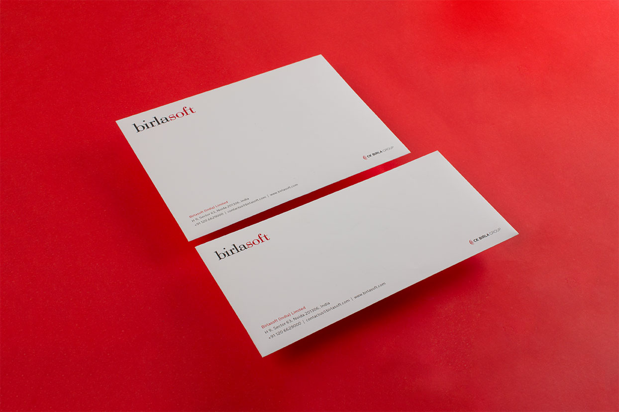
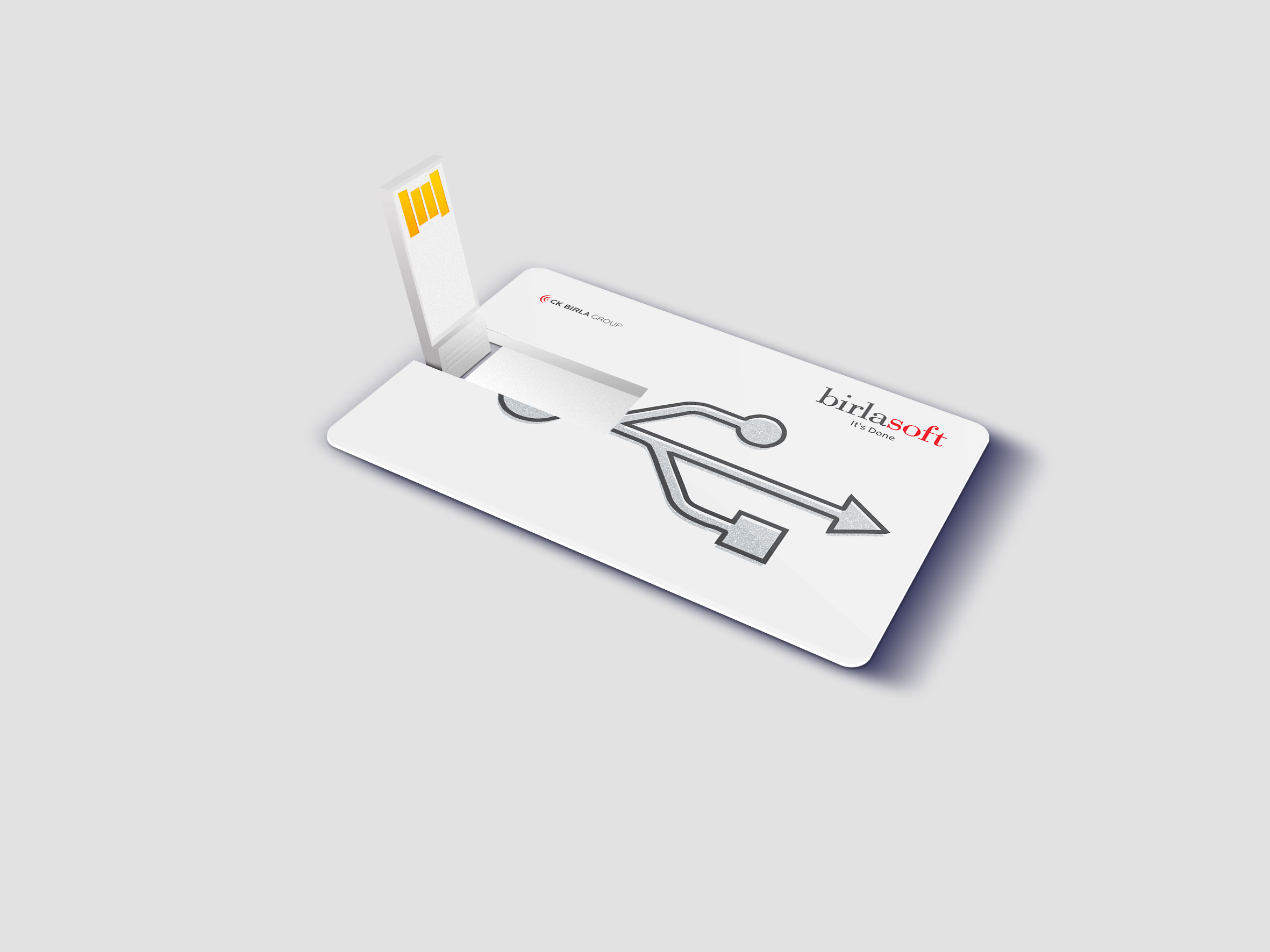
Stationery
Corporate Folder
Employee Induction Book Cover

All Projects

SunsureRe-Branding an energy as a service brand
Godrej My FarmBranding a premium niche dairy brand for Godrej
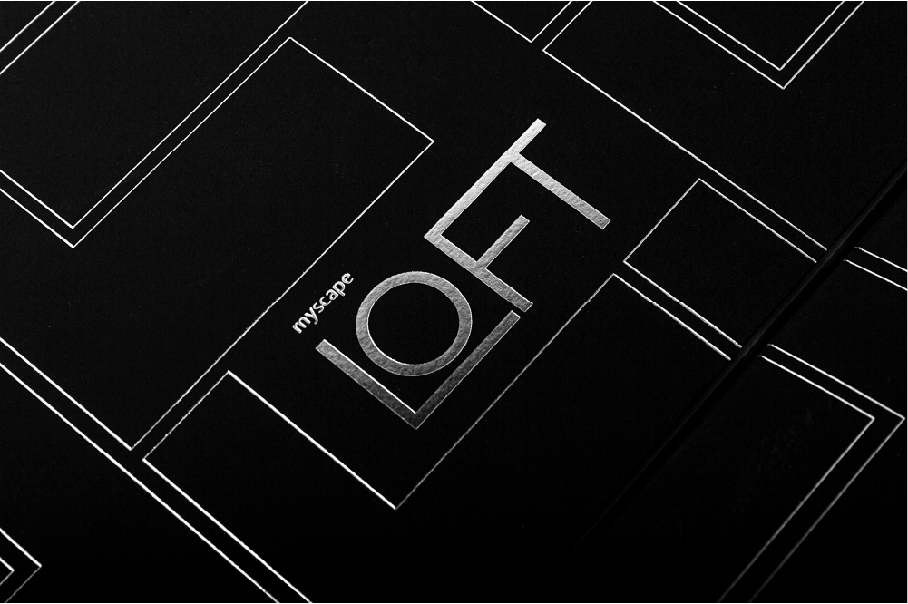
ASBL LOFTResidential property brochure
MyHome 99Residential property brochure
HROneBranding a HRMS platform
FlexipleBranding a global tech talent network
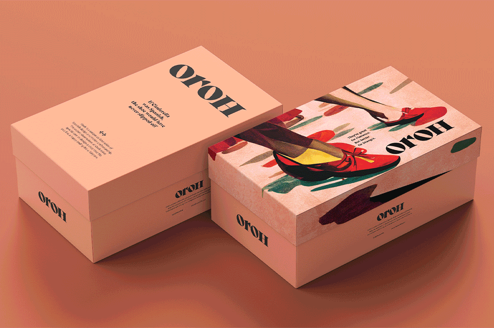
OrohBranding an Indian D2C footwear brand
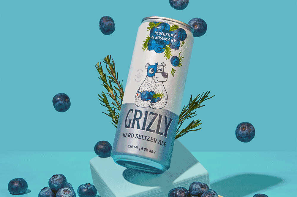
Grizly Hard Seltzers AleBranding & packaging design | House of Bira 91
Red.HealthRebranding India's largest emergency response company

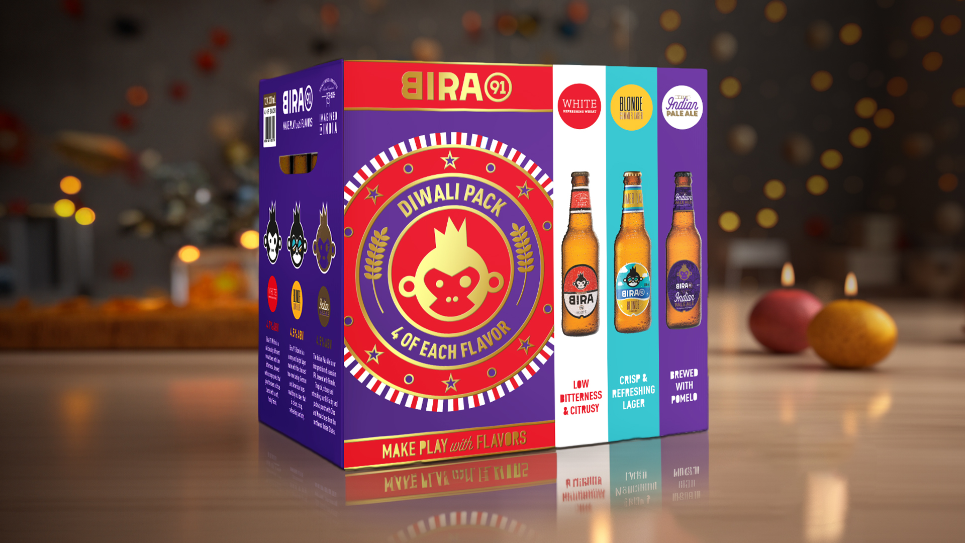
Bira 91 Make Play with FlavorsDefining the brand world for a beer brand
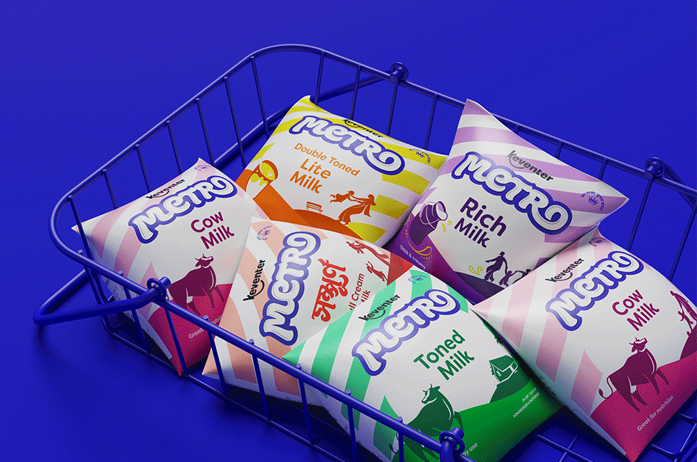
Keventer MetroRebranding a dairy brand in West Bengal
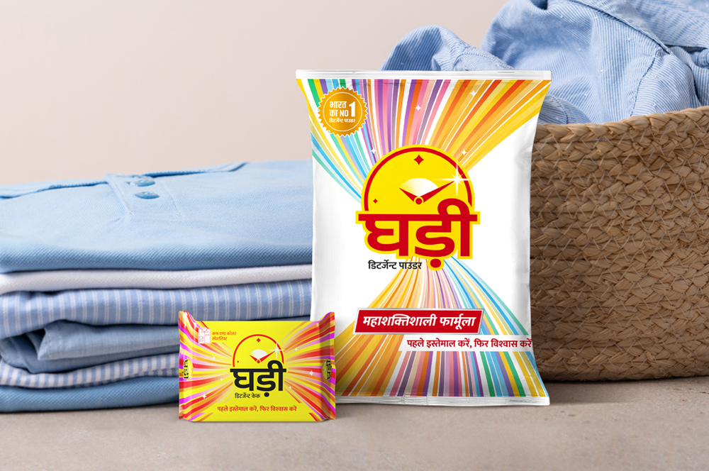
Ghadi by RSPL GroupRe-packaging an iconic detergent brand
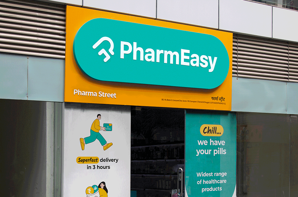
PharmEasyRedesigning an omnichannel brand experience
Celebrate with Every SipFestive & special edition packs for Bira 91
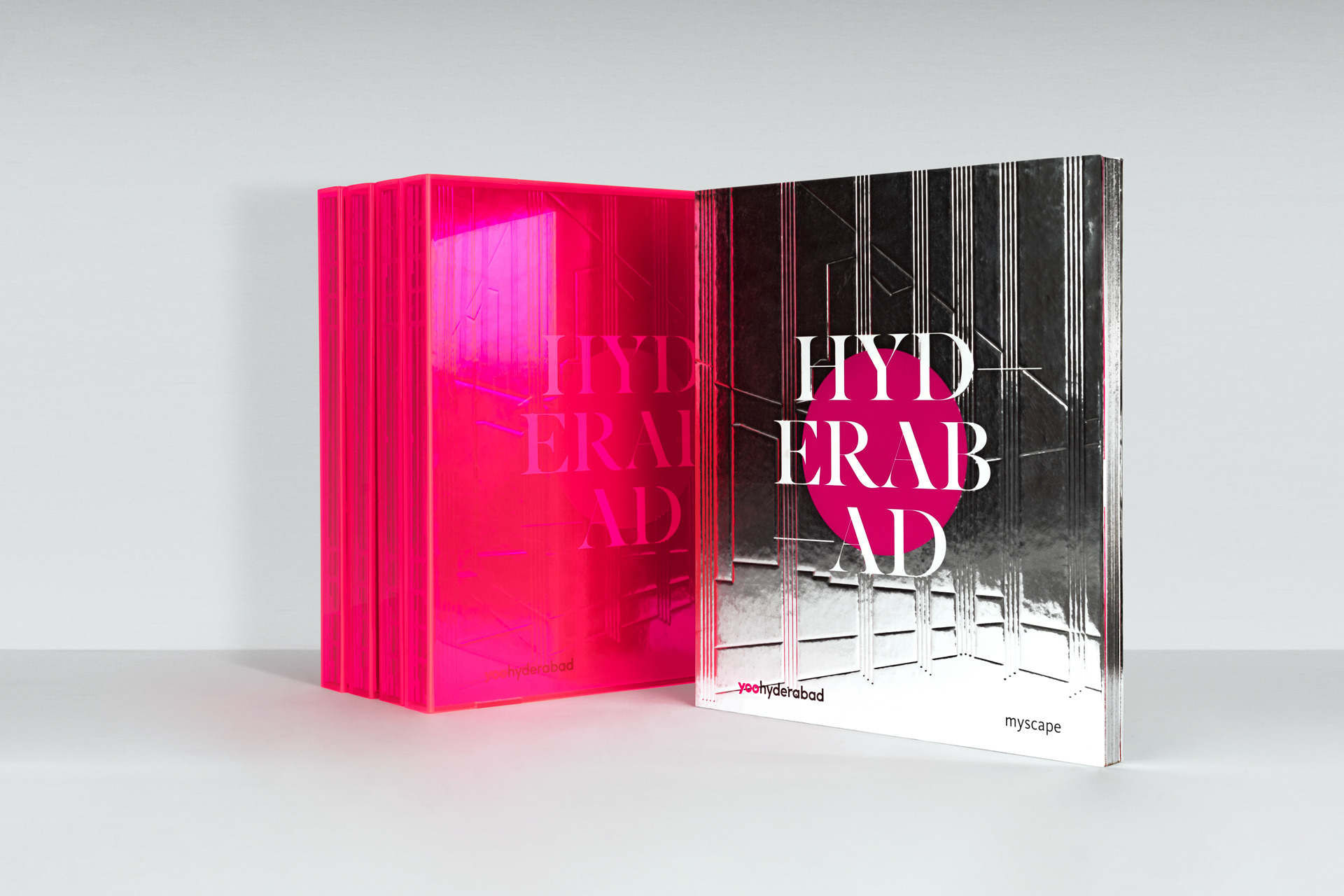
Myscape YOOSelling branded residences
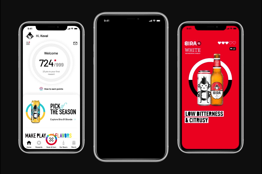
Bira 91 | Customer Loyalty AppUI design for brand advocacy
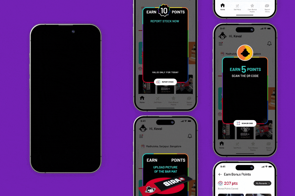
Bira 91 | Counter Sales Managers AppB2B channel partner UI Design
LifioBranding a clinical research and trial company
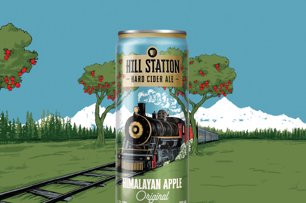
Hill Station Hard Cider AleBranding & Packaging Design | House of Bira 91
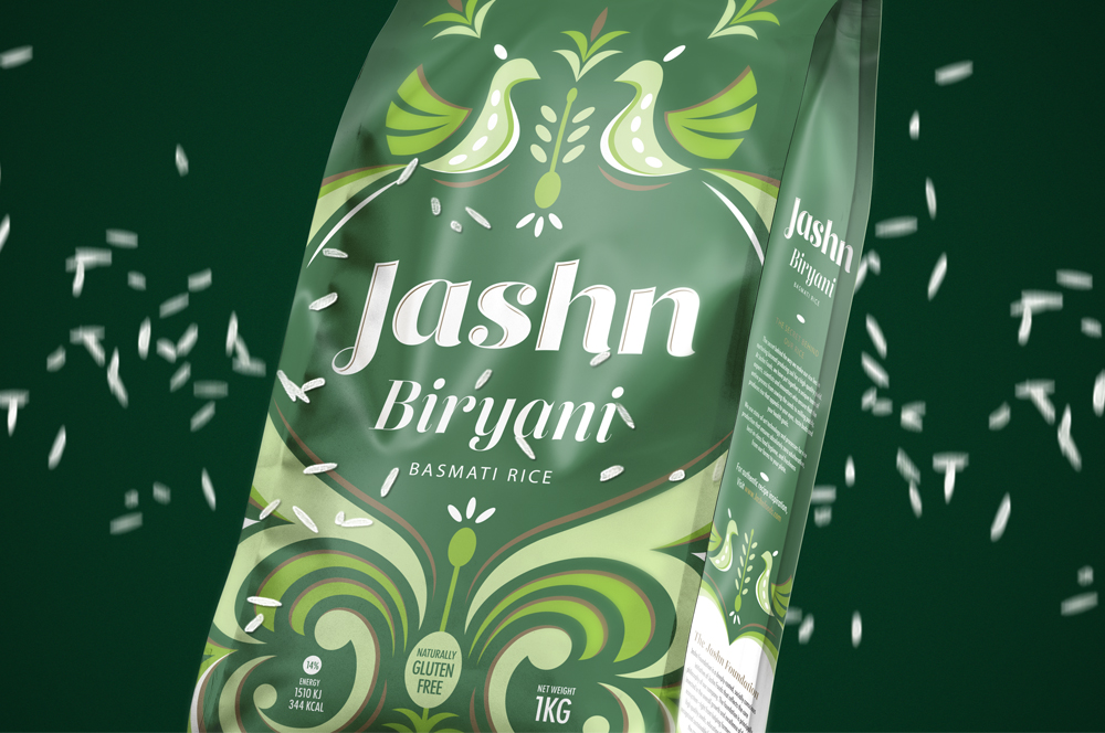
Jashn FoodsPackaging design for basmati rice
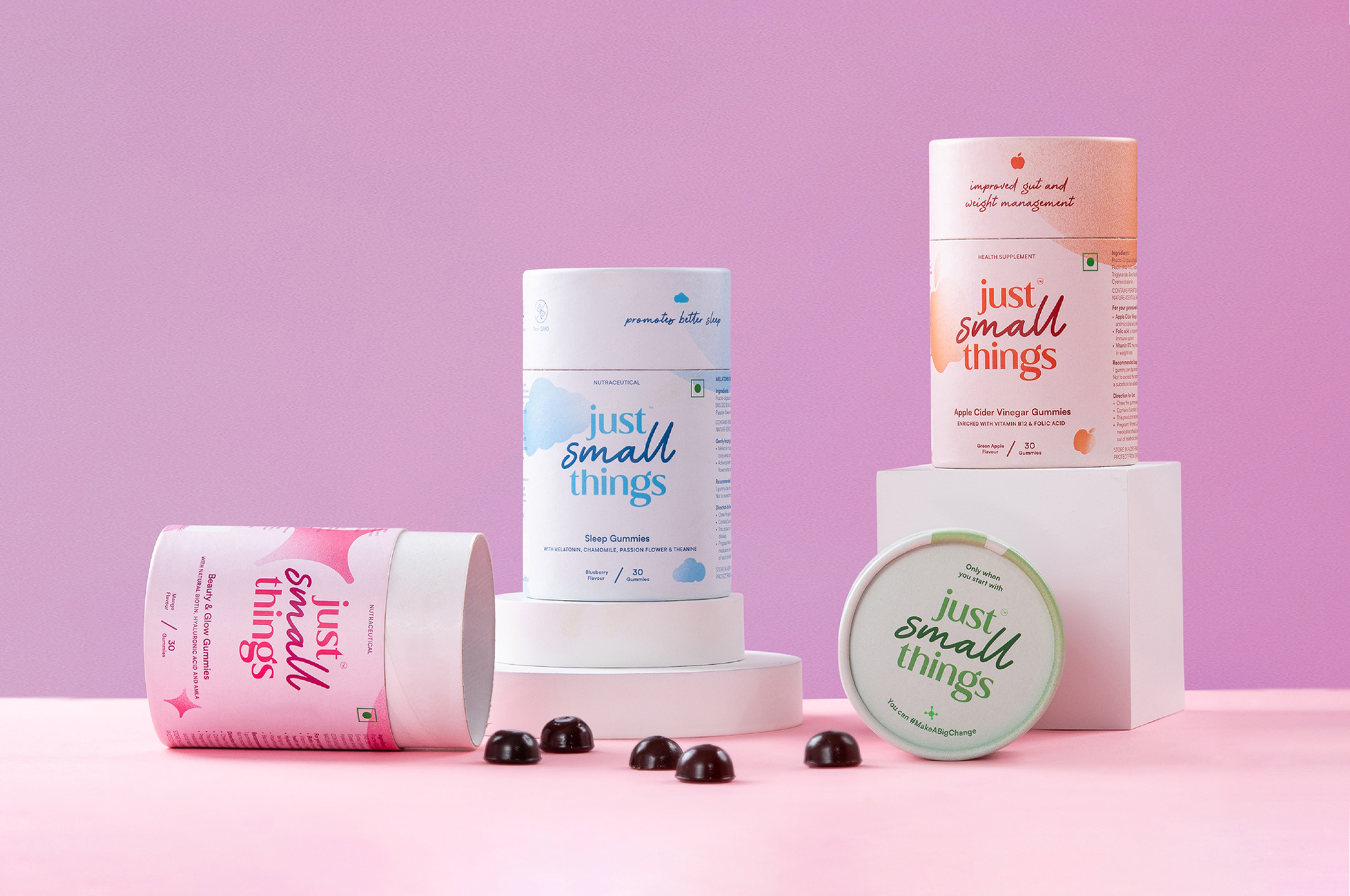
Just Small ThingsDesigning a personal care nutraceutical brand
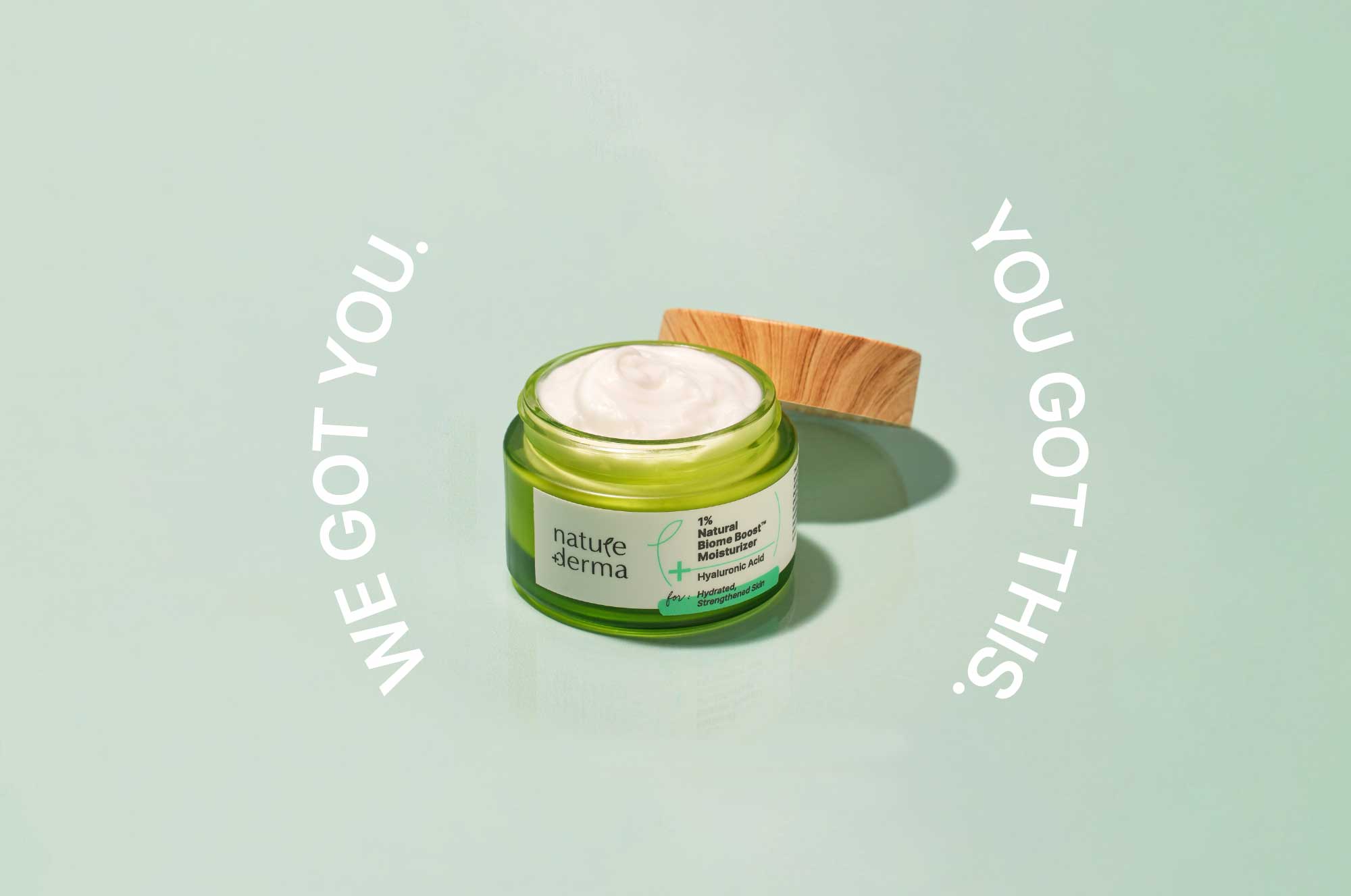
Nature DermaCommunications for active skincare

DoozeBranding & UI design for an alcohol delivery app
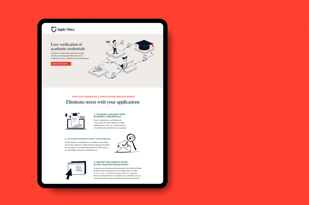
Apply Once and Veri OnceBranding a new age educational navigator
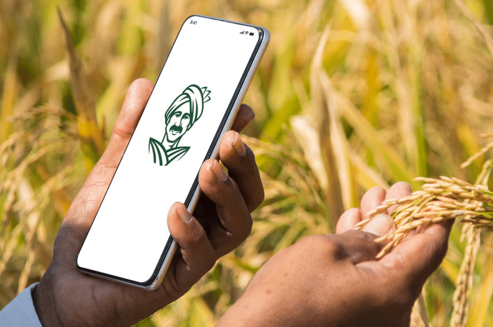
eFarmarket by AP markfedDesigning an identity for an agritech platform
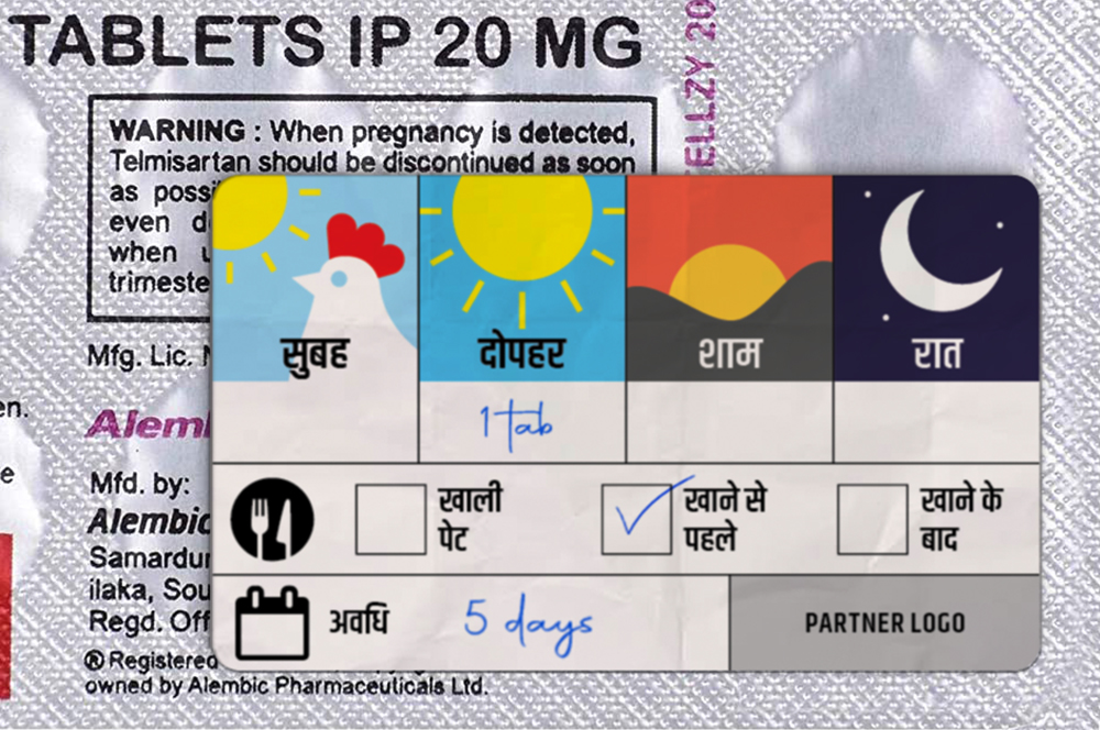
Stickers to Monitor Drug DosageSelf Initiated Project

AzlyaBranding a cultural yet contemporary fashion Label
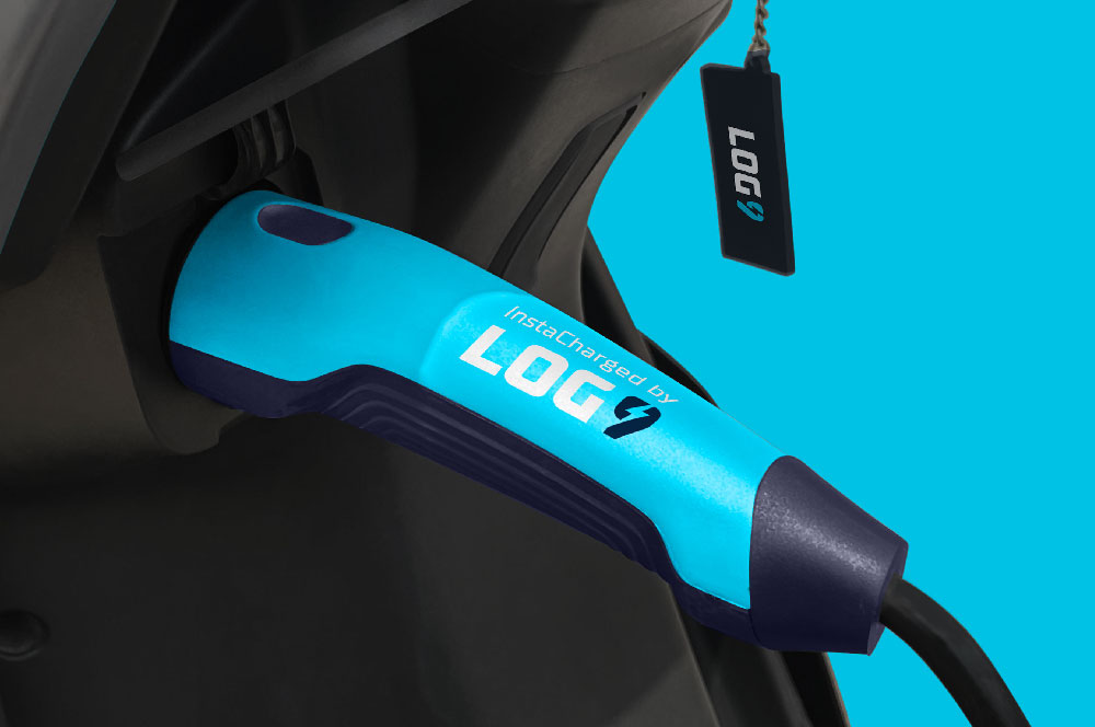
Log9 MaterialsRebranding an energy solutions company

Science of HimMale wellness treated with science
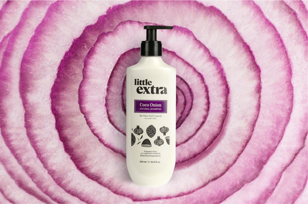
Little ExtraAll natural personal care
Pristyn CareRebranding short stay surgery
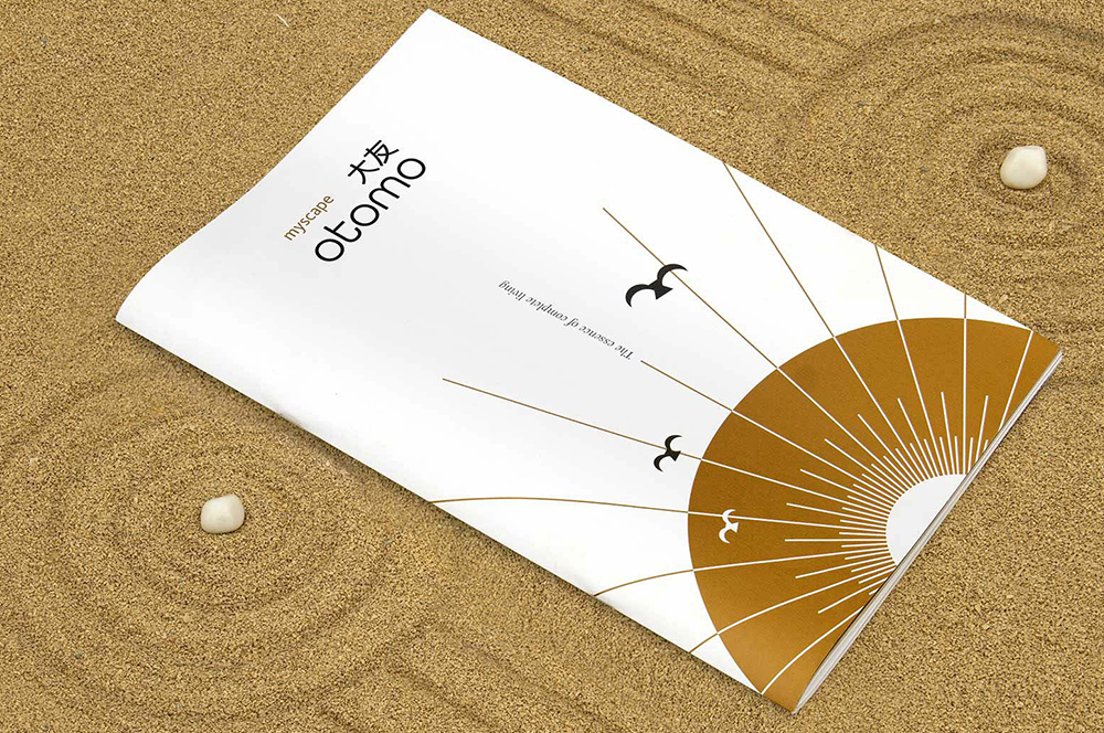
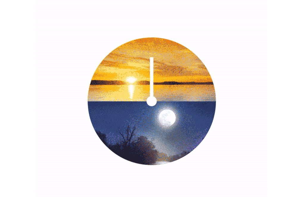
Myscape OtomoResidential property brochure
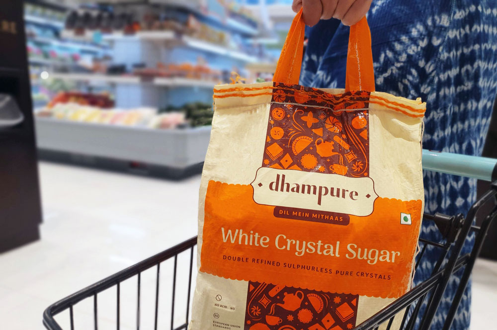
DhampureRebranding a Pioneer Sugar Brand
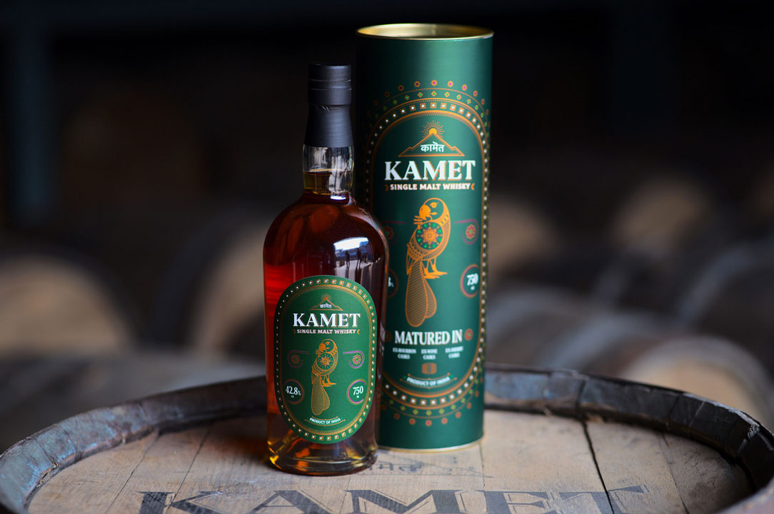
Kamet by Peak SpiritsWhisky Label
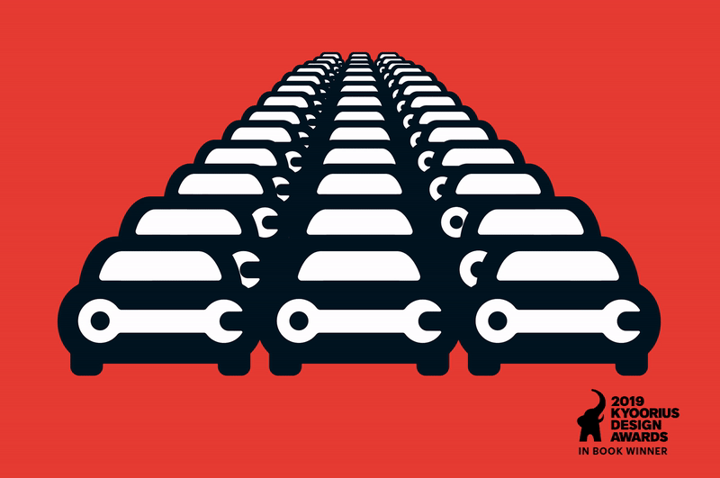
Go MechanicBranding a Multi-Brand Car Service Startup
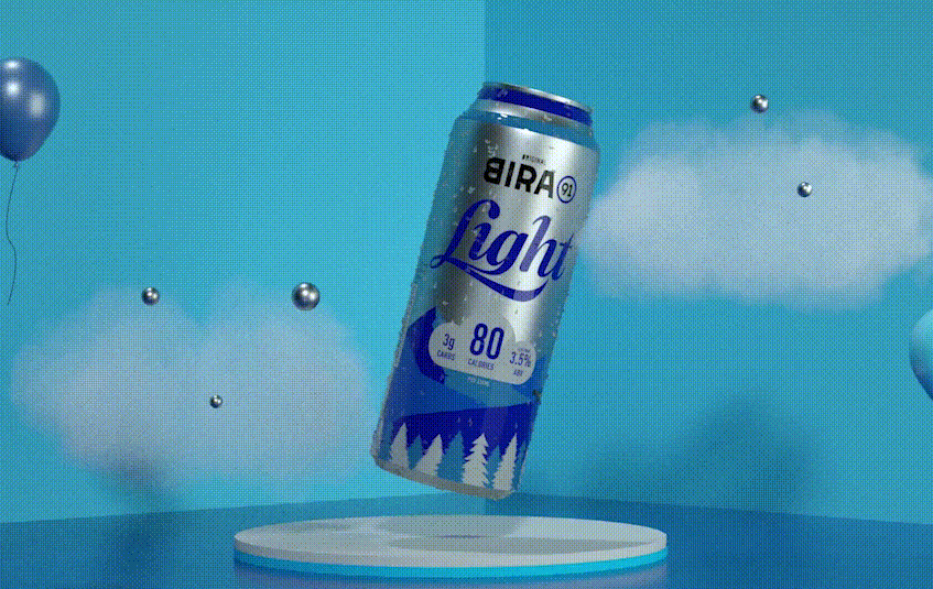
Bira 91 LightPackaging Refresh & Positioning

Bira 91 Sustainability ReportMission To Zero
BirthplaceBranding a Maternity Hospital
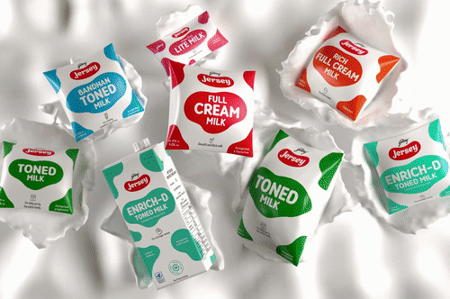
Godrej JerseyRevamping a Legacy Brand
Hyderabad FCRebranding a Football Club
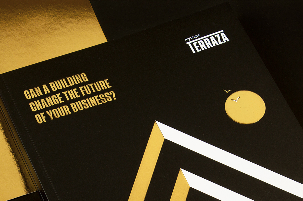
Myscape TerrazaCommercial Property Brochure
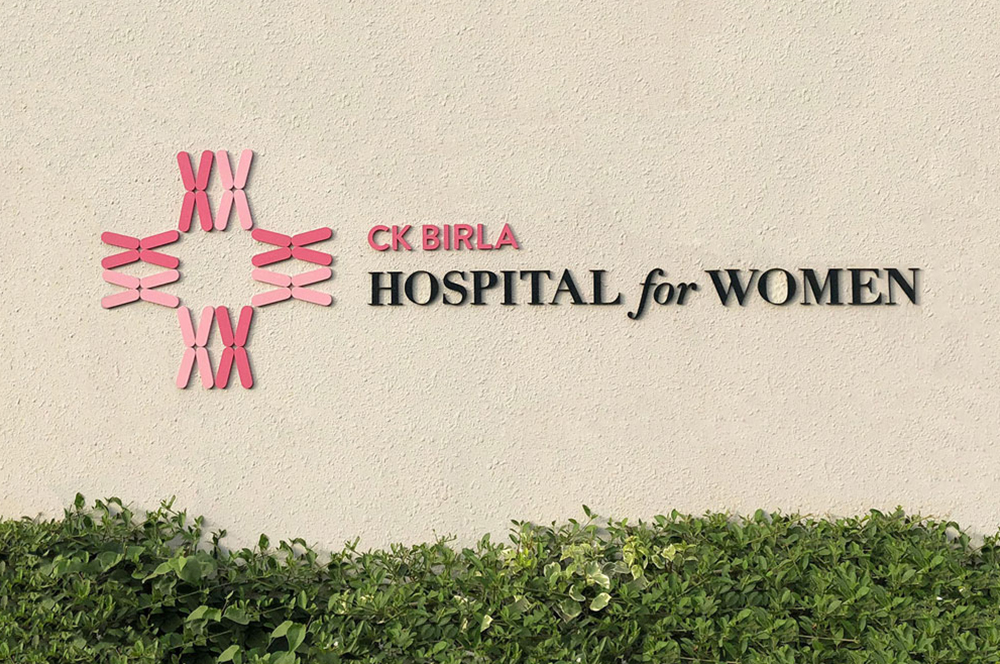
CK Birla GroupBranding a Women's Hospital
HousrDesigning for a Mega Co-living Brand
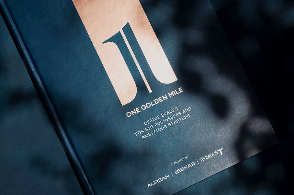
One Golden MileCommerical Brochure for Aurean| Eskar| Terminus
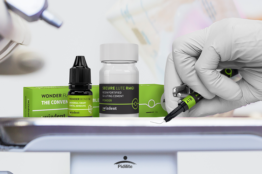
Wizdent by PidiliteIndia's Youngest Dental Consumables
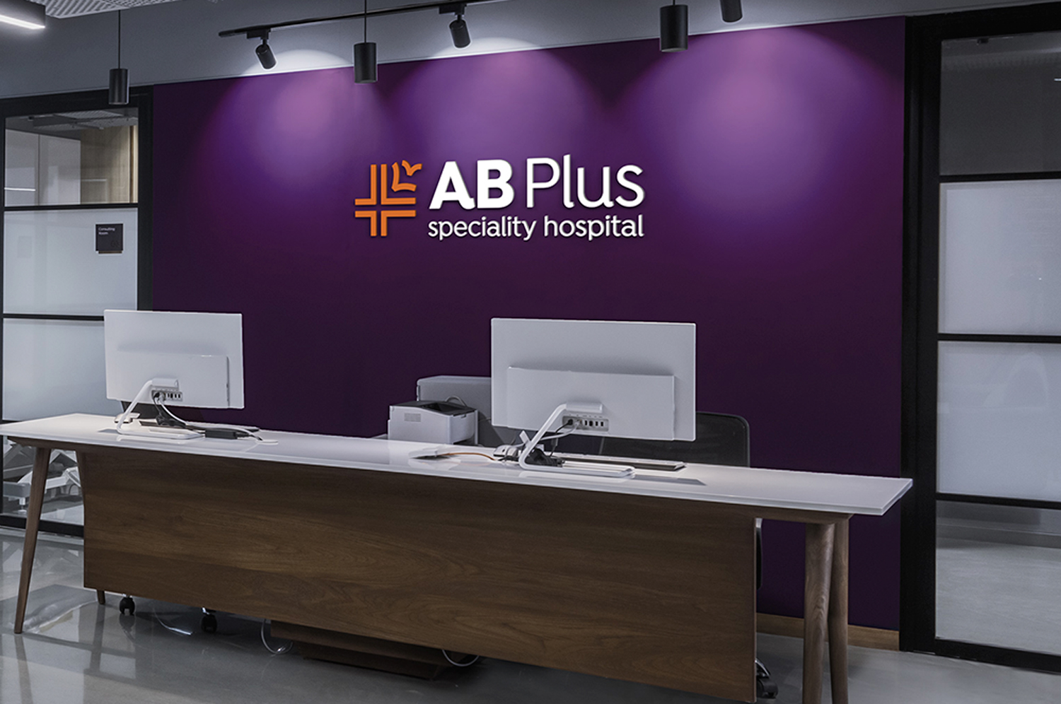
AB Plus Speciality HospitalBranding a boutique Hospital
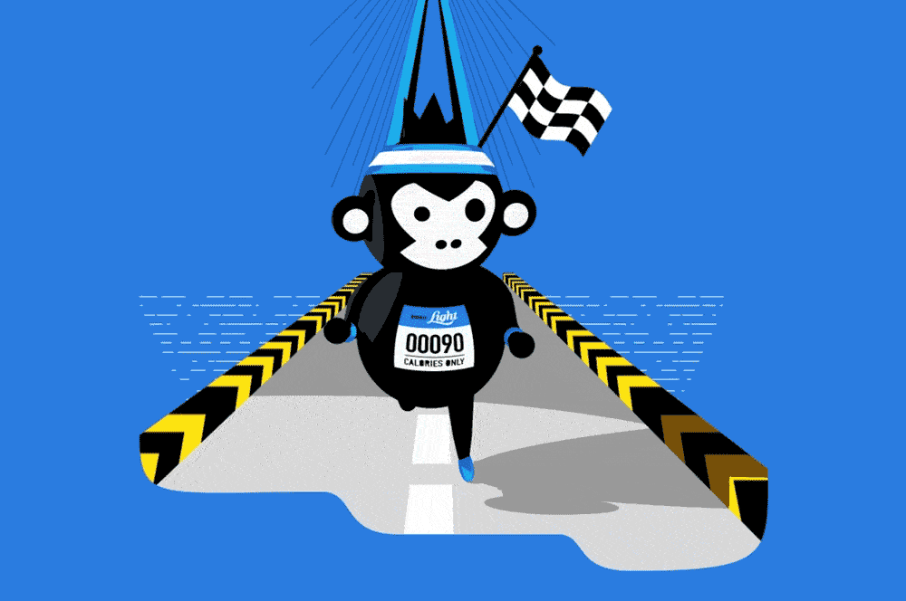
Bira 91 LightAssociating Beer with Fitness
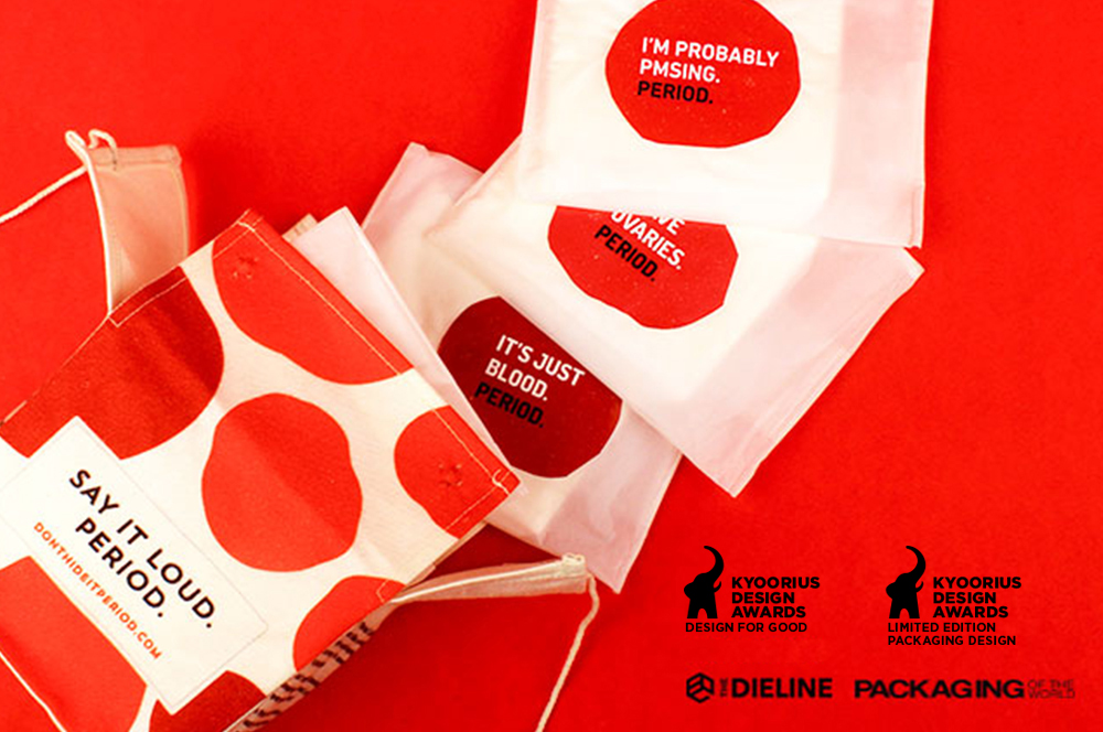
Don't Hide it. PeriodSanitary Pad Packaging
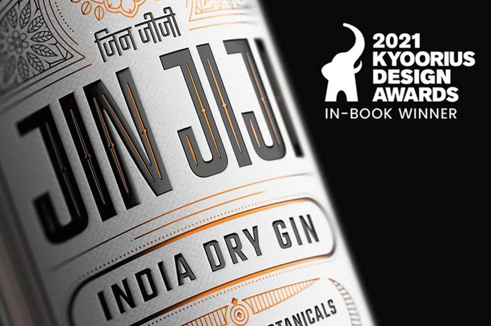
Jin JijiPackaging Indian Gin
AinqaHumanising data
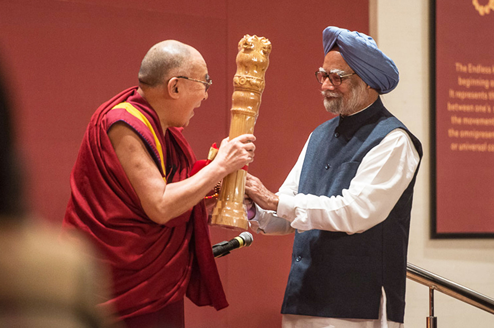
The Dalai LamaCelebrating His Holiness
Bhagirathi Neotia HospitalEnvironmental Graphics
Max Estates, DehradunResidential Property Brochure & Communications
MajjaBranding a Chain of QSR in Ahmedabad

QuaQuaBranding a Virtual Travel Platform
Kalpataru VistaResidential Property Brochure & Communications
Myscape LoftResidential Property Brochure
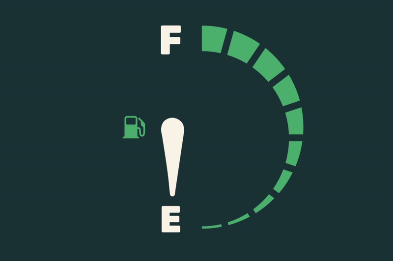
Fuel BuddyBranding India's First Fuel Delivery Platform
BirlasoftRebranding a Global IT Service Provider
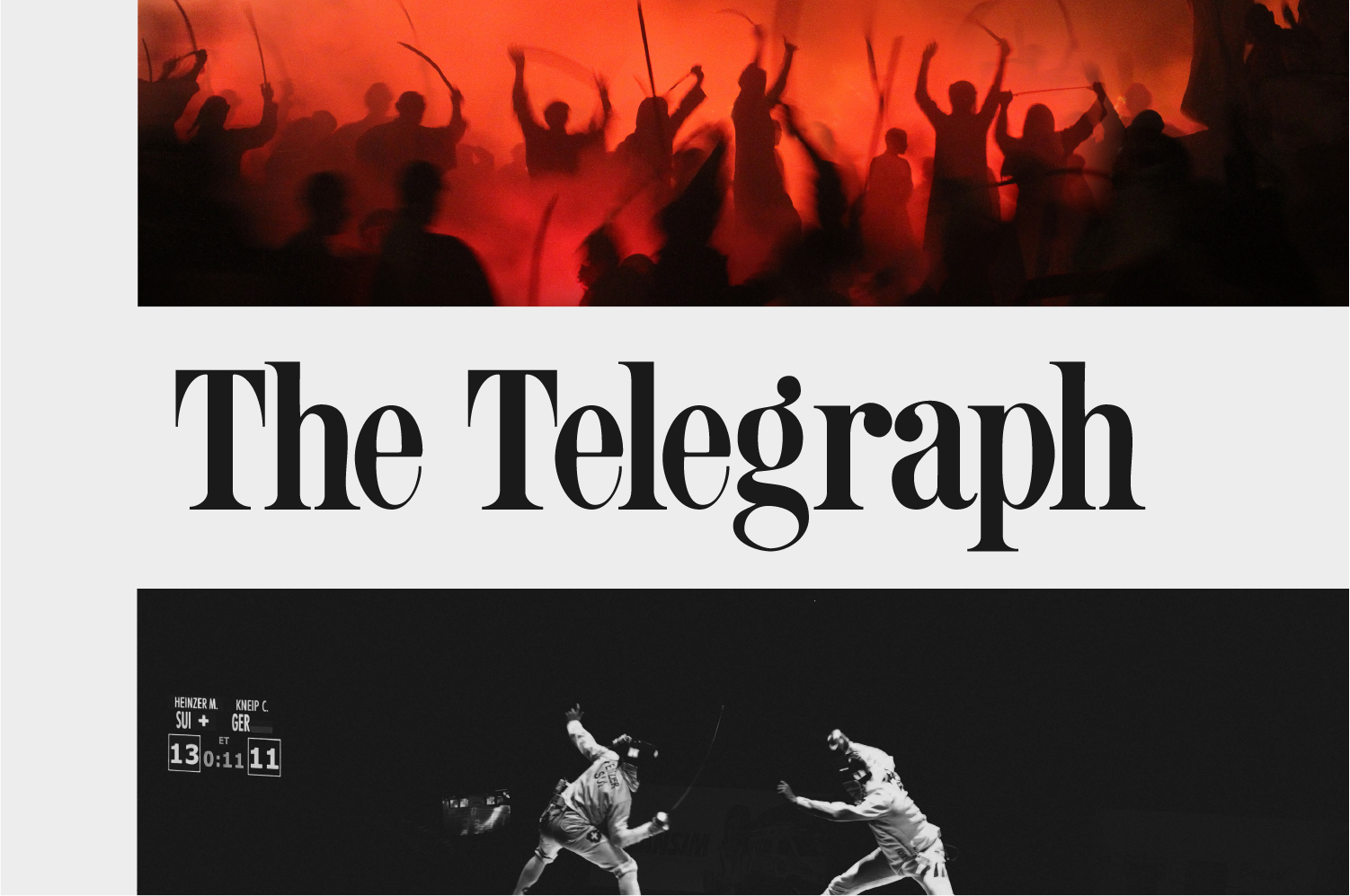
The Telegraph OnlineDesign Language
Danone EcosystemWomen Empowerment Brochure
Central Square FoundationDesign for Non-Designers
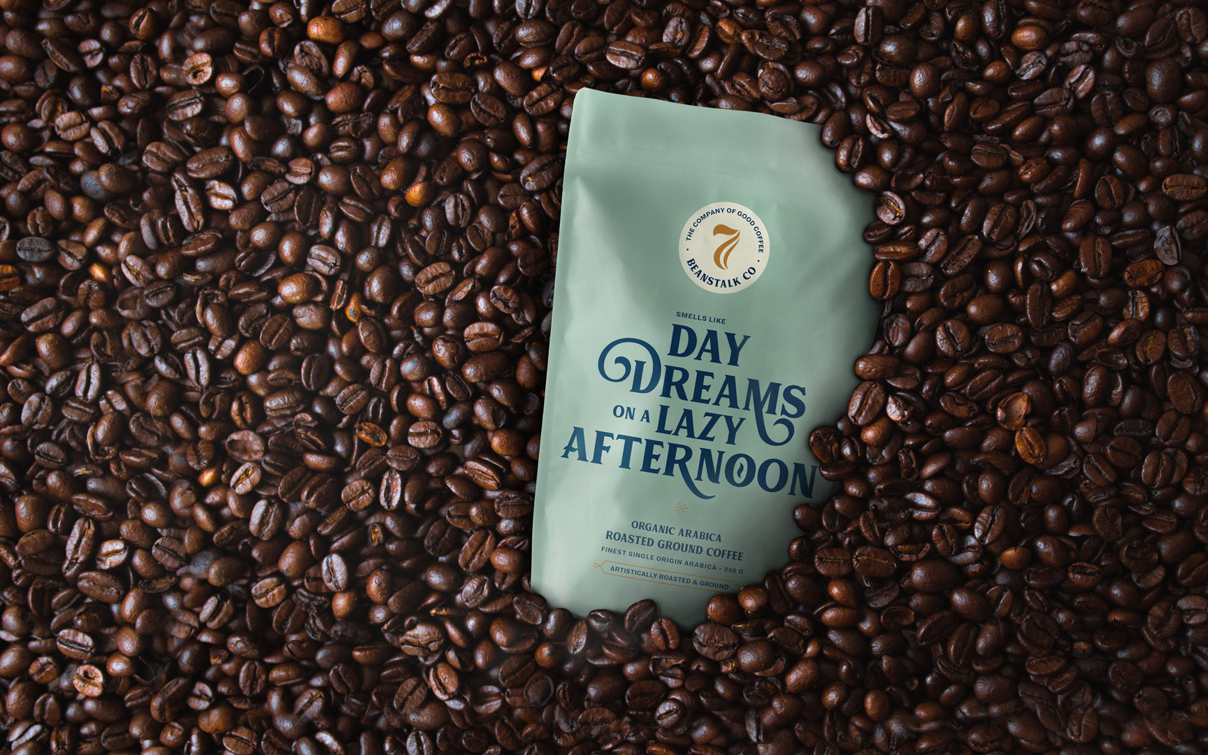
Seven BeanstalkCoffee Packaging

SlingshotDesigning for an Ed-tech Brand

CareCoverBranding a Pre-approved Medical Loan Card
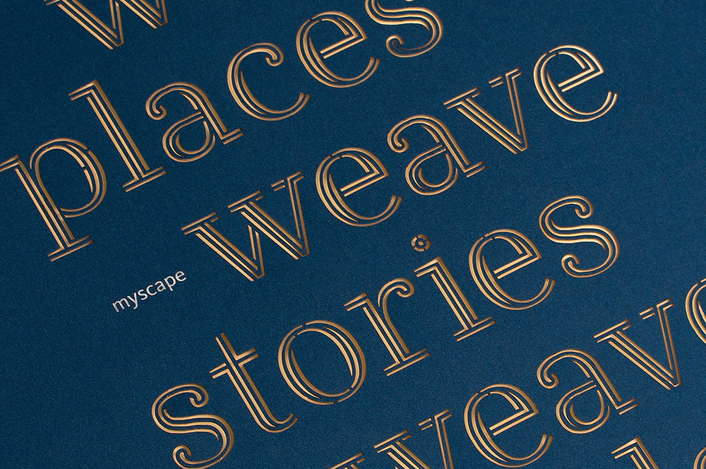
Myscape WeaveCommercial Property Brochure
NumberzBranding a Fintech Startup
SunshineBranding a Multi Speciality Hospital
The Tooth CompanyBranding a Dental Clinic

MedicsBranding Lucknow's Super Speciality Hospital
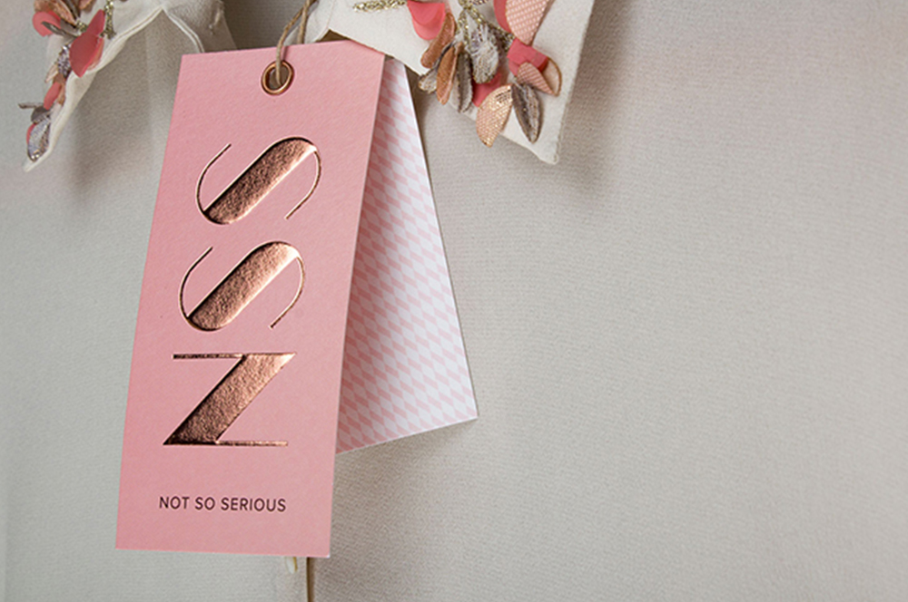
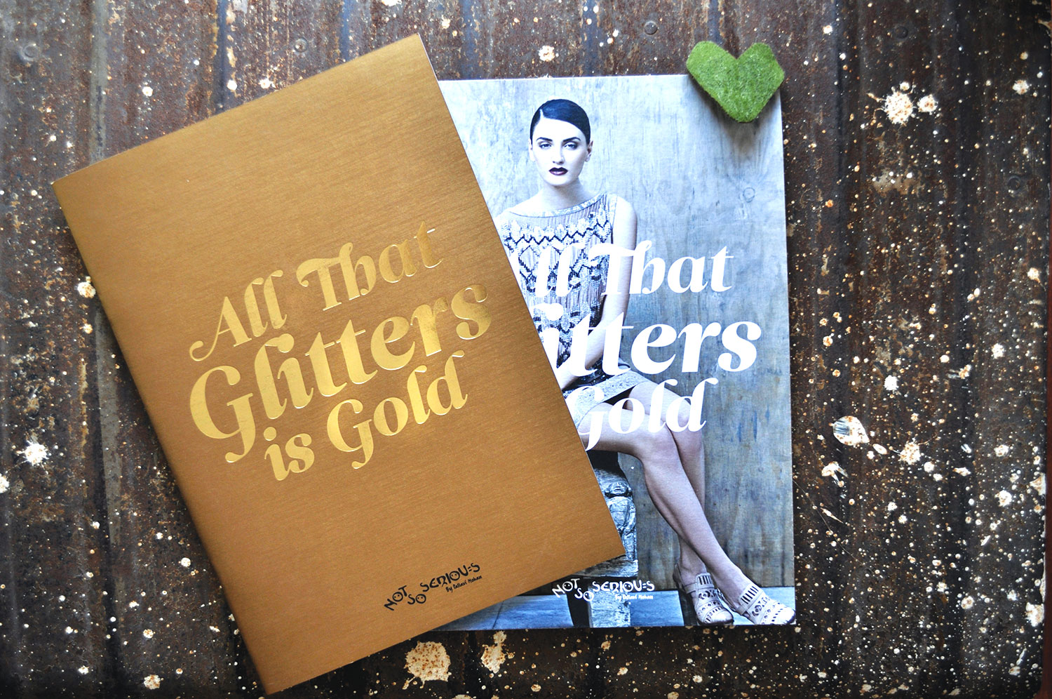
Not So SeriousRebranding a Luxury fashion label
OlivaRebranding a Chain of Medico Aesthetic Clinics
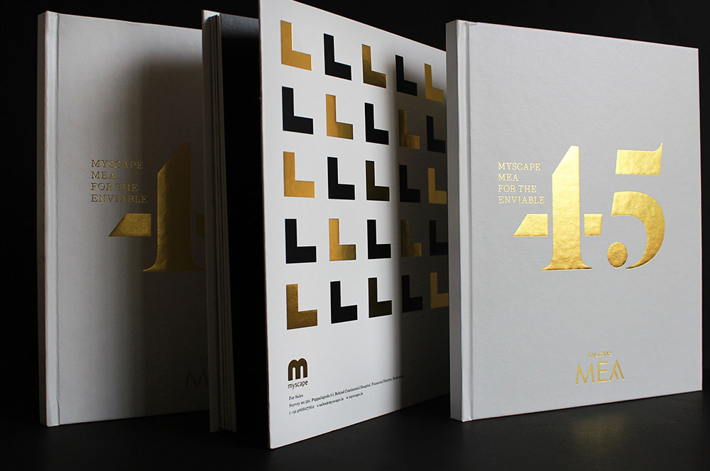
Myscape MeaResidential Property Brochure
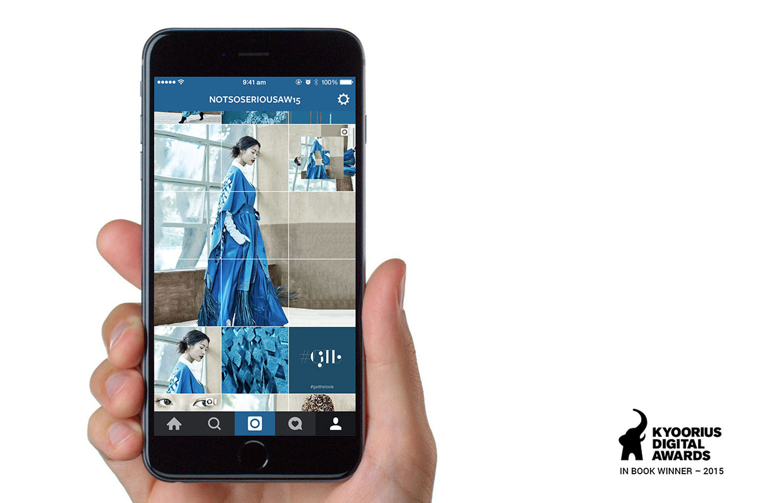
Not So SeriousAn Instagram Lookbook
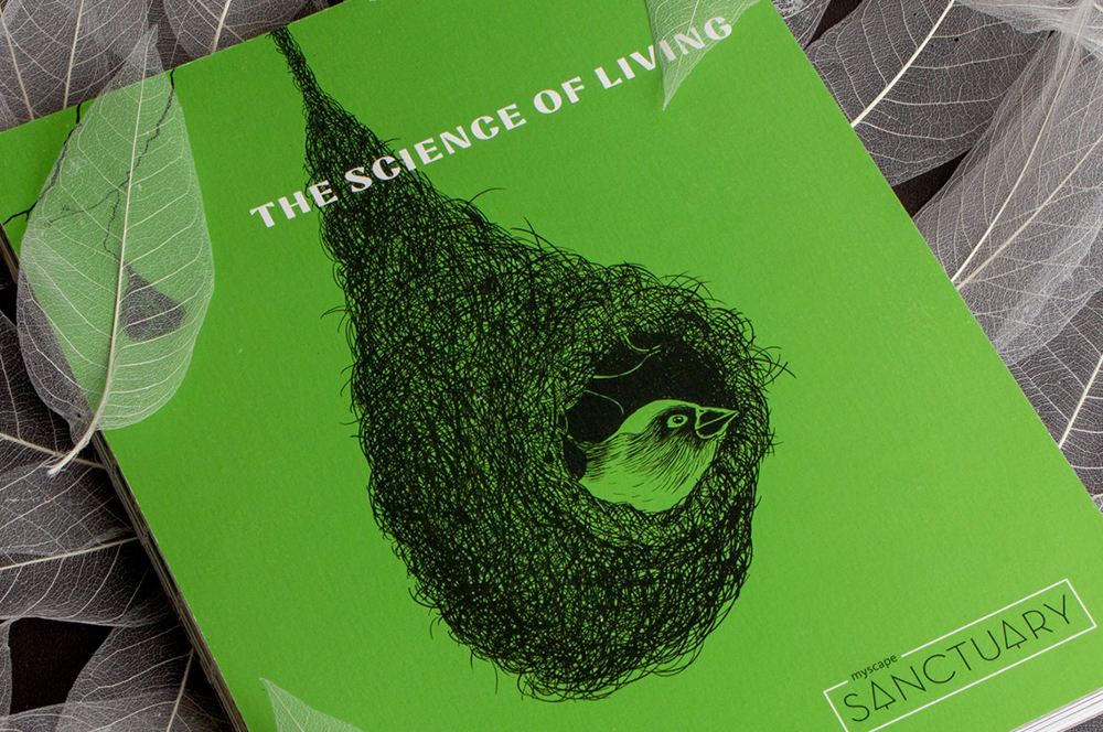
Myscape SanctuaryResidential Property Brochure & Communications
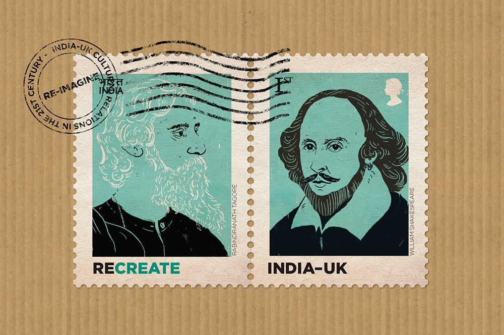
British CouncilIndia-UK relationship
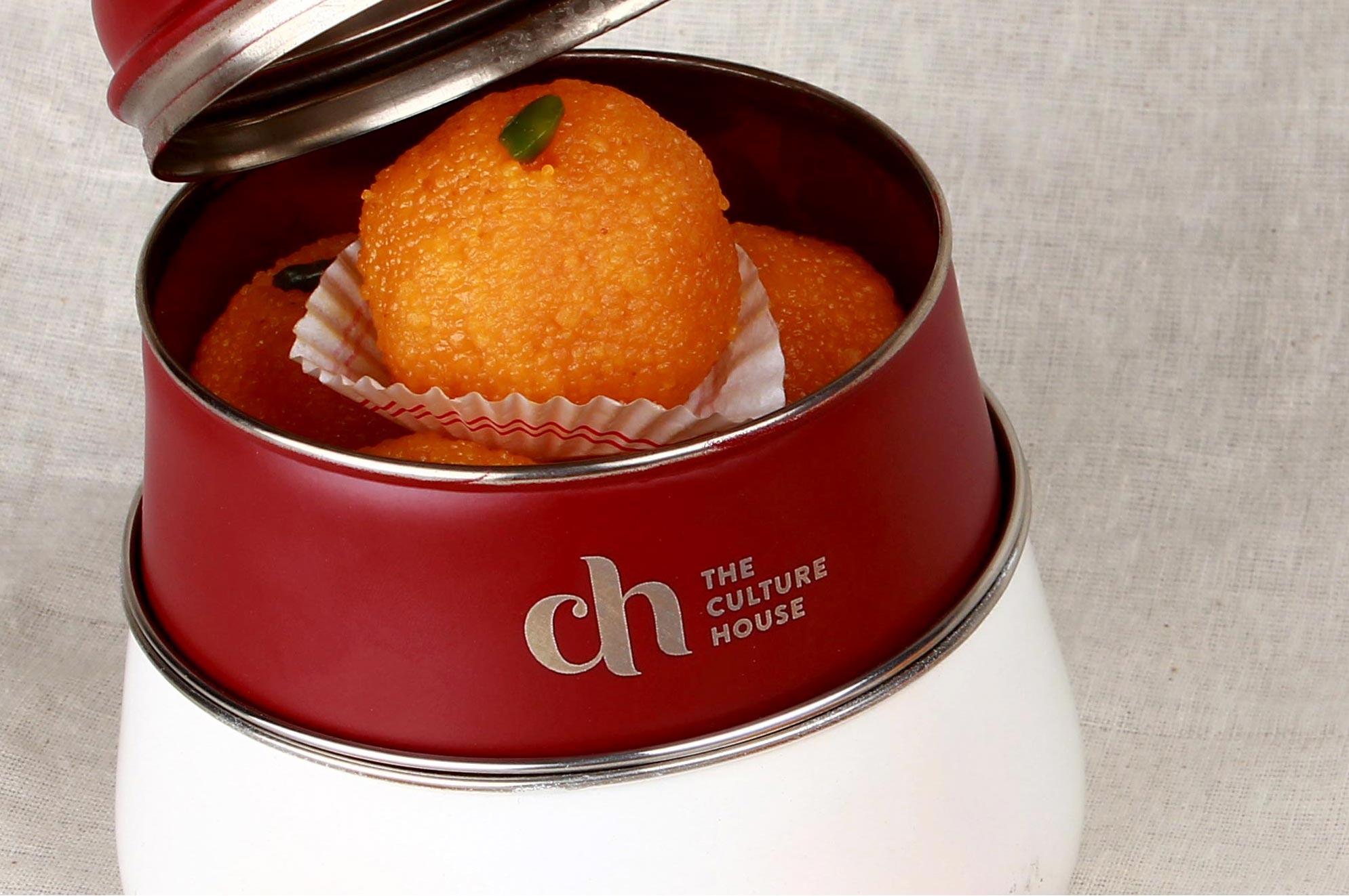
The Culture HouseRestaurant Branding
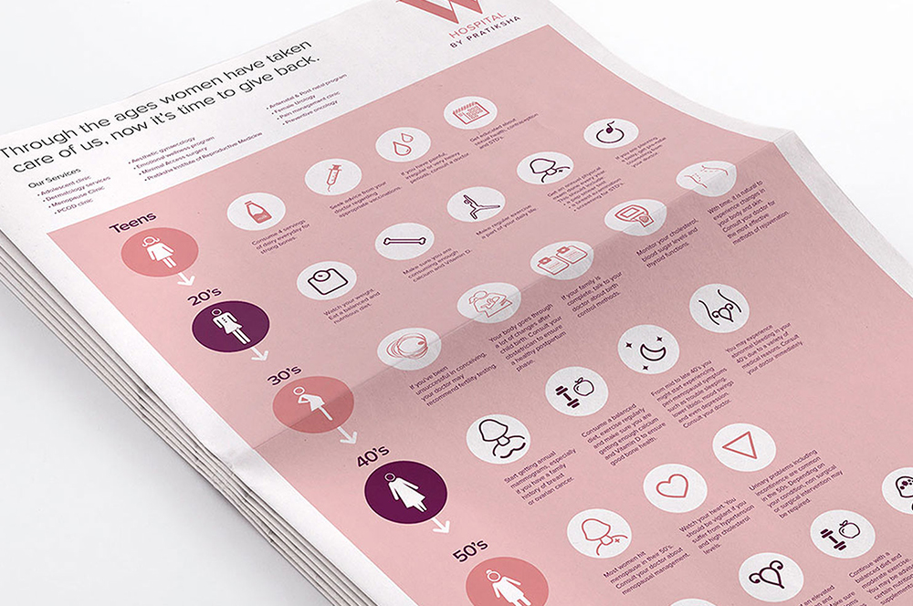
PratikshaBrand India’s Largest Hospital for Women
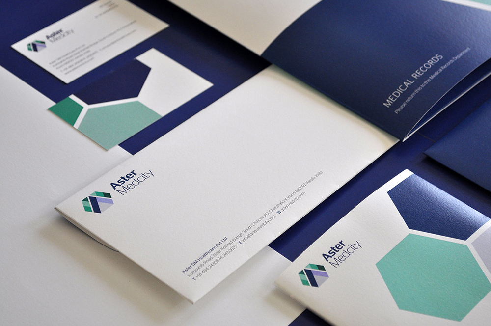
Aster MedcityBranding a Healthcare Destination
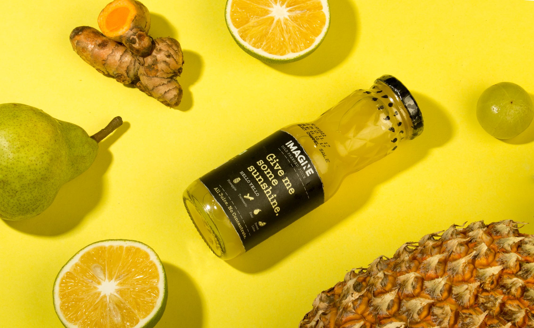
ImagineCold Pressed Juice Packaging
Nishada by My HomeResidential Property Brochure

TummyfullBranding a Homemade Food Tech Venture
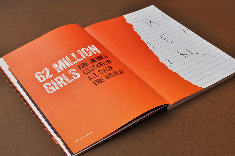
Central Square FoundationAnnual Report
MedisyncBranding a B2B knowledge delivery platform
Intuit IndiaWhitepaper Design
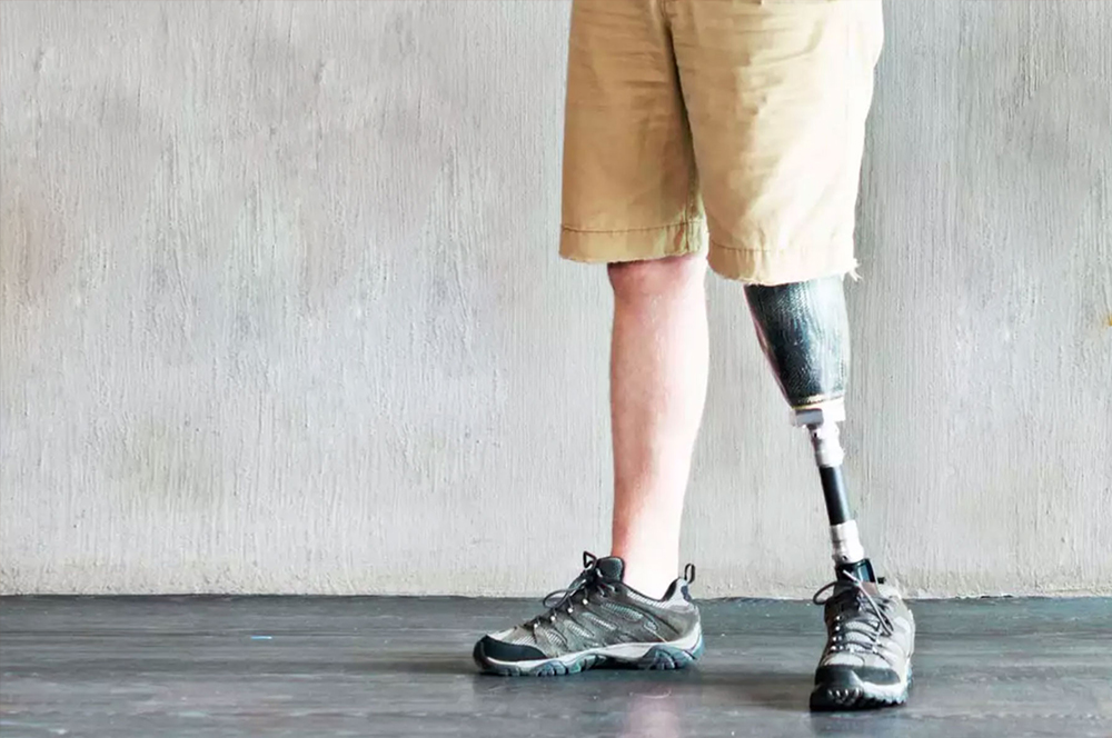
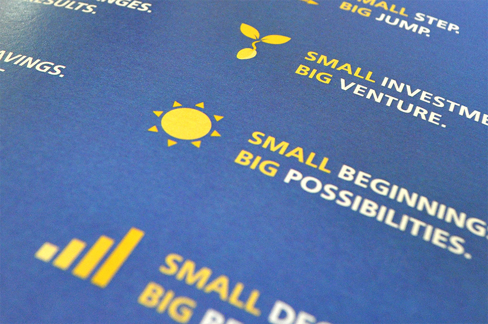
CPOBranding a Chain of Prosthetic Clinics
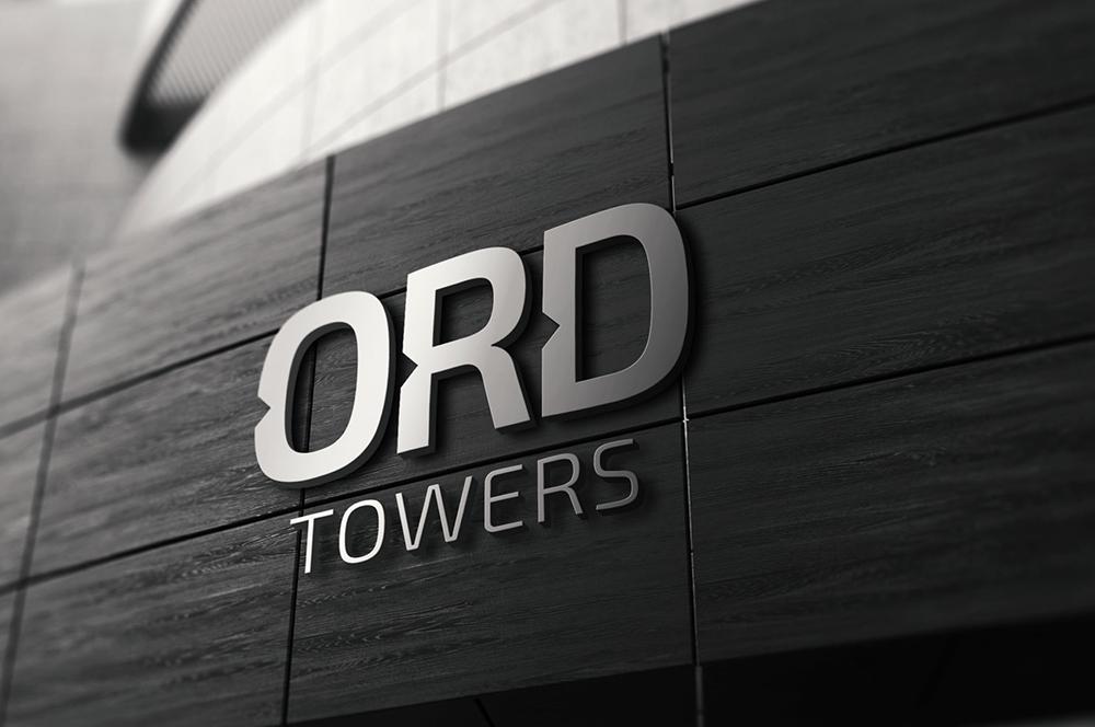
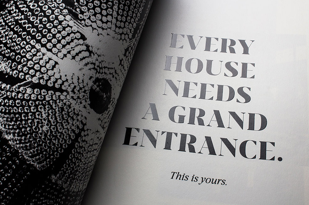
ORDReal Estate Branding
Myscape Isle of SkyResidential Property Brochure
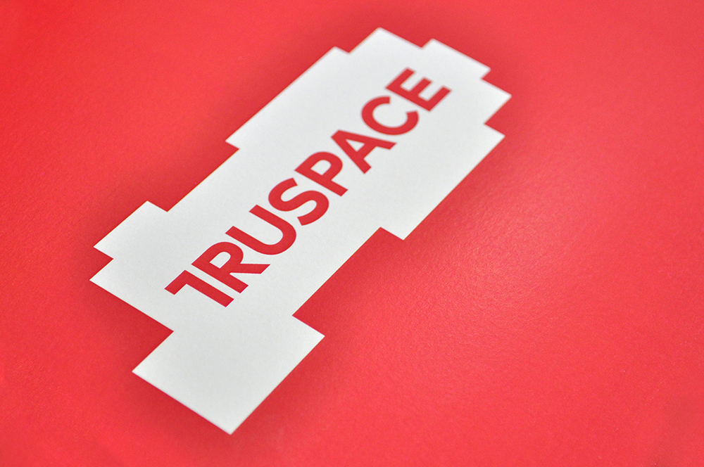
TruSpaceDynamic Real Estate Branding
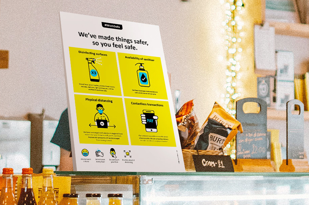
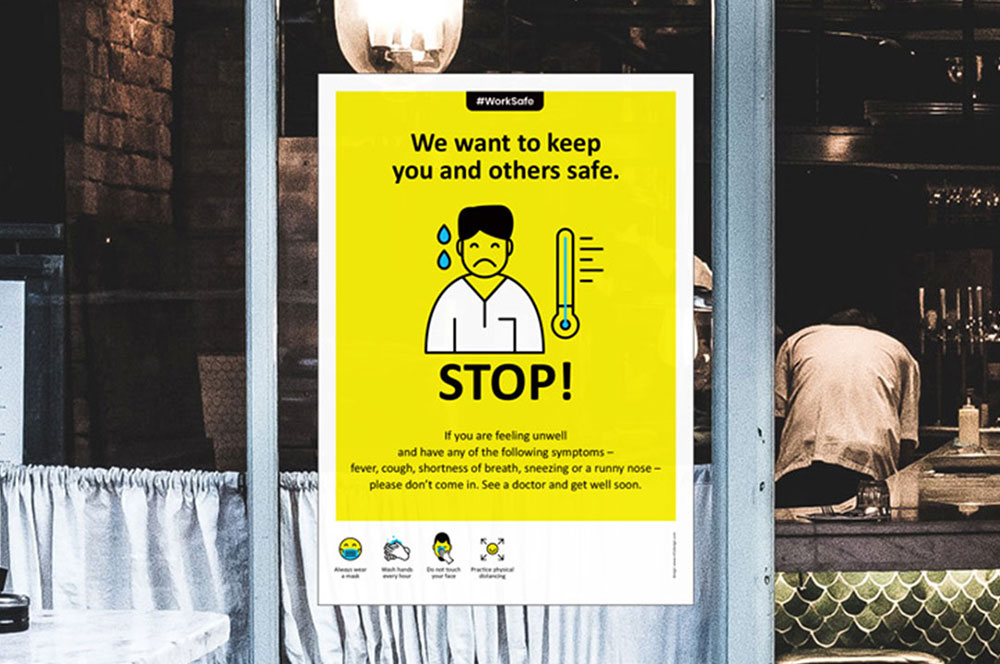
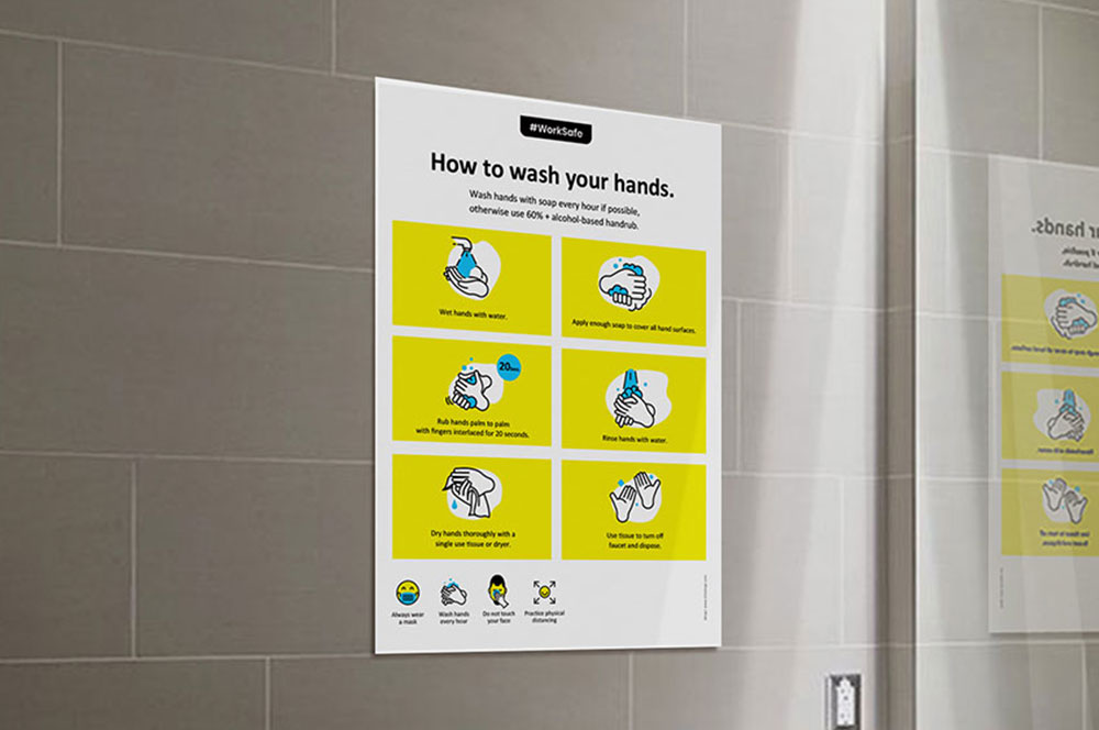
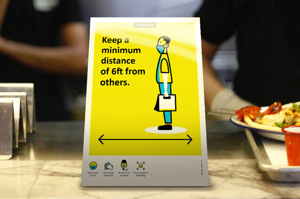
Work Safe Covid19 PostersSelf Initiated Project
Come & Go SafelyWork Safe Posters
Community SafetyWork Safe Posters
Individual SafetyWork Safe Posters
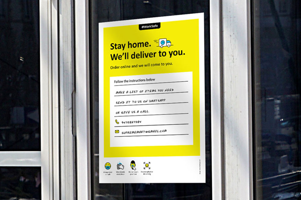
Business & Customer SafetyWork Safe Posters

StudentaccoBranding a Student Accommodation Portal
ShrachiDesigning a Notebook Brand for India
SWOTNotebook Cover Design
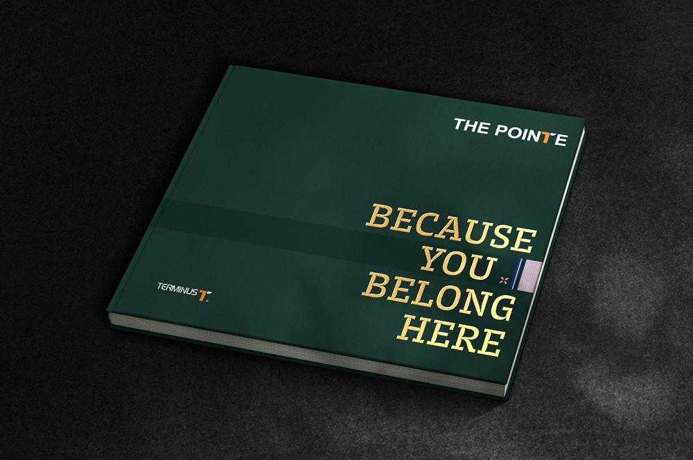
The Pointe by TerminusResidential Property Brochure
Asian BariatricsBranding a Bariatric Hospital
Not So SeriousFashion Lookbook
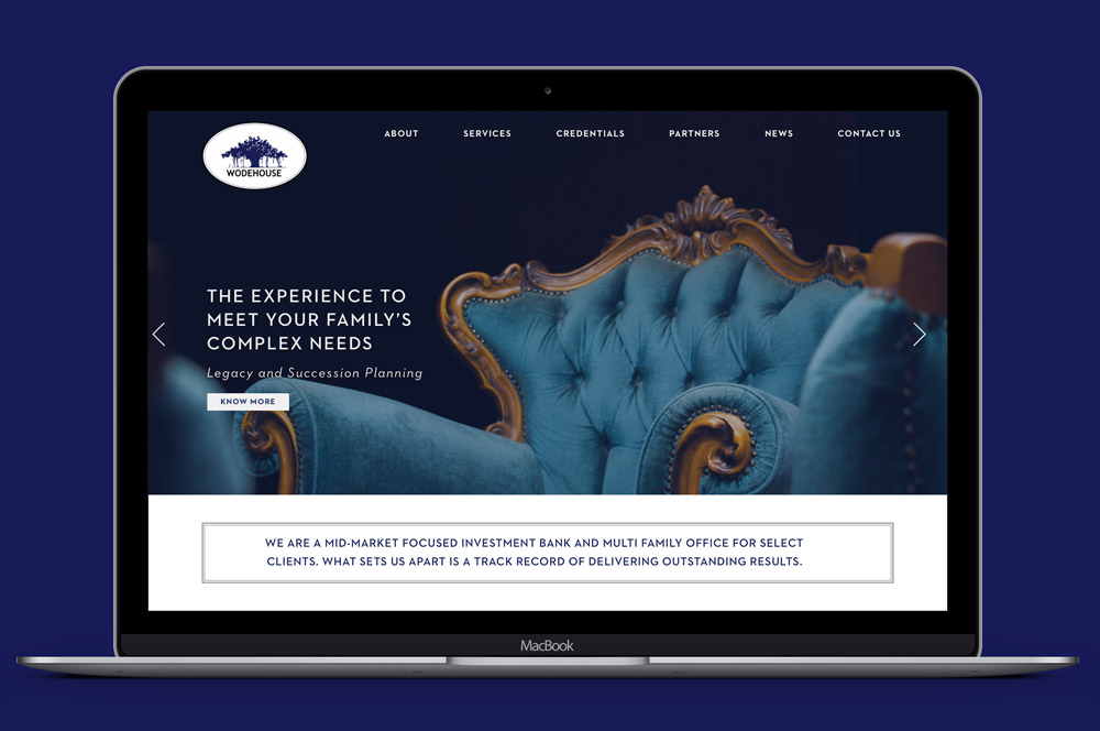
Wodehouse CapitalWebsite Design
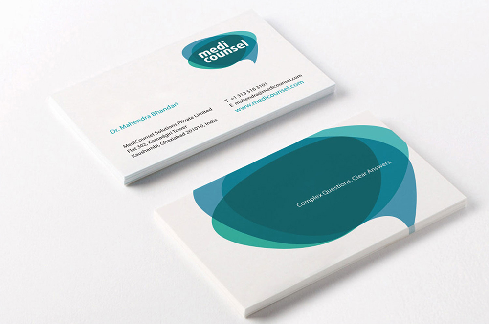
MediCounselBranding a Medical Portal
Subscribe to our Newsletter
Subscribe to our Newsletter
Subscribe to our Newsletter