
Question
How do you amalgamate a 30-year old dairy brand into a larger family and make it even more relevant?
Answer
By staying true to its heritage and making it more appealing to today’s generation.
Question
How do you amalgamate a 30-year old dairy brand into a larger family and make it even more relevant?
Answer
By staying true to its heritage and making it more appealing to today’s generation.
Question
How do you amalgamate a 30-year old dairy brand into a larger family and make it even more relevant?
Answer
By staying true to its heritage and making it more appealing to today’s generation.
Question
How do you amalgamate a 30-year old dairy brand into a larger family and make it even more relevant?
Answer
By staying true to its heritage and making it more appealing to today’s generation.
Question
How do you amalgamate a 30-year old dairy brand into a larger family and make it even more relevant?
Answer
By staying true to its heritage and making it more appealing to today’s generation.
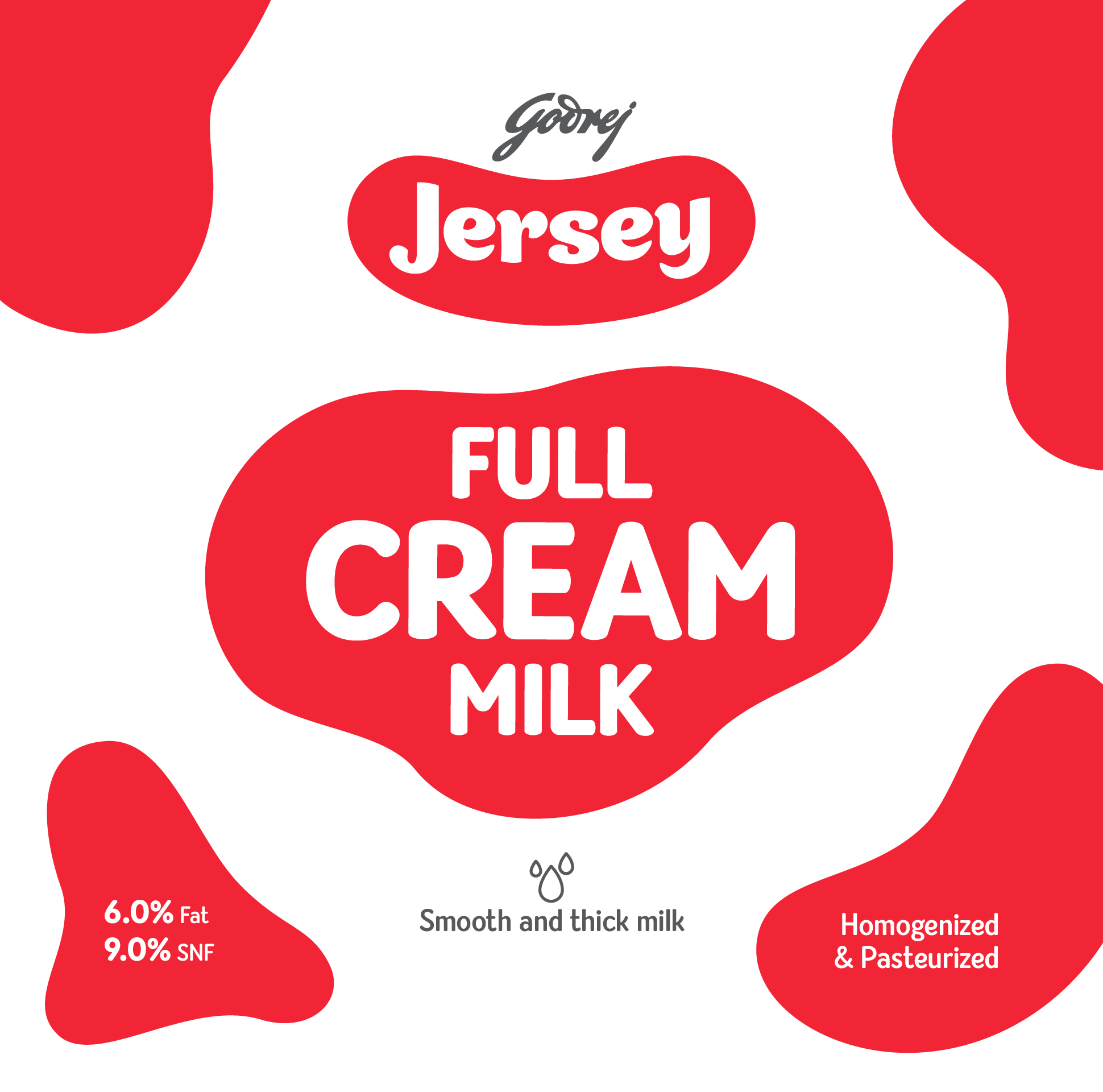
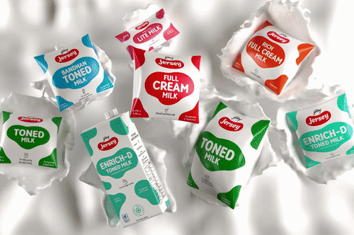
Godrej Jersey
Godrej Jersey
Godrej Jersey
Godrej Jersey
Godrej Jersey
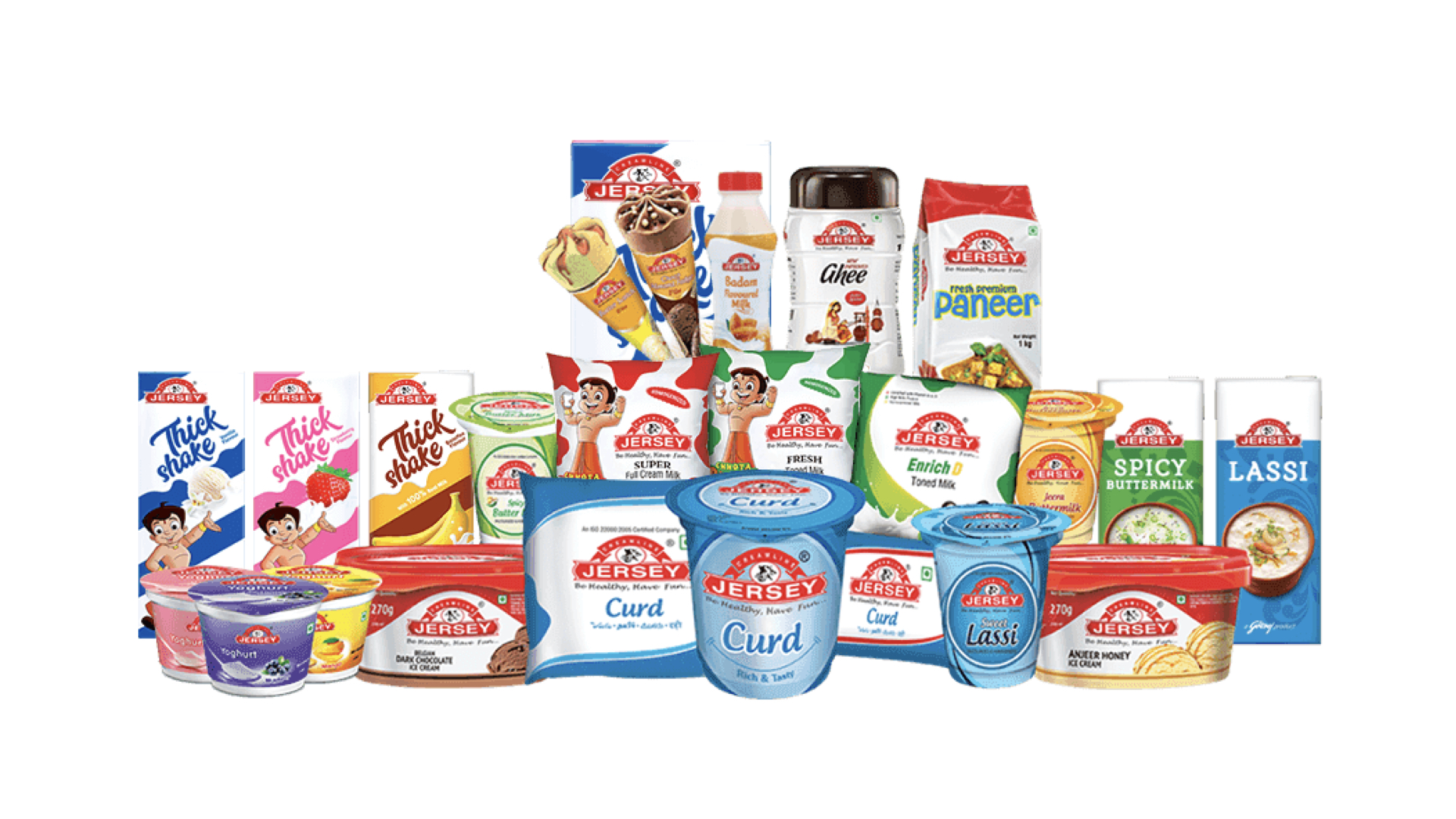
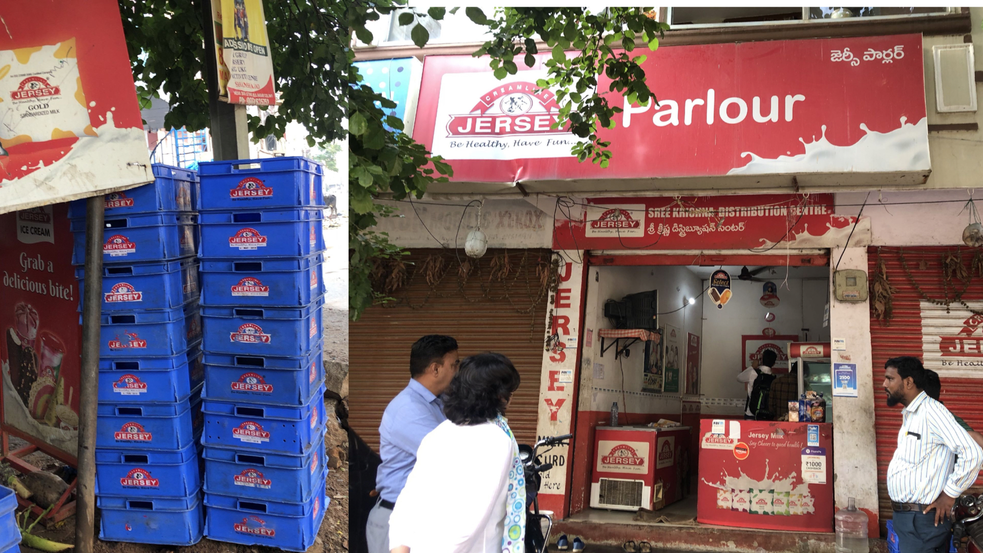
Creamline Dairy Products Limited (CDPL) is a leading private dairy player in Southern India with its operations spanning Telangana, Andhra Pradesh, Tamil Nadu, Karnataka, and Nagpur in Maharashtra. Its products have been sold under the brand name `Jersey’. Since its inception in 1986, the company has been growing consistently and adding various products to its diversified dairy portfolio.
With the evolution of the brand in mind and its recent association with the iconic brand Godrej, NH1 Design helped Jersey forge a new and improved brand identity and packaging system. The new design language stays true to the brand’s decades-strong legacy while incorporating the promise of trust and good quality personified for over a century by Godrej.
SERVICES REBRANDING | PACKAGING
CLIENT GODREJ
SECTOR FMCG
Brand Challenges
Brand Challenges
Brand Challenges
Brand Challenges
Brand Challenges
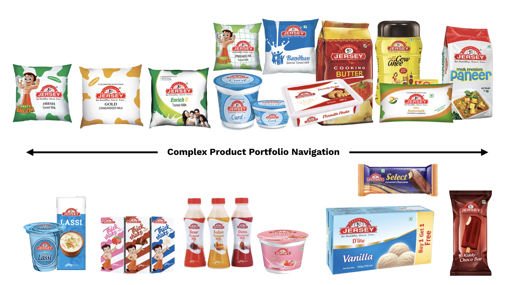
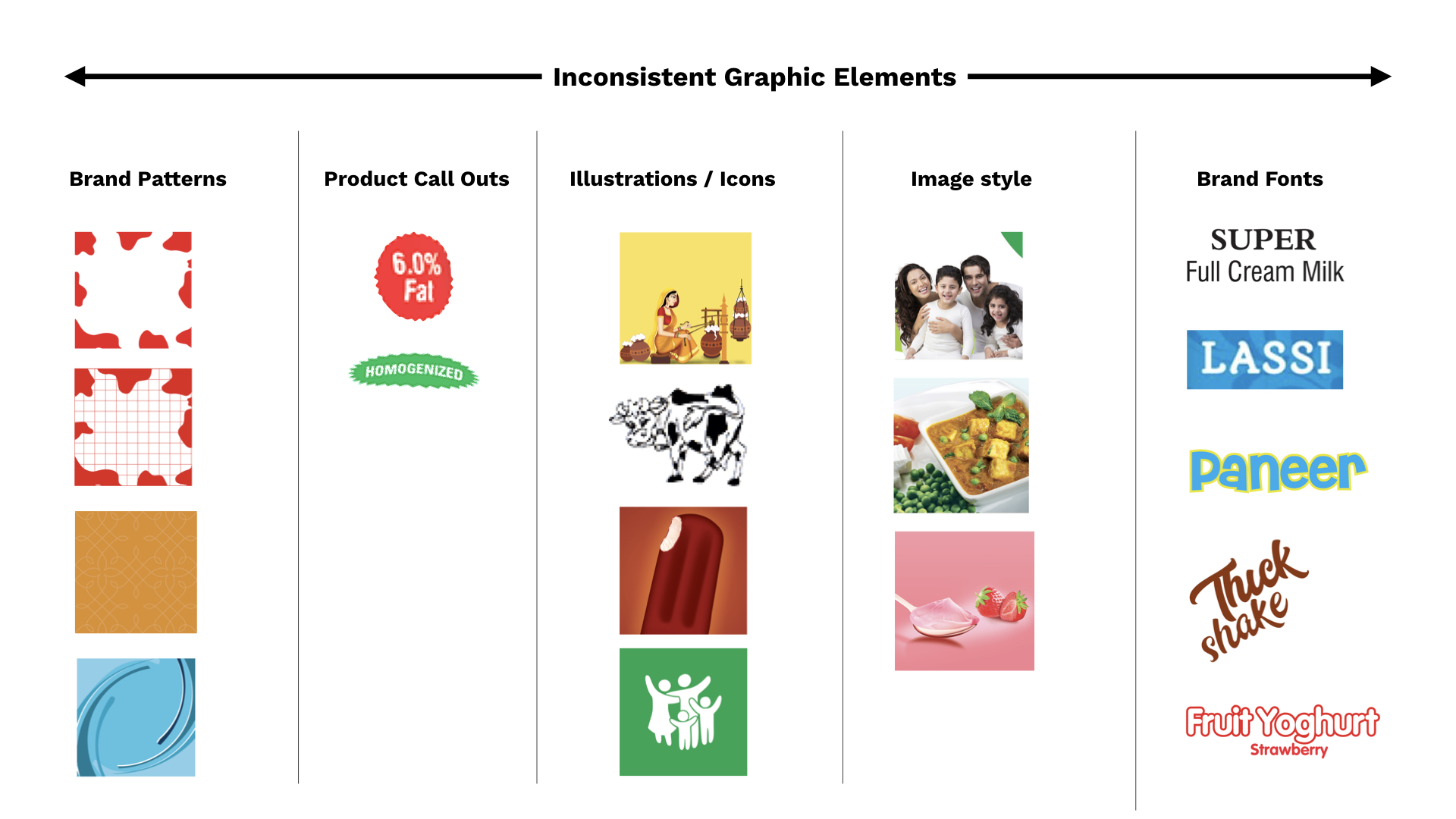
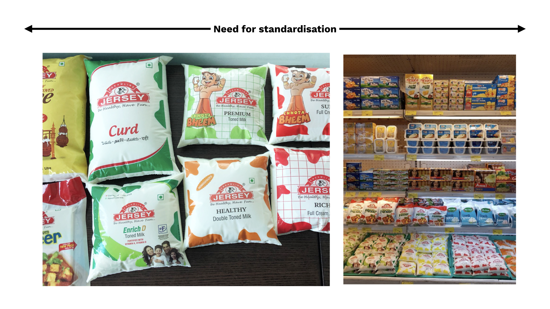
The current portfolio lacked a coherent design theme.
Consumer brand association with a legacy of over 25 years needed strengthening.
Jersey looked dated as all major dairy players had rebranded to stay relevant.
The Godrej brand association hadn’t yet been communicated strongly and could be leveraged much more.
Before
Before
Before
Before
Before
After
After
After
After
After
Brand Identity Evolution.
Brand Identity Evolution.
Brand Identity Evolution.
Brand Identity Evolution.
Brand Identity Evolution.
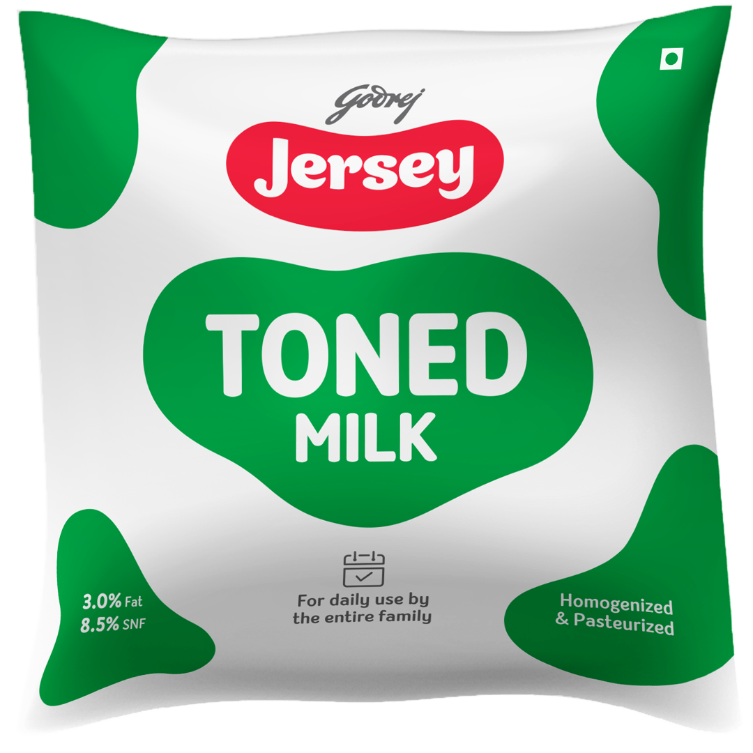
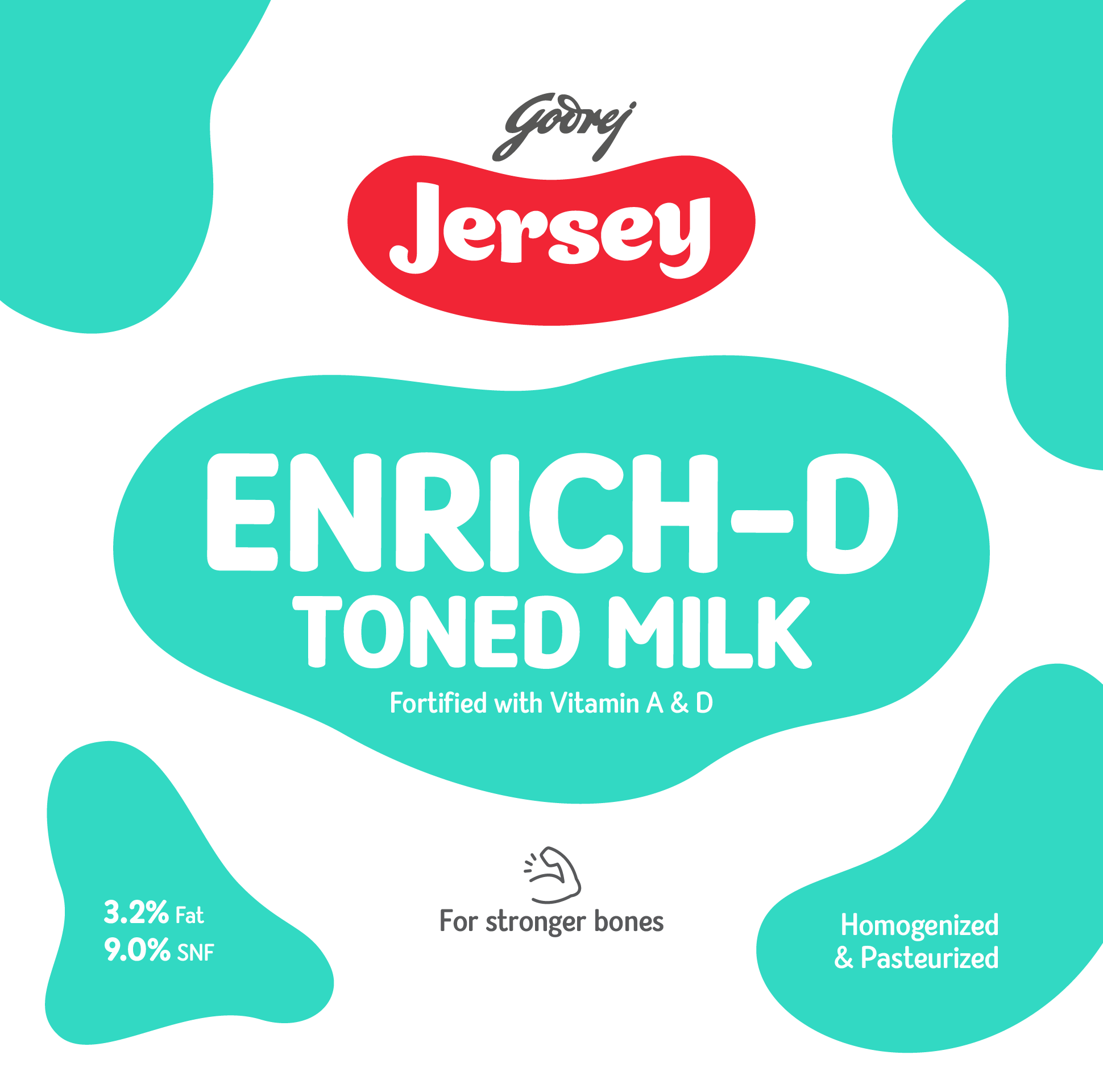
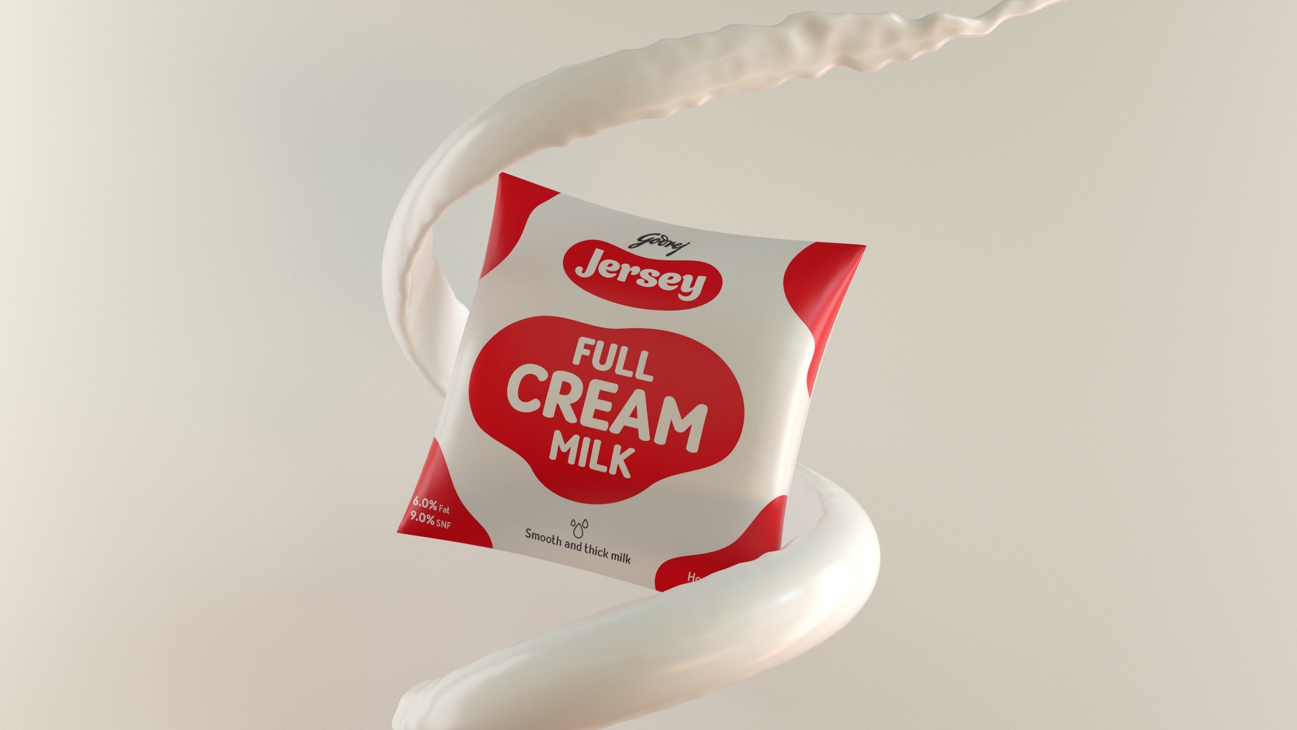
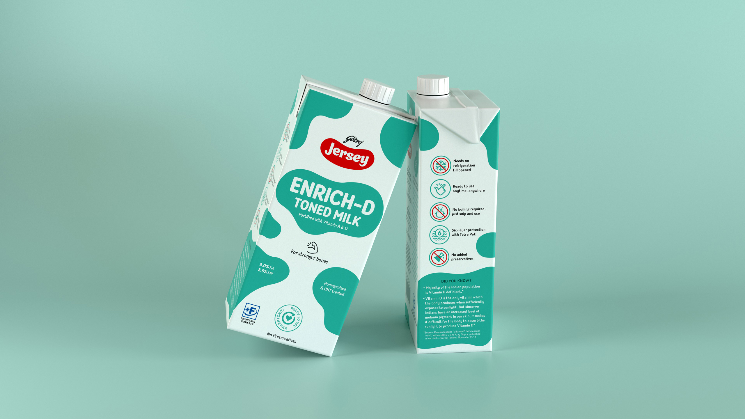
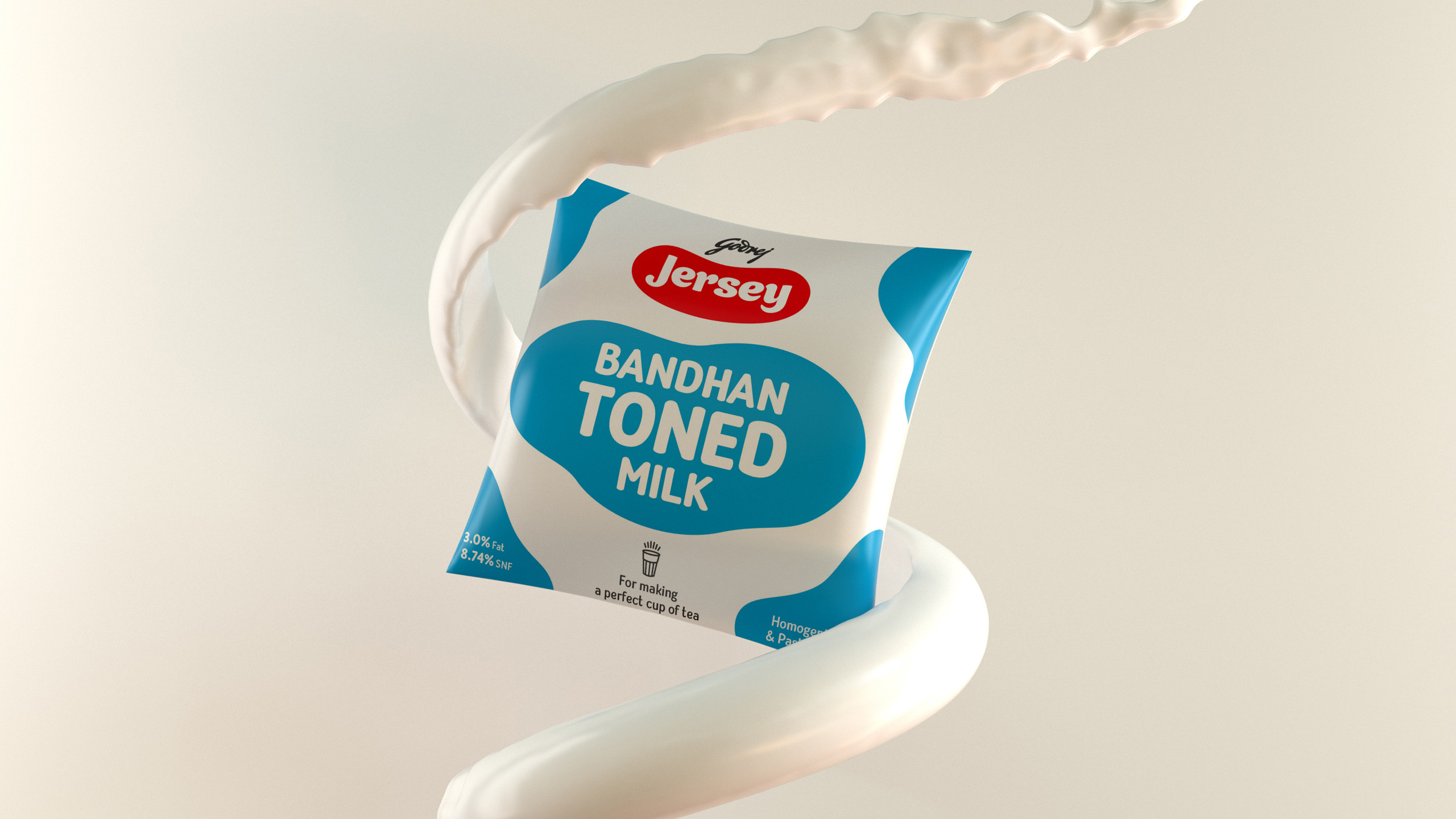
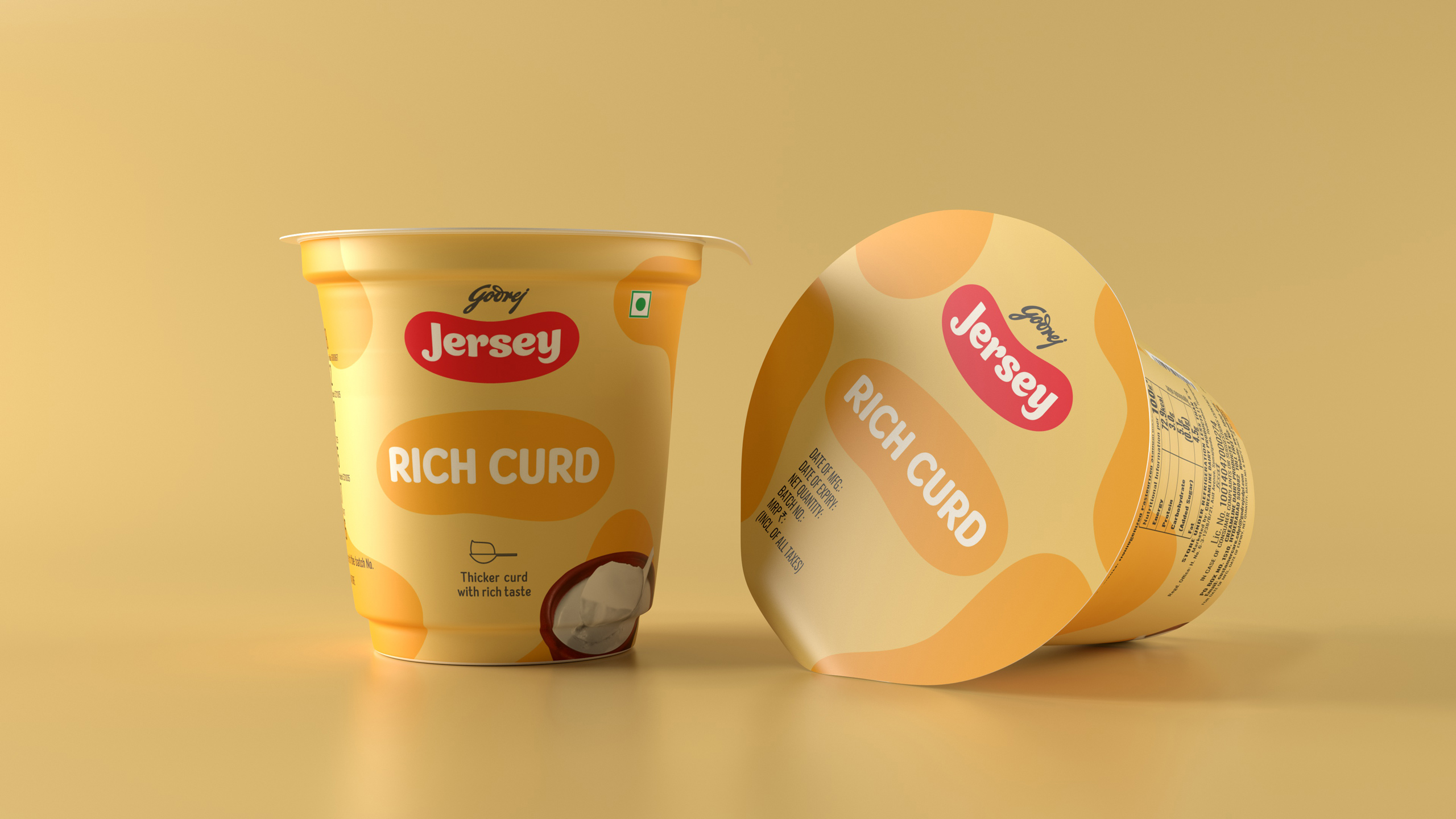
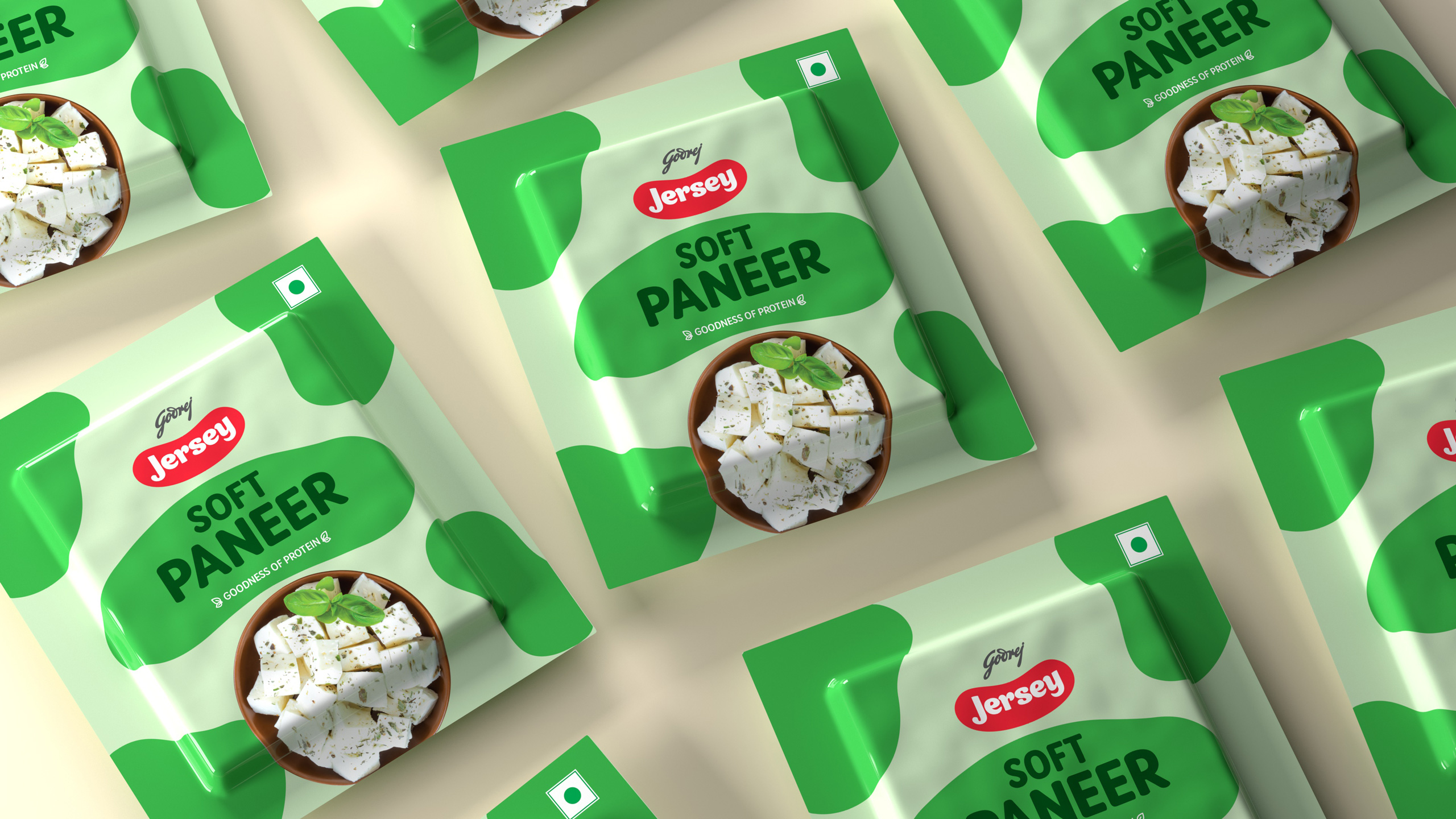
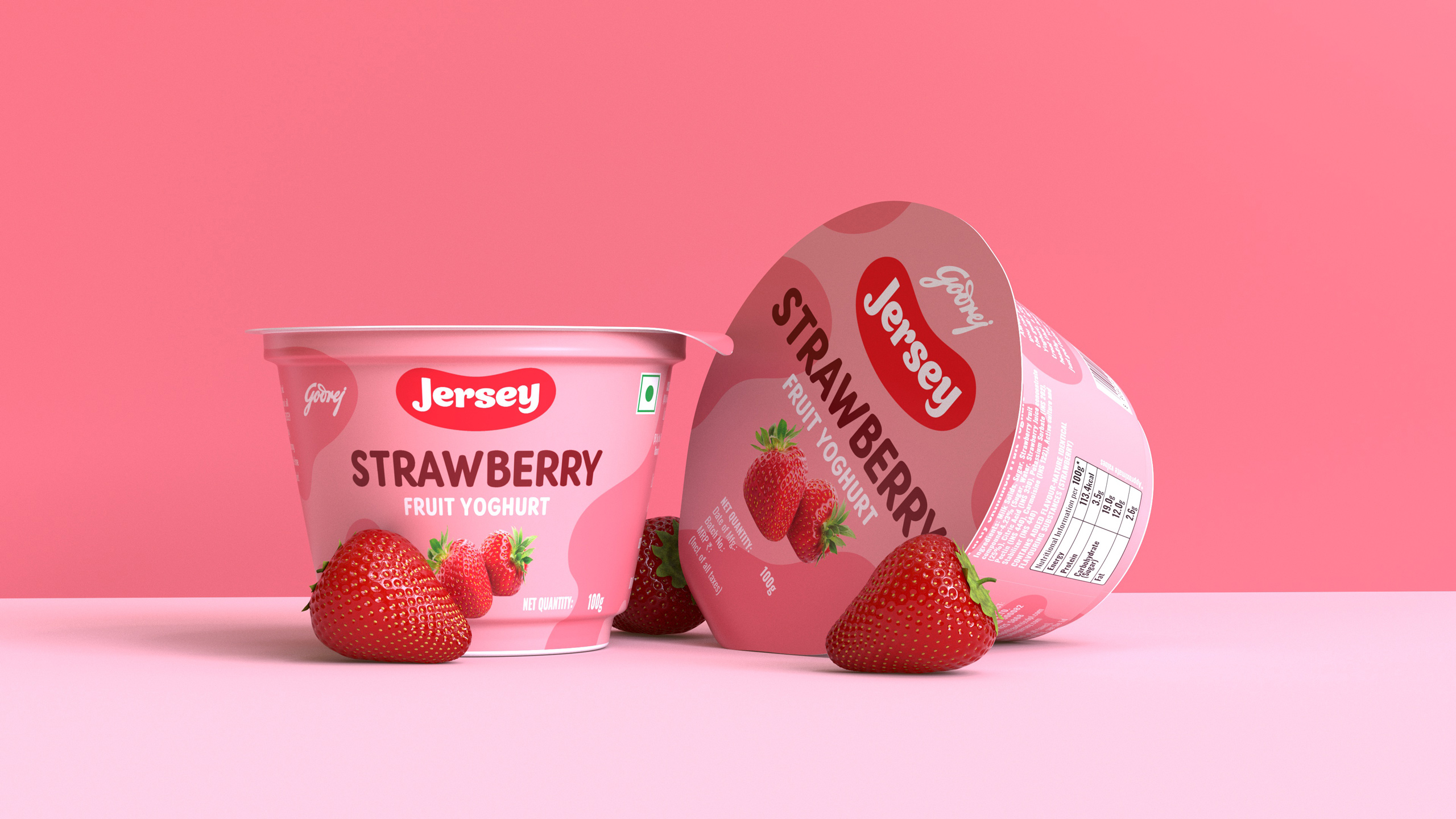
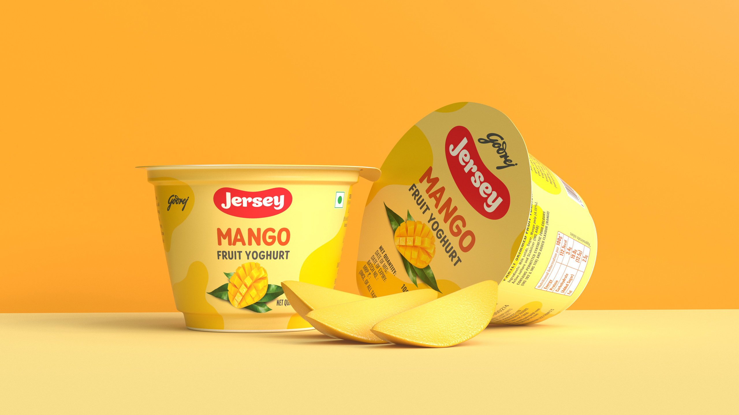
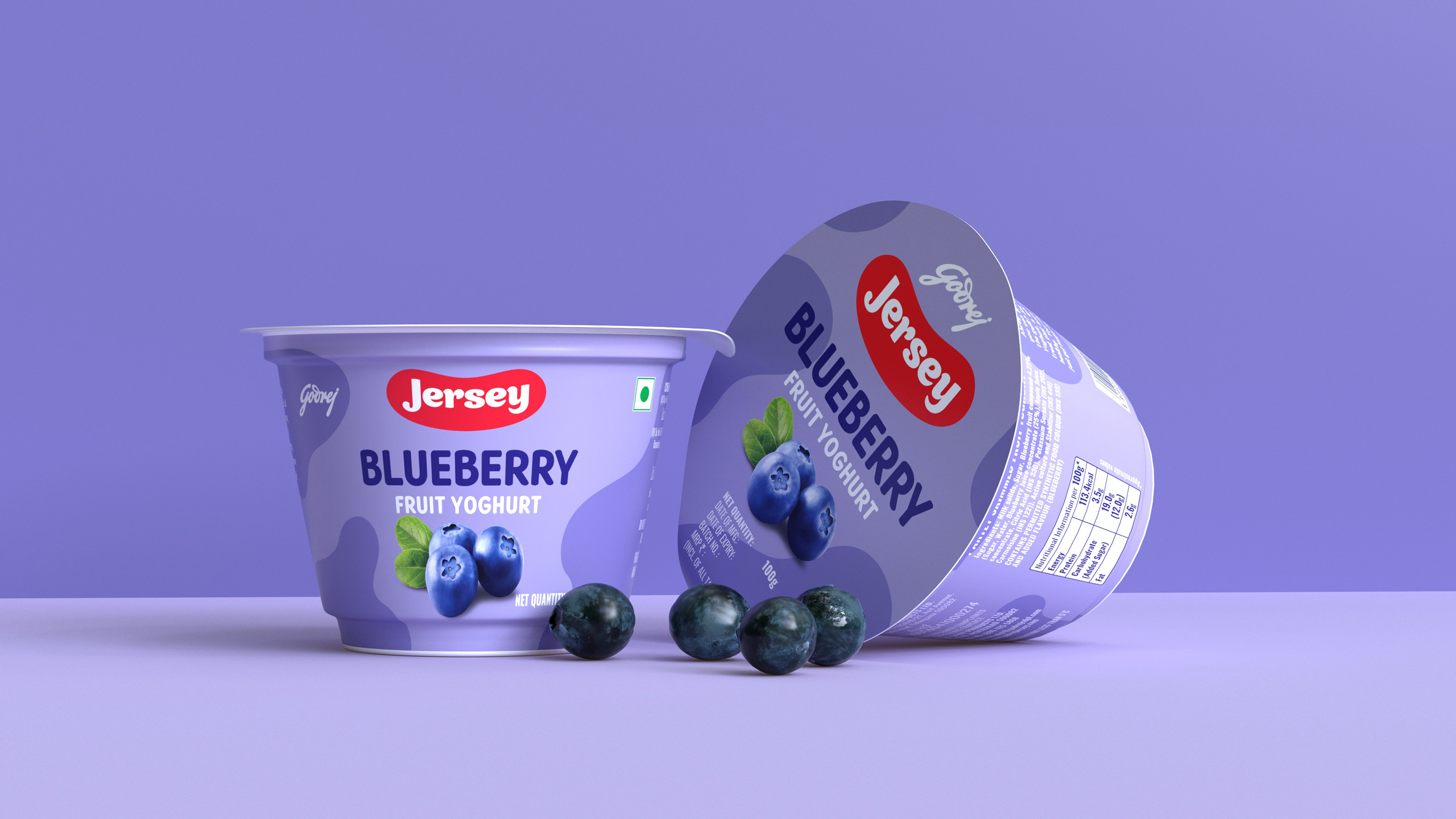
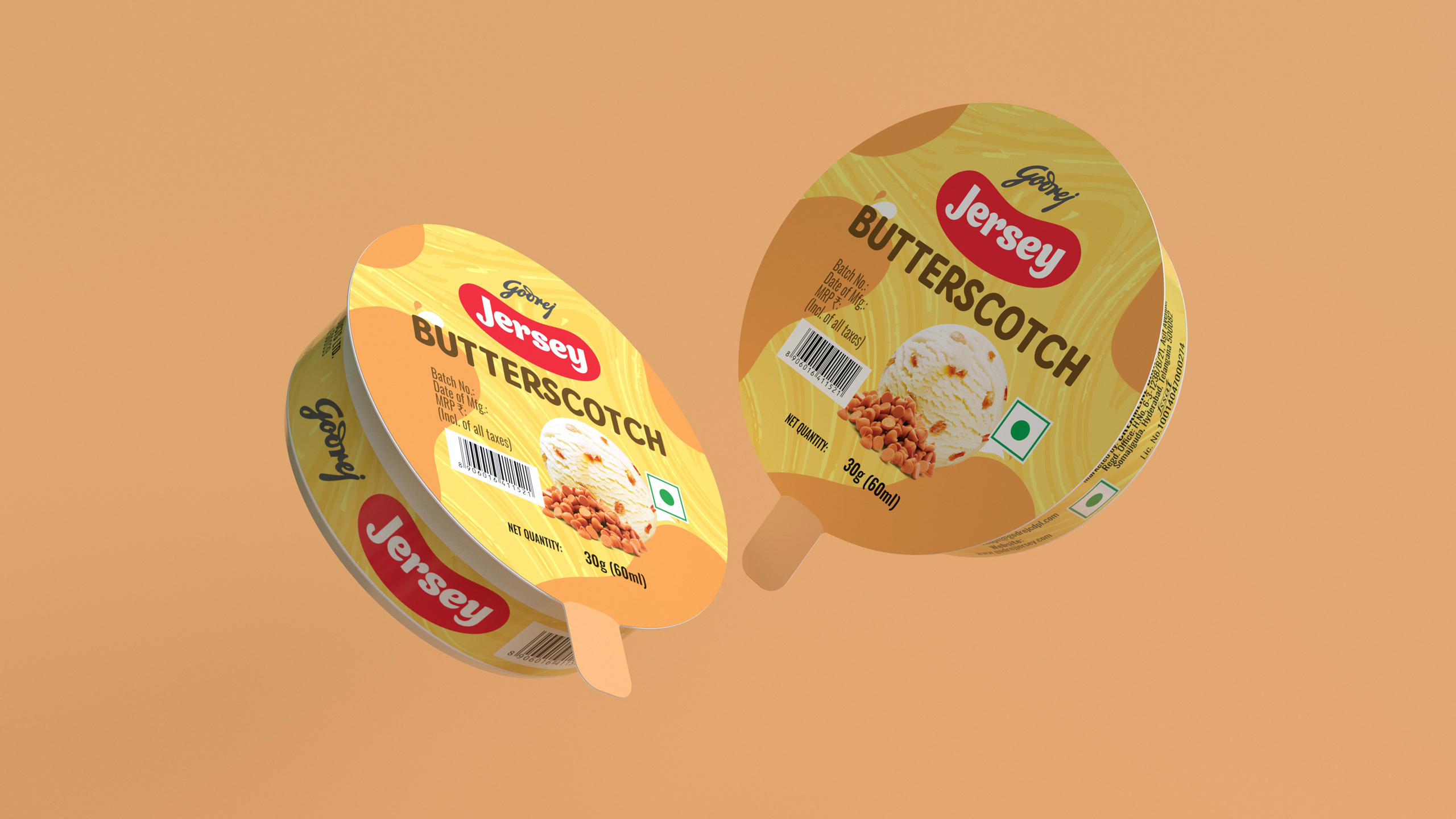
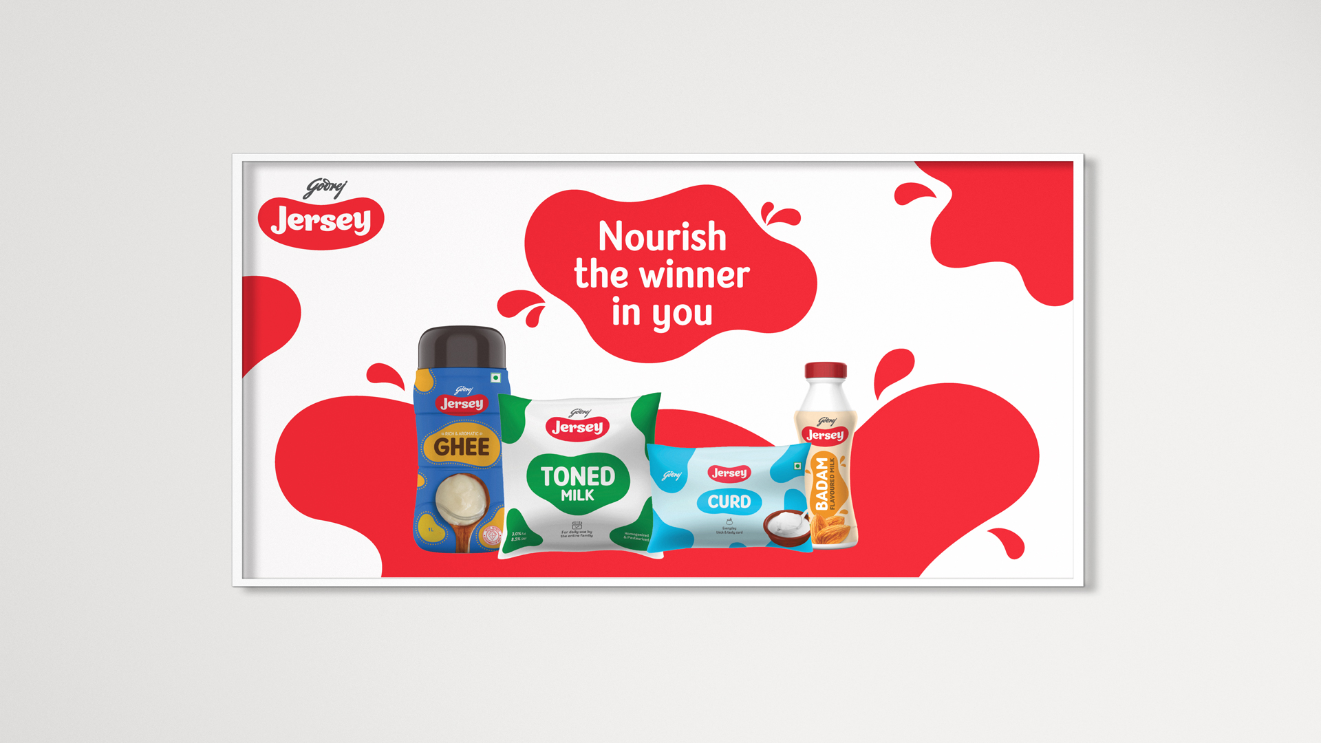
The core idea is derived from the distinctive patches found on Jersey cows. The typography and the patch on the pack resembles a smile. The type mark has a softness to it which captures the edible, drinkable, and approachable character of the brand.
The core idea is derived from the distinctive patches found on Jersey cows. The typography and the patch on the pack resembles a smile. The type mark has a softness to it which captures the edible, drinkable and approachable character of the brand.
The core idea is derived from the distinctive patches found on Jersey cows. The typography and the patch on the pack resembles a smile. The type mark has a softness to it which captures the edible, drinkable and approachable character of the brand.
The core idea is derived from the distinctive patches found on Jersey cows. The typography and the patch on the pack resembles a smile. The type mark has a softness to it which captures the edible, drinkable, and approachable character of the brand.
The core idea is derived from the distinctive patches found on Jersey cows. The typography and the patch on the pack resembles a smile. The type mark has a softness to it which captures the edible, drinkable and approachable character of the brand.
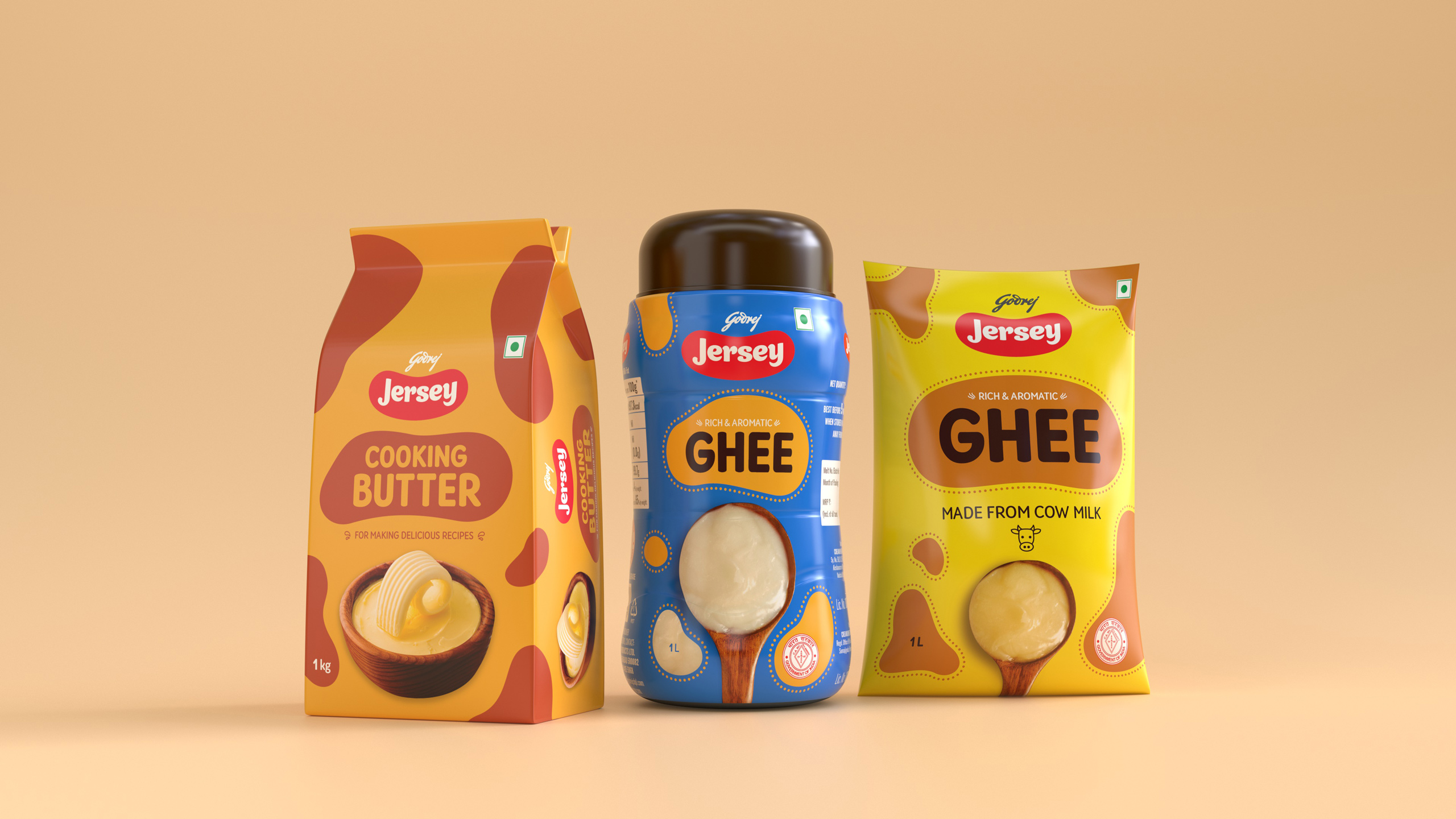
The packaging design system was inspired by the brand's decades-strong legacy.
The packaging design system was inspired by the brand's decades-strong legacy.
The packaging design system was inspired by the brand's decades-strong legacy.
The packaging design system was inspired by the brand's decades-strong legacy.
The packaging design system was inspired by the brand's decades-strong legacy.
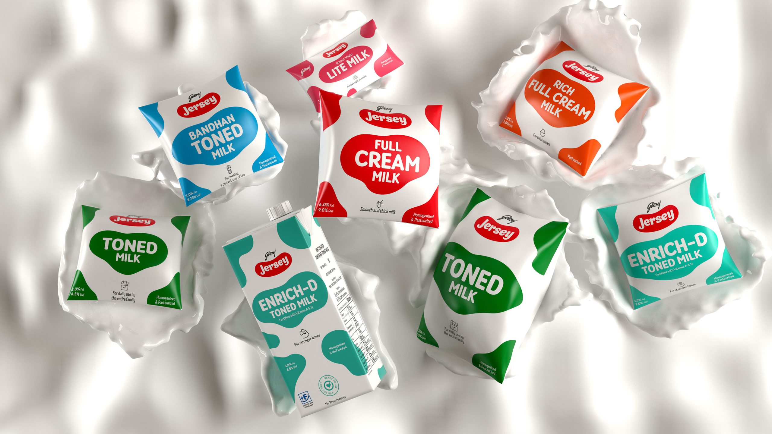
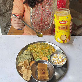
Jersey Milk packs had some very strong elements of familiarity in the consumer’s mind. We had to be mindful of this and yet infuse a new personality to make it more relevant to the times and consumers. The new design language flows from the strong legacy of the brand incorporating the promise of trust and quality personified for a very long time by Godrej. The cow pattern in packaging has been retained, albeit modified, to showcase the products in a more contemporary manner. It is also extended across the portfolio to maintain a consistent visual identity.
Jersey Milk packs had some very strong elements of familiarity in the consumer’s mind. We had to be mindful of this and yet infuse a new personality to make it more relevant to the times and consumers. The new design language flows from the strong legacy of the brand incorporating the promise of trust and quality personified for a very long time by Godrej. The cow pattern in packaging has been retained, albeit modified, to showcase the products in a more contemporary manner. It is also extended across the portfolio to maintain a consistent visual identity.
Jersey Milk packs had some very strong elements of familiarity in the consumer’s mind. We had to be mindful of this and yet infuse a new personality to make it more relevant to the times and consumers. The new design language flows from the strong legacy of the brand incorporating the promise of trust and quality personified for a very long time by Godrej. The cow pattern in packaging has been retained, albeit modified, to showcase the products in a more contemporary manner. It is also extended across the portfolio to maintain a consistent visual identity.
Jersey Milk packs had some very strong elements of familiarity in the consumer’s mind. We had to be mindful of this and yet infuse a new personality to make it more relevant to the times and consumers. The new design language flows from the strong legacy of the brand incorporating the promise of trust and quality personified for a very long time by Godrej. The cow pattern in packaging has been retained, albeit modified, to showcase the products in a more contemporary manner. It is also extended across the portfolio to maintain a consistent visual identity.
Jersey Milk packs had some very strong elements of familiarity in the consumer’s mind. We had to be mindful of this and yet infuse a new personality to make it more relevant to the times and consumers. The new design language flows from the strong legacy of the brand incorporating the promise of trust and quality personified for a very long time by Godrej. The cow pattern in packaging has been retained, albeit modified, to showcase the products in a more contemporary manner. It is also extended across the portfolio to maintain a consistent visual identity.
Old Pack Design
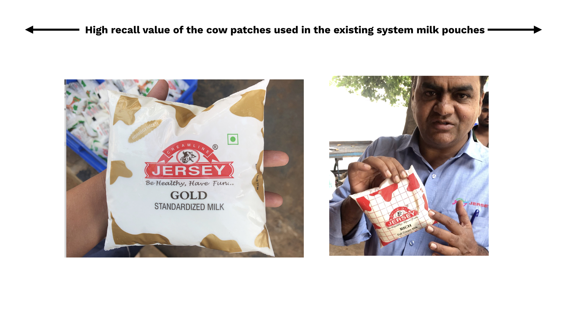
Consumers recognized the brand Jersey cow patch story used in the current packaging design.
Old Pack Design
Consumers recognized the brand Jersey cow patch story used in the current packaging design.
Old Pack Design
Consumers recognized the brand Jersey cow patch story used in the current packaging design.
Consumers recognized the brand Jersey cow patch story used in the current packaging design.
Old Pack Design
Consumers recognized the brand Jersey cow patch story used in the current packaging design.
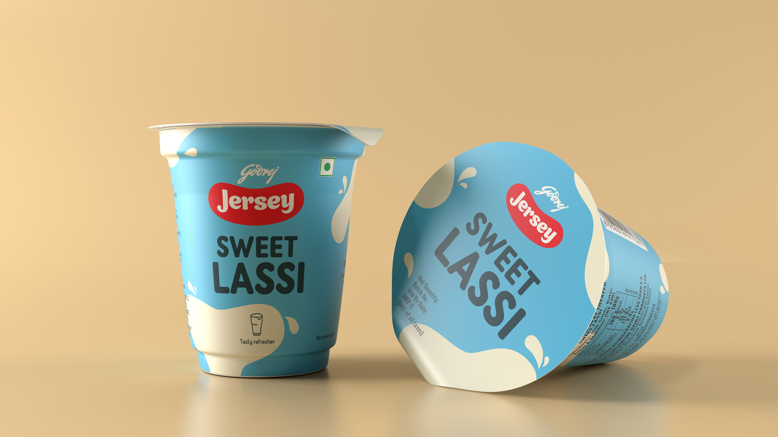
New Pack Design
Contemporising the patches we wanted to capture the consumer mindset change.
New Pack Design
Contemporising the patches we wanted to capture the consumer mindset change.
New Pack Design
Contemporising the patches we wanted to capture the consumer mindset change.
Contemporising the patches we wanted to capture the consumer mindset change.
New Pack Design
Contemporising the patches we wanted to capture the consumer mindset change.
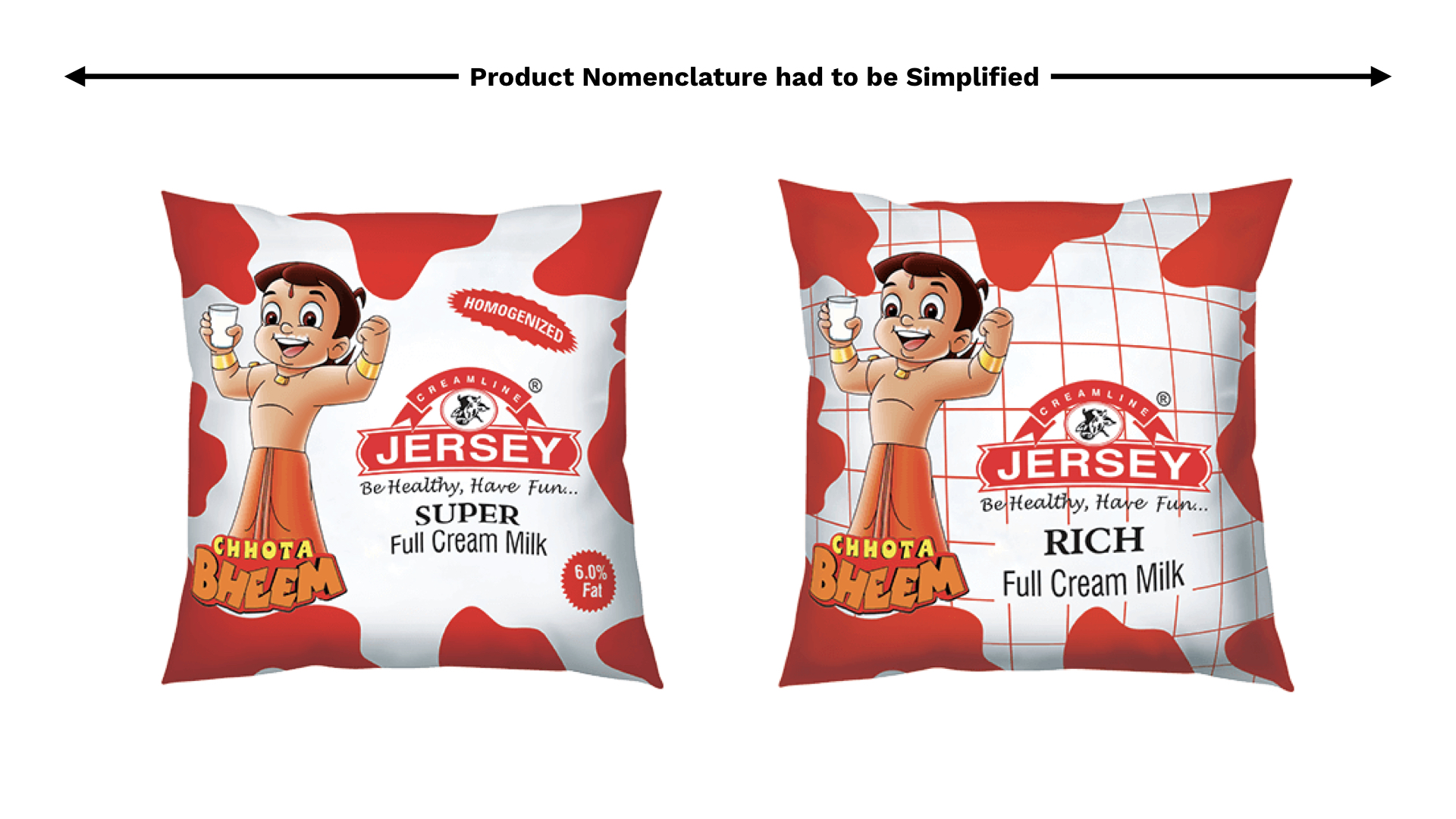
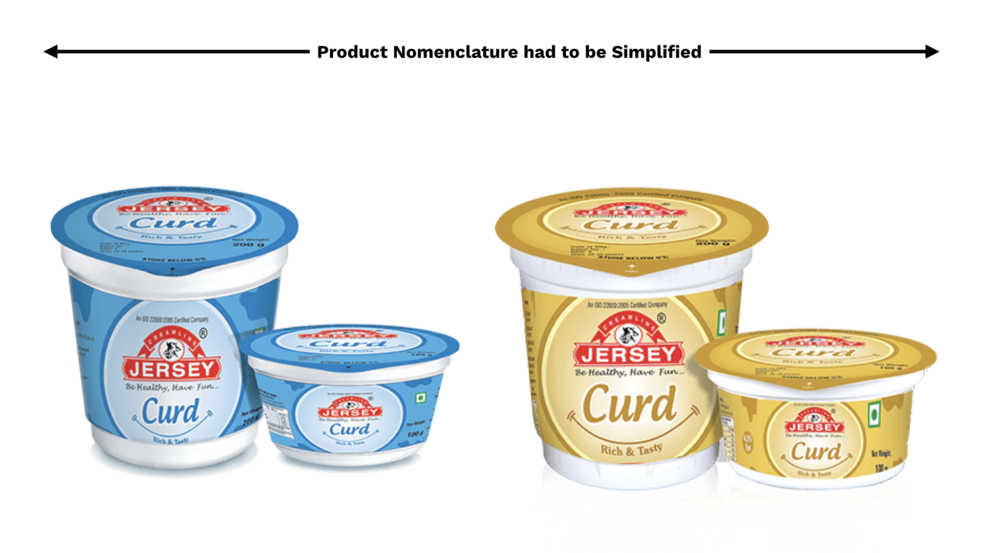
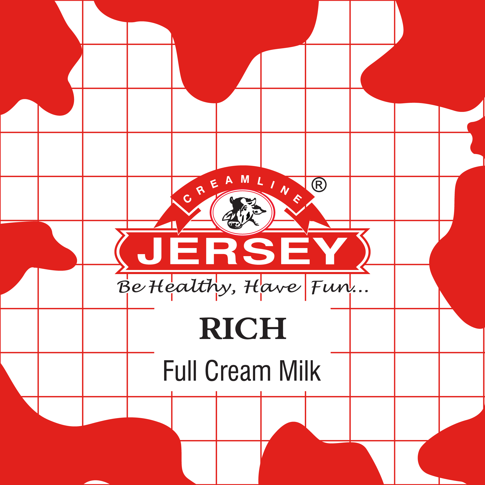
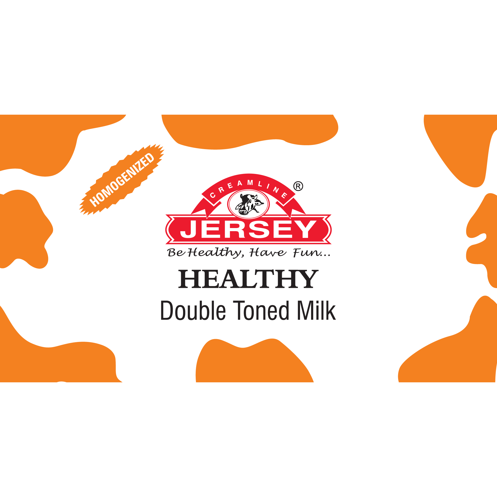
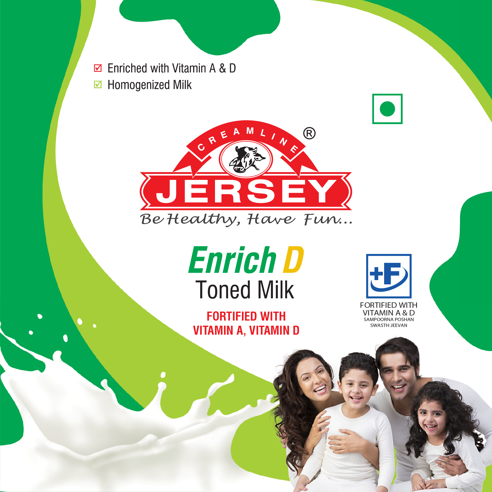
Product naming had to be simplified to enable faster purchase decisions.
Product naming had to be simplified to enable faster purchase decisions.
Product naming had to be simplified to enable faster purchase decisions.
Product naming had to be simplified to enable faster purchase decisions.
Product naming had to be simplified to enable faster purchase decisions.
Product Names before re-design
While conducting the brand audit, we realized the current naming architecture in the milk range created confusion as there was no clear distinction between product names and descriptors. For example, the product difference between rich full cream and super full cream had to be established.
Product Names before re-design
While conducting the brand audit, we realised the current naming architecture in the milk range created confusion as there was no clear distinction between product names and descriptors. For example: the product difference between rich full cream and super full cream had to be established.
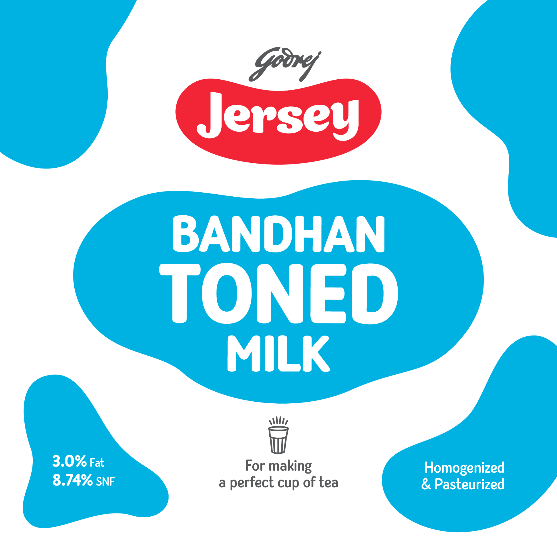
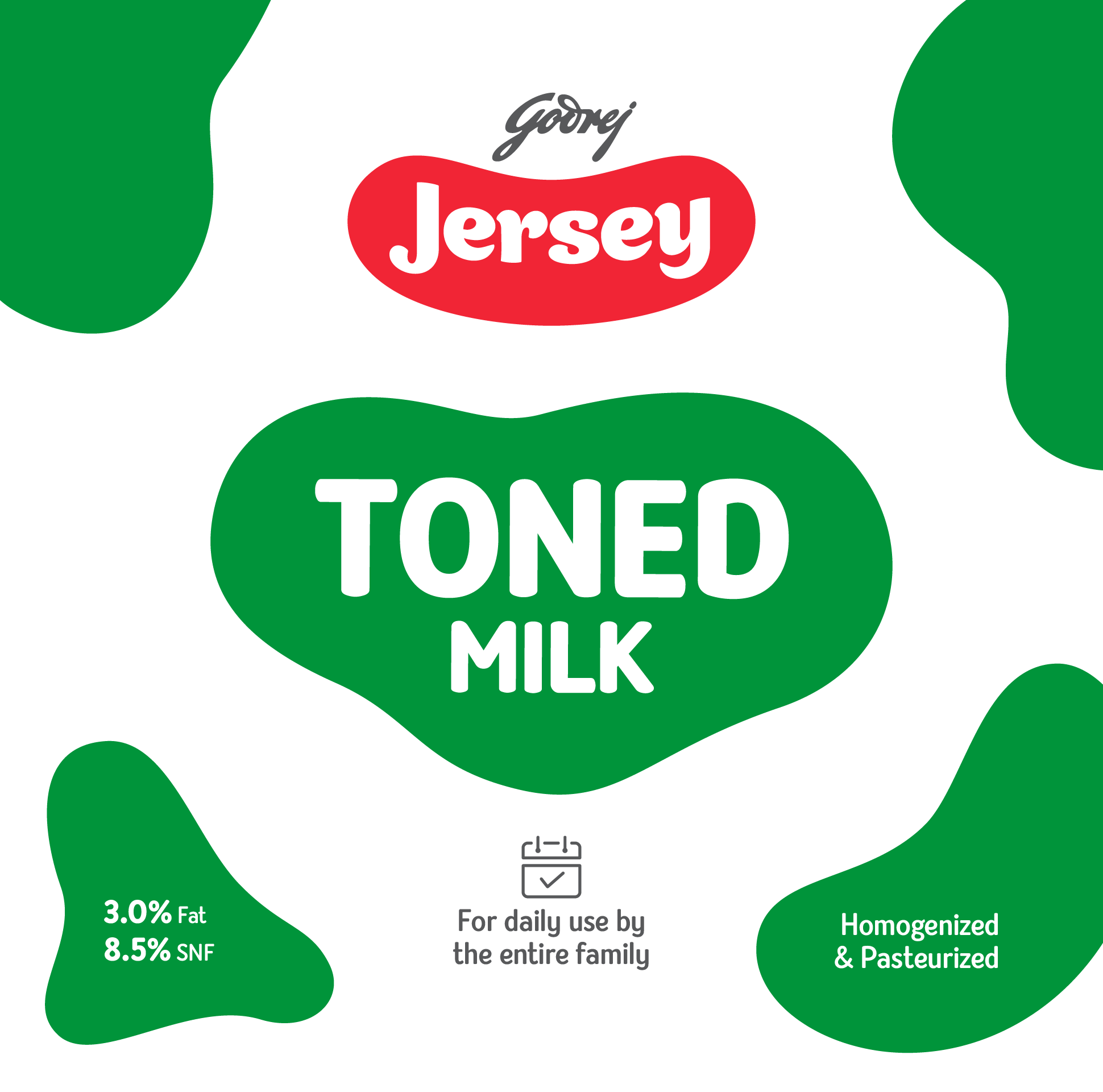
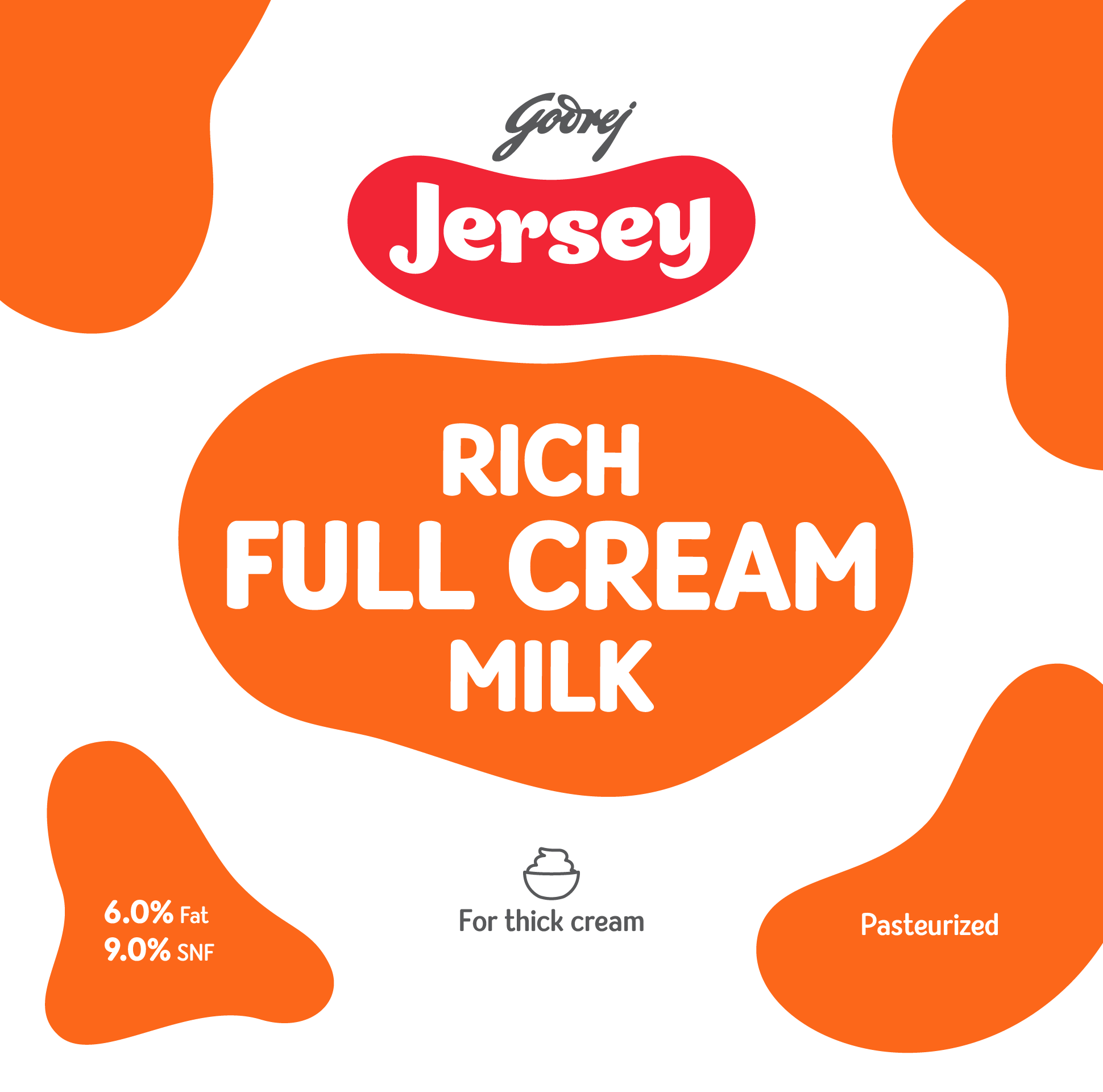
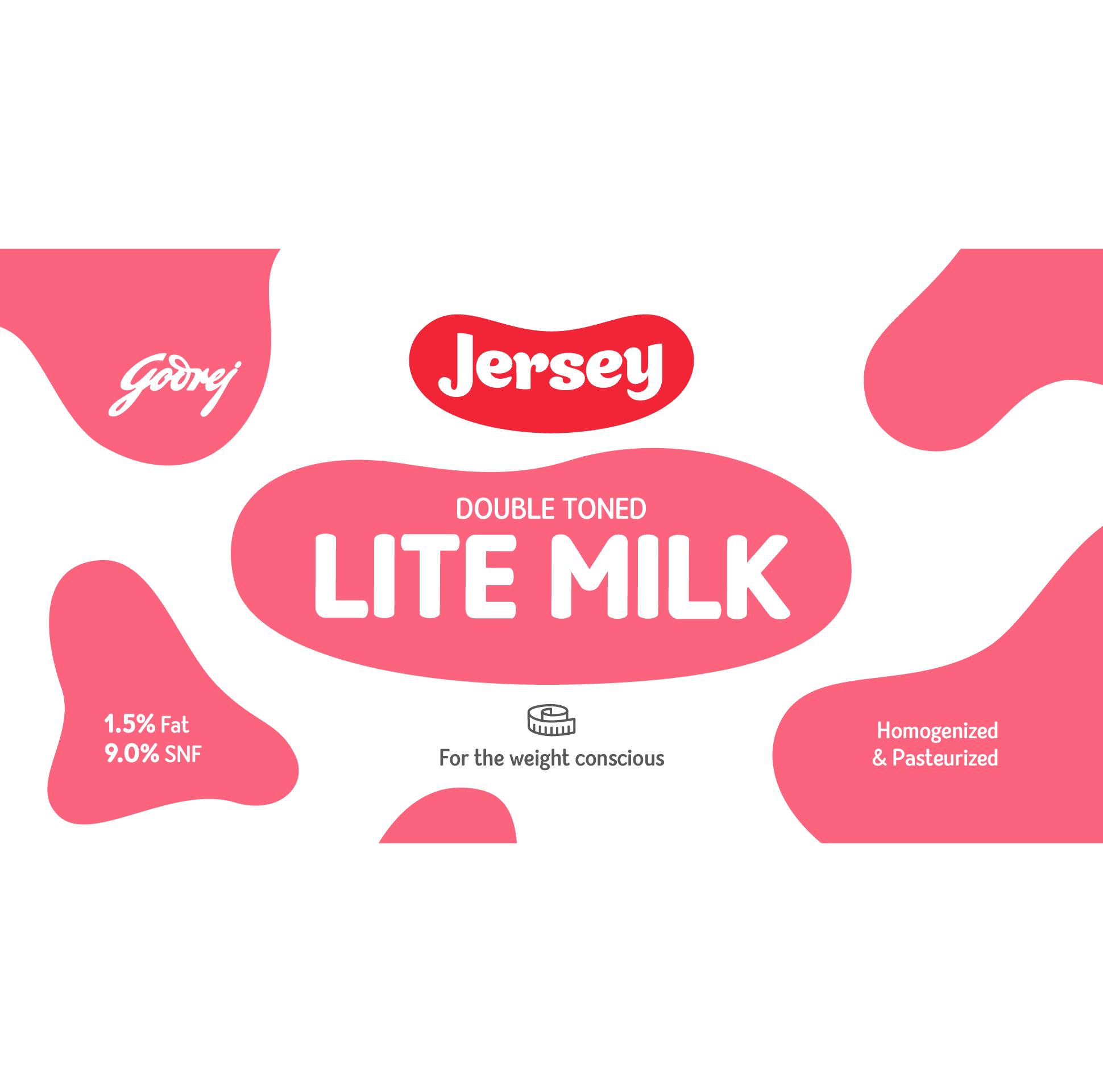
Product Names post re-design
We simplified product names, used color as a differentiator, and introduced an icon system to further describe the utility of milk products. This made it clearer for the end-user to understand the milk range. If users wanted to make ghee at home, they had to purchase rich full cream milk.
Product Names post re-design
We simplified product names, used colour as a differentiator and introduced an icon system to further describe the utility of milk products. This made it clearer for the end-user to understand the milk range. If users wanted to make ghee at home, they had to purchase rich full cream milk.
The icons on the front of the packs clearly described the benefit or the utility of the product.
The icons on the front of the packs clearly described the benefit or the utility of the product.
The icons on the front of the packs clearly described the benefit or the utility of the product.
The icons on the front of the packs clearly described the benefit or the utility of the product.
The icons on the front of the packs clearly described the benefit or the utility of the product.
Media error: Format(s) not supported or source(s) not found
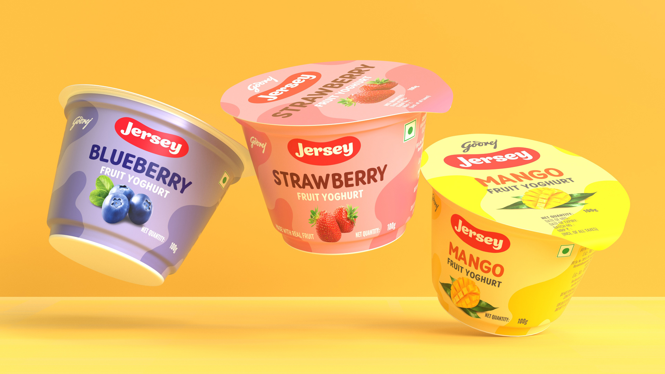
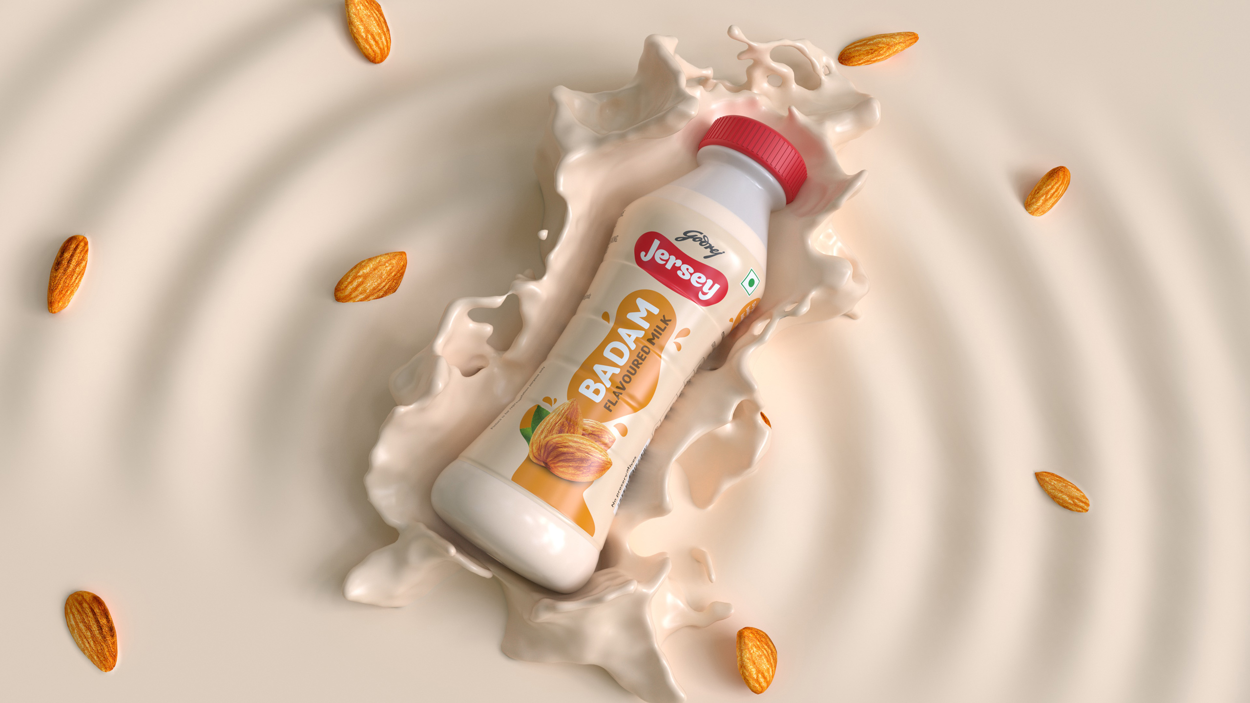
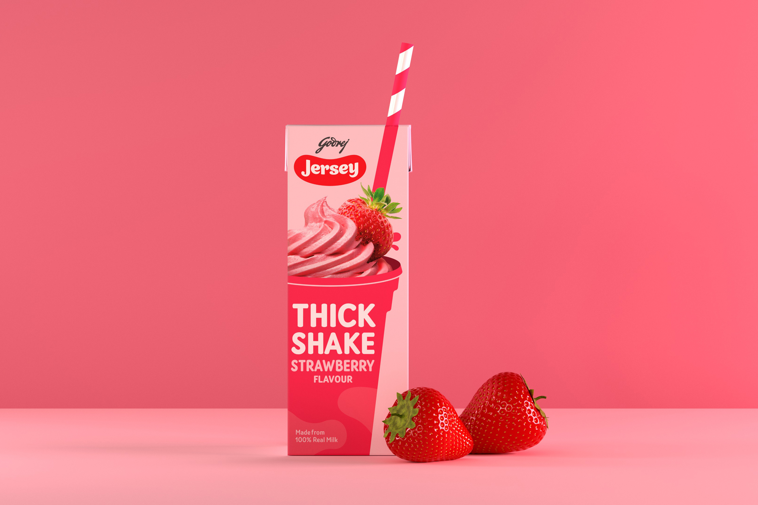
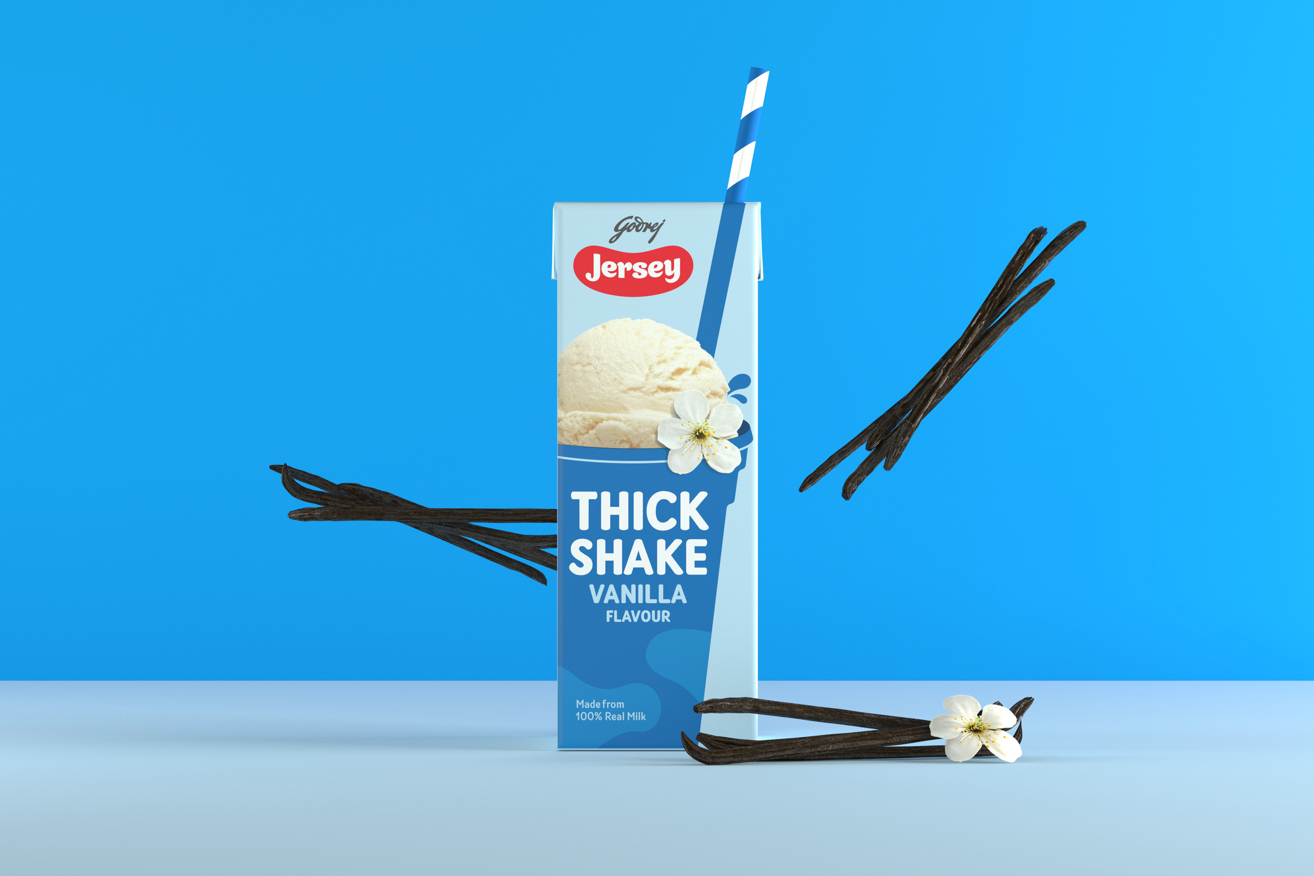
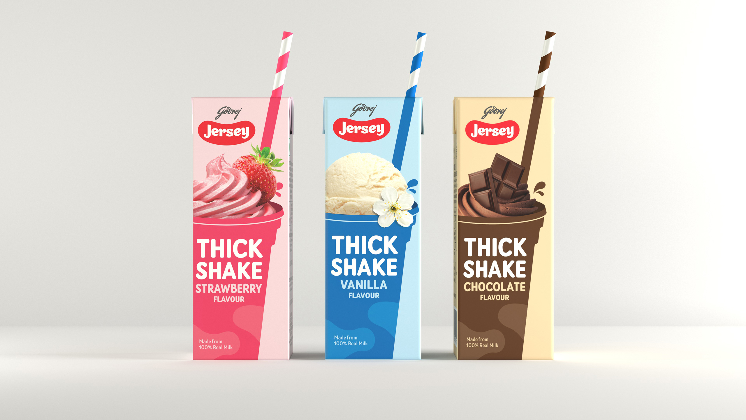
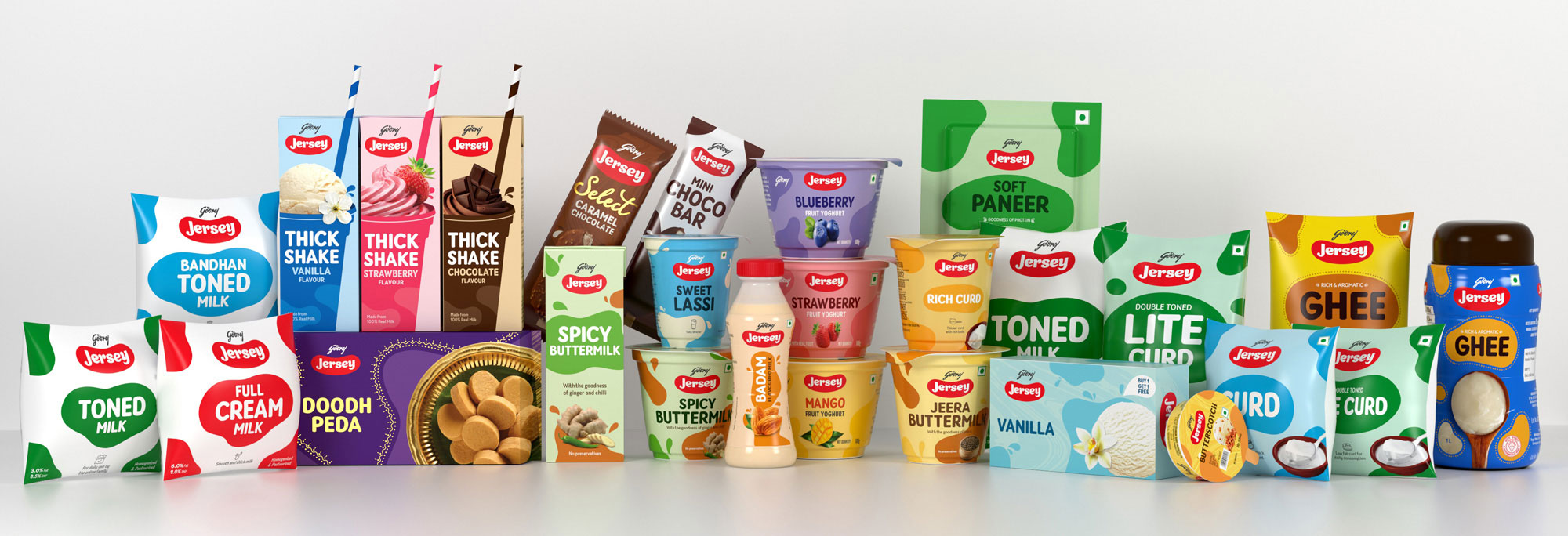
Download File: https://nh1design.com/wp-content/uploads/2020/11/Packaging-Extension_Compressed.mp4The flexibility of the visual language allows for easy extension of the patches into their continually-increasing portfolio of flavours and product ranges. The design system can be used with ingredients to tickle the appetite. Additional ornaments and textures can be incorporated to further differentiate the product range. This new visual system allowed itself to adapt to various product formats.
The flexibility of the visual language allows for easy extension of the patches into their continually-increasing portfolio of flavours and product ranges. The design system can be used with ingredients to tickle the appetite. Additional ornaments and textures can be incorporated to further differentiate the product range. This new visual system allowed itself to adapt to various product formats.
The flexibility of the visual language allows for easy extension of the patches into their continually-increasing portfolio of flavours and product ranges. The design system can be used with ingredients to tickle the appetite. Additional ornaments and textures can be incorporated to further differentiate the product range. This new visual system allowed itself to adapt to various product formats.
The flexibility of the visual language allows for easy extension of the patches into their continually-increasing portfolio of flavors and product ranges. The design system can be used with ingredients to tickle the appetite. Additional ornaments and textures can be incorporated to further differentiate the product range. This new visual system allowed itself to adapt to various product formats.
The flexibility of the visual language allows for easy extension of the patches into their continually-increasing portfolio of flavours and product ranges. The design system can be used with ingredients to tickle the appetite. Additional ornaments and textures can be incorporated to further differentiate the product range. This new visual system allowed itself to adapt to various product formats.
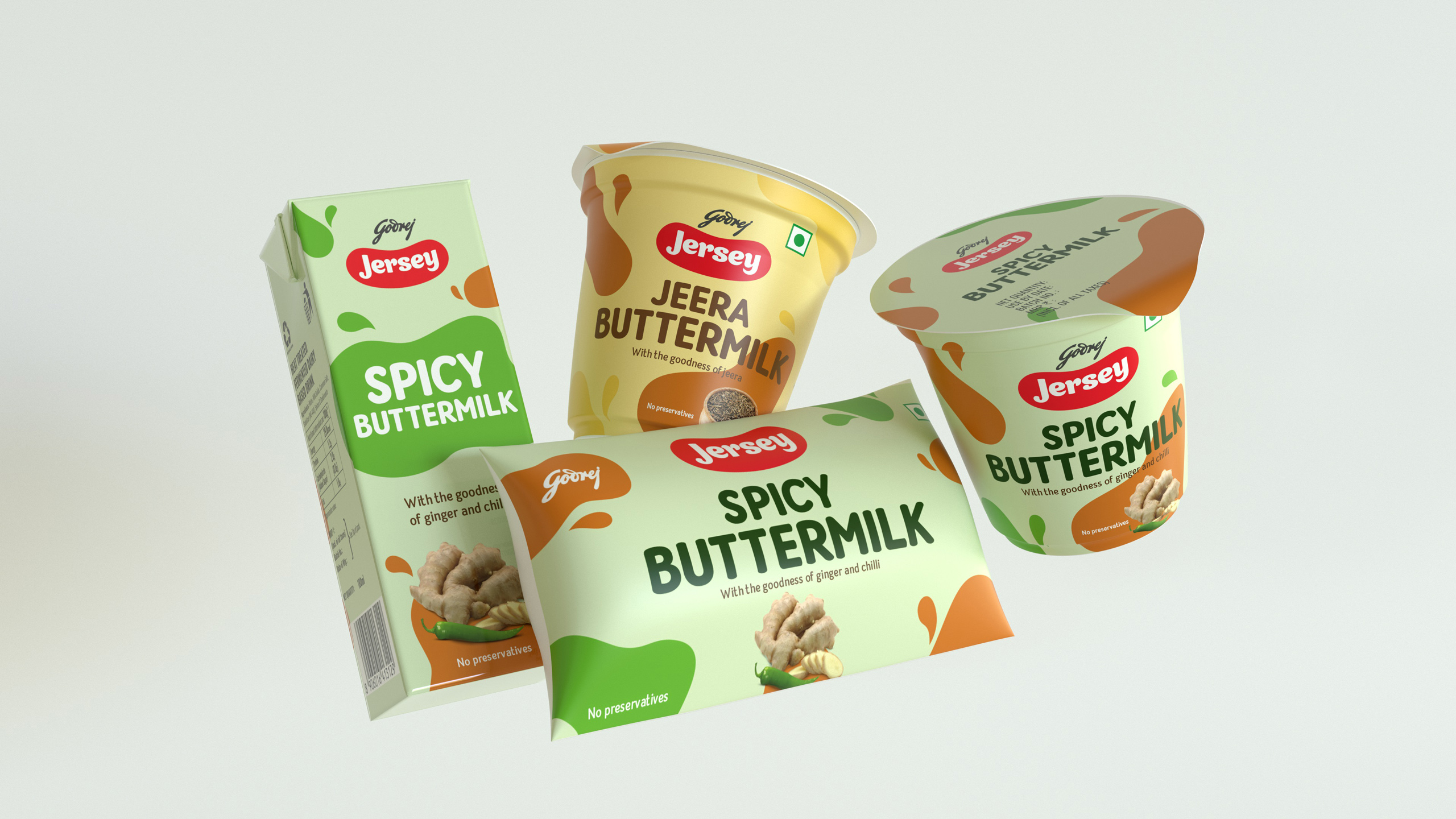
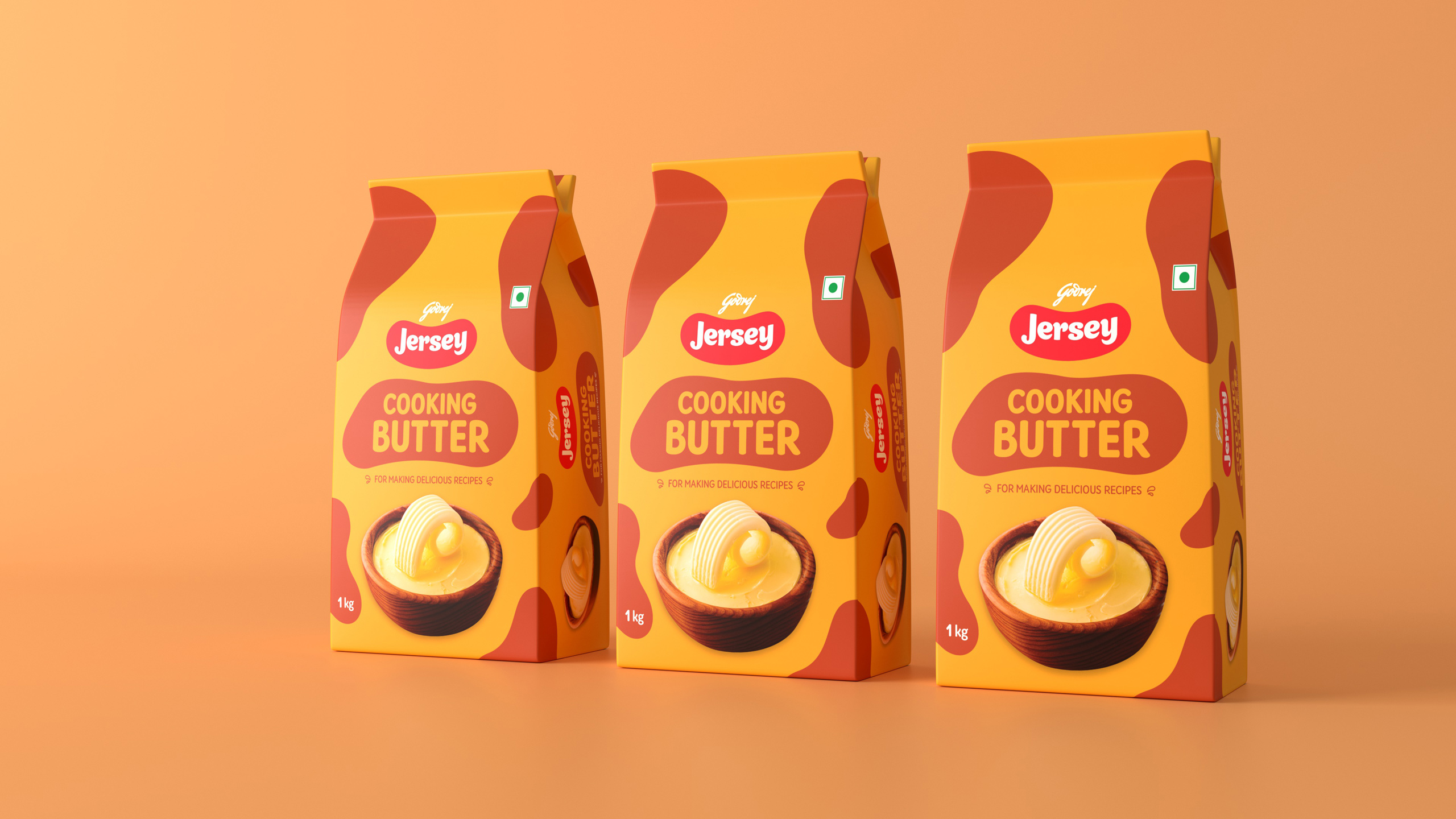
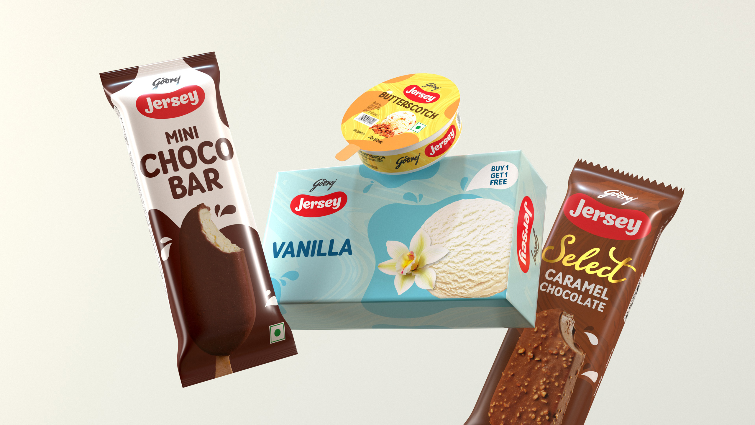
A design solution that would be a fit with every segment of consumers and yet not alienate the current set.
A design solution that would be a fit with every segment of consumers and yet not alienate the current set.
A design solution that would be a fit with every segment of consumers and yet not alienate the current set.
A design solution that would be a fit with every segment of consumers and yet not alienate the current set.
A design solution that would be a fit with every segment of consumers and yet not alienate the current set.
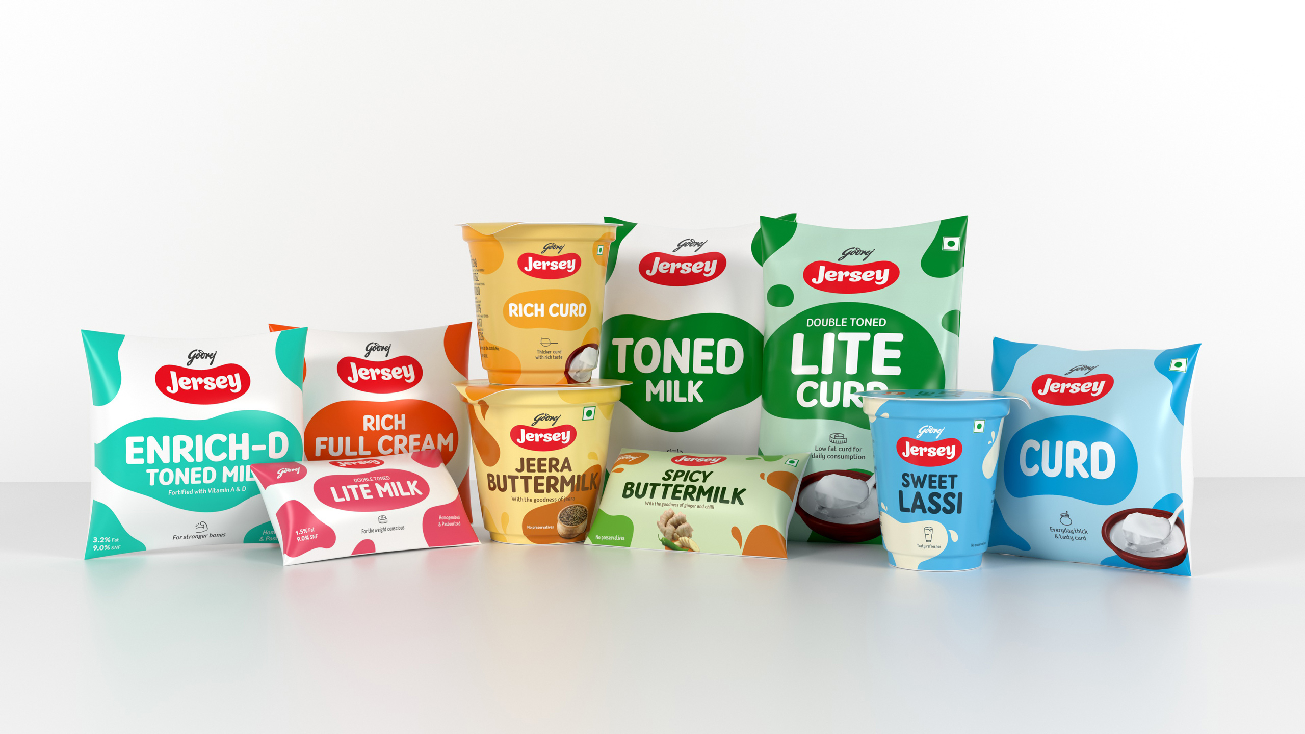
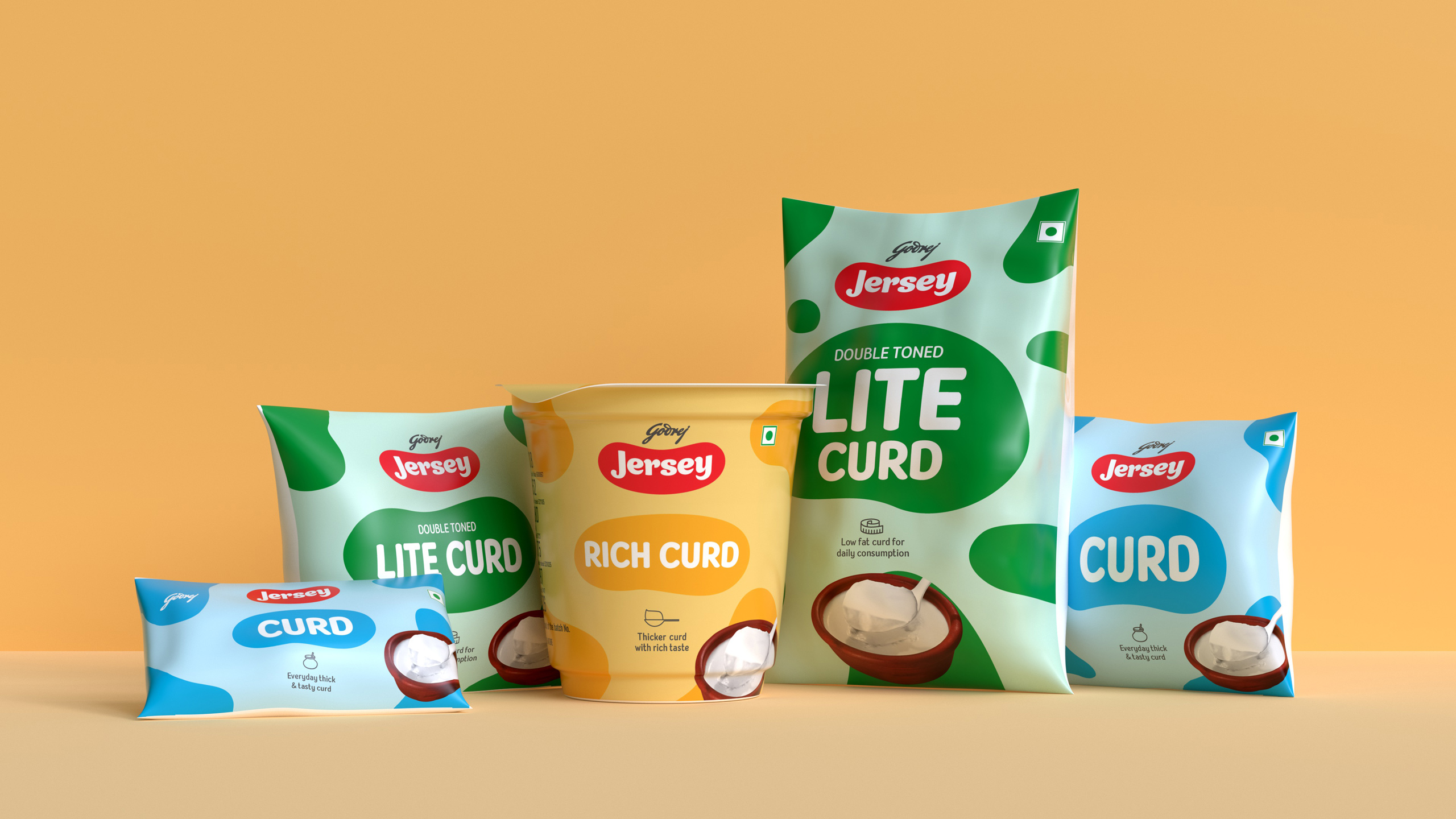
Based on the over-arching concept, each product category employs a distinct treatment. Yet, to ensure high recall and synergy associated with a portfolio of contemporary brands, the entire range has a family look.
Based on the over-arching concept, each product category employs a distinct treatment. Yet, to ensure high recall and synergy associated with a portfolio of contemporary brands, the entire range has a family look.
Based on the over-arching concept, each product category employs a distinct treatment. Yet, to ensure high recall and synergy associated with a portfolio of contemporary brands, the entire range has a family look.
Based on the over-arching concept, each product category employs a distinct treatment. Yet, to ensure high recall and synergy associated with a portfolio of contemporary brands, the entire range has a family look.
Based on the over-arching concept, each product category employs a distinct treatment. Yet, to ensure high recall and synergy associated with a portfolio of contemporary brands, the entire range has a family look.
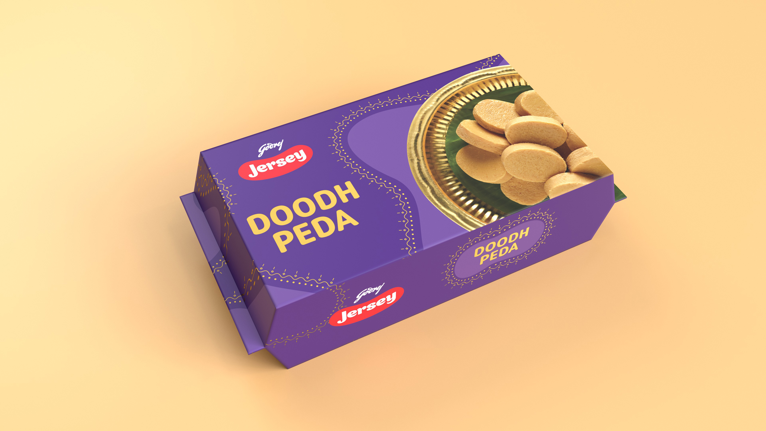
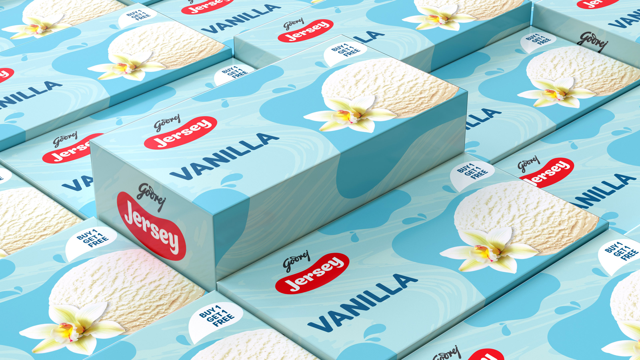
A great design system must allow flexibility: cultural ornaments complemented our Jersey patches for products which had to cue celebrations.
A great design system must allow flexibility: cultural ornaments complemented our Jersey patches for products which had to cue celebrations.
A great design system must allow flexibility: cultural ornaments complemented our Jersey patches for products which had to cue celebrations.
A great design system must allow flexibility: cultural ornaments complemented our Jersey patches for products which had to cue celebrations.
A great design system must allow flexibility: cultural ornaments complemented our Jersey patches for products which had to cue celebrations.
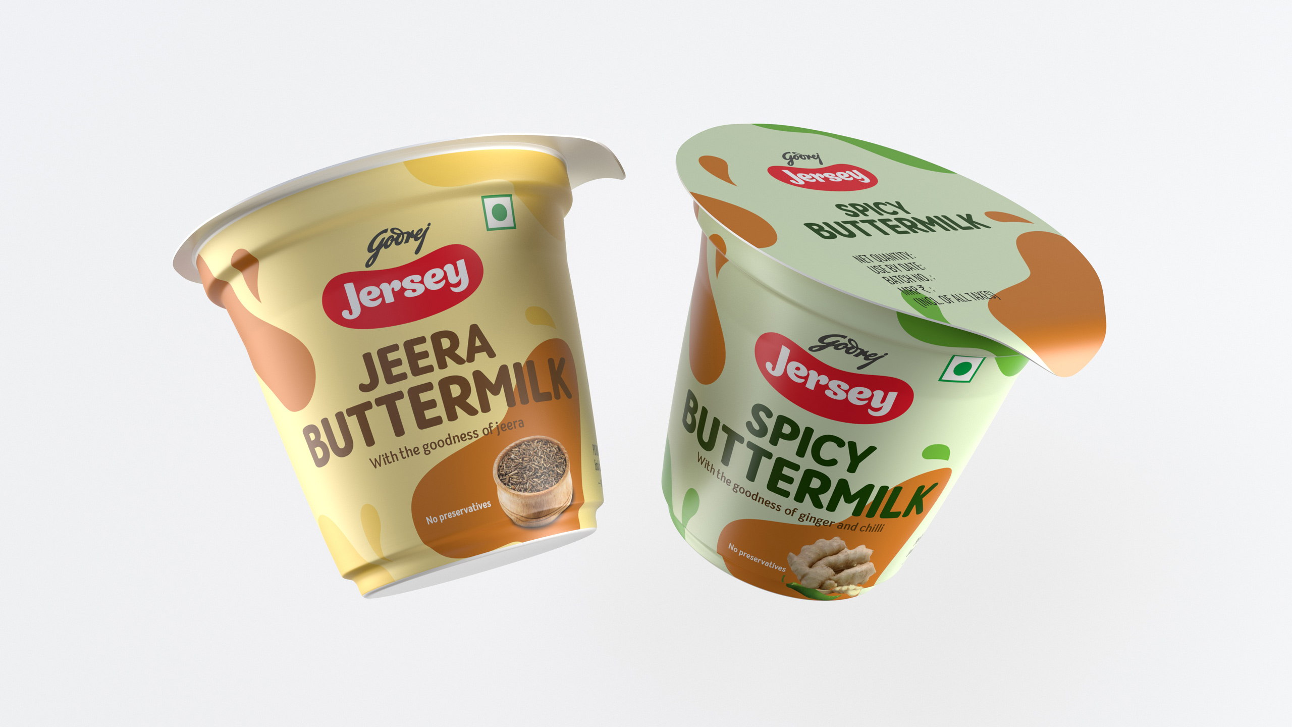
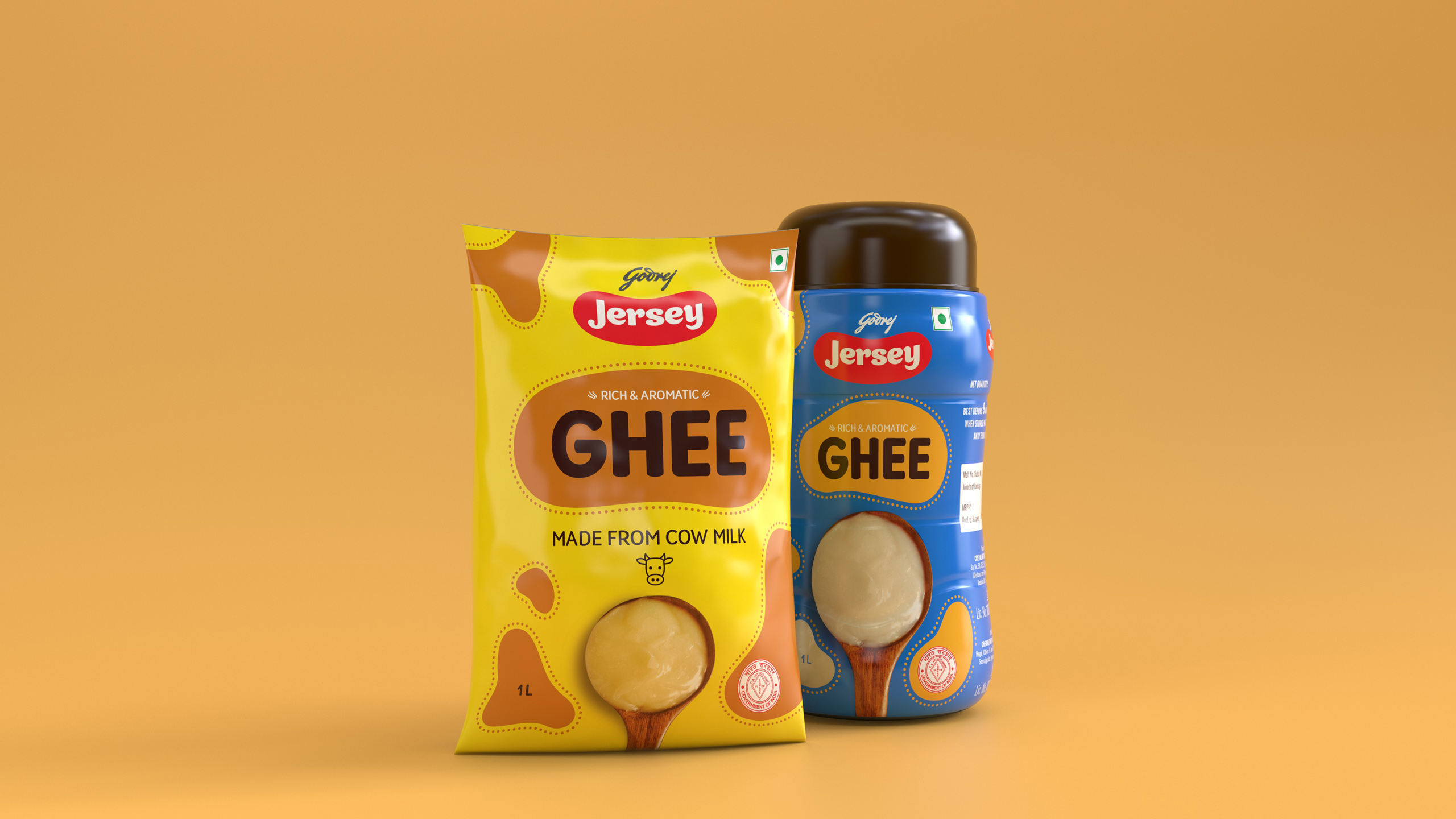
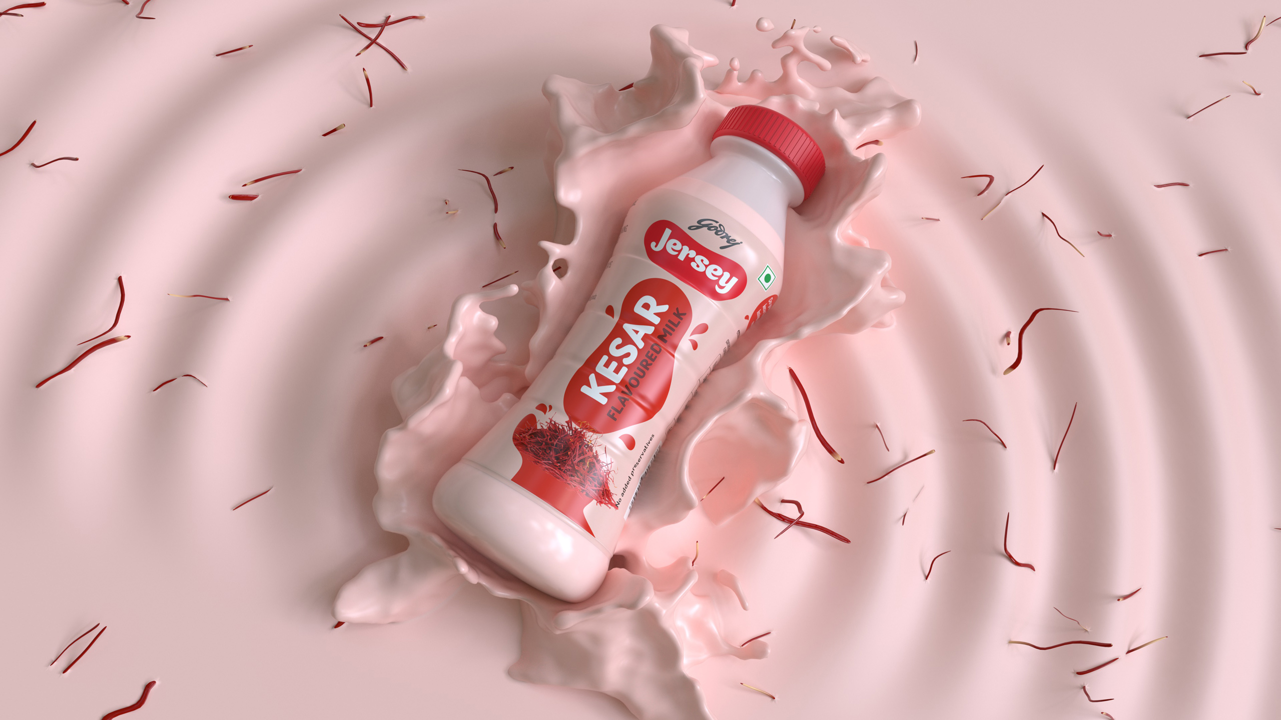
We married the ingredient and the Jersey patch story to further add an appetizing appeal to our packaging design.
We married the ingredient and the Jersey patch story to further add an appetizing appeal to our packaging design.
We married the ingredient and the Jersey patch story to further add an appetizing appeal to our packaging design.
We married the ingredient and the Jersey patch story to further add an appetizing appeal to our packaging design.
We married the ingredient and the Jersey patch story to further add an appetizing appeal to our packaging design.
An additional texture palette was added to our design system to cue indulgent product categories.
An additional texture palette was added to our design system to cue indulgent product categories.
An additional texture palette was added to our design system to cue indulgent product categories.
An additional texture palette was added to our design system to cue indulgent product categories.
An additional texture palette was added to our design system to cue indulgent product categories.
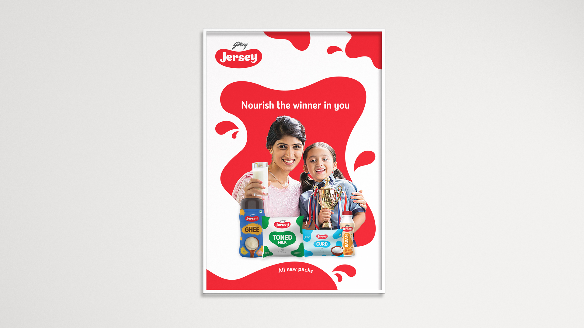
Meet the fresh, new Godrej Jersey family.
Meet the Refreshed Godrej Jersey Family.
Meet the Refreshed Godrej Jersey Family.
Meet the Refreshed Godrej Jersey Family.
Meet the Refreshed Godrej Jersey Family.
Meet the Refreshed Godrej Jersey Family.
All Projects

Dinshaw'sRebranding and Repackaging Legacy

Albero D'oroCrafted for American Cocktail Culture

TansenA culinary crescendo

Yippee Pasta ScoreEstablishing AFA partnership

Yippee Pasta MasalaBon appetit

Sunfeast Baked CreationsCookie Culture around the world

Fratelli MS WineRedesigning MS Wine Label

Ateaz CafeCafe experience in New York

Dirty GoodDesigning for a kids' skin care brand
ZenworkBrand refresh for a regtech platform

Space 2 GrowRebranding Social Impact Consulting

Fresh GravityDriven by Data. Inspired by Innovation.

Nestle Resource ActivHigh Protein Shake Packaging Design
Godrej My FarmBranding a premium niche dairy brand for Godrej
Don't Hide it. PeriodSanitary Pad Packaging
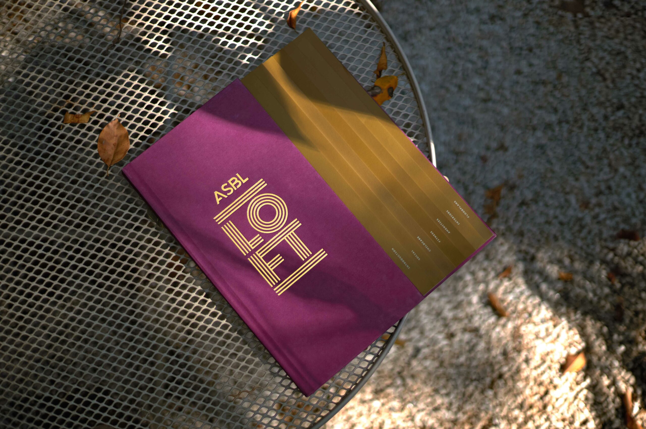
ASBL LOFTResidential property brochure
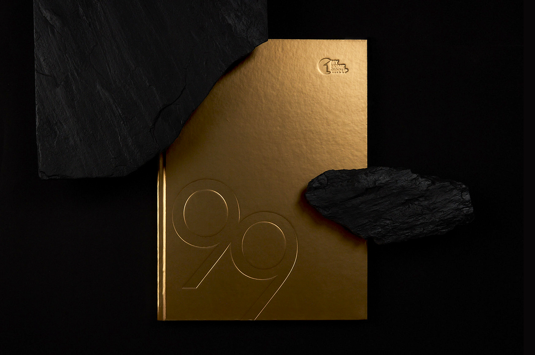
MyHome 99Residential property brochure

Lushlands by Adani RealtyYour Natural Habitat

StreaxPackaging design for skincare

SunsureRe-Branding an energy as a service brand
HROneBranding a HRMS platform

FlexipleBranding a global tech talent network
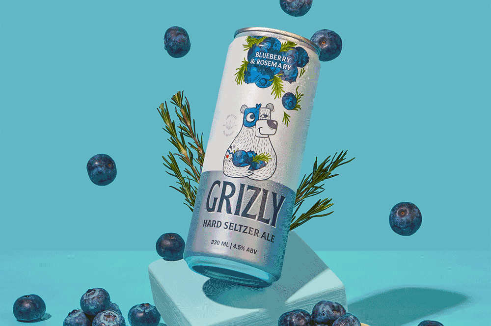
Grizly Hard Seltzers AleBranding & packaging design | House of Bira 91
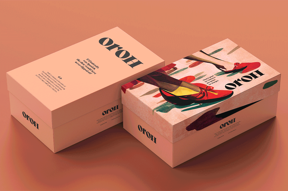
OrohBranding an Indian D2C footwear brand
Red.HealthRebranding India's largest emergency response company

Aakash OrthocityCentres of Excellence in Ortho Care
Livasa HospitalsWe care for life

Bira 91 Make Play with FlavorsDefining the brand world for a beer brand
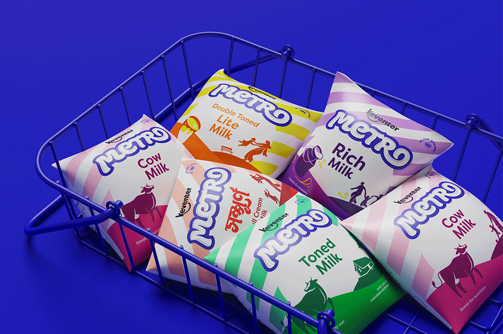
Keventer MetroRebranding a dairy brand in West Bengal
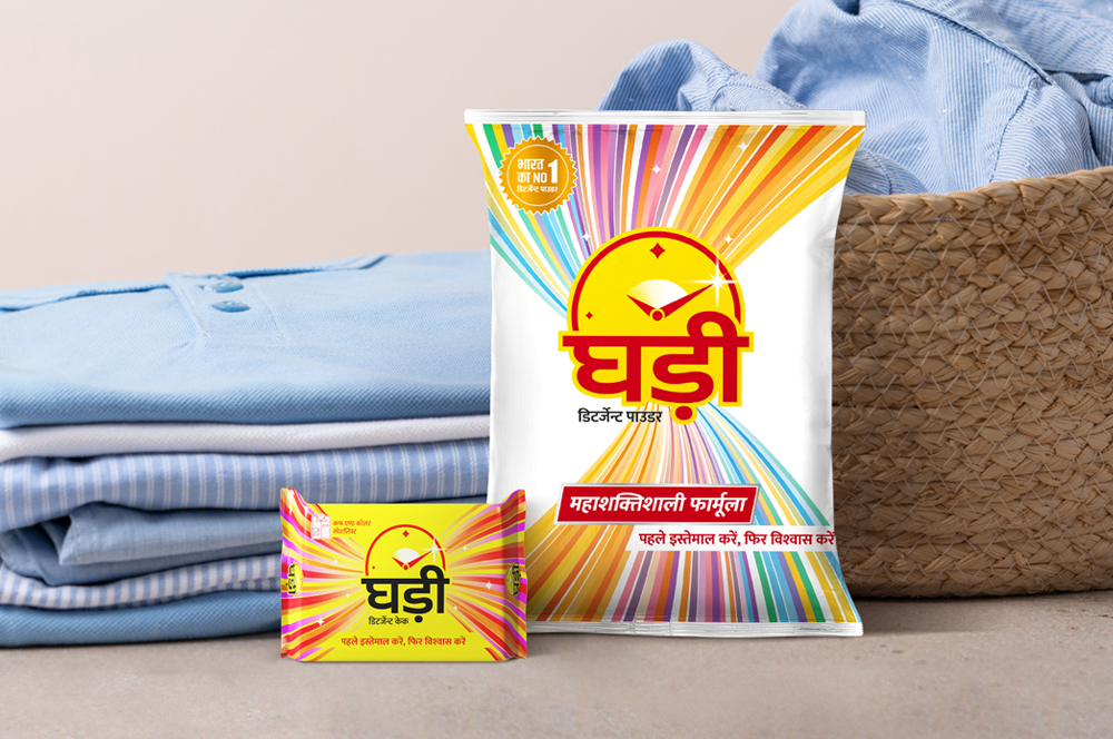
Ghadi by RSPL GroupRe-packaging an iconic detergent brand
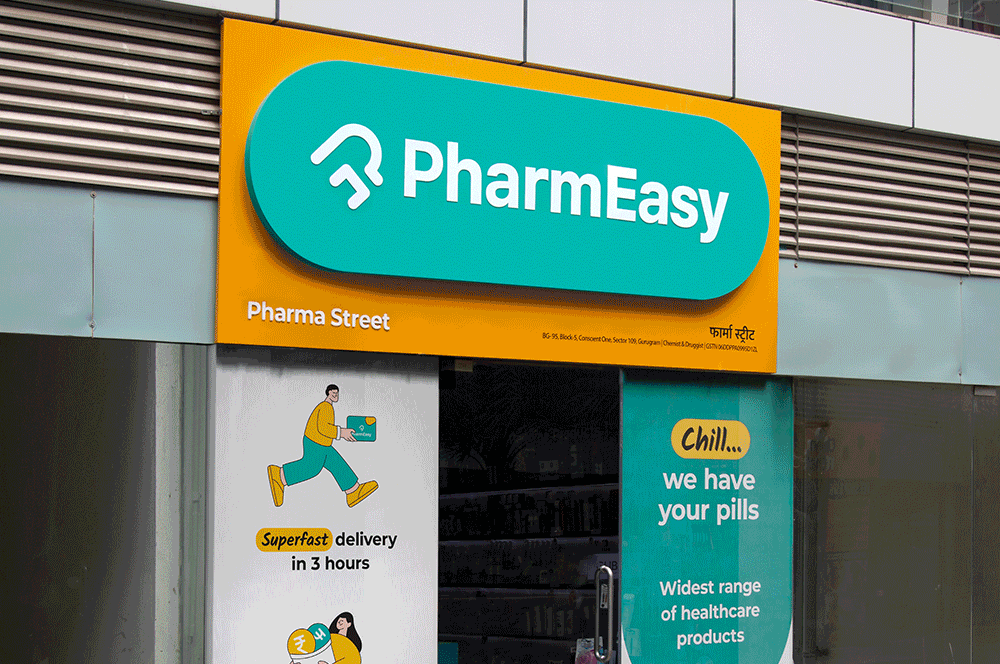
PharmEasyRedesigning an omnichannel brand experience
RIVEAWhere high tech meets low risk

Celebrate with Every SipFestive & special edition packs for Bira 91
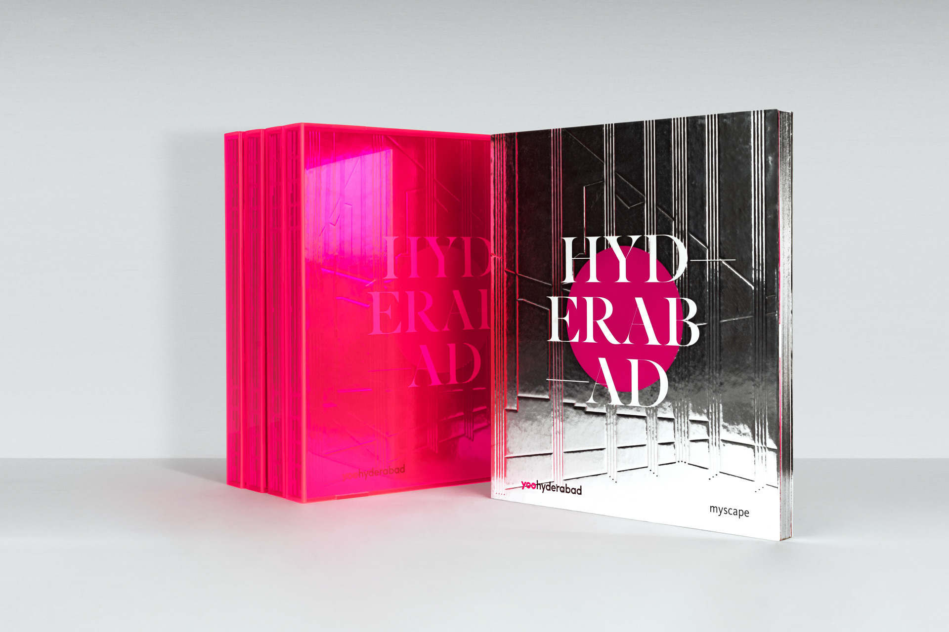
Myscape YOOSelling branded residences

Rama EikoLush meets Plush

Keystone SeasonsThe Voice of Wellness

Bira 91 | Customer Loyalty AppUI design for brand advocacy

ITSA HospitalsHealthcare. Harmony. Hospitality
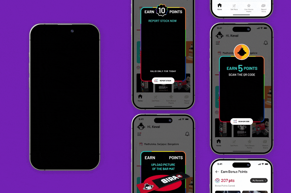
Bira 91 | Counter Sales Managers AppB2B channel partner UI Design

LifioBranding a clinical research and trial company
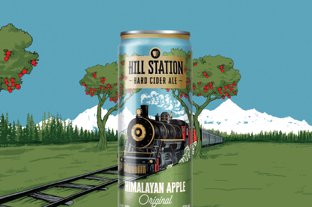
Hill Station Hard Cider AleBranding & Packaging Design | House of Bira 91
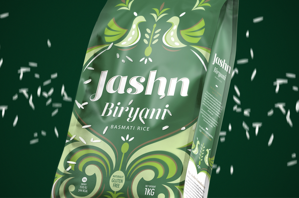
Jashn FoodsPackaging design for basmati rice
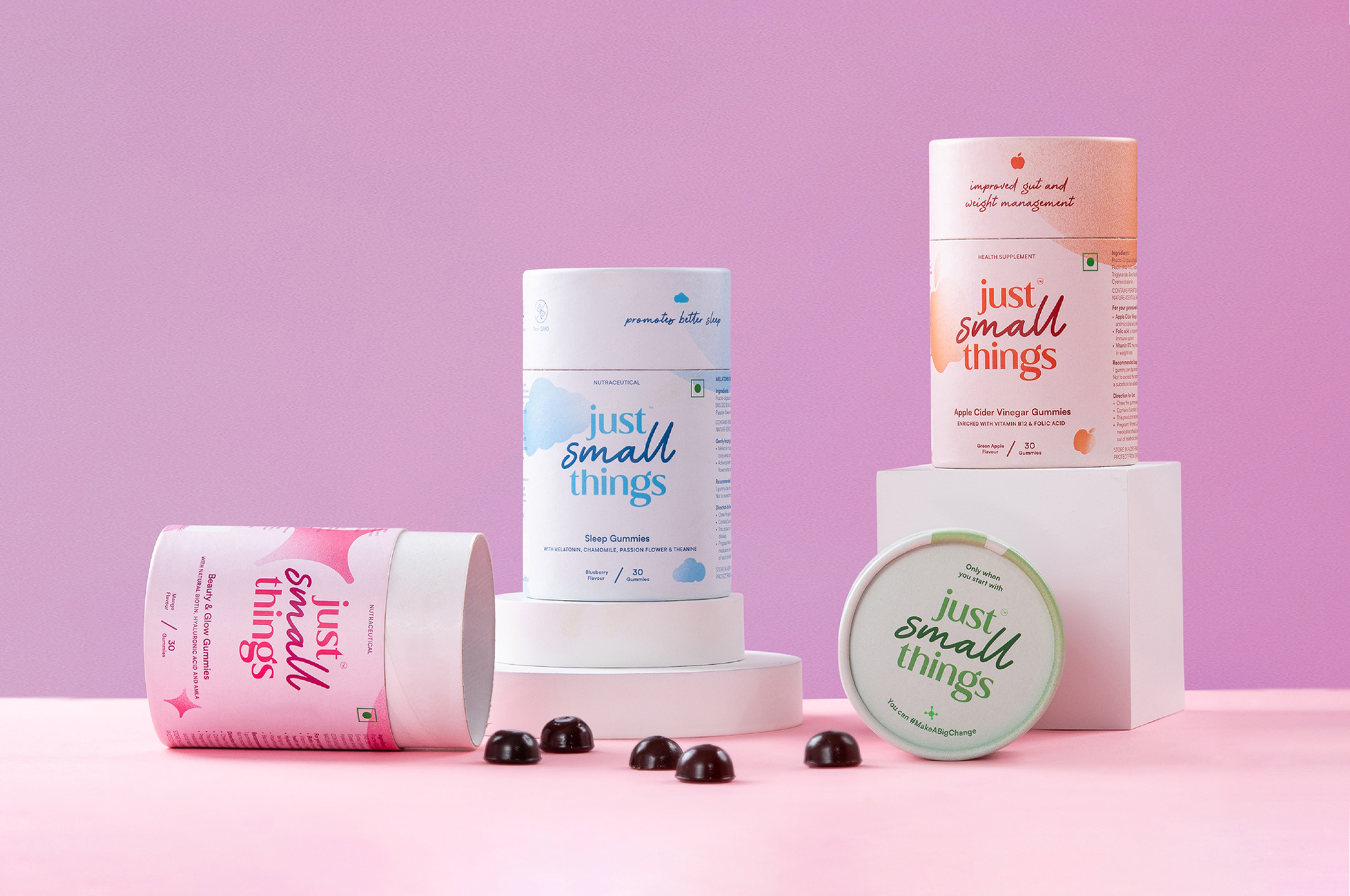
Just Small ThingsDesigning a personal care nutraceutical brand
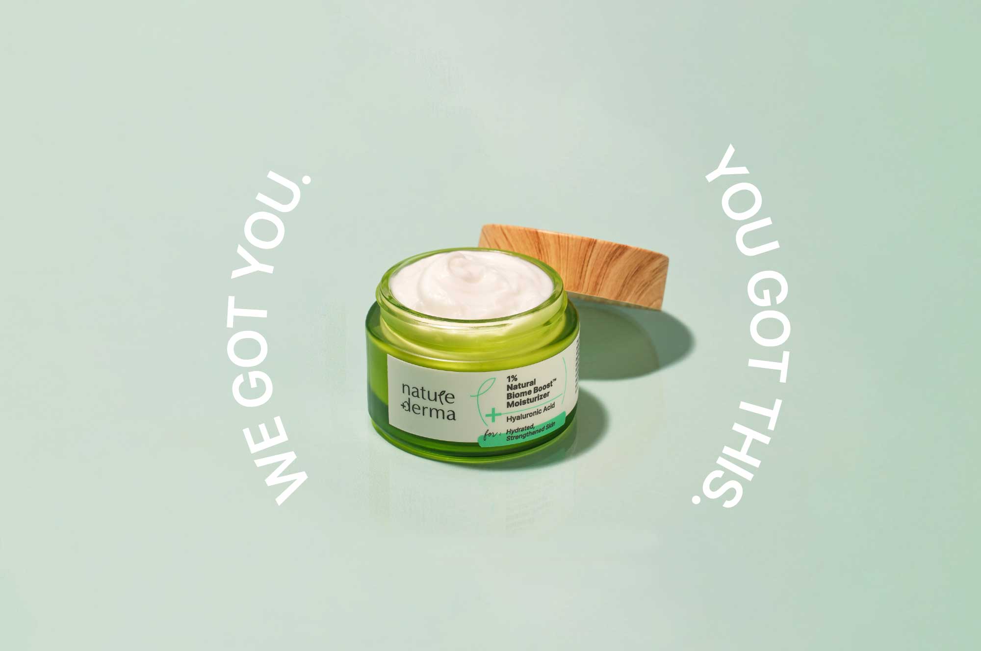
Nature DermaCommunications for active skincare

DoozeBranding & UI design for an alcohol delivery app
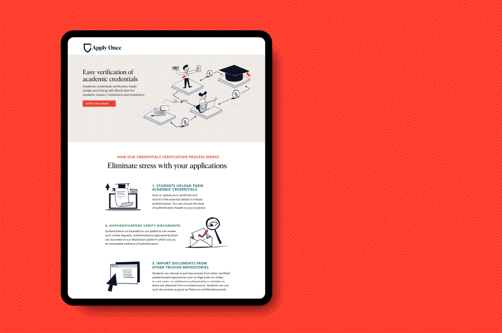
Apply Once and Veri OnceBranding a new age educational navigator
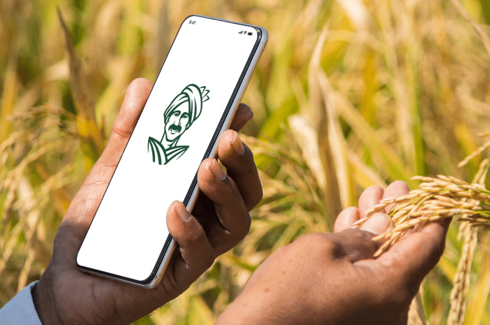
eFarmarket by AP markfedDesigning an identity for an agritech platform
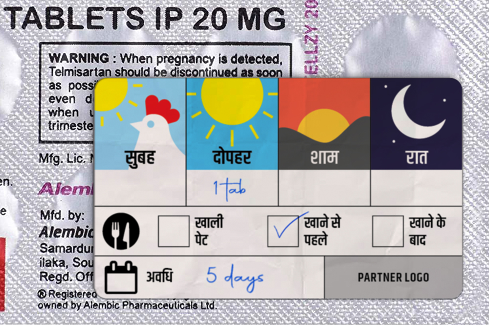
Stickers to Monitor Drug DosageSelf Initiated Project

AzlyaBranding a cultural yet contemporary fashion Label
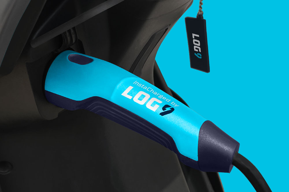
Log9 MaterialsRebranding an energy solutions company

Science of HimMale wellness treated with science
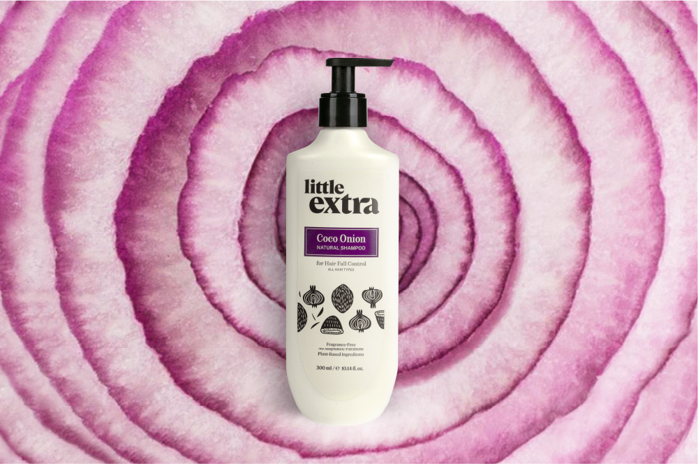
Little ExtraAll natural personal care

Pristyn CareRebranding short stay surgery
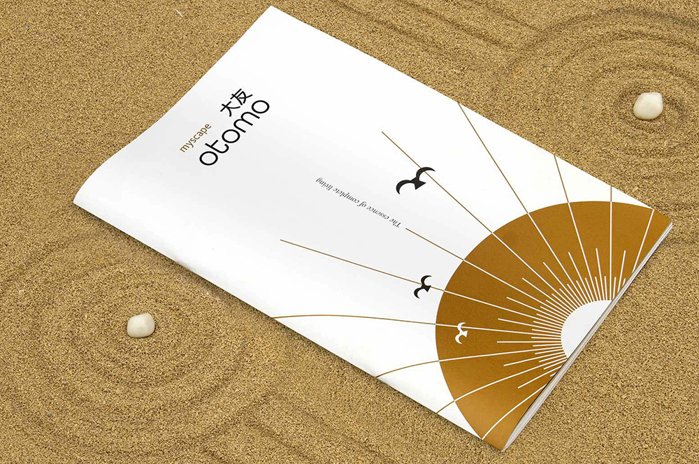
Myscape OtomoResidential property brochure
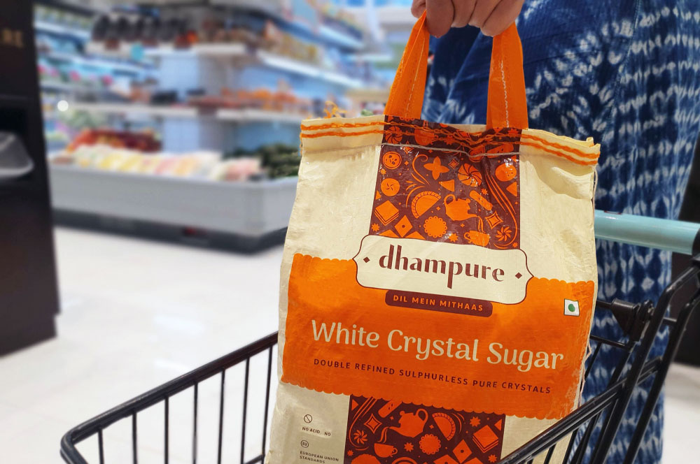
DhampureRebranding a Pioneer Sugar Brand
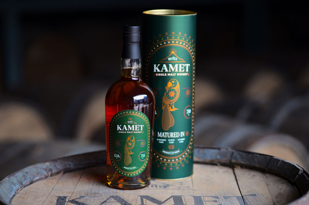
Kamet by Peak SpiritsWhisky Label

Bira 91 LightPackaging Refresh & Positioning

Bira 91 Sustainability ReportMission To Zero
BirthplaceBranding a Maternity Hospital
Godrej JerseyRevamping a Legacy Brand

Hyderabad FCRebranding a Football Club
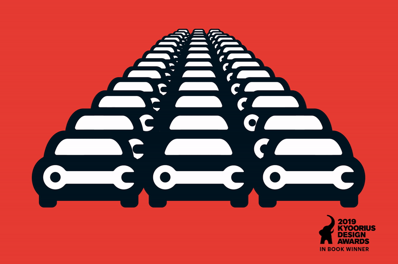
Go MechanicBranding a Multi-Brand Car Service Startup
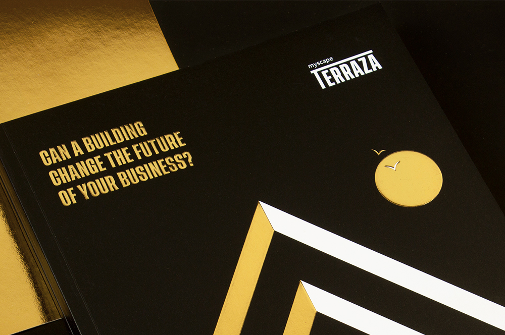
Myscape TerrazaCommercial Property Brochure

Advait by PioneerCampaign for Real Estate

CK Birla GroupBranding a Women's Hospital
HousrDesigning for a Mega Co-living Brand
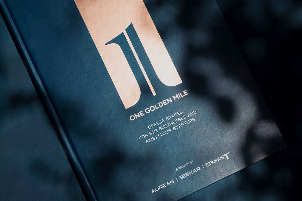
One Golden MileCommerical Brochure for Aurean| Eskar| Terminus
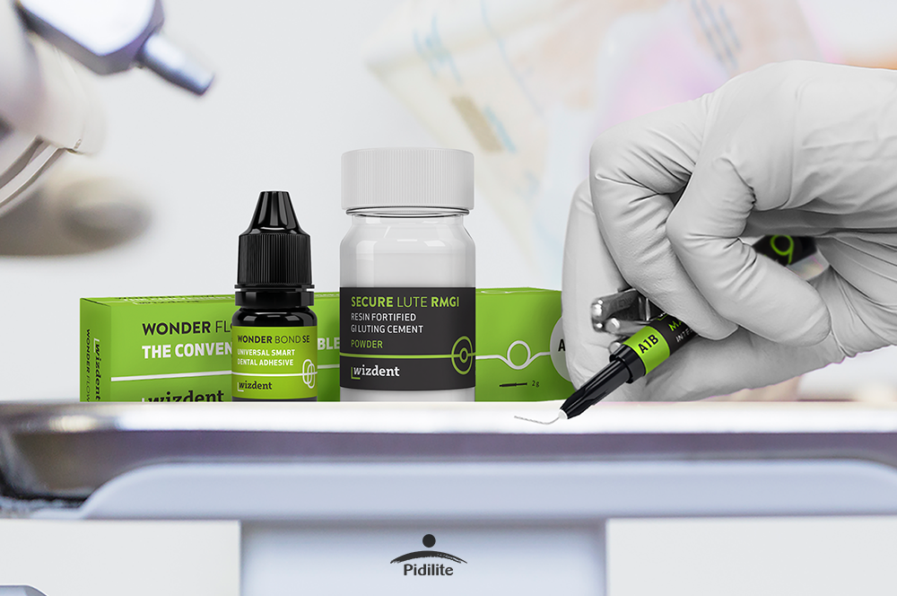
Wizdent by PidiliteIndia's Youngest Dental Consumables

AB Plus Speciality HospitalBranding a boutique Hospital

Bira 91 LightAssociating Beer with Fitness
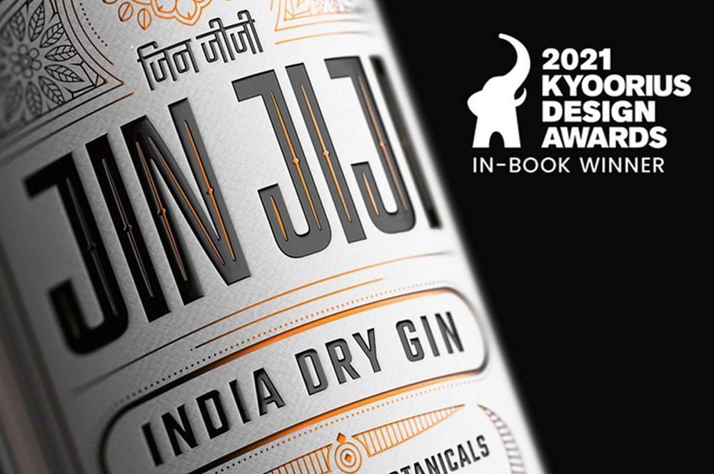
Jin JijiPackaging Indian Gin

AinqaHumanising data

The Dalai LamaCelebrating His Holiness
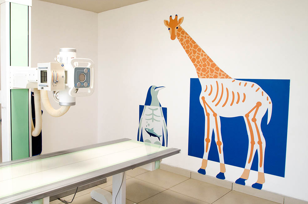
Bhagirathi Neotia HospitalEnvironmental Graphics
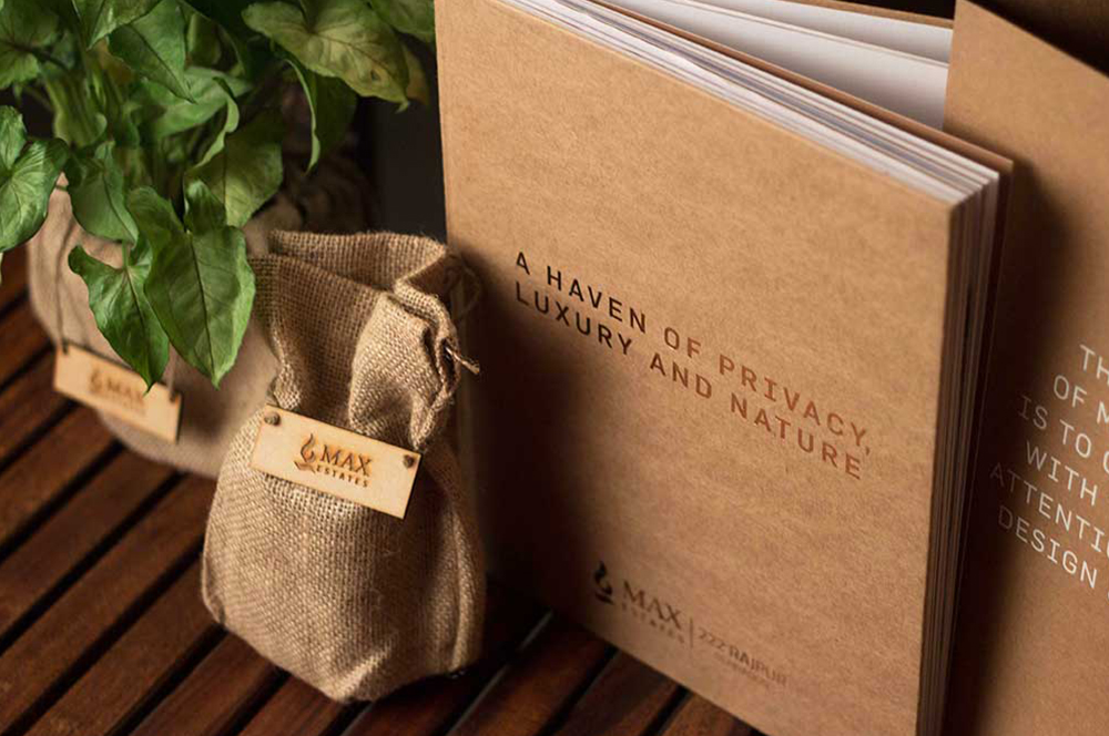
Max Estates, DehradunResidential Property Brochure & Communications
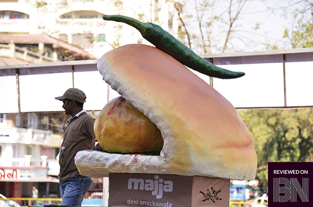
MajjaBranding a Chain of QSR in Ahmedabad

QuaQuaBranding a Virtual Travel Platform
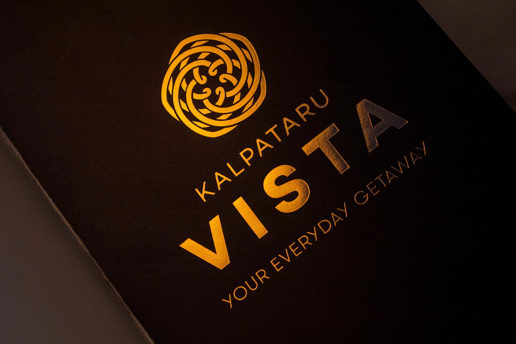
Kalpataru VistaResidential Property Brochure & Communications
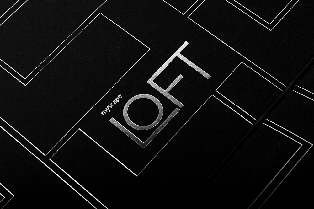
Myscape LoftResidential Property Brochure

Fuel BuddyBranding India's First Fuel Delivery Platform
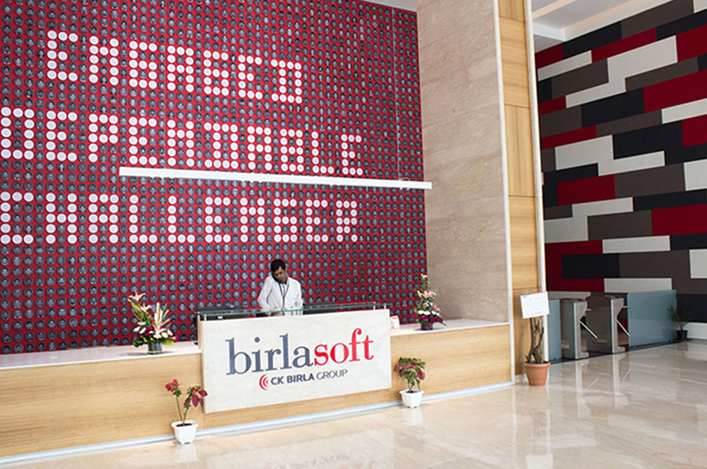
BirlasoftRebranding a Global IT Service Provider

The Telegraph OnlineDesign Language
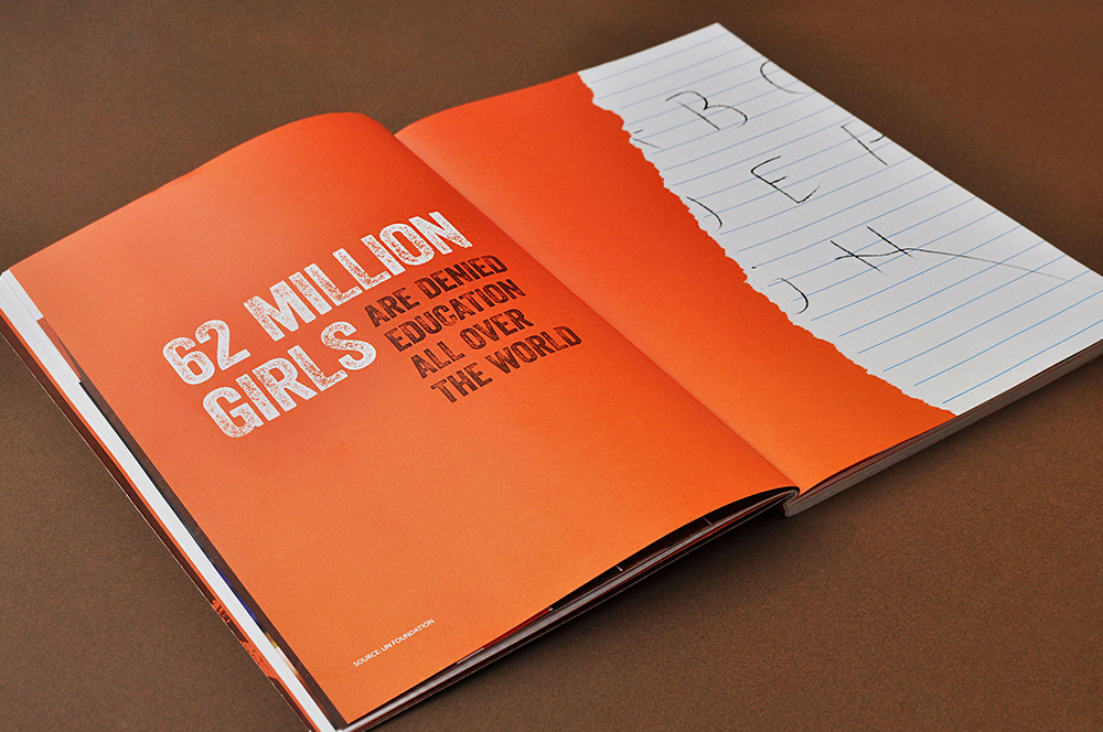
Danone EcosystemWomen Empowerment Brochure
Central Square FoundationDesign for Non-Designers
Seven BeanstalkCoffee Packaging

SlingshotDesigning for an Ed-tech Brand

CareCoverBranding a Pre-approved Medical Loan Card
Myscape WeaveCommercial Property Brochure

NumberzBranding a Fintech Startup

SunshineBranding a Multi Speciality Hospital

The Tooth CompanyBranding a Dental Clinic

MedicsBranding Lucknow's Super Speciality Hospital
Not So SeriousRebranding a Luxury fashion label

OlivaRebranding a Chain of Medico Aesthetic Clinics
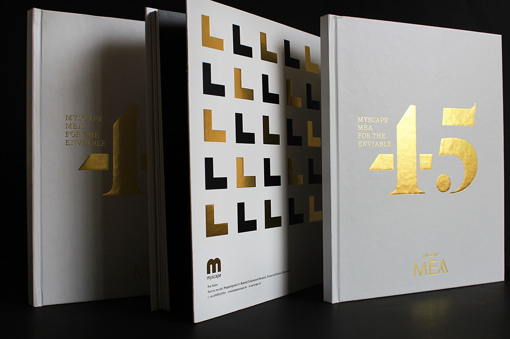
Myscape MeaResidential Property Brochure
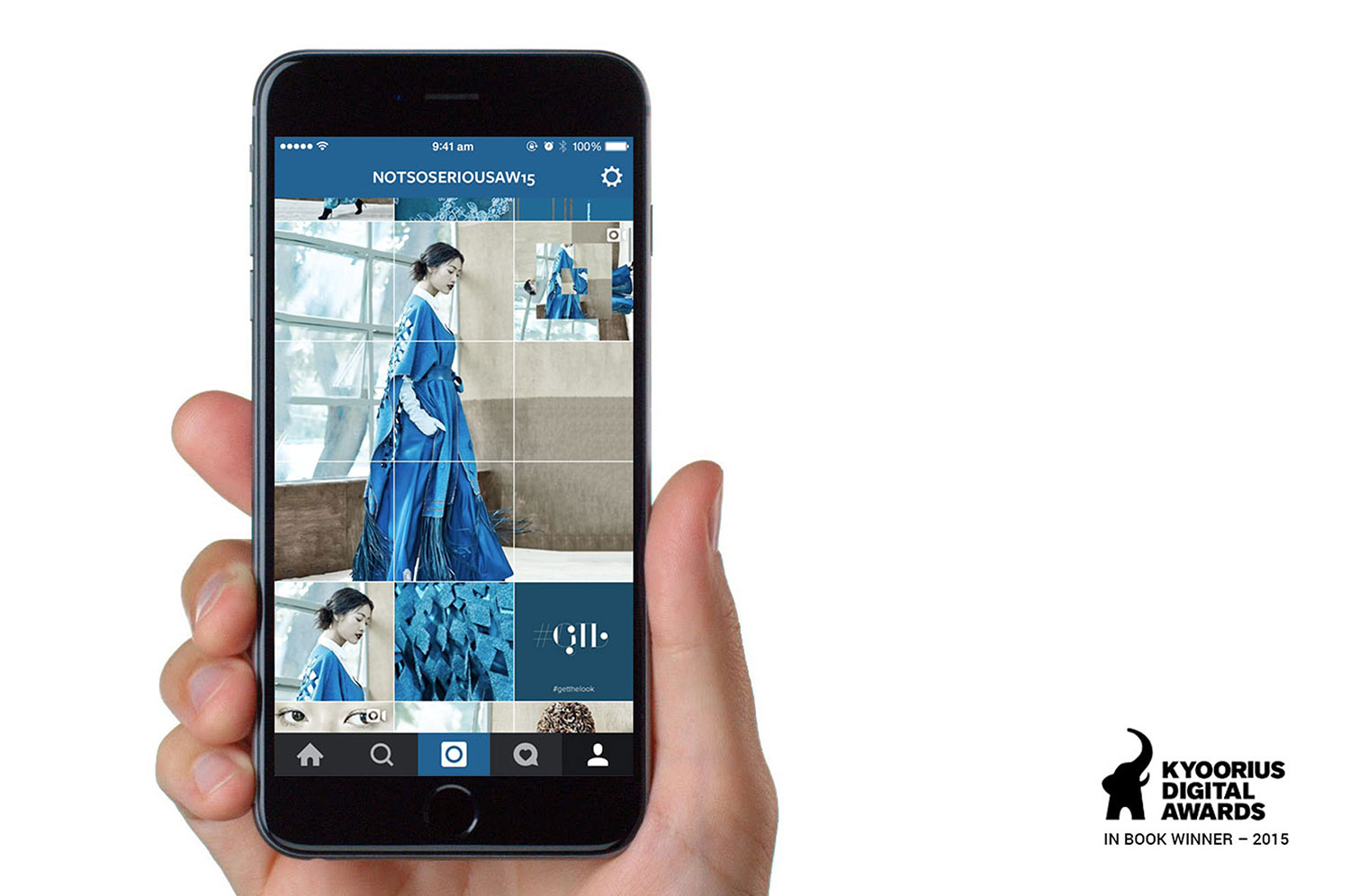
Not So SeriousAn Instagram Lookbook
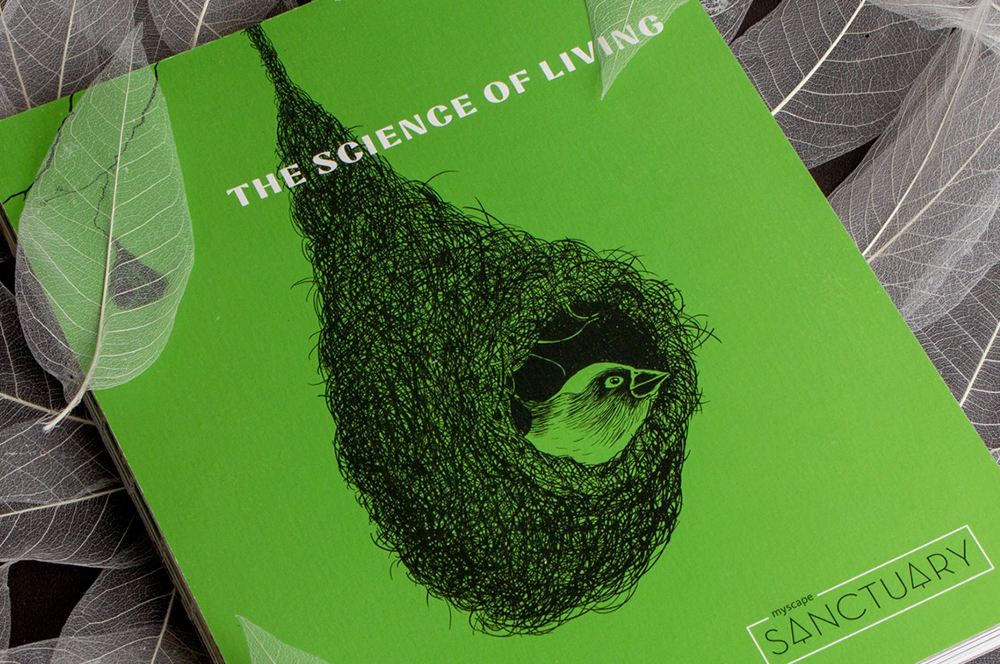
Myscape SanctuaryResidential Property Brochure & Communications
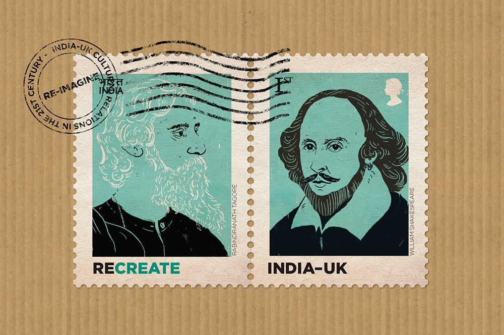
British CouncilIndia-UK relationship
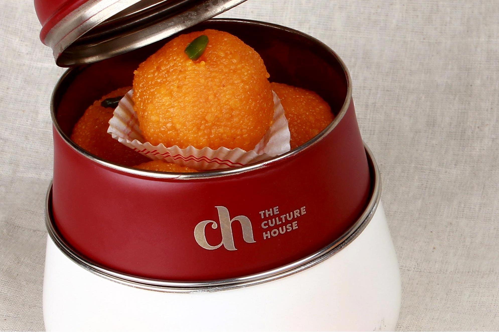
The Culture HouseRestaurant Branding
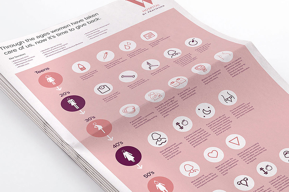
PratikshaBrand India’s Largest Hospital for Women
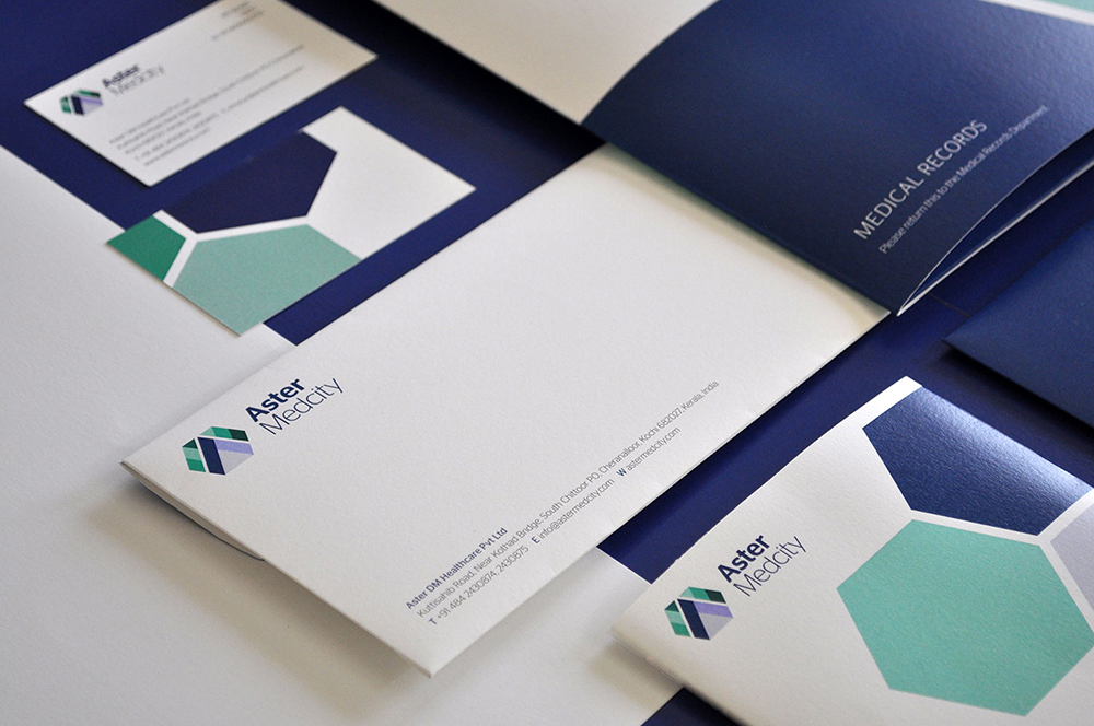
Aster MedcityBranding a Healthcare Destination
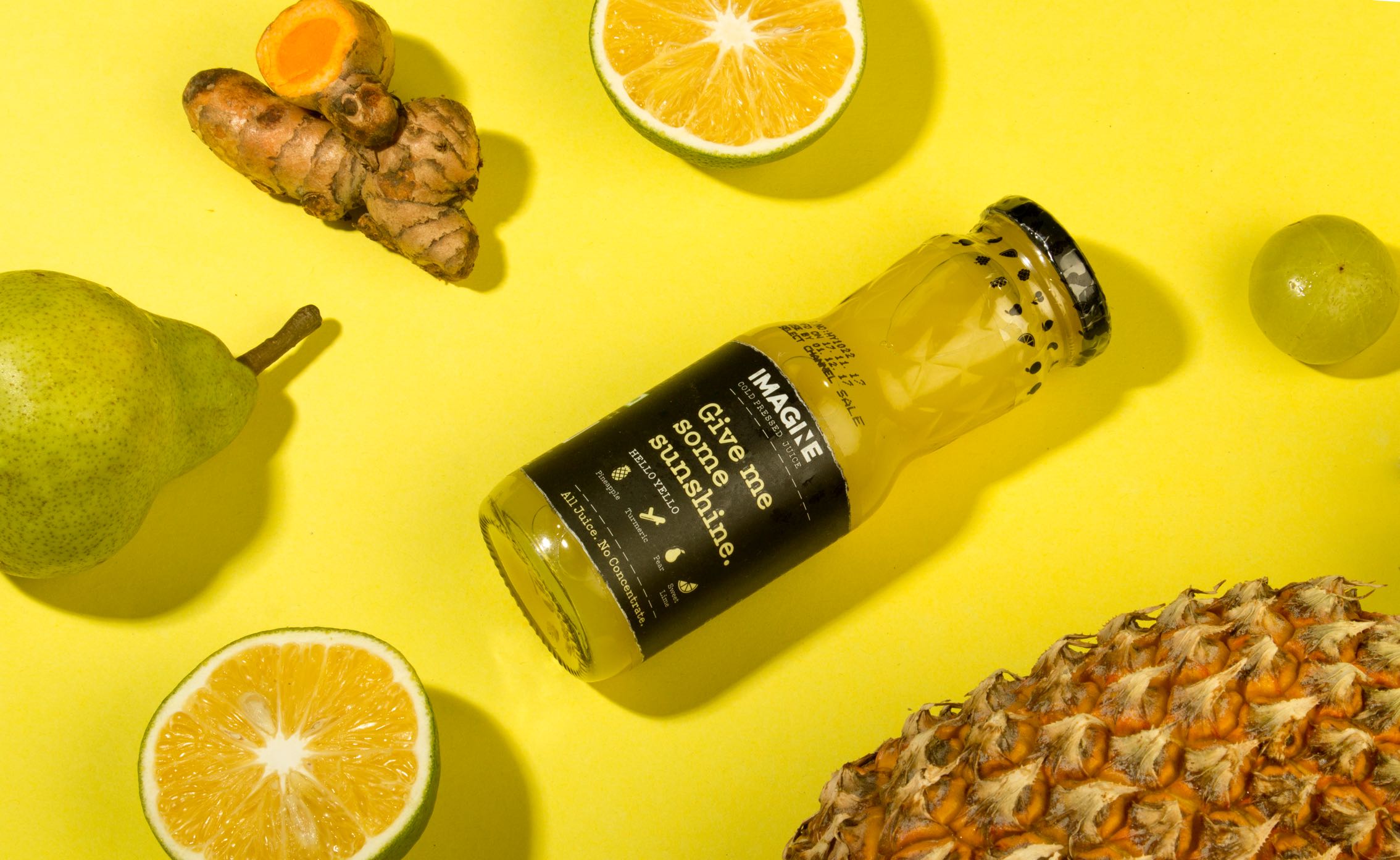
ImagineCold Pressed Juice Packaging
Nishada by My HomeResidential Property Brochure

TummyfullBranding a Homemade Food Tech Venture

Central Square FoundationAnnual Report

MedisyncBranding a B2B knowledge delivery platform
Intuit IndiaWhitepaper Design
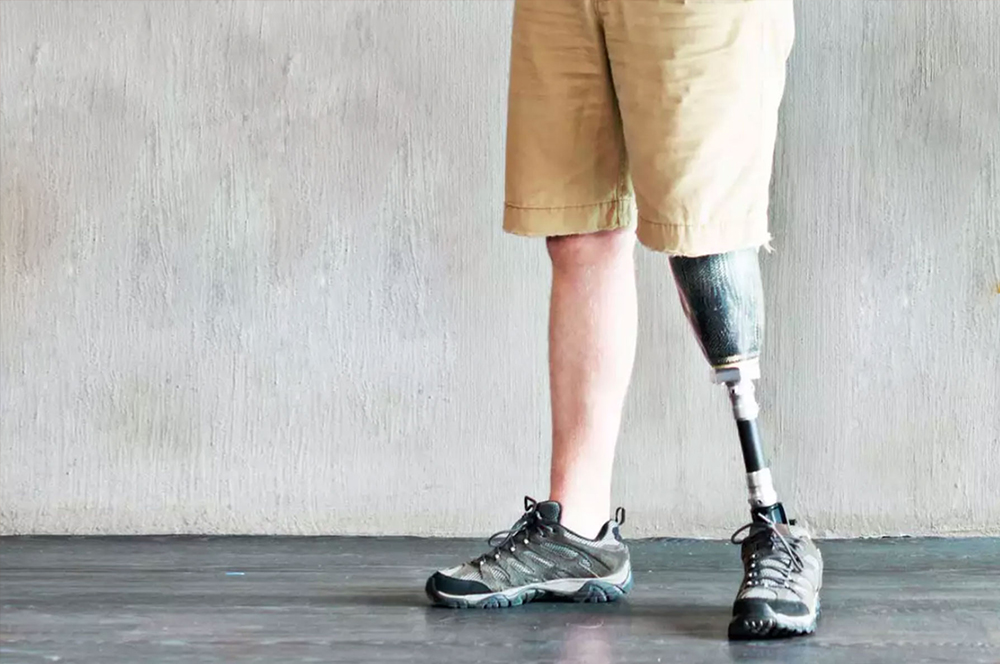
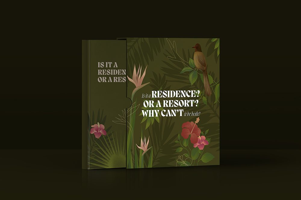
CPOBranding a Chain of Prosthetic Clinics

ORDReal Estate Branding
Myscape Isle of SkyResidential Property Brochure

TruSpaceDynamic Real Estate Branding
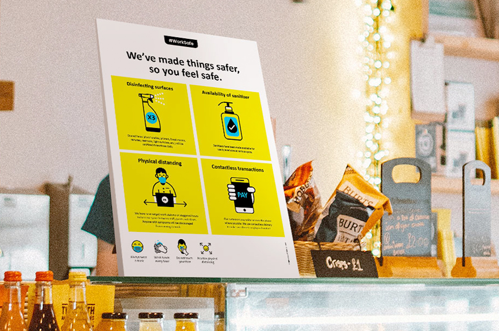
Work Safe Covid19 PostersSelf Initiated Project

StudentaccoBranding a Student Accommodation Portal
ShrachiDesigning a Notebook Brand for India
SWOTNotebook Cover Design

The Pointe by TerminusResidential Property Brochure
Asian BariatricsBranding a Bariatric Hospital
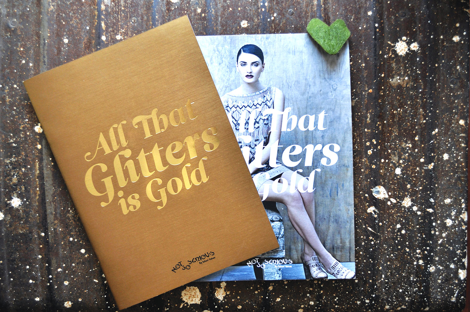
Not So SeriousFashion Lookbook
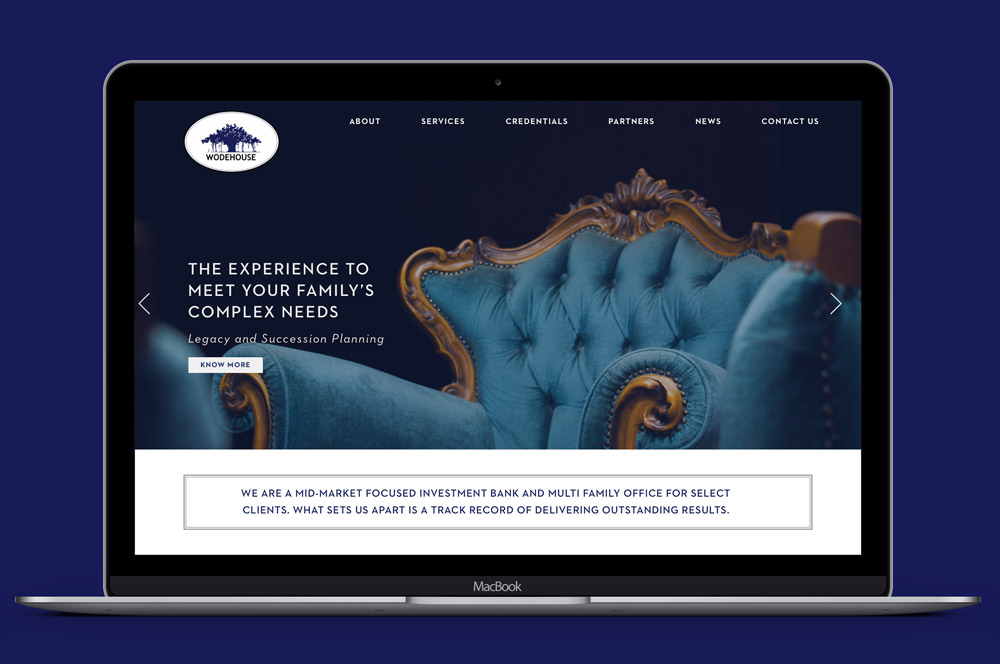
Wodehouse CapitalWebsite Design
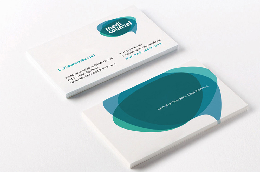
MediCounselBranding a Medical Portal
Subscribe to our Newsletter
Subscribe to our Newsletter
Subscribe to our Newsletter