Question
How do you redesign an iconic brand that has stood the test of time?
Answer
Balancing legacy with future ambitions.
Question
How do you redesign an iconic brand that has stood the test of time?
Answer
Balancing legacy with future ambitions.
Question
How do you redesign an iconic brand that has stood the test of time?
Answer
Balancing legacy with future ambitions.
Question
How do you redesign an iconic brand that has stood the test of time?
Answer
Balancing legacy with future ambitions.
Question
How do you redesign an iconic brand that has stood the test of time?
Answer
Balancing legacy with future ambitions.
Ghadi | RSPL Group
Ghadi | RSPL Group
Ghadi | RSPL Group
Ghadi | RSPL Group
Ghadi | RSPL Group
Ghadi, a brand owned by RSPL Group, is a well-known and respected name in the Indian detergent market. With a presence in more than 48% of Indian households annually, Ghadi has established itself as a category leader. The brand prides itself on its superior cleaning capabilities, setting it apart from its competitors. Its tagline, "Pehle istemal karein, fir wishwas karein," reinforces the brand's confidence in its quality and encourages consumers to give it a try.
Ghadi wanted to expand its reach to new geographies and increase penetration in existing ones. To achieve this, the brand needed to create an identity that resonated with its multilingual target audience and fostered strong connections through regional languages. Additionally, the brand needed to develop a packaging experience that was consistent across different product formats such as cakes, powder, and machine wash variants.
The challenge with Ghadi was to balance its iconic legacy with its future ambitions. We needed to conduct a thorough brand audit that accounted for both the emotional and rational aspects of the brand's identity. This involved analyzing the established memory structures associated with the brand packaging and understanding our target audience in depth. Only after gaining these insights could we embark on the redesign exercise and create a new packaging system that paid homage to the brand's heritage while positioning it for future growth.
SERVICES IDENTITY DESIGN | PACKAGING DESIGN
CLIENT GHADI (RSPL GROUP)
SECTOR FMCG
Design Audit
Design Audit
Design Audit
Design Audit
Visual inconsistency in multi-lingual identity
Visual inconsistency in multi-lingual identity
Visual inconsistency in multi-lingual identity
Visual inconsistency in multi-lingual identity
Visual inconsistency in multi-lingual identity
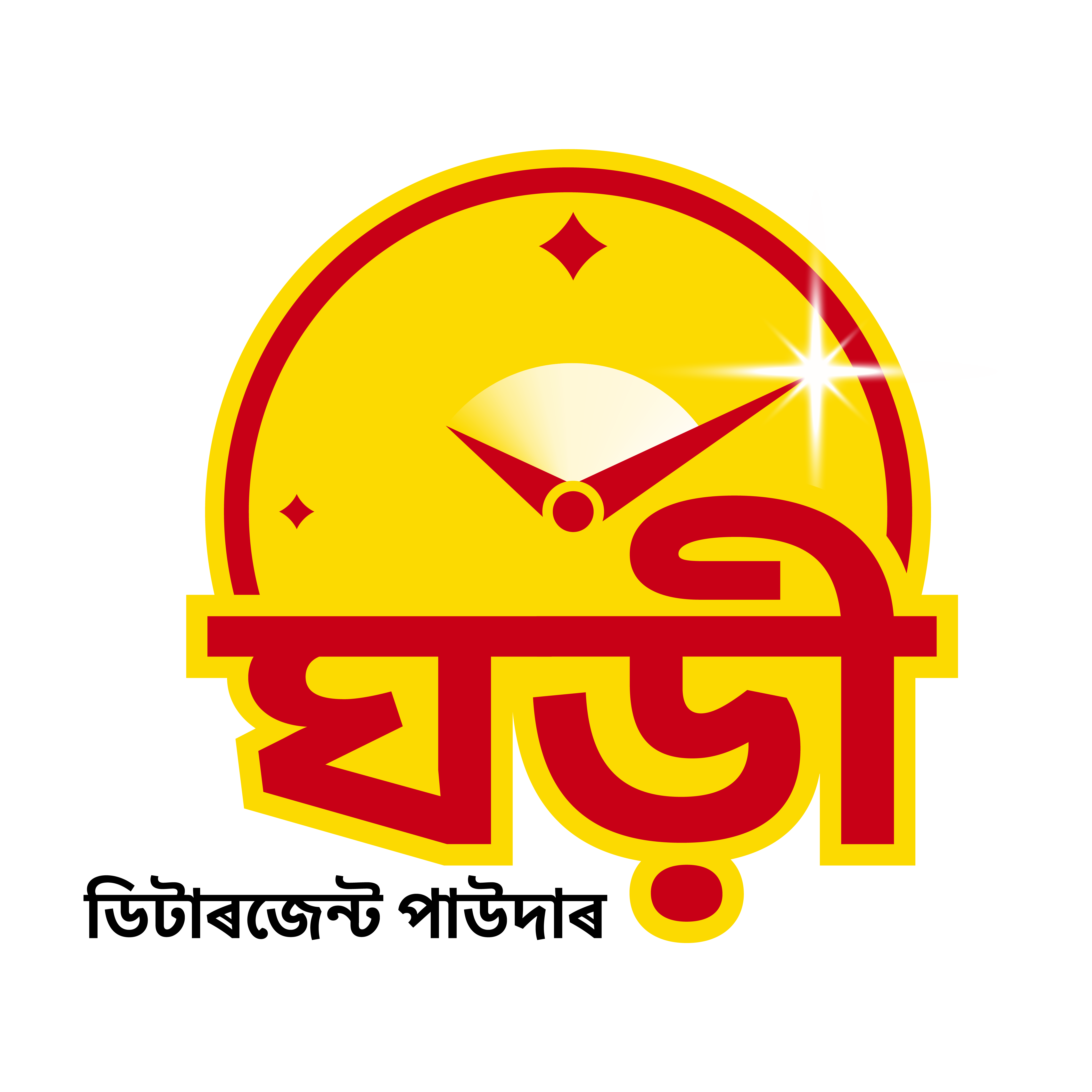
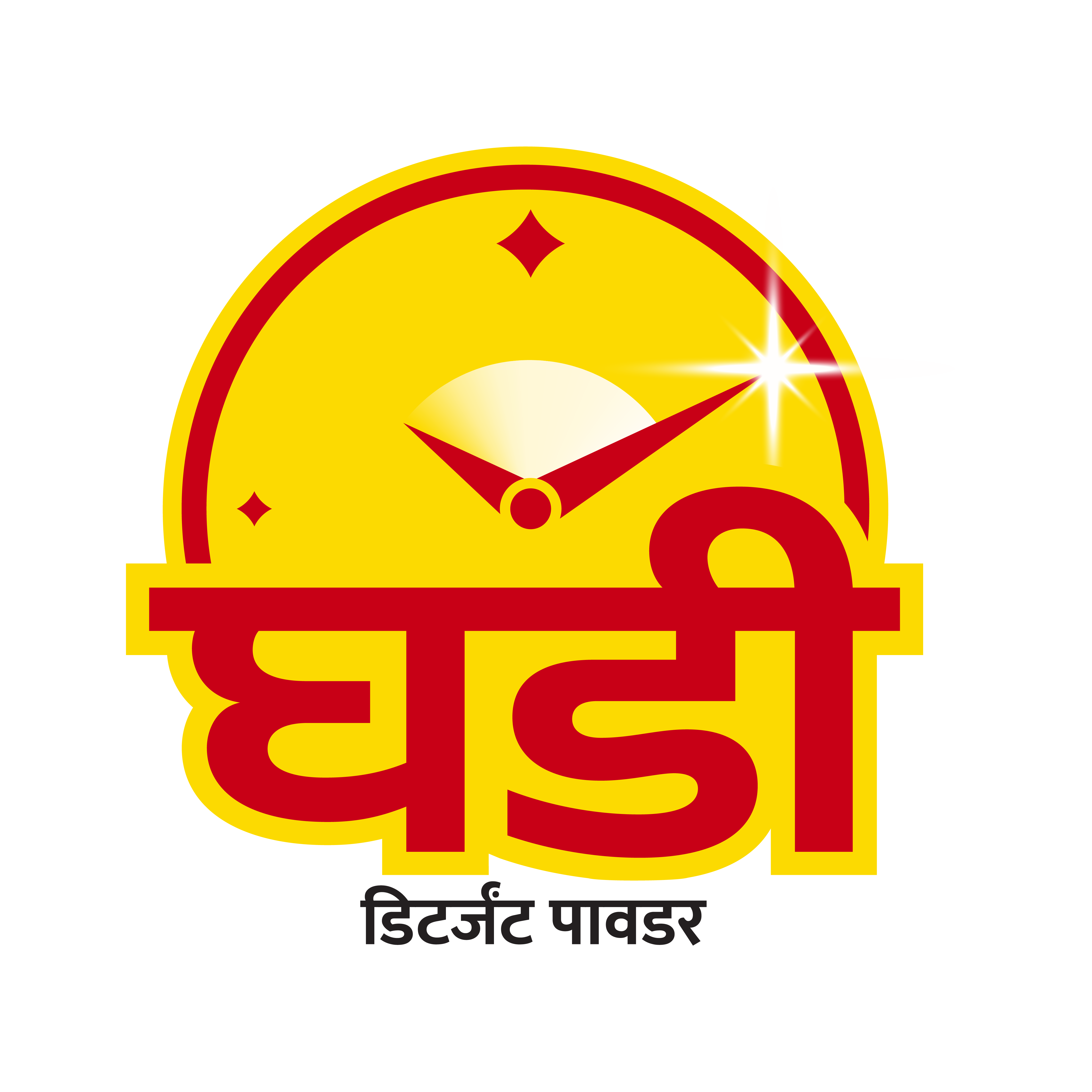
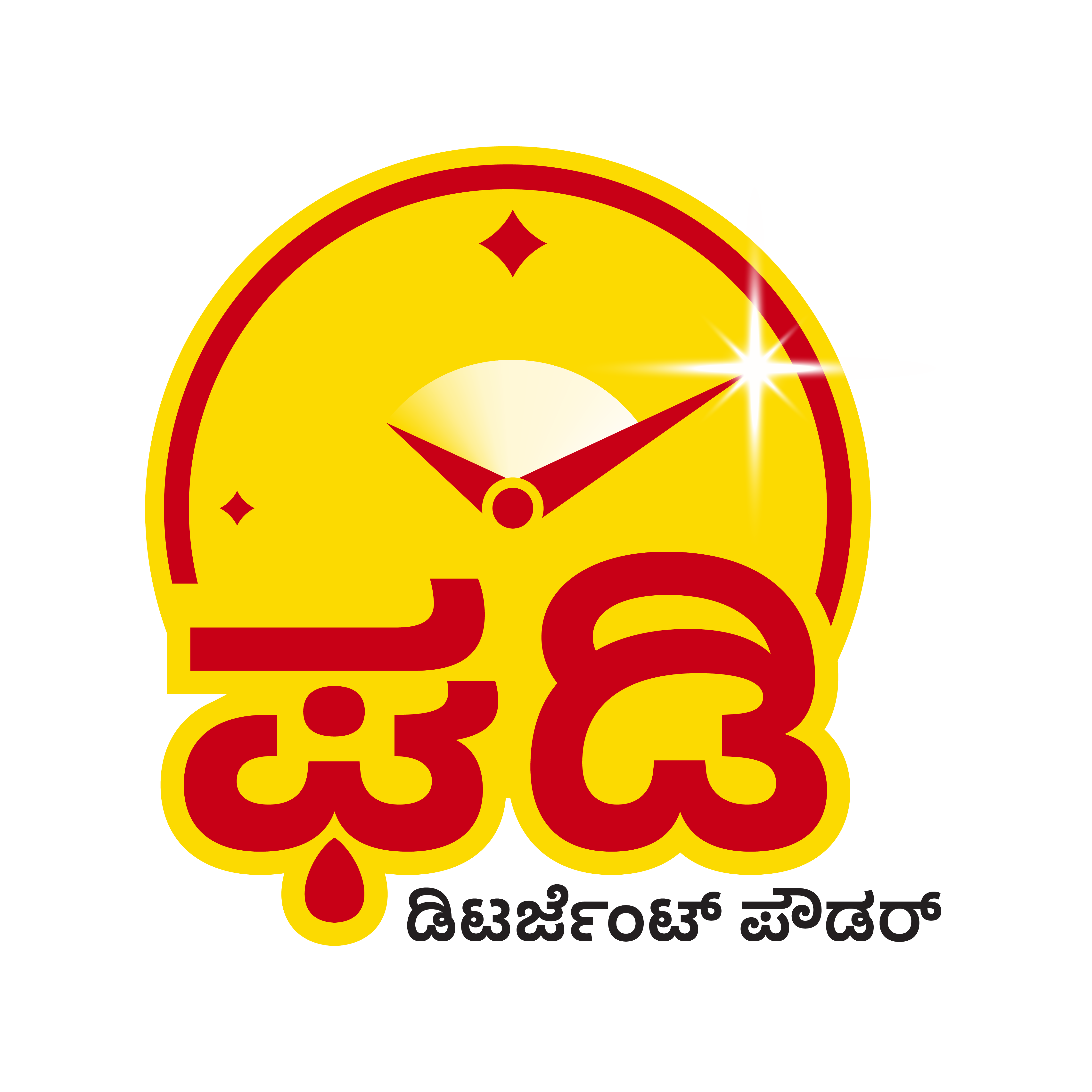
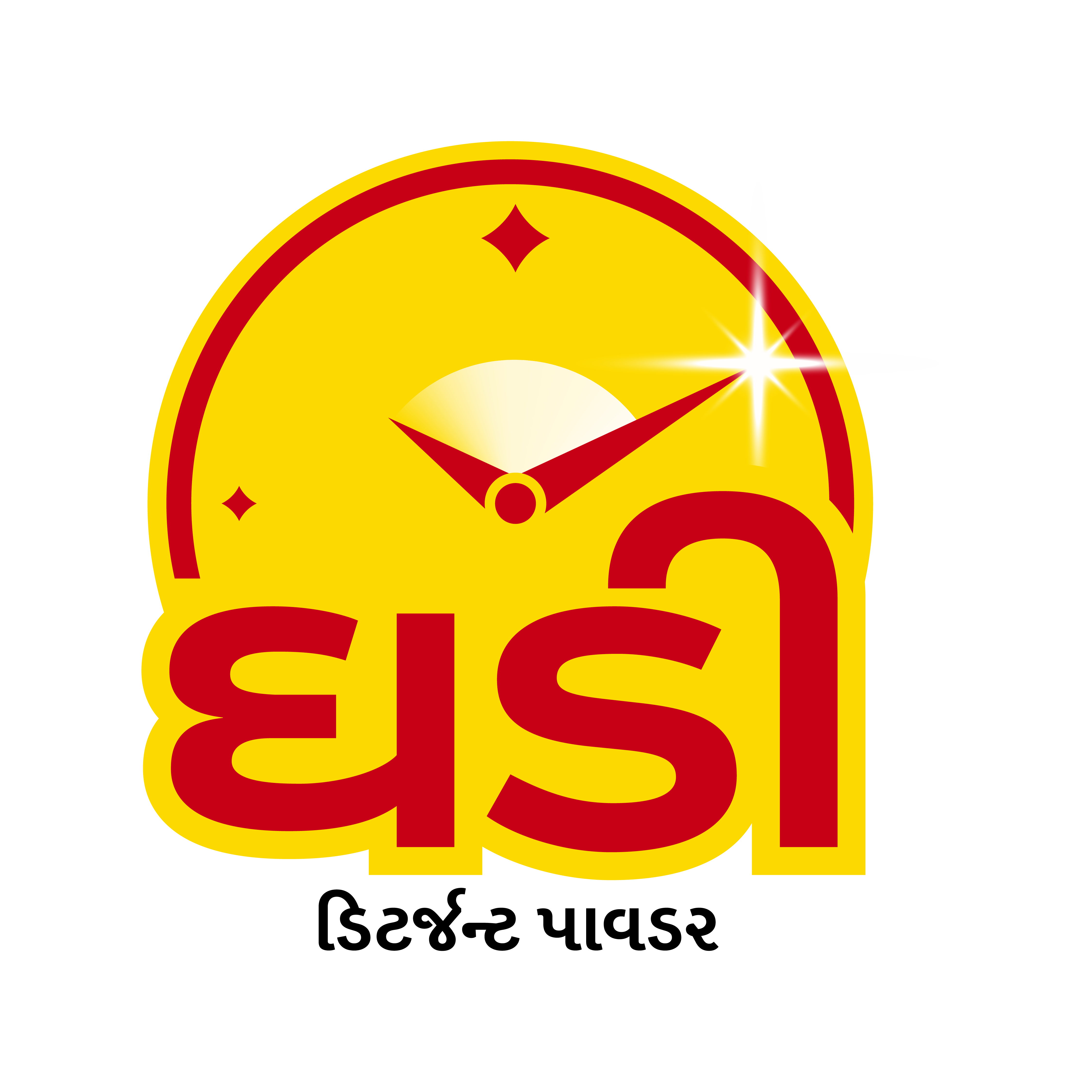
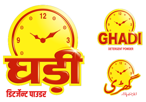
The Ghadi logotype needed an updated while retaining its legacy which can be further extended into multiple Indian language scripts.
The Ghadi logotype needed an updated while retaining its legacy which can be further extended into multiple Indian language scripts.
The Ghadi logotype needed an updated while retaining its legacy which can be further extended into multiple Indian language scripts.
The Ghadi logotype needed an updated while retaining its legacy which can be further extended into multiple Indian language scripts.
The Ghadi logotype needed an updated while retaining its legacy which can be further extended into multiple Indian language scripts.
Need for a visual portfolio architecture
Need for a visual portfolio architecture
Need for a visual portfolio architecture
Need for a visual portfolio architecture
Need for a visual portfolio architecture
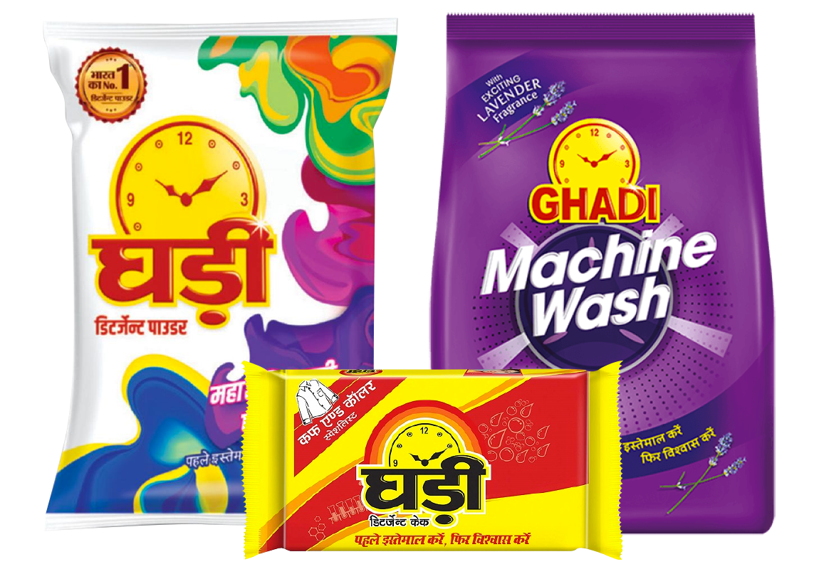
There was no unifying visual architecture for the product portfolio.
There was no unifying visual architecture for the product portfolio.
There was no unifying visual architecture for the product portfolio.
There was no unifying visual architecture for the product portfolio.
There was no unifying visual architecture for the product portfolio.
Design Audit
Design Audit
Design Audit
Design Audit

Visual inconsistency in multi-lingual identity
Visual inconsistency in multi-lingual identity
Visual inconsistency in multi-lingual identity
Visual inconsistency in multi-lingual identity
Visual inconsistency in multi-lingual identity
The Ghadi logotype needed an updated while retaining its legacy which can be further extended into multiple Indian language scripts.
The Ghadi logotype needed an updated while retaining its legacy which can be further extended into multiple Indian language scripts.
The Ghadi logotype needed an updated while retaining its legacy which can be further extended into multiple Indian language scripts.
The Ghadi logotype needed an updated while retaining its legacy which can be further extended into multiple Indian language scripts.
The Ghadi logotype needed an updated while retaining its legacy which can be further extended into multiple Indian language scripts.

Need for a visual portfolio architecture
Need for a visual portfolio architecture
Need for a visual portfolio architecture
Need for a visual portfolio architecture
Need for a visual portfolio architecture
There was no unifying visual architecture for the product portfolio.
There was no unifying visual architecture for the product portfolio.
There was no unifying visual architecture for the product portfolio.
There was no unifying visual architecture for the product portfolio.
There was no unifying visual architecture for the product portfolio.

Ghadi packaging evolution
Ghadi packaging evolution
Ghadi packaging evolution
Ghadi packaging evolution
Ghadi packaging evolution
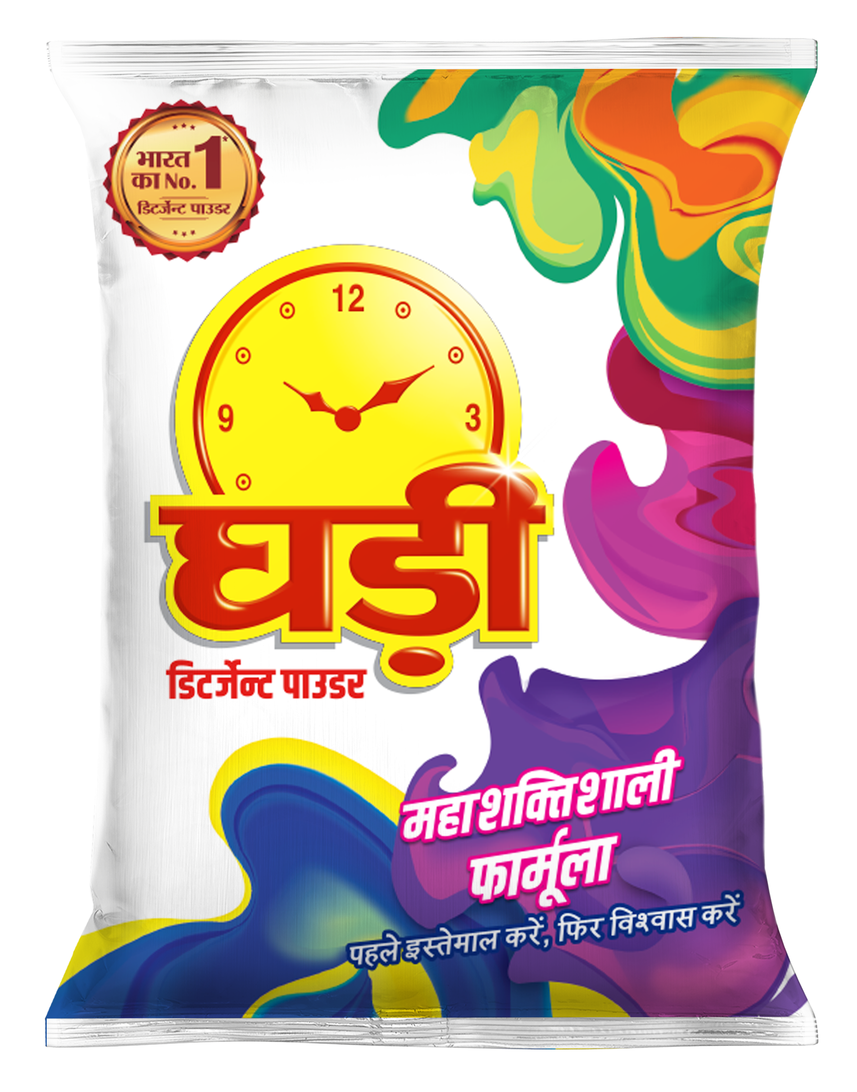
The white colour pack had significant visual equity with consumers. Also, red and yellow in the brand identity colours were non-negotiable.
The white colour pack had significant visual equity with consumers. Also, red and yellow in the brand identity colours were non-negotiable.
The white colour pack had significant visual equity with consumers. Also, red and yellow in the brand identity colours were non-negotiable.
The white colour pack had significant visual equity with consumers. Also, red and yellow in the brand identity colours were non-negotiable.
The white colour pack had significant visual equity with consumers. Also, red and yellow in the brand identity colours were non-negotiable.
Redesigning an identity for an iconic brand
Redesigning an identity for an iconic brand
Redesigning an identity for an iconic brand
Redesigning an identity for an iconic brand
Redesigning an identity for an iconic brand
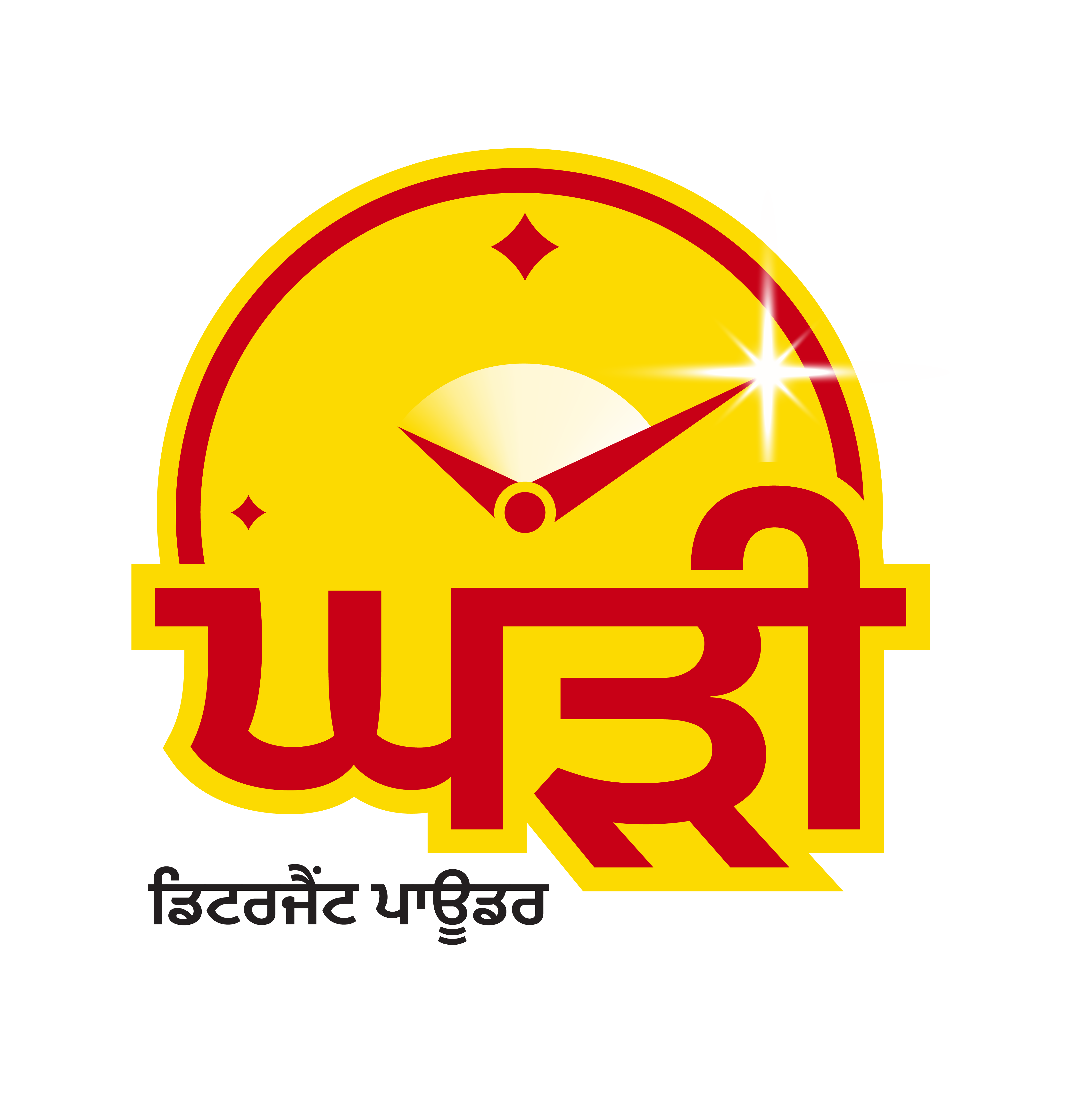
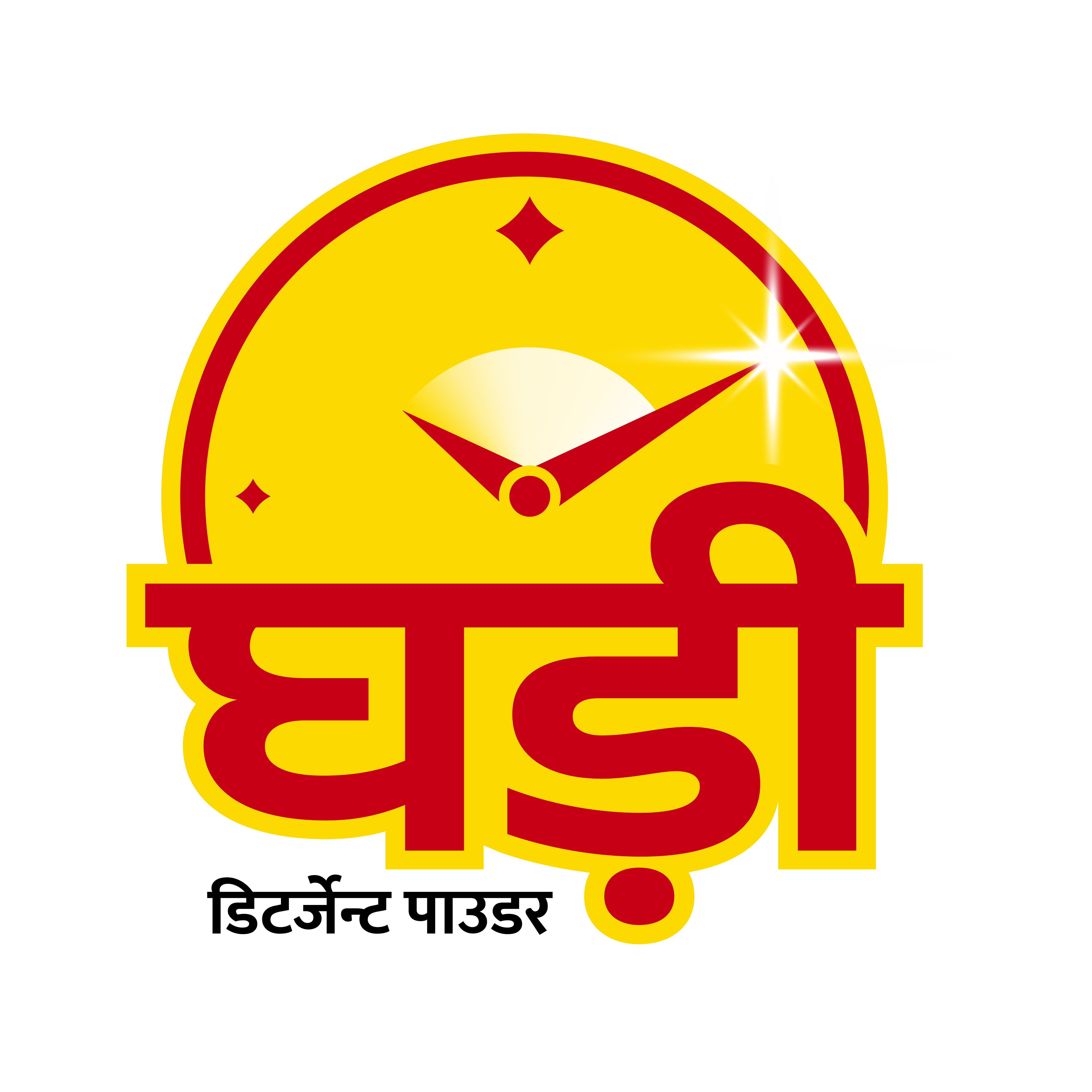
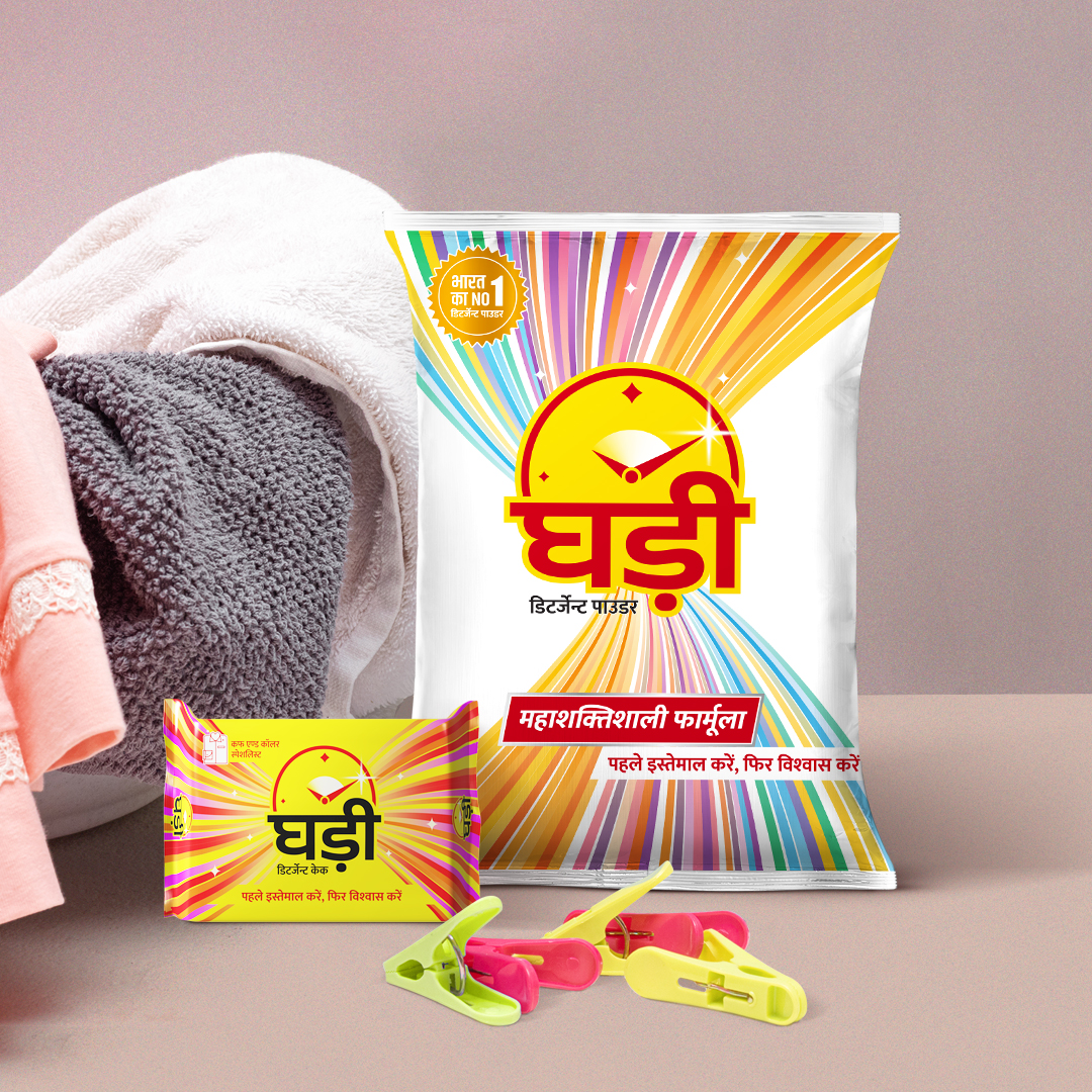
The new Ghadi identity has been carefully crafted to carry this legacy forward while being fresh and modern. The clock in the new identity has been simplified. The minute-hand and hour-hand movement shows the cleaning action where numbers are represented by sparkles – a metaphor for superior cleaning. The Ghadi logotype visually complements the clock mnemonic. A custom-designed sans serif logotype was crafted for more consistency and improved legibility on smaller pack sizes. Multilingual adaptations of the identity made in collaboration with White Crow Design.
The new Ghadi identity has been carefully crafted to carry this legacy forward while being fresh and modern. The clock in the new identity has been simplified. The minute-hand and hour-hand movement shows the cleaning action where numbers are represented by sparkles – a metaphor for superior cleaning. The Ghadi logotype visually complements the clock mnemonic. A custom-designed sans serif logotype was crafted for more consistency and improved legibility on smaller pack sizes. Multilingual adaptations of the identity made in collaboration with White Crow Design.
The new Ghadi identity has been carefully crafted to carry this legacy forward while being fresh and modern. The clock in the new identity has been simplified. The minute-hand and hour-hand movement shows the cleaning action where numbers are represented by sparkles – a metaphor for superior cleaning. The Ghadi logotype visually complements the clock mnemonic. A custom-designed sans serif logotype was crafted for more consistency and improved legibility on smaller pack sizes. Multilingual adaptations of the identity made in collaboration with White Crow Design.
The new Ghadi identity has been carefully crafted to carry this legacy forward while being fresh and modern. The clock in the new identity has been simplified. The minute-hand and hour-hand movement shows the cleaning action where numbers are represented by sparkles – a metaphor for superior cleaning. The Ghadi logotype visually complements the clock mnemonic. A custom-designed sans serif logotype was crafted for more consistency and improved legibility on smaller pack sizes. Multilingual adaptations of the identity made in collaboration with White Crow Design.
The new Ghadi identity has been carefully crafted to carry this legacy forward while being fresh and modern. The clock in the new identity has been simplified. The minute-hand and hour-hand movement shows the cleaning action where numbers are represented by sparkles – a metaphor for superior cleaning. The Ghadi logotype visually complements the clock mnemonic. A custom-designed sans serif logotype was crafted for more consistency and improved legibility on smaller pack sizes. Multilingual adaptations of the identity made in collaboration with White Crow Design.

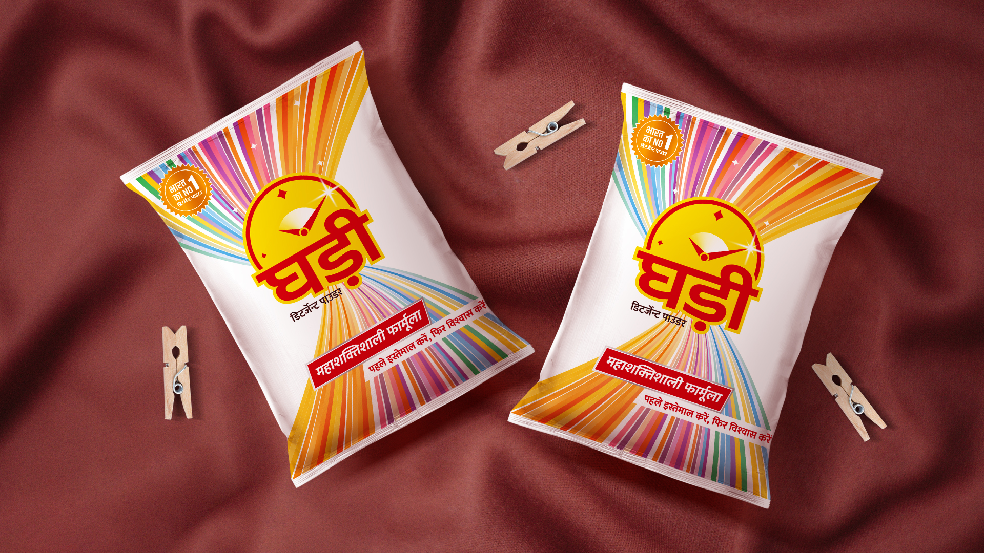
Capturing a visual movement of ‘squeezing’ into our packaging
Capturing a visual movement of ‘squeezing’ into our packaging
Capturing a visual movement of ‘squeezing’ into our packaging
Capturing a visual movement of ‘squeezing’ into our packaging
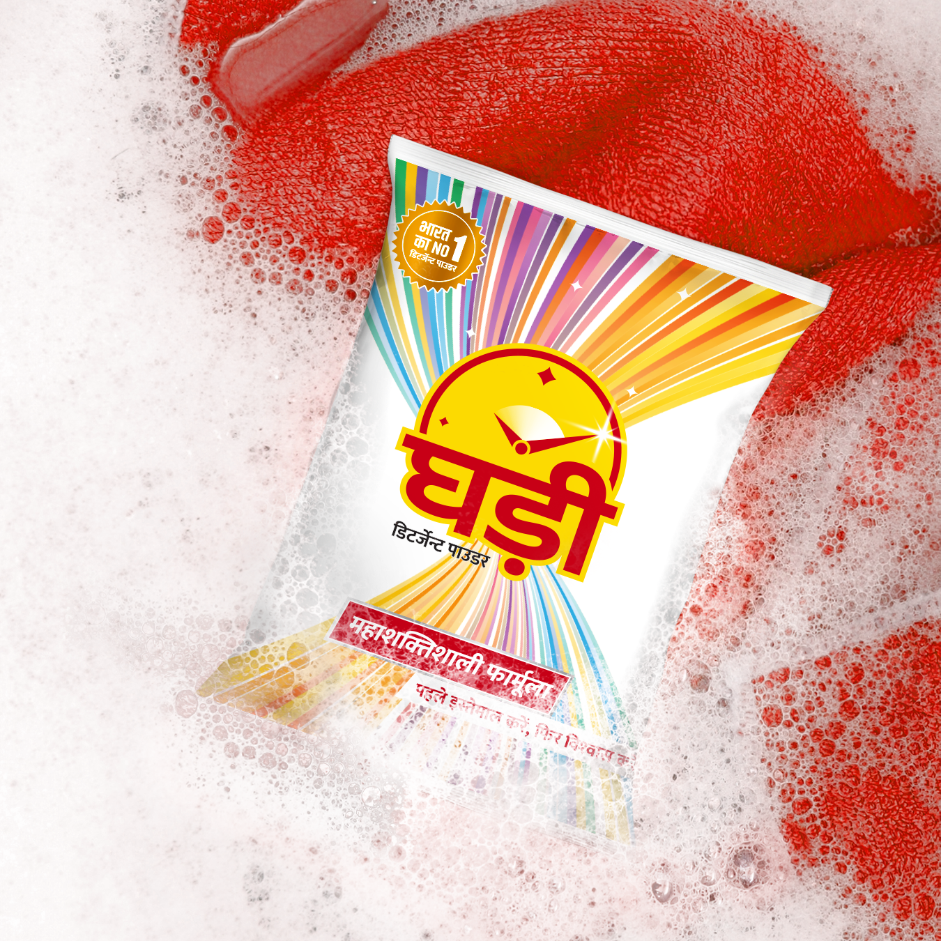
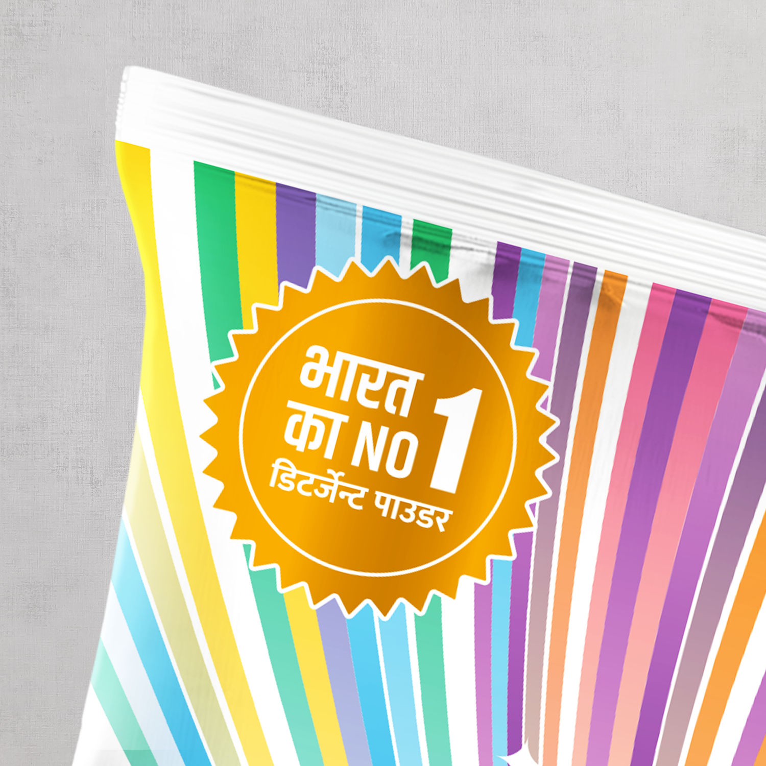
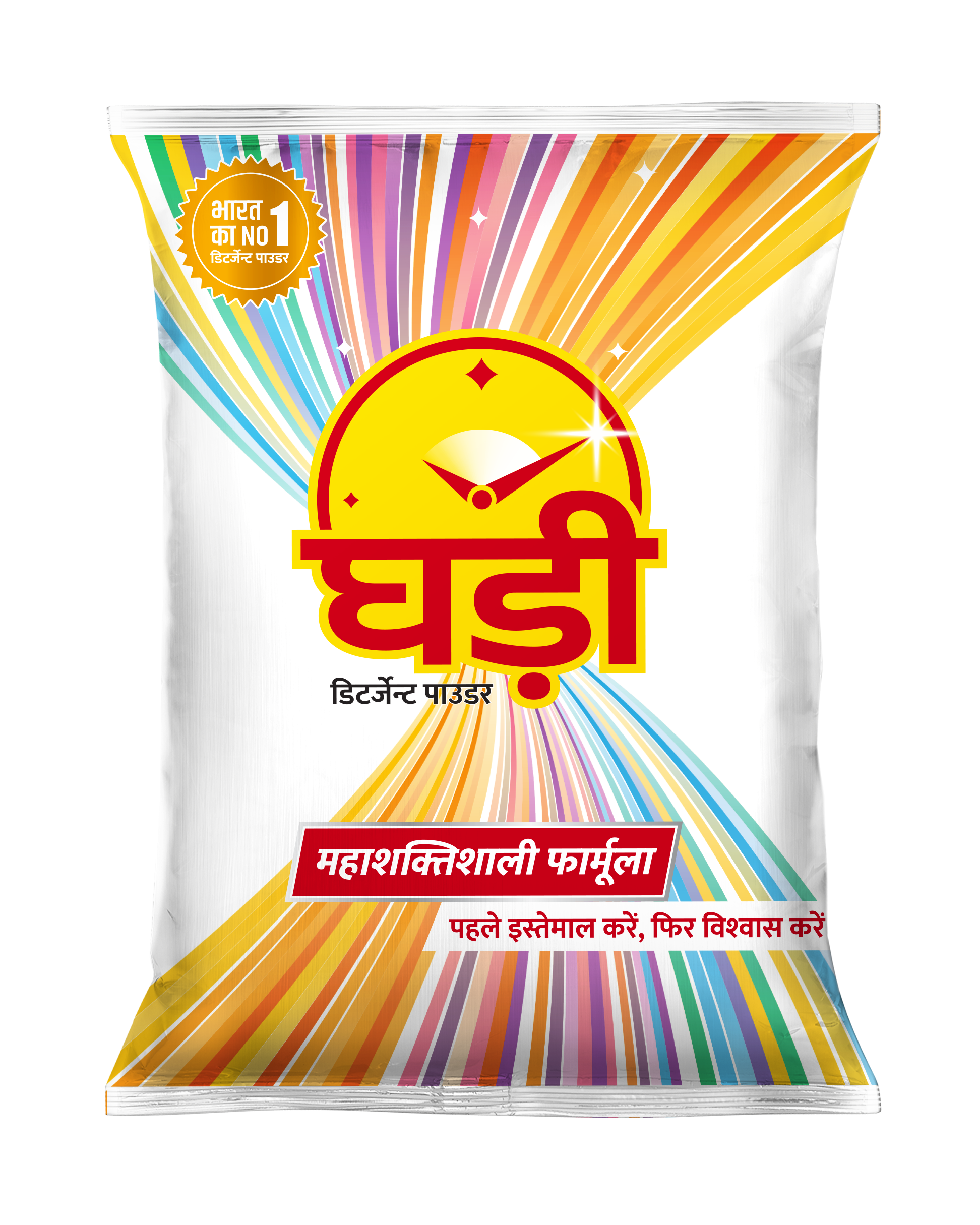
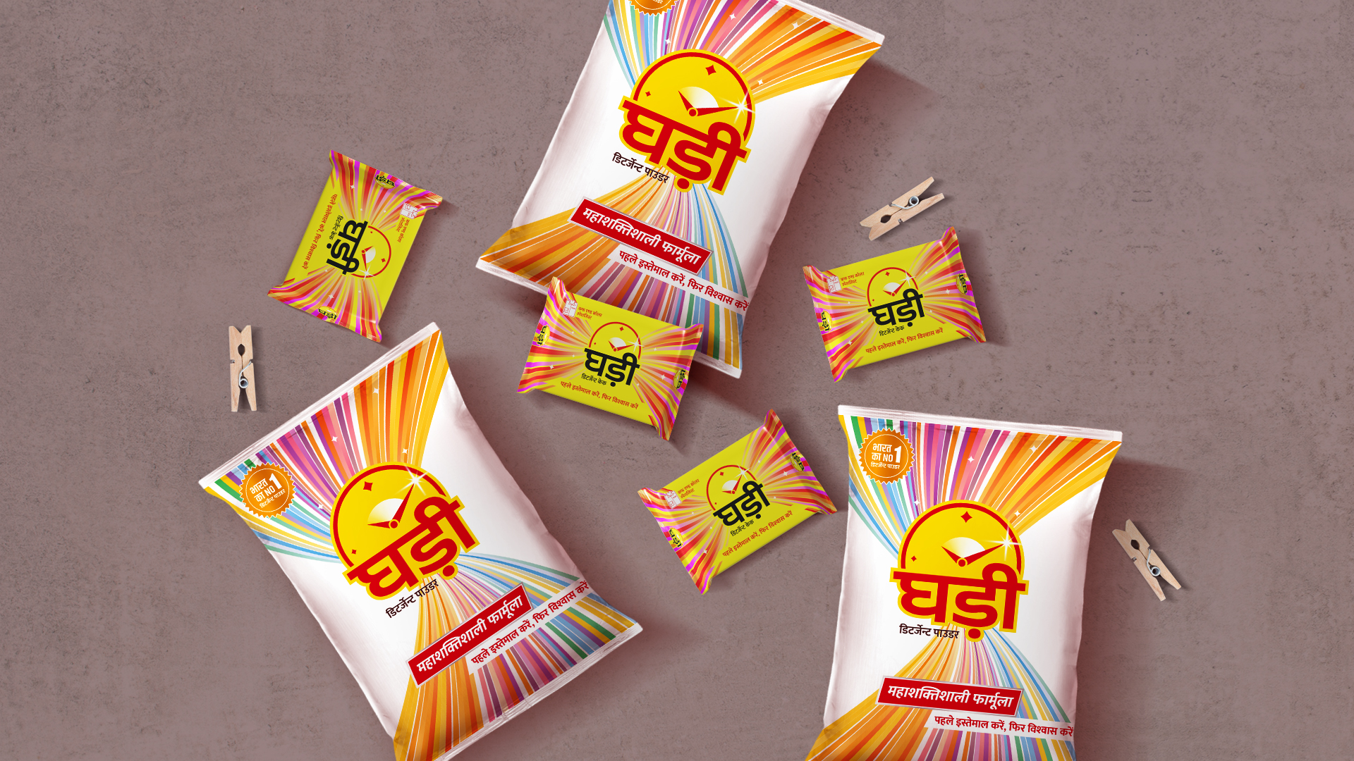
The new Ghadi packaging was inspired by consumer behavior during bucket washing. Consumers often hand squeeze and twist their garments to ensure that every particle of dirt and stain is removed. To reflect this process in the packaging design, we incorporated a striking graphic that represents squeezing. The design features rays that symbolize shine and brightness along with a twist that signifies deep cleaning, aligning well with the brand's 'Mahashaktishali Formula.'
When consumers bucket wash clothes, they hand squeeze and twist the garment. They believe in squeezing out each and every particle of dirt and stain from their clothes. Drawn out of this user behaviour, the new Ghadi packaging represents this process of squeezing in a striking graphic. Rays that represent shine and brightness with the twist of deep cleaning fits well with its ‘Mahashaktishali Formula’.
When consumers bucket wash clothes, they hand squeeze and twist the garment. They believe in squeezing out each and every particle of dirt and stain from their clothes. Drawn out of this user behaviour, the new Ghadi packaging represents this process of squeezing in a striking graphic. Rays that represent shine and brightness with the twist of deep cleaning fits well with its ‘Mahashaktishali Formula’.
When consumers bucket wash clothes, they hand squeeze and twist the garment. They believe in squeezing out each and every particle of dirt and stain from their clothes. Drawn out of this user behaviour, the new Ghadi packaging represents this process of squeezing in a striking graphic. Rays that represent shine and brightness with the twist of deep cleaning fits well with its ‘Mahashaktishali Formula’.
Before
Before
Before
Before
After
After
After
After
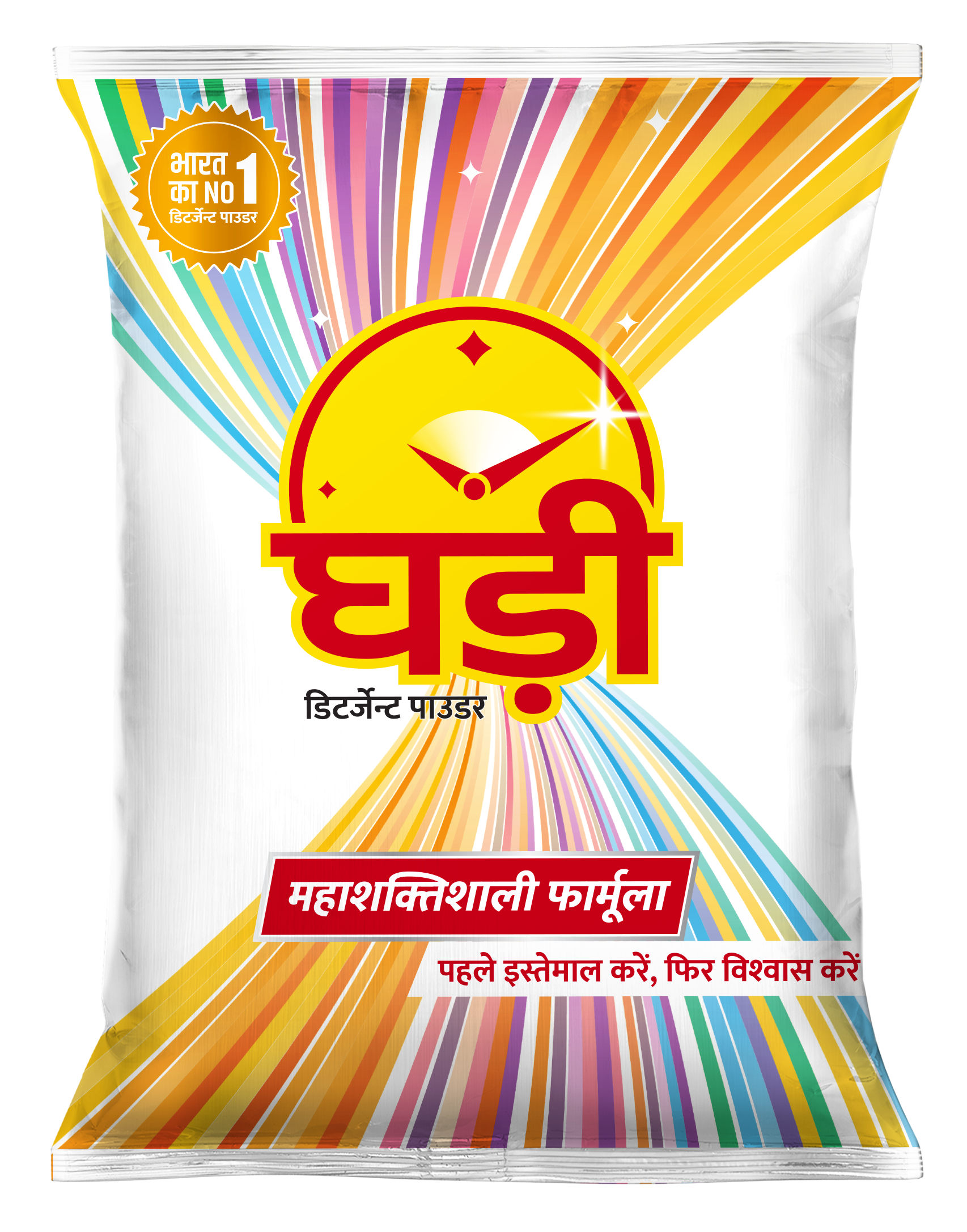
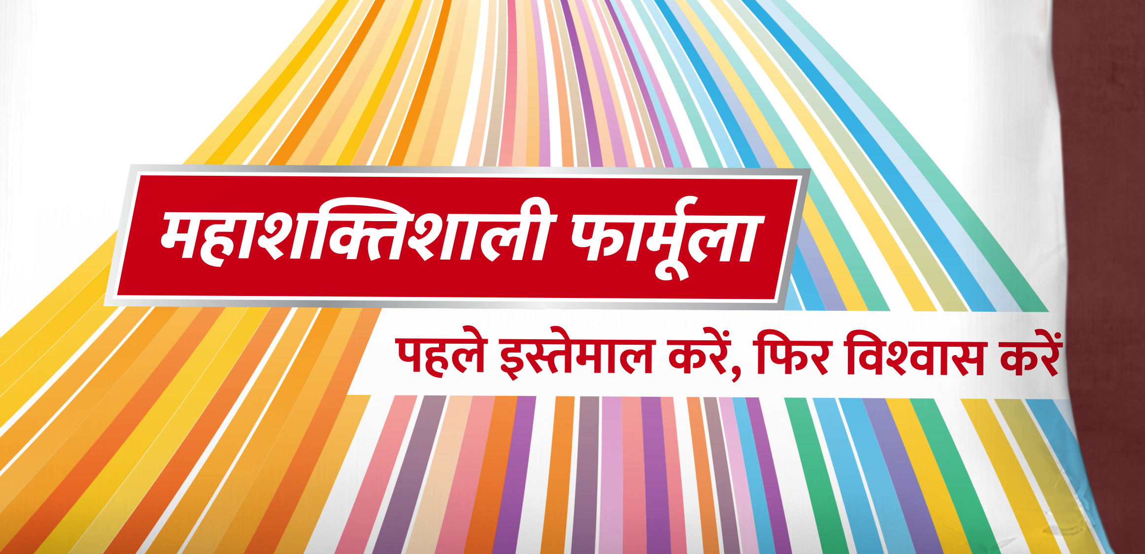
Mahashaktishali Formula (Super Powerful Formula) is a USP of Ghadi detergent powder. It has given a prime importance on front. Along with the tagline ‘First Use, Then Believe’ it highlights the brand promise.
Mahashaktishali Formula (Super Powerful Formula) is a USP of Ghadi detergent powder. It has given a prime importance on front. Along with the tagline ‘First Use, Then Believe’ it highlights the brand promise.
Mahashaktishali Formula (Super Powerful Formula) is a USP of Ghadi detergent powder. It has given a prime importance on front. Along with the tagline ‘First Use, Then Believe’ it highlights the brand promise.
Mahashaktishali Formula (Super Powerful Formula) is a USP of Ghadi detergent powder. It has given a prime importance on front. Along with the tagline ‘First Use, Then Believe’ it highlights the brand promise.
Mahashaktishali Formula (Super Powerful Formula) is a USP of Ghadi detergent powder. It has given a prime importance on front. Along with the tagline ‘First Use, Then Believe’ it highlights the brand promise.
Back of pack is the new front of pack
Back of pack is the new front of pack
Back of pack is the new front of pack
Back of pack is the new front of pack
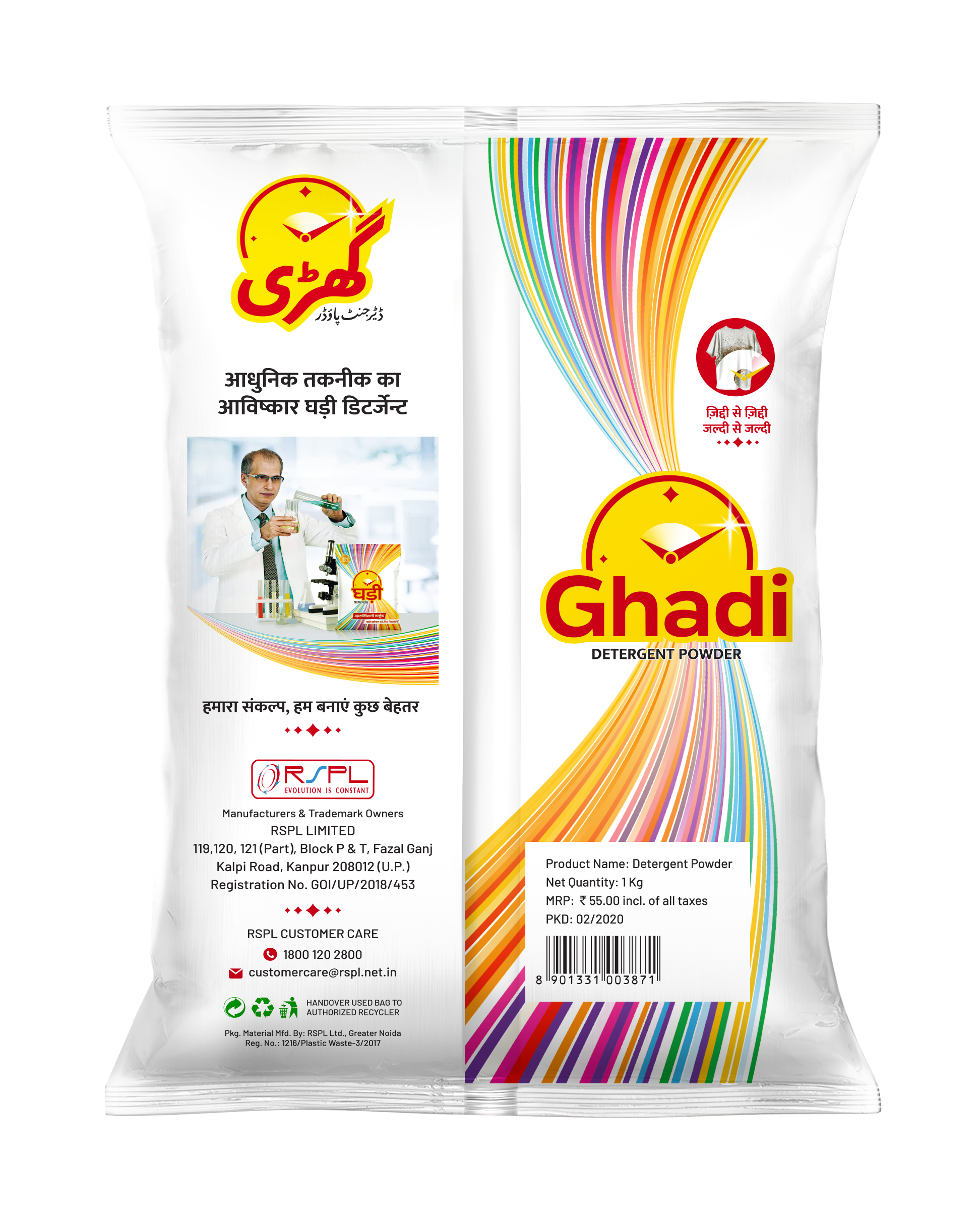
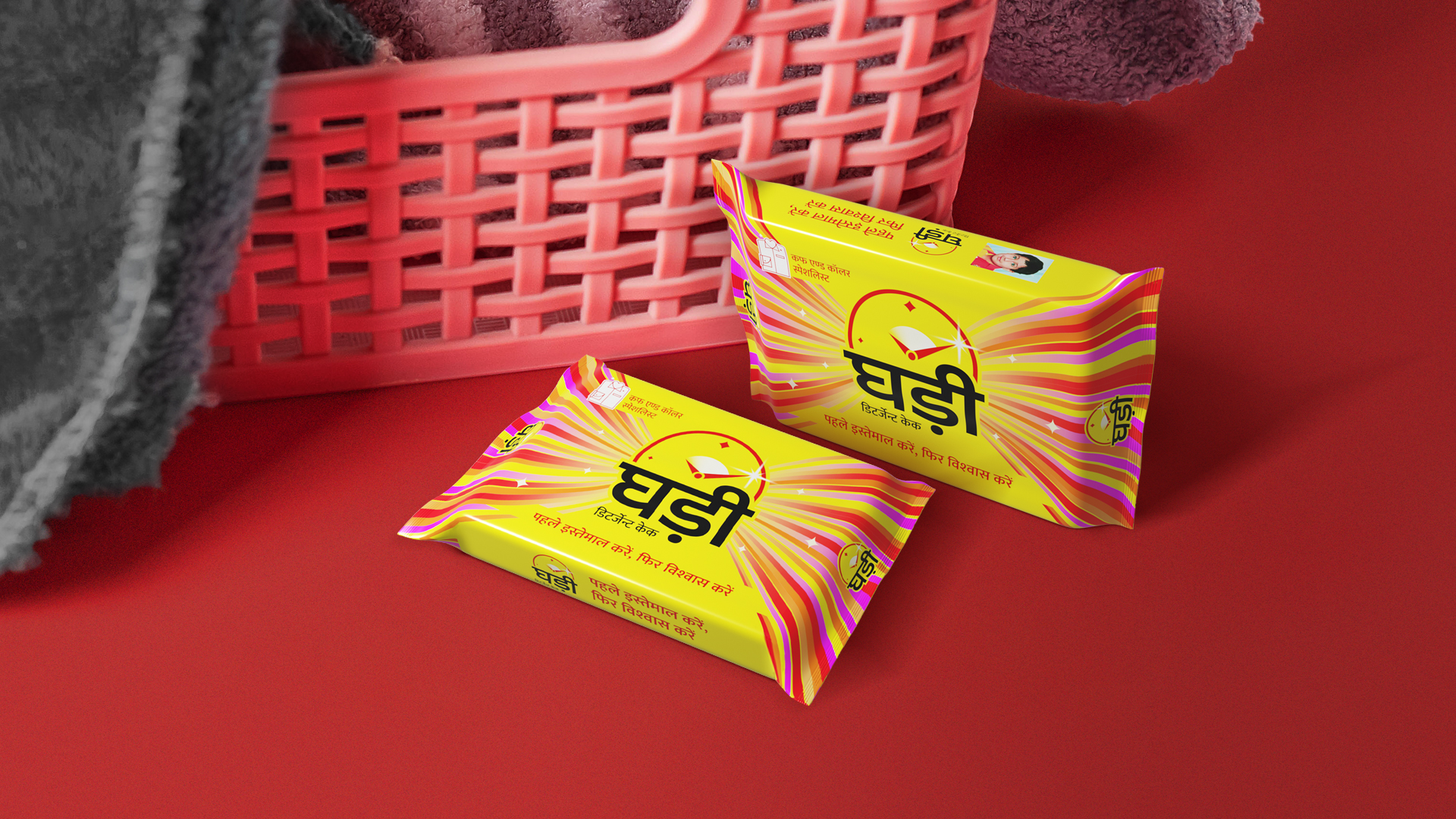
The back of a pack is often overlooked as a secondary area for brand communication, with the focus being on the front. However, the new Ghadi packaging breaks this convention by treating the back of the pack as a primary area for brand communication. It features the twisting pattern and the English version of the logo, ensuring that no matter how the product is placed on a shelf, Ghadi detergent will always face the consumer.
The back of a pack is often overlooked as a secondary area for brand communication, with the focus being on the front. However, the new Ghadi packaging breaks this convention by treating the back of the pack as a primary area for brand communication. It features the twisting pattern and the English version of the logo, ensuring that no matter how the product is placed on a shelf, Ghadi detergent will always face the consumer.
The back of a pack is often overlooked as a secondary area for brand communication, with the focus being on the front. However, the new Ghadi packaging breaks this convention by treating the back of the pack as a primary area for brand communication. It features the twisting pattern and the English version of the logo, ensuring that no matter how the product is placed on a shelf, Ghadi detergent will always face the consumer.
The back of a pack is often overlooked as a secondary area for brand communication, with the focus being on the front. However, the new Ghadi packaging breaks this convention by treating the back of the pack as a primary area for brand communication. It features the twisting pattern and the English version of the logo, ensuring that no matter how the product is placed on a shelf, Ghadi detergent will always face the consumer.
The back of a pack is often overlooked as a secondary area for brand communication, with the focus being on the front. However, the new Ghadi packaging breaks this convention by treating the back of the pack as a primary area for brand communication. It features the twisting pattern and the English version of the logo, ensuring that no matter how the product is placed on a shelf, Ghadi detergent will always face the consumer.
Benefit visualisation for the detergent cake
Benefit visualisation for the detergent cake
Benefit visualisation for the detergent cake
Benefit visualisation for the detergent cake
Benefit visualisation for the detergent cake
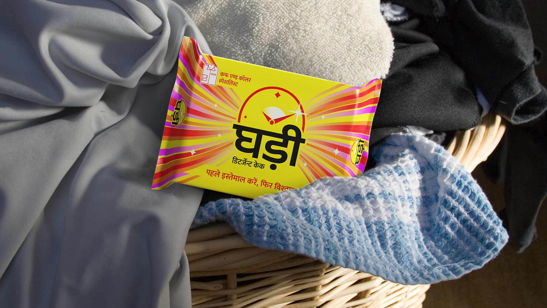
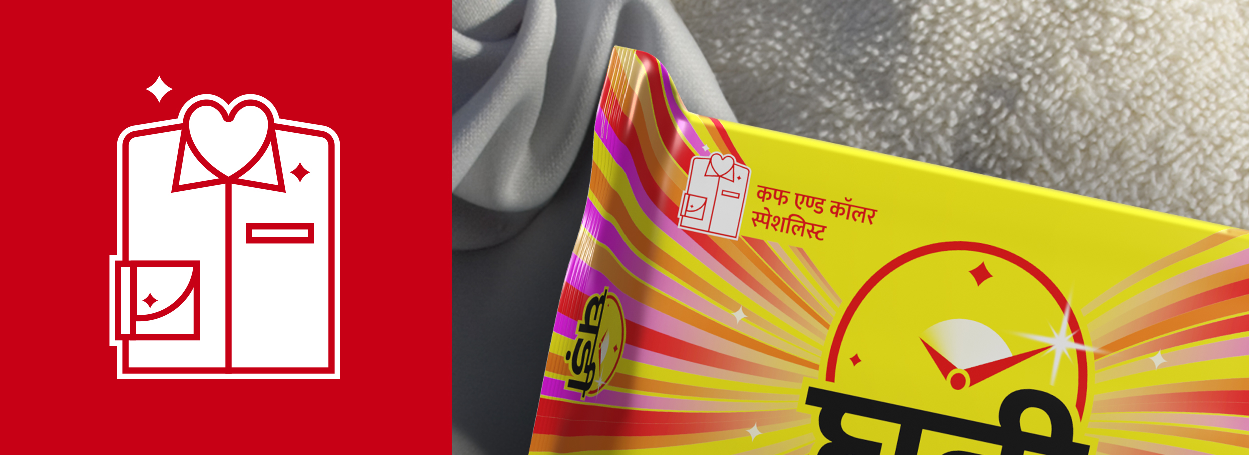
Ghadi detergent cake is a cuff and collar specialist. It removes dirt and sweat stains without effort. The new packaging design highlights this USP with the freshly-designed icon. It has sparkles at its heart to represent the care and cleanliness consumers get from the detergent cake.
Ghadi detergent cake is a cuff and collar specialist. It removes dirt and sweat stains without effort. The new packaging design highlights this USP with the freshly-designed icon. It has sparkles at its heart to represent the care and cleanliness consumers get from the detergent cake.
Ghadi detergent cake is a cuff and collar specialist. It removes dirt and sweat stains without effort. The new packaging design highlights this USP with the freshly-designed icon. It has sparkles at its heart to represent the care and cleanliness consumers get from the detergent cake.
Ghadi detergent cake is a cuff and collar specialist. It removes dirt and sweat stains without effort. The new packaging design highlights this USP with the freshly-designed icon. It has sparkles at its heart to represent the care and cleanliness consumers get from the detergent cake.
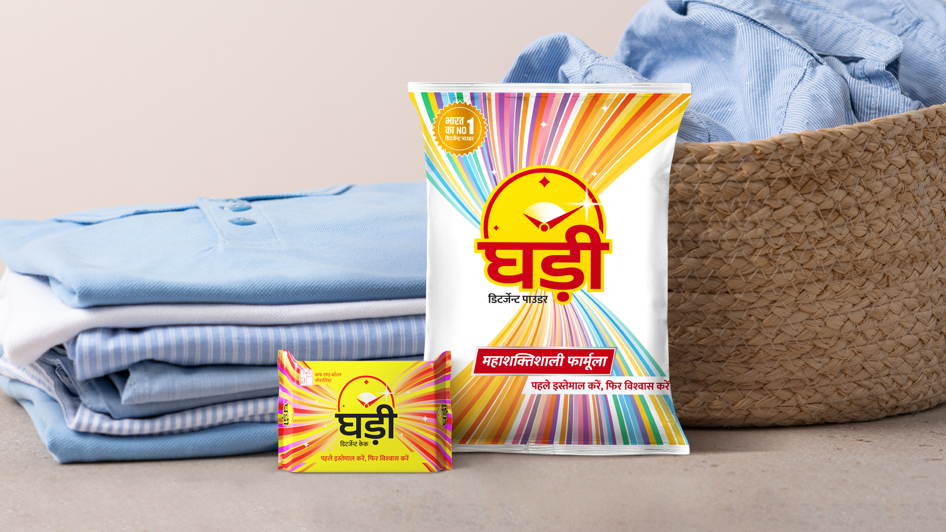
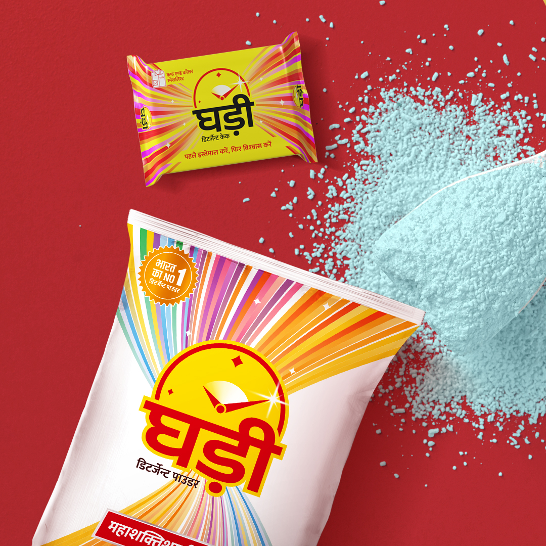
Identity and Packaging design extended by team Ghadi for communication
Identity and Packaging design extended by team Ghadi for communication
Identity and Packaging design extended by team Ghadi for communication
Identity and Packaging design extended by team Ghadi for communication
All Projects

SunsureRe-Branding an energy as a service brand
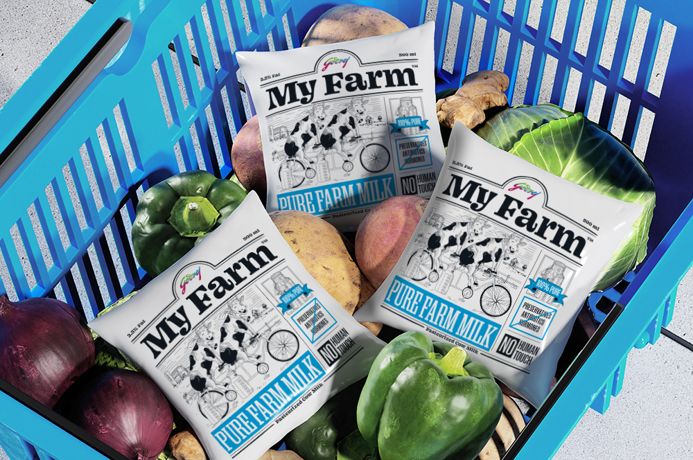
Godrej My FarmBranding a premium niche dairy brand for Godrej
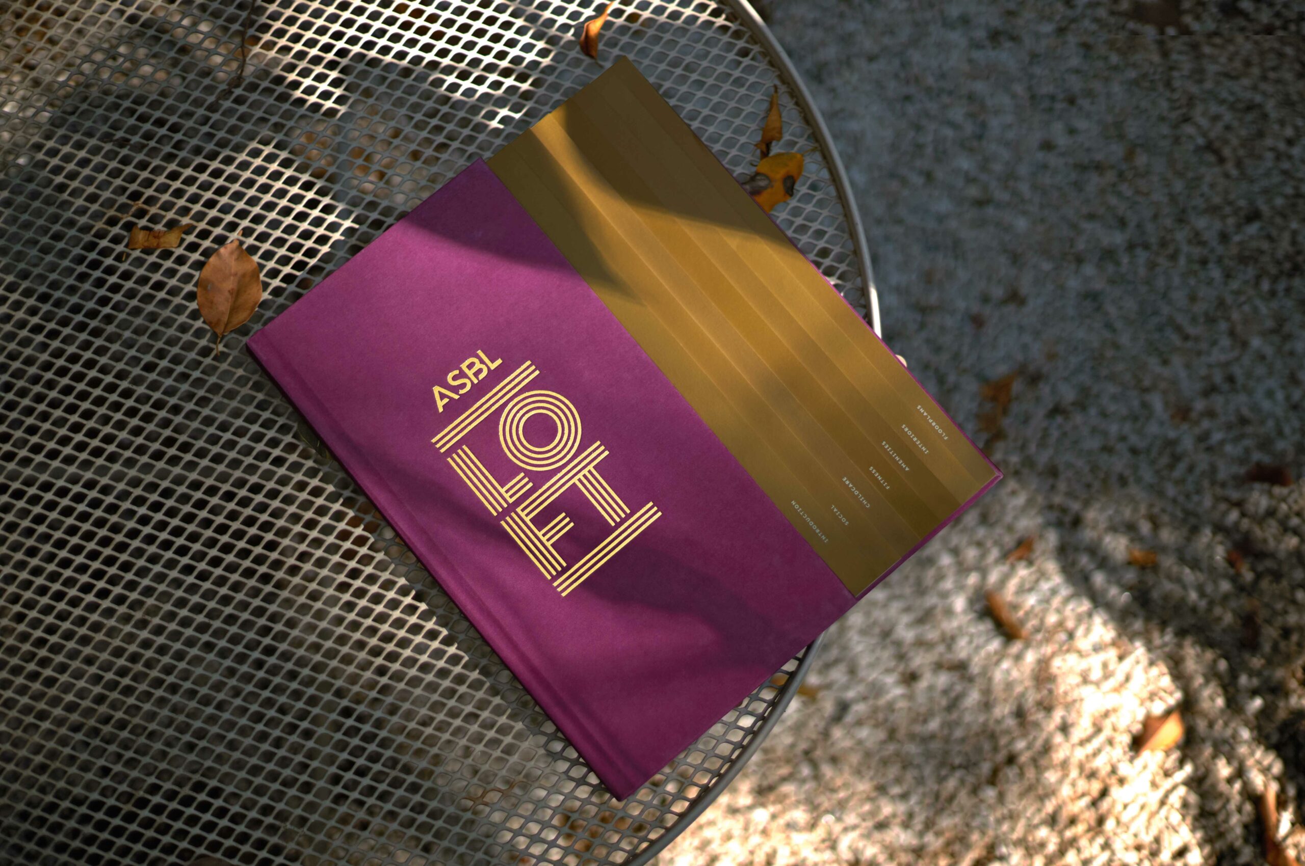
ASBL LOFTResidential property brochure
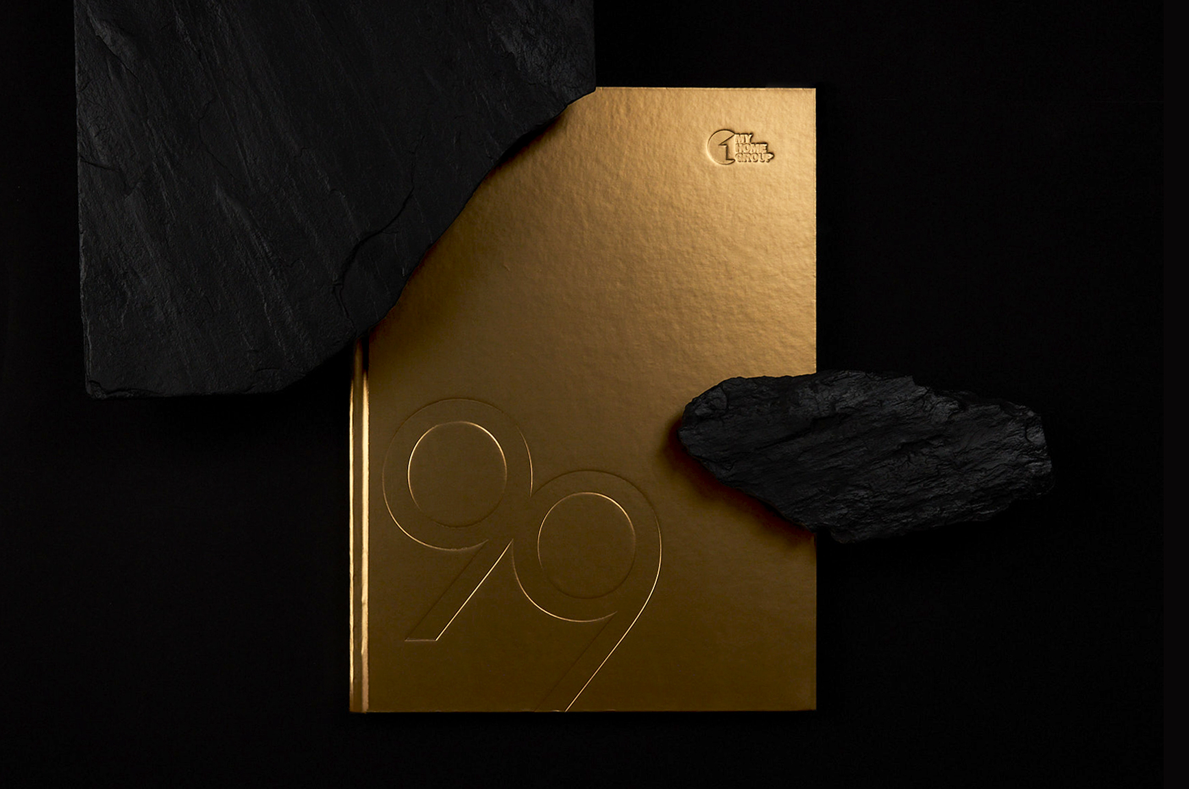
MyHome 99Residential property brochure

HROneBranding a HRMS platform
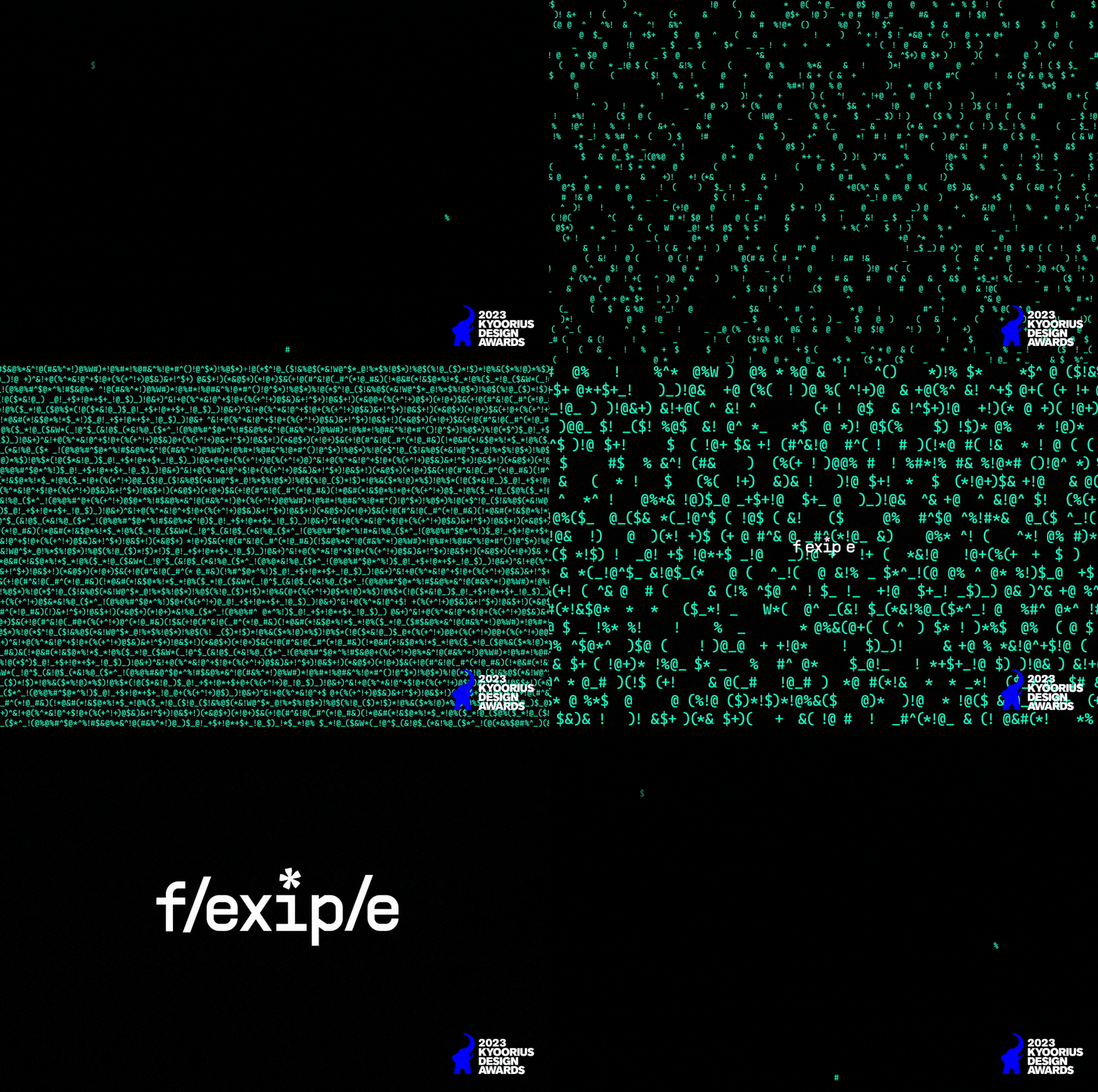
FlexipleBranding a global tech talent network
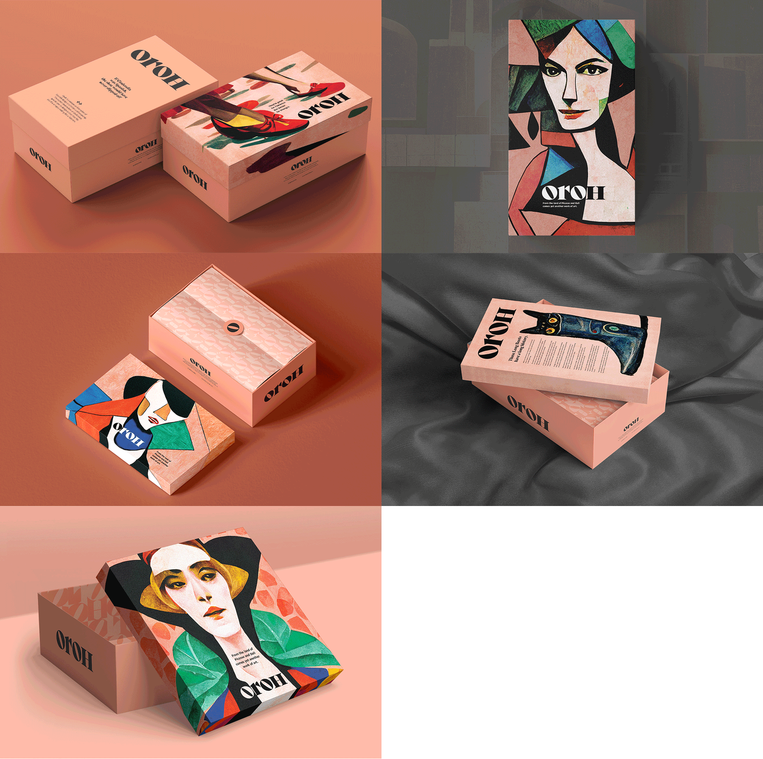
OrohBranding an Indian D2C footwear brand
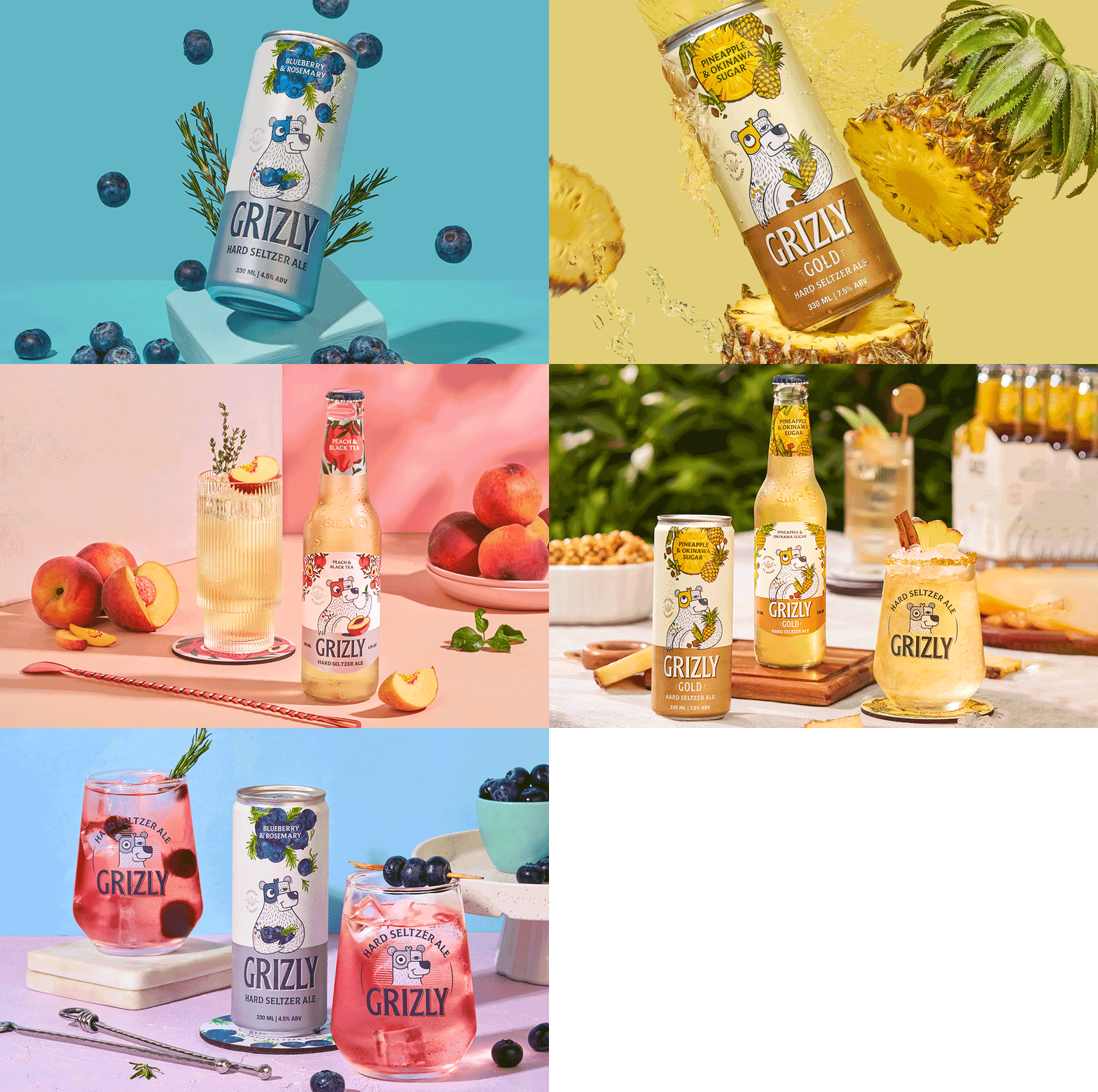
Grizly Hard Seltzers AleBranding & packaging design | House of Bira 91

Red.HealthRebranding India's largest emergency response company

Bira 91 Make Play with FlavorsDefining the brand world for a beer brand
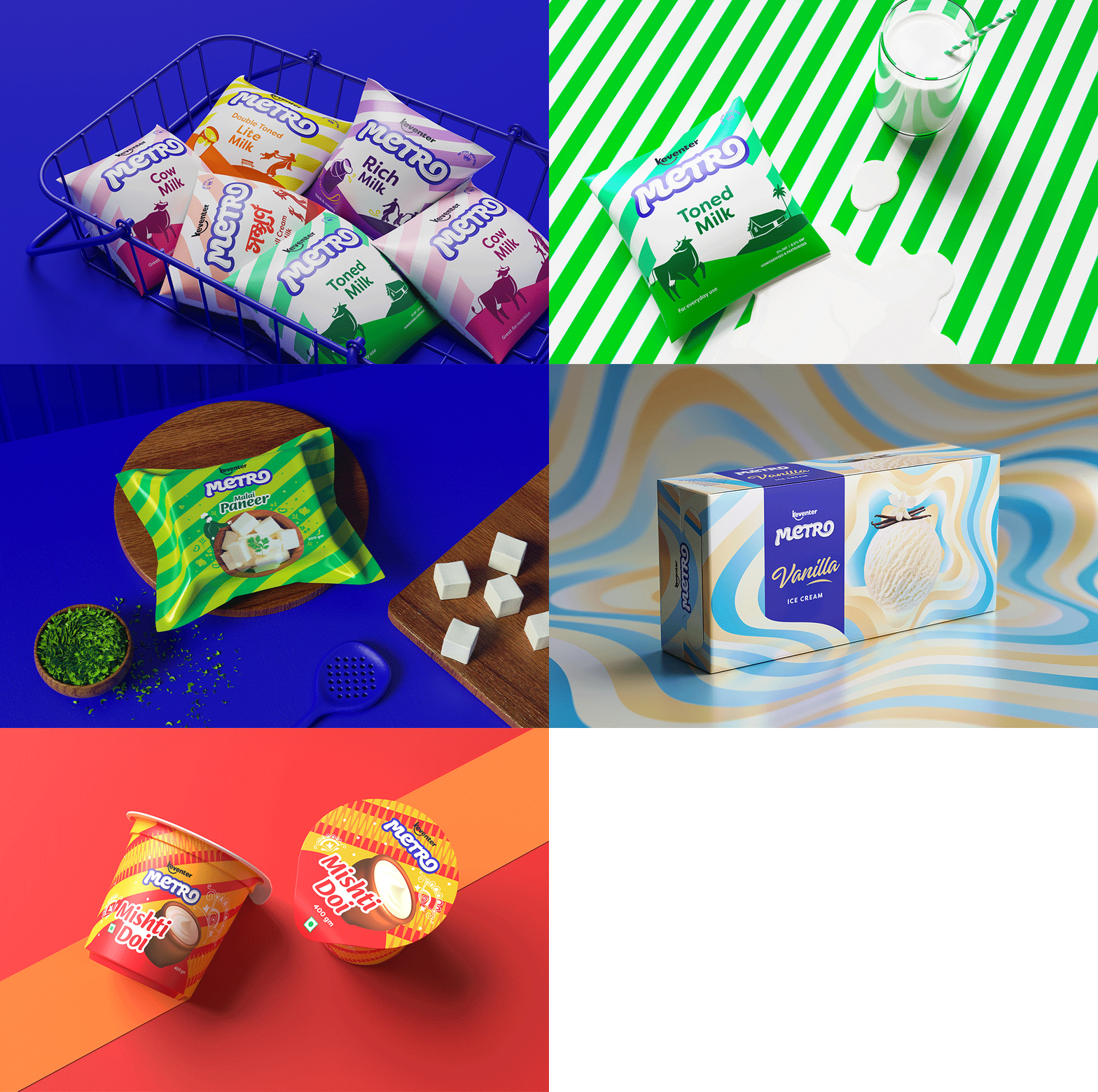
Keventer MetroRebranding a dairy brand in West Bengal
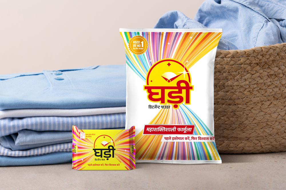
Ghadi by RSPL GroupRe-packaging an iconic detergent brand
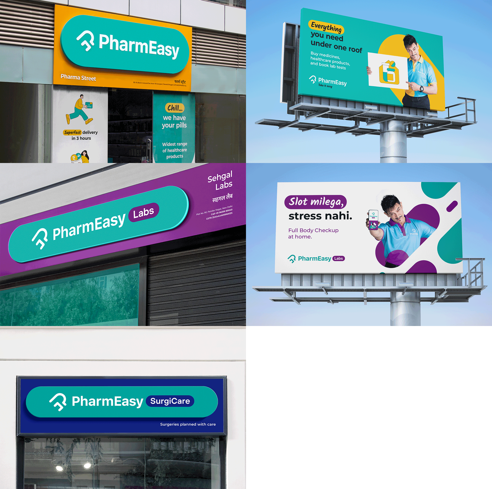
PharmEasyRedesigning an omnichannel brand experience
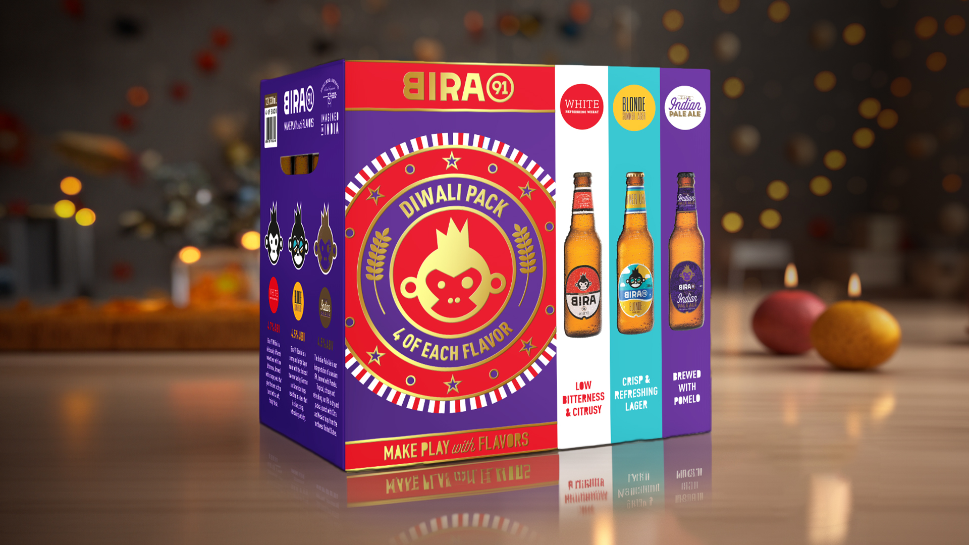
Celebrate with Every SipFestive & special edition packs for Bira 91
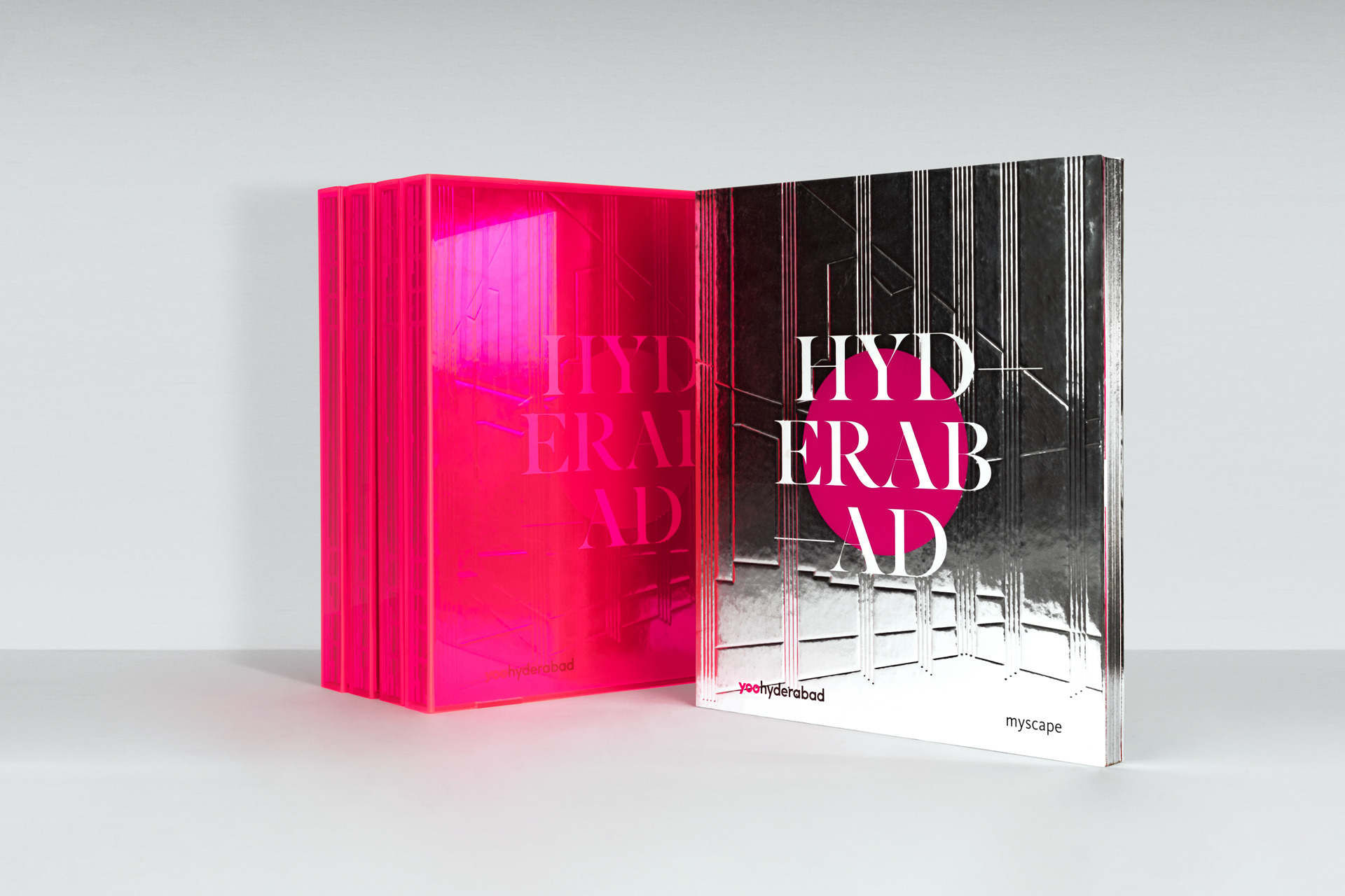
Myscape YOOSelling branded residences
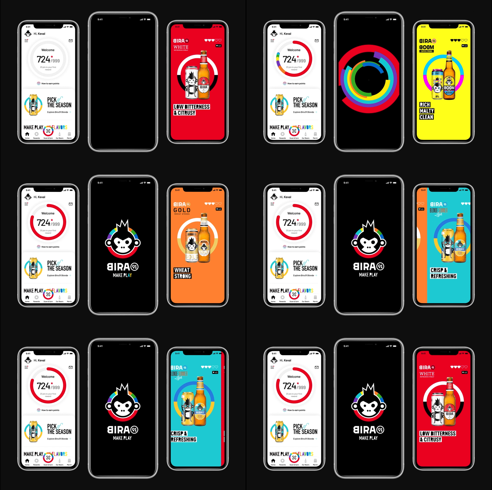
Bira 91 | Customer Loyalty AppUI design for brand advocacy
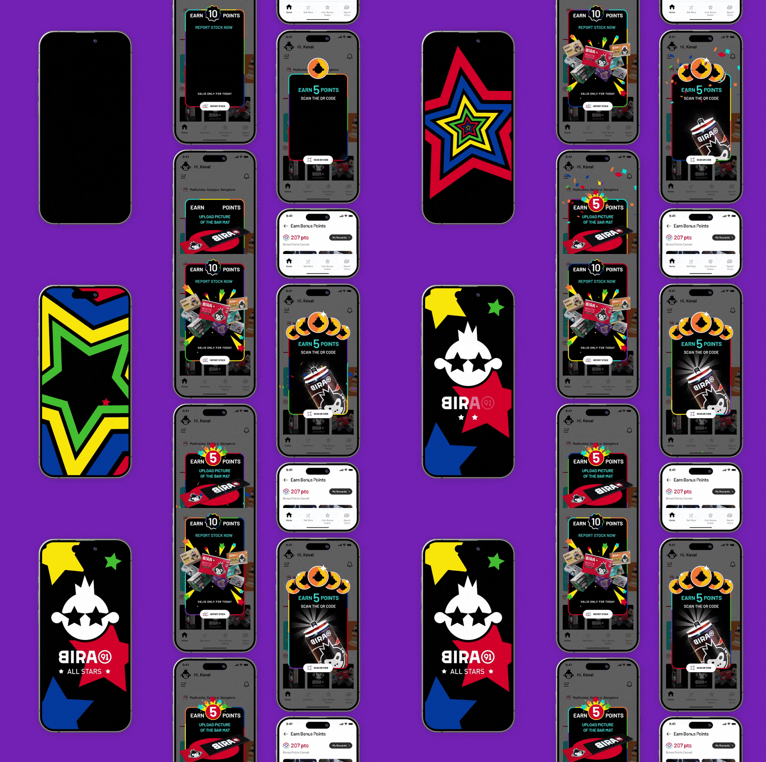
Bira 91 | Counter Sales Managers AppB2B channel partner UI Design
LifioBranding a clinical research and trial company
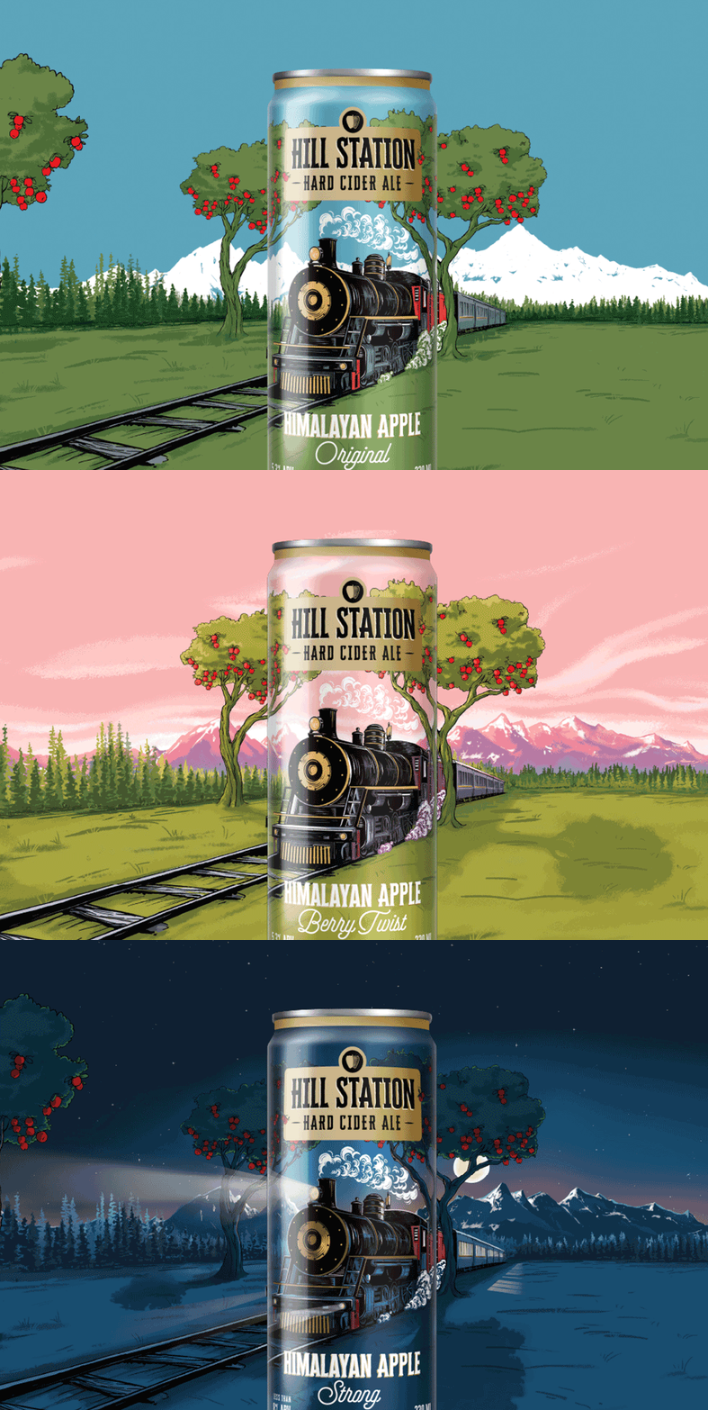
Hill Station Hard Cider AleBranding & Packaging Design | House of Bira 91
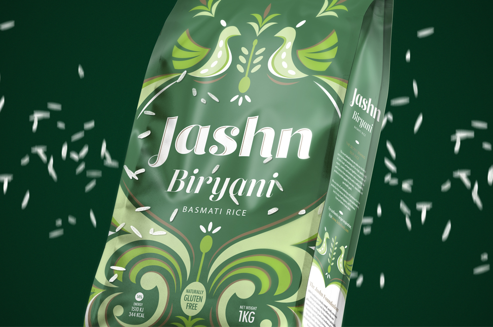
Jashn FoodsPackaging design for basmati rice
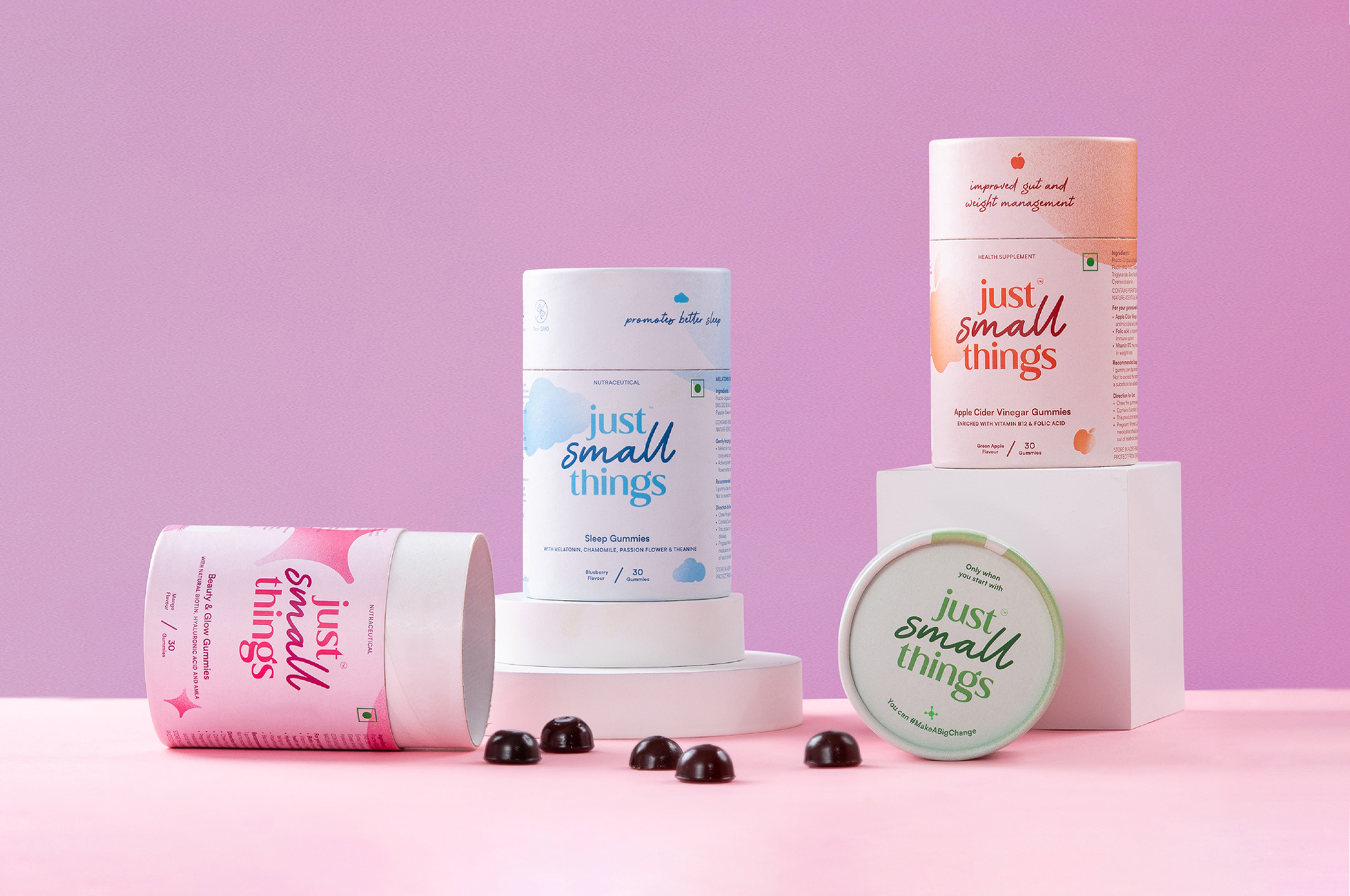
Just Small ThingsDesigning a personal care nutraceutical brand
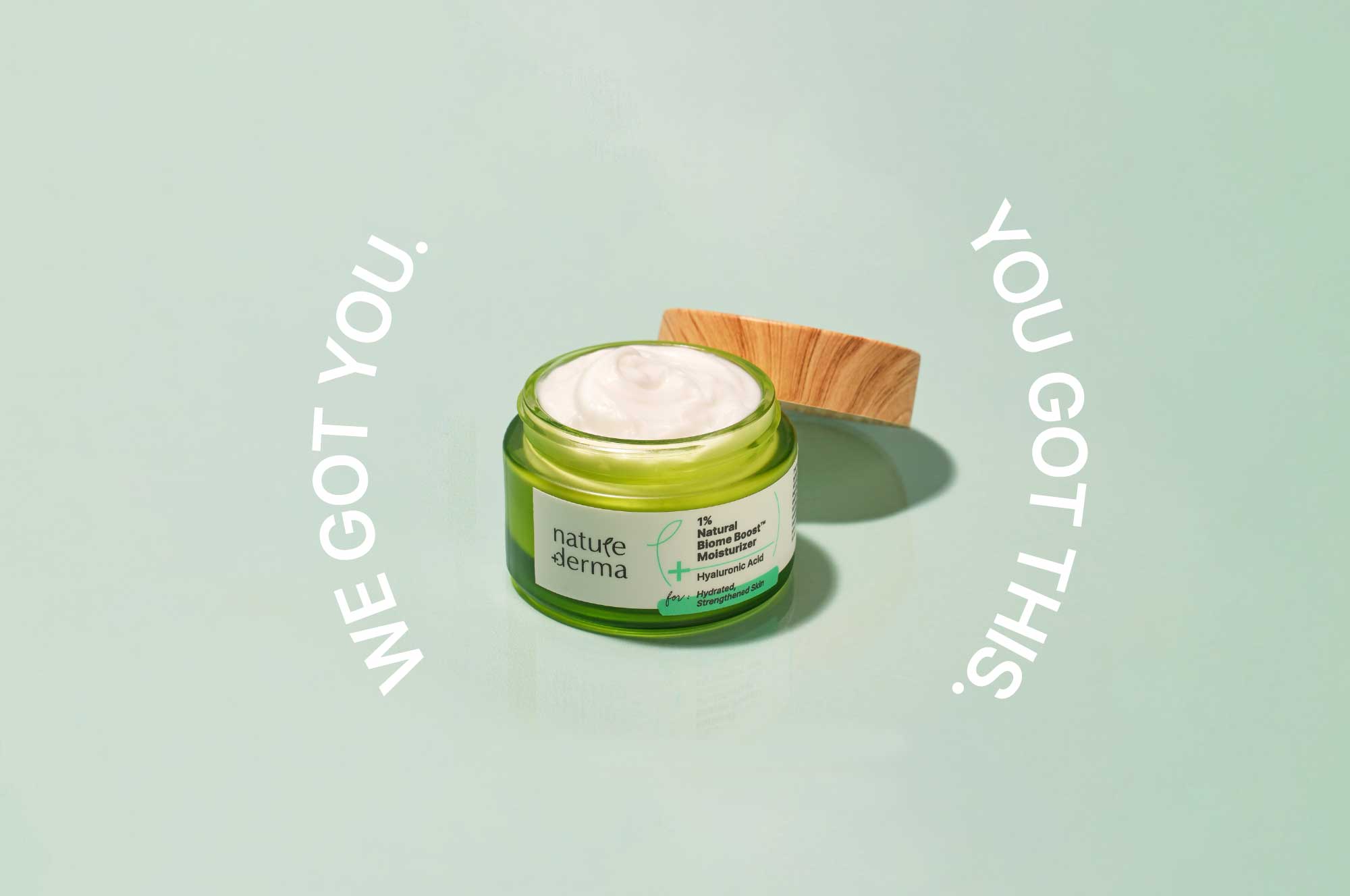
Nature DermaCommunications for active skincare

DoozeBranding & UI design for an alcohol delivery app
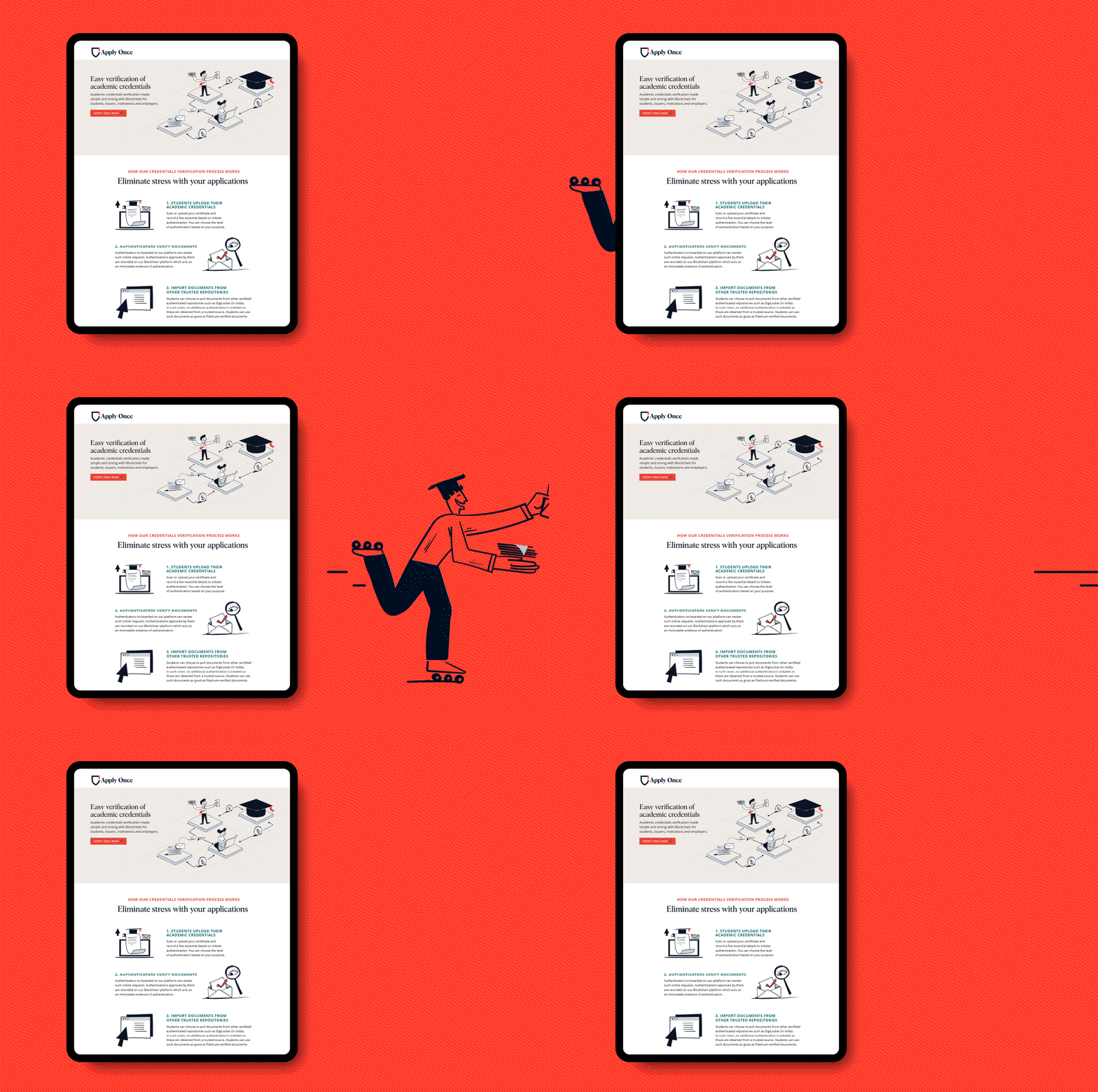
Apply Once and Veri OnceBranding a new age educational navigator
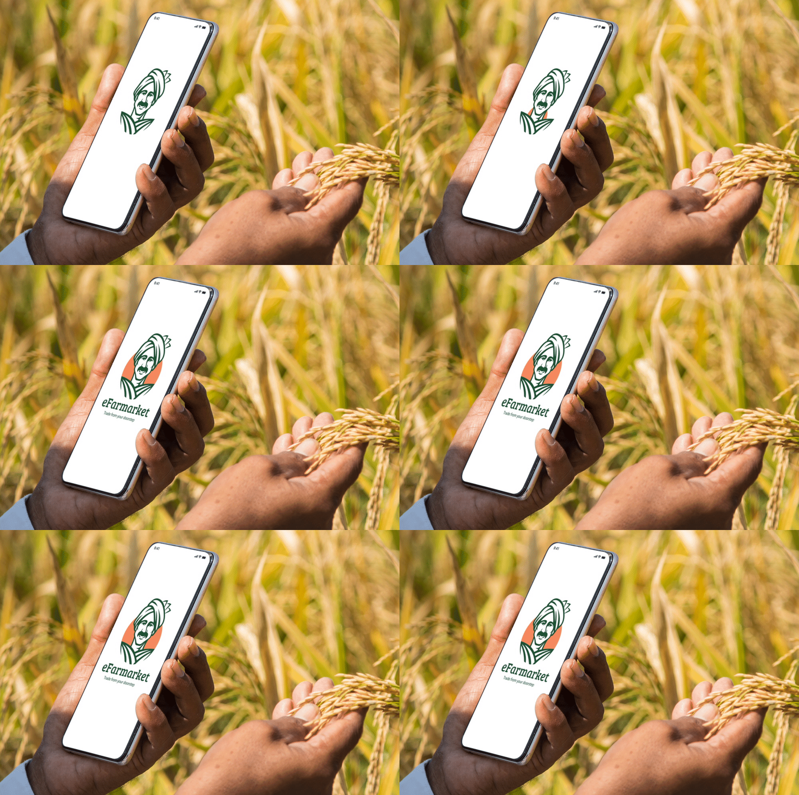
eFarmarket by AP markfedDesigning an identity for an agritech platform
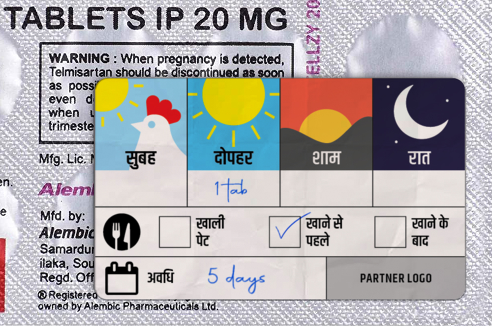
Stickers to Monitor Drug DosageSelf Initiated Project

AzlyaBranding a cultural yet contemporary fashion Label
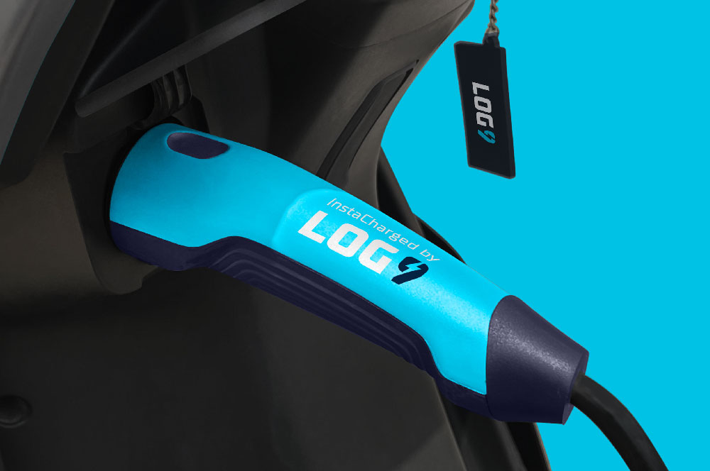
Log9 MaterialsRebranding an energy solutions company

Science of HimMale wellness treated with science
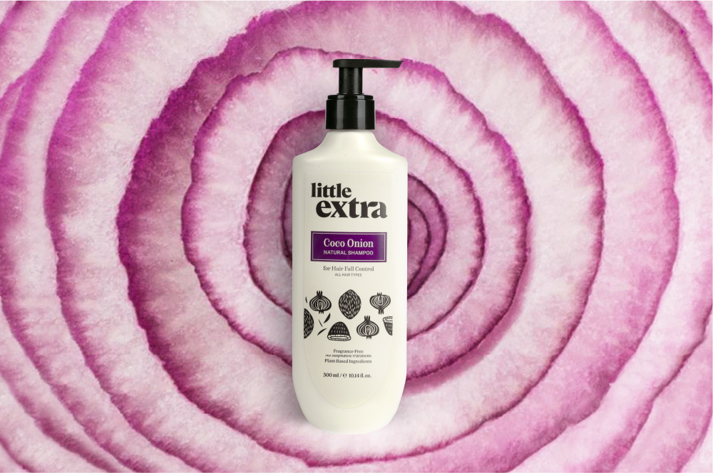
Little ExtraAll natural personal care

Pristyn CareRebranding short stay surgery
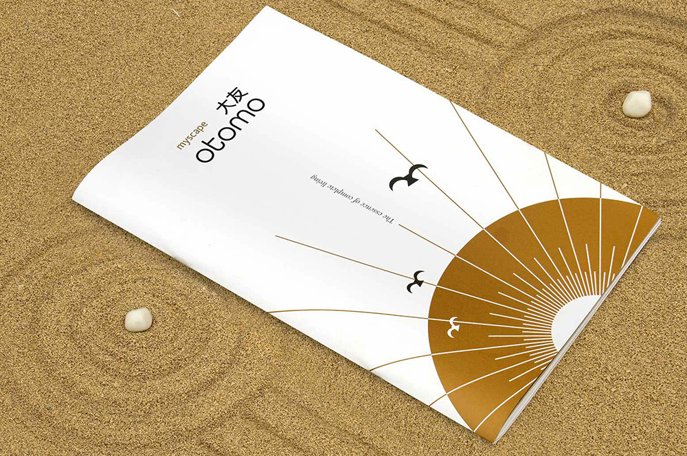
Myscape OtomoResidential property brochure
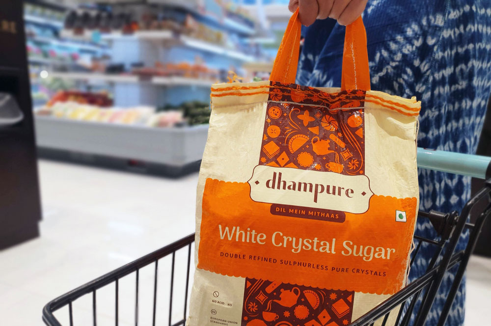
DhampureRebranding a Pioneer Sugar Brand
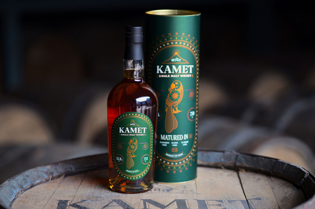
Kamet by Peak SpiritsWhisky Label
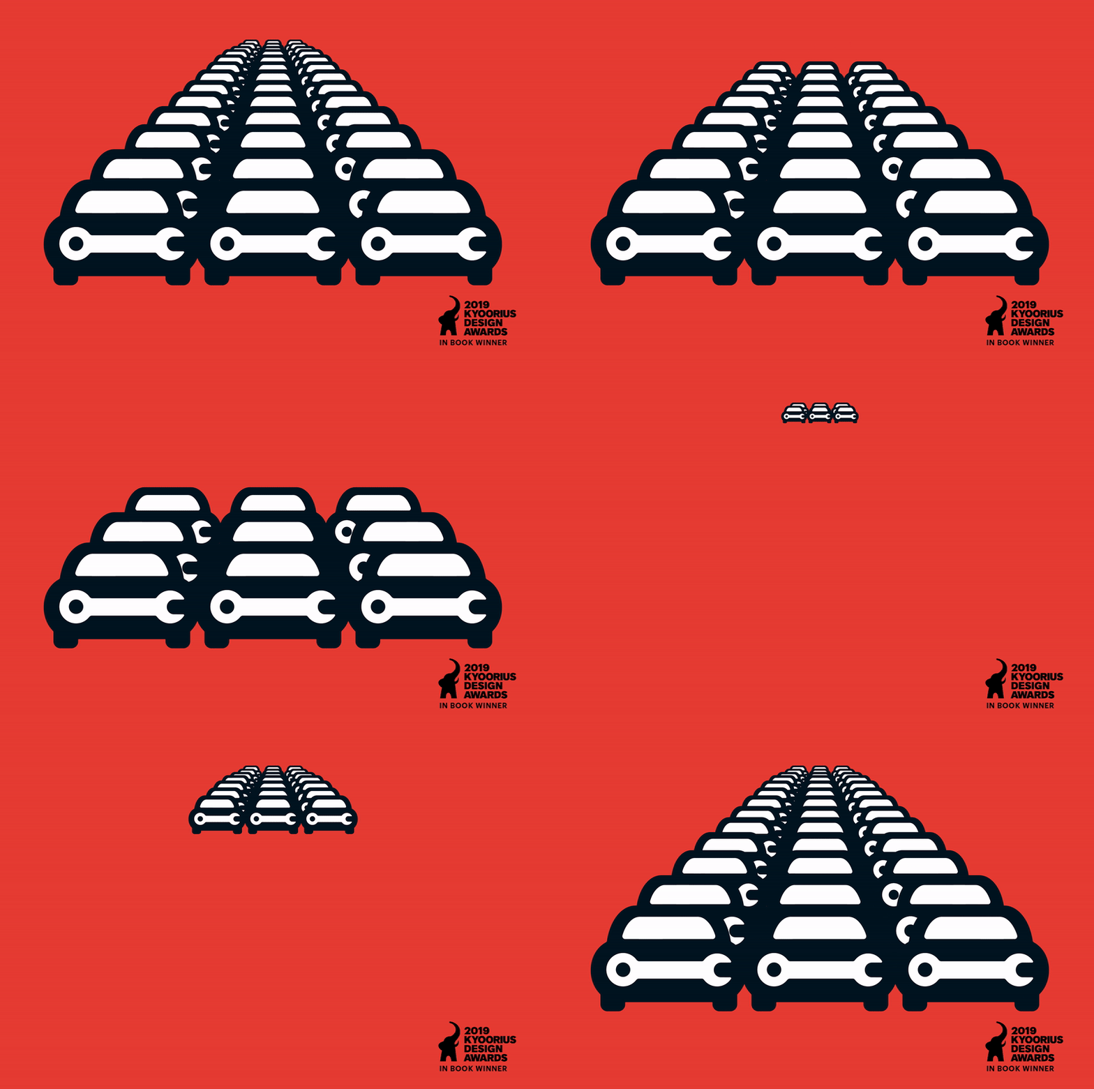
Go MechanicBranding a Multi-Brand Car Service Startup

Bira 91 LightPackaging Refresh & Positioning

Bira 91 Sustainability ReportMission To Zero
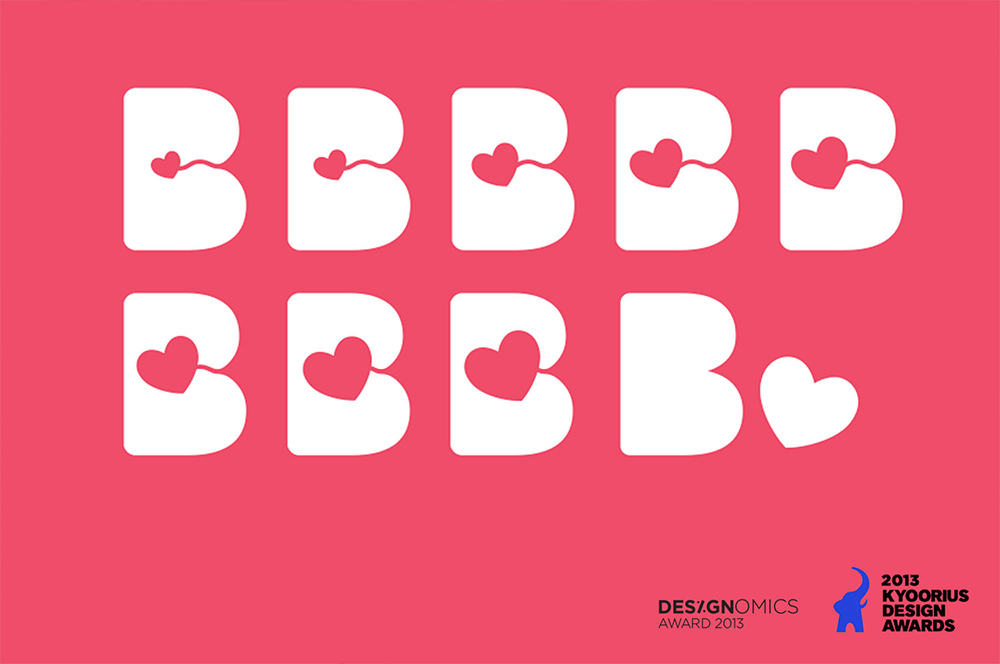
BirthplaceBranding a Maternity Hospital
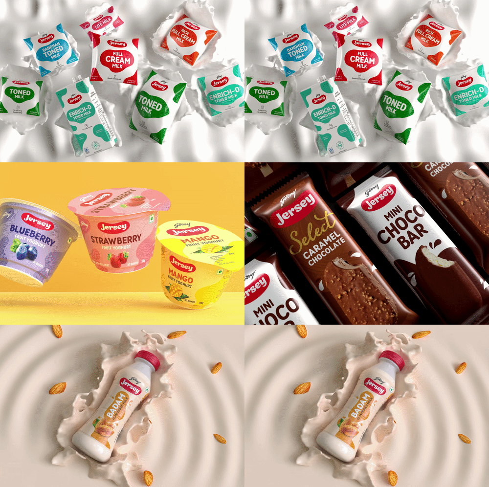
Godrej JerseyRevamping a Legacy Brand
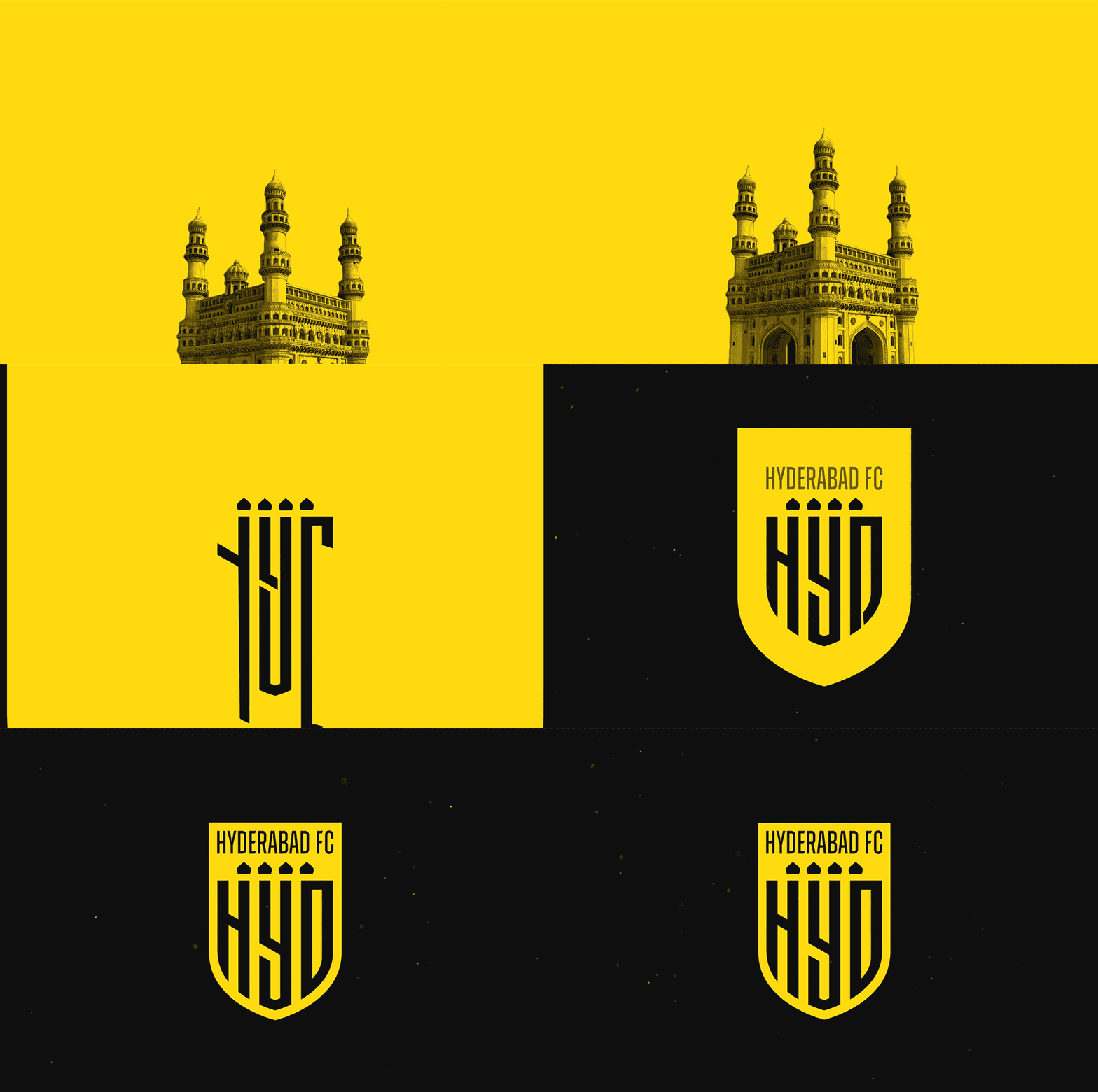
Hyderabad FCRebranding a Football Club
Myscape TerrazaCommercial Property Brochure
CK Birla GroupBranding a Women's Hospital
HousrDesigning for a Mega Co-living Brand
One Golden MileCommerical Brochure for Aurean| Eskar| Terminus
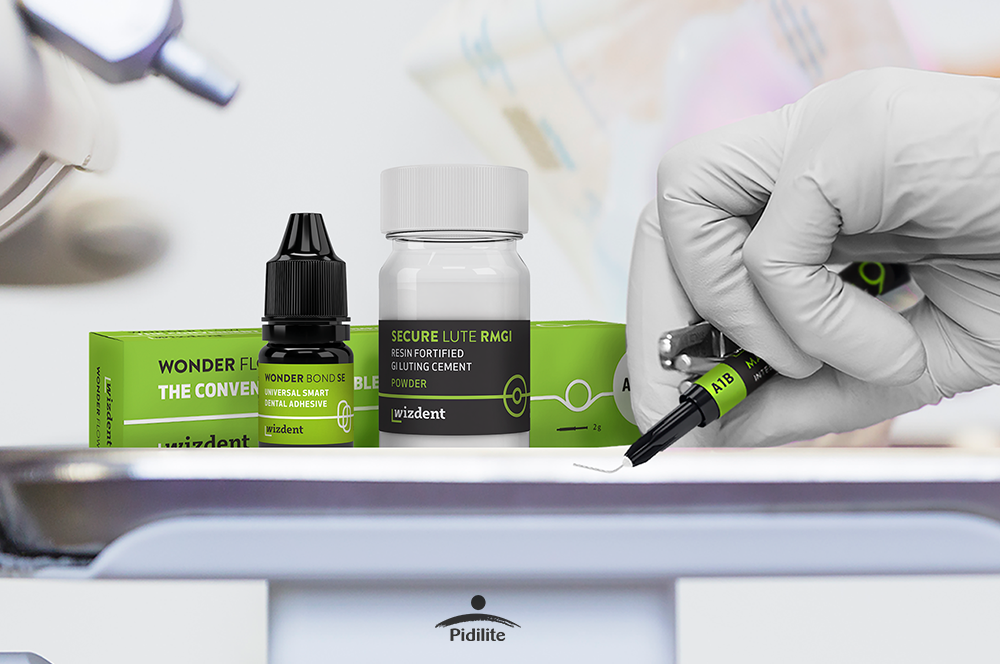
Wizdent by PidiliteIndia's Youngest Dental Consumables

AB Plus Speciality HospitalBranding a boutique Hospital
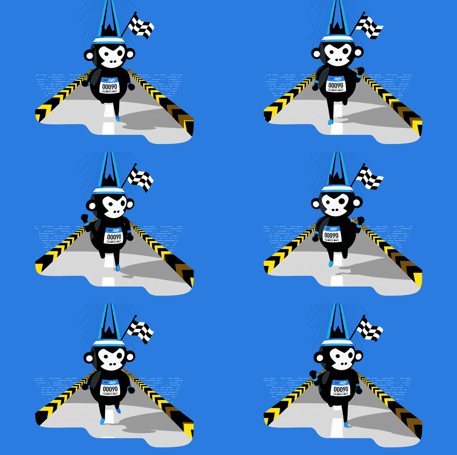
Bira 91 LightAssociating Beer with Fitness
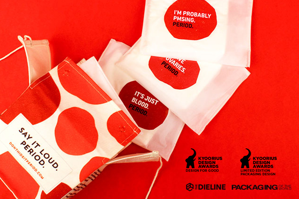
Don't Hide it. PeriodSanitary Pad Packaging
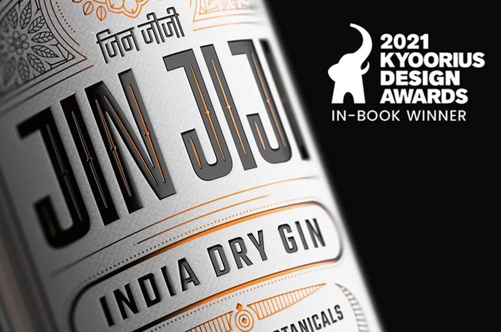
Jin JijiPackaging Indian Gin
AinqaHumanising data
The Dalai LamaCelebrating His Holiness
Bhagirathi Neotia HospitalEnvironmental Graphics
Max Estates, DehradunResidential Property Brochure & Communications
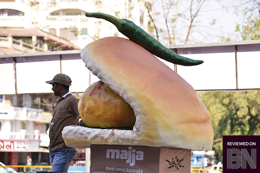
MajjaBranding a Chain of QSR in Ahmedabad

QuaQuaBranding a Virtual Travel Platform
Kalpataru VistaResidential Property Brochure & Communications
Myscape LoftResidential Property Brochure
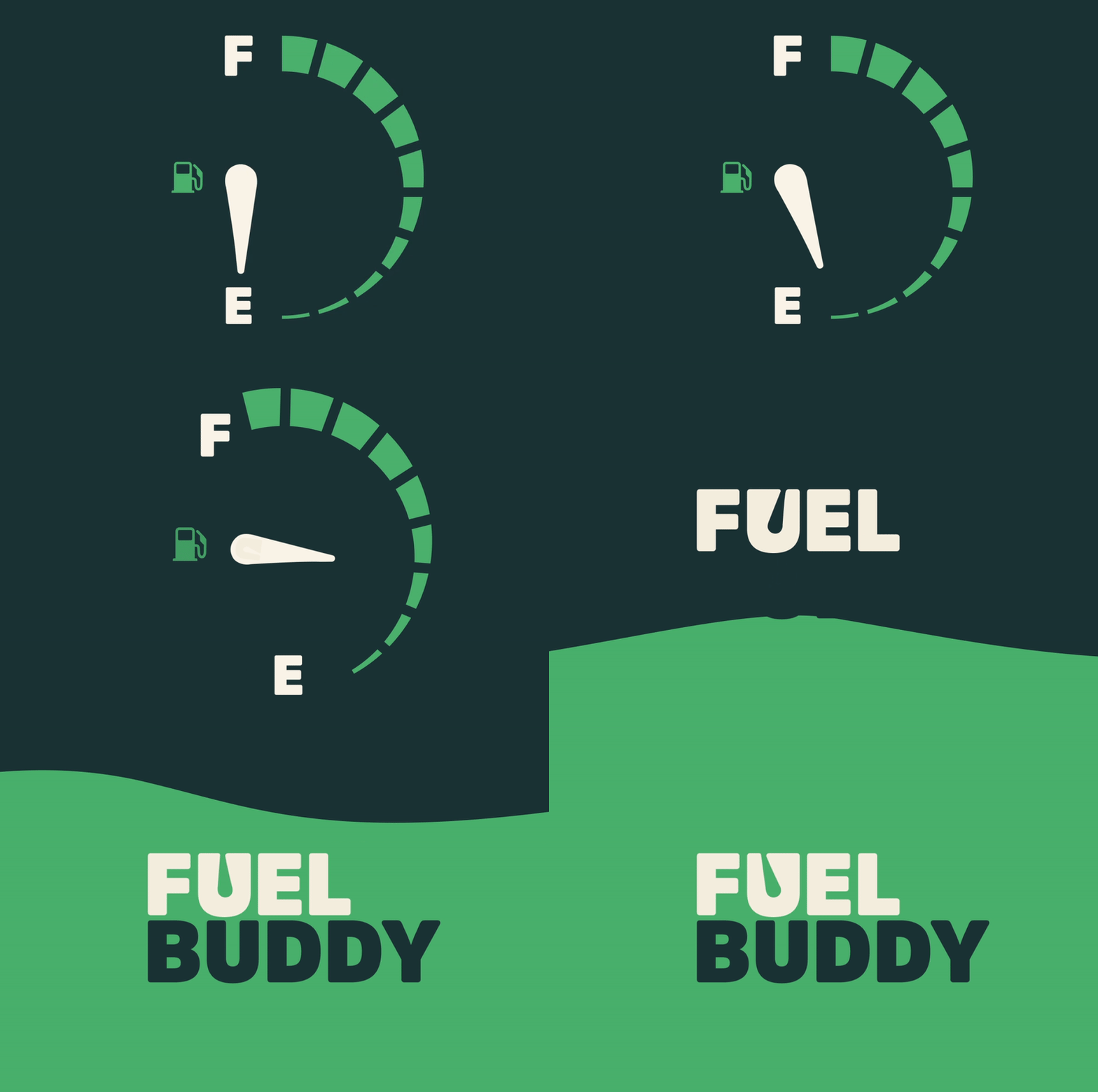
Fuel BuddyBranding India's First Fuel Delivery Platform
BirlasoftRebranding a Global IT Service Provider
The Telegraph OnlineDesign Language
Danone EcosystemWomen Empowerment Brochure
Central Square FoundationDesign for Non-Designers
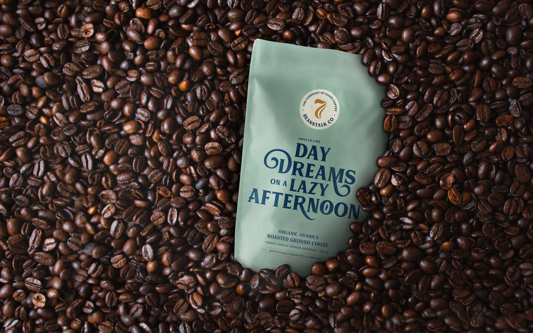
Seven BeanstalkCoffee Packaging

SlingshotDesigning for an Ed-tech Brand

CareCoverBranding a Pre-approved Medical Loan Card
Myscape WeaveCommercial Property Brochure
NumberzBranding a Fintech Startup
SunshineBranding a Multi Speciality Hospital
The Tooth CompanyBranding a Dental Clinic

MedicsBranding Lucknow's Super Speciality Hospital
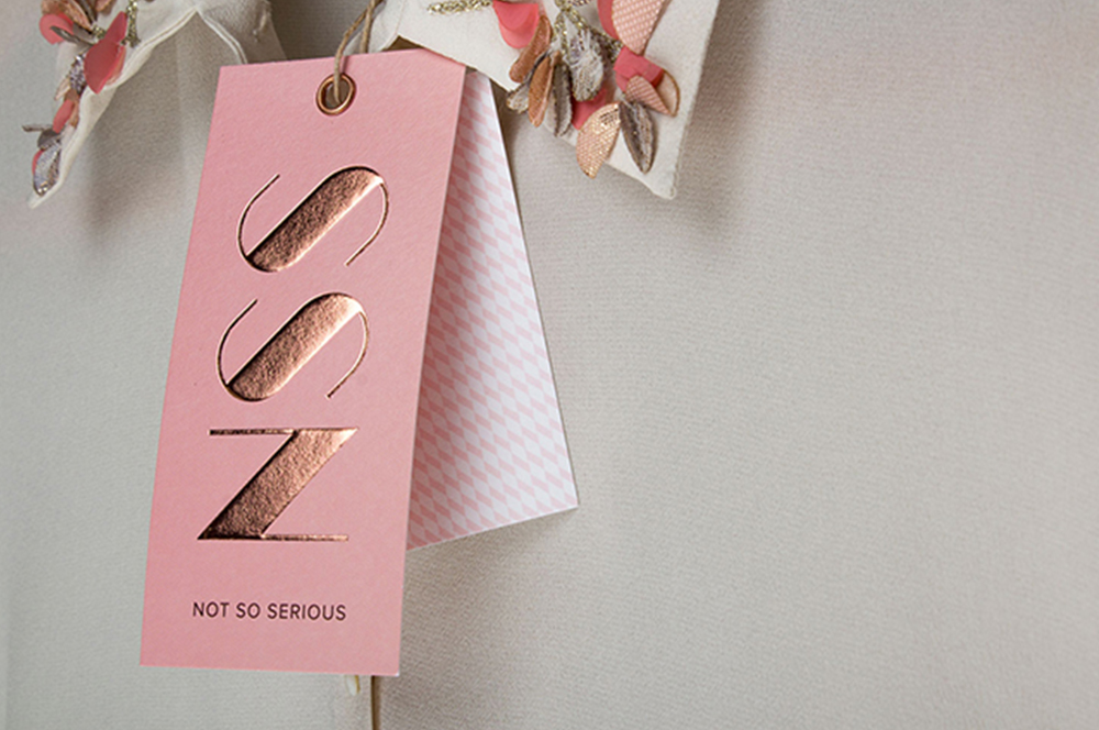
Not So SeriousRebranding a Luxury fashion label
OlivaRebranding a Chain of Medico Aesthetic Clinics
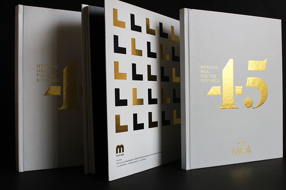
Myscape MeaResidential Property Brochure
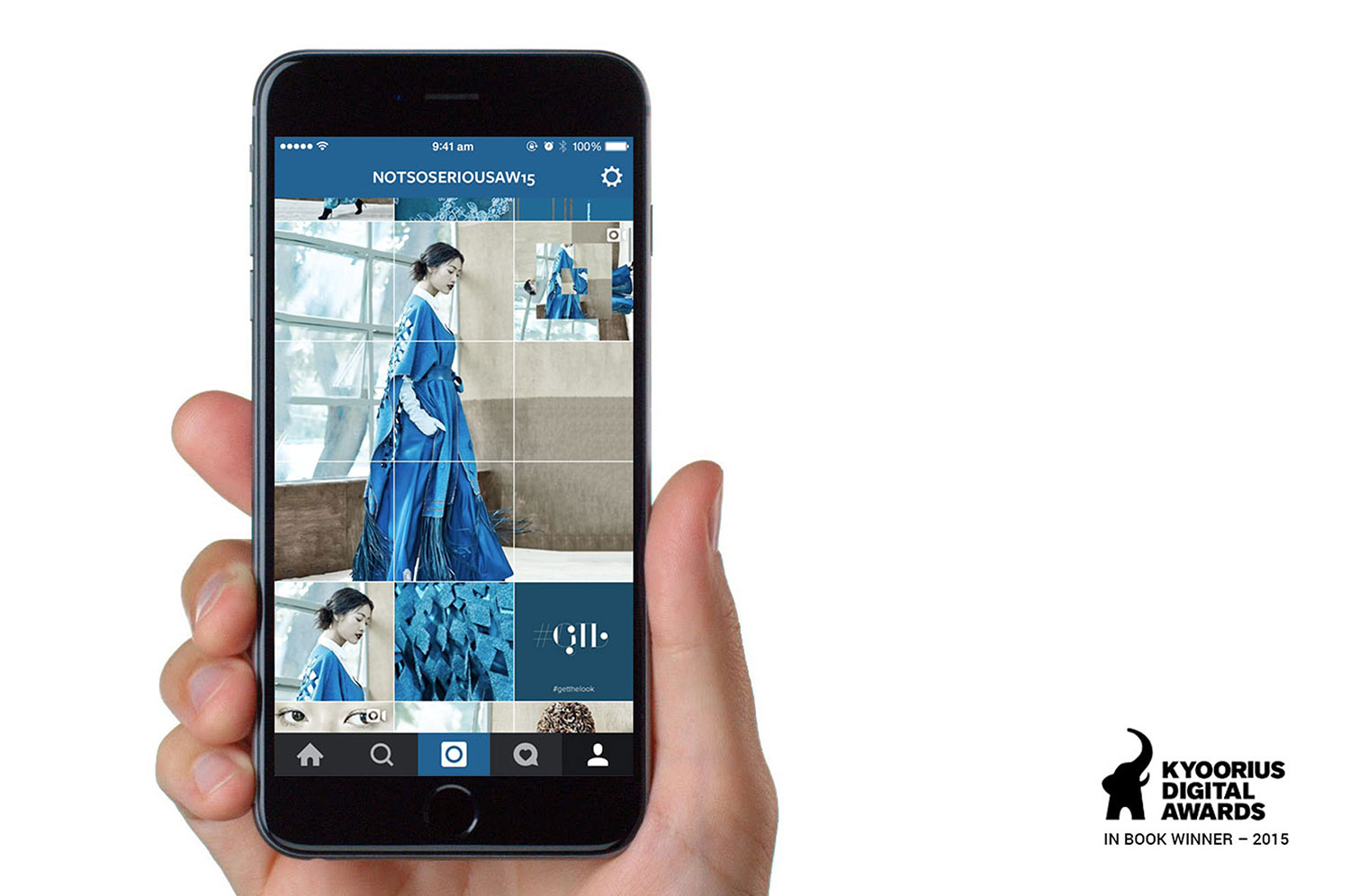
Not So SeriousAn Instagram Lookbook
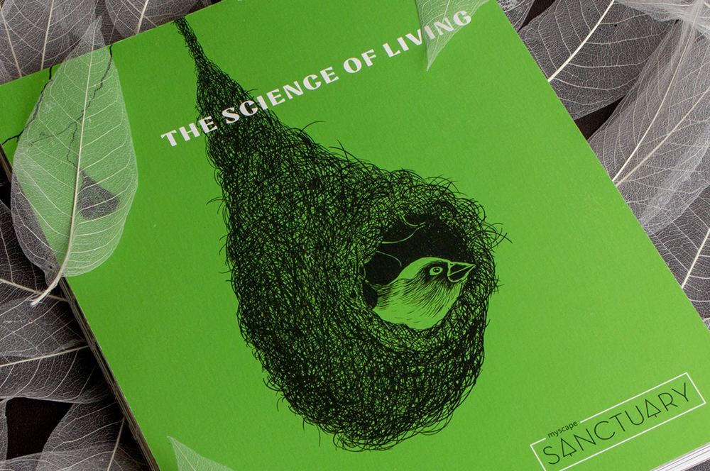
Myscape SanctuaryResidential Property Brochure & Communications
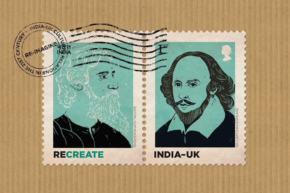
British CouncilIndia-UK relationship
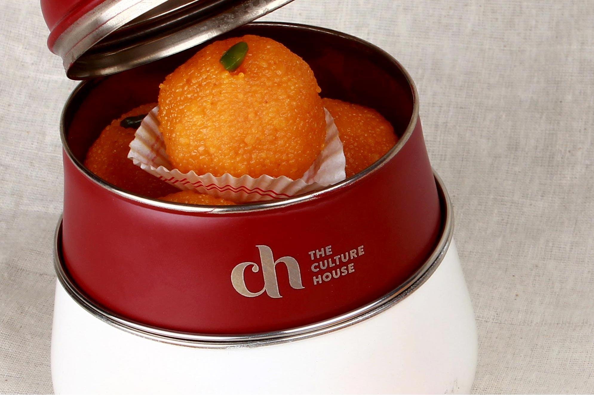
The Culture HouseRestaurant Branding
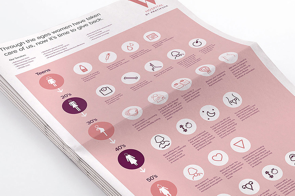
PratikshaBrand India’s Largest Hospital for Women
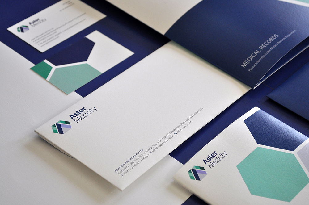
Aster MedcityBranding a Healthcare Destination
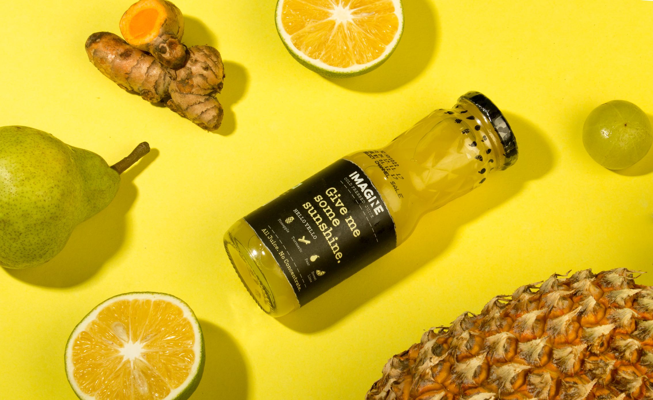
ImagineCold Pressed Juice Packaging
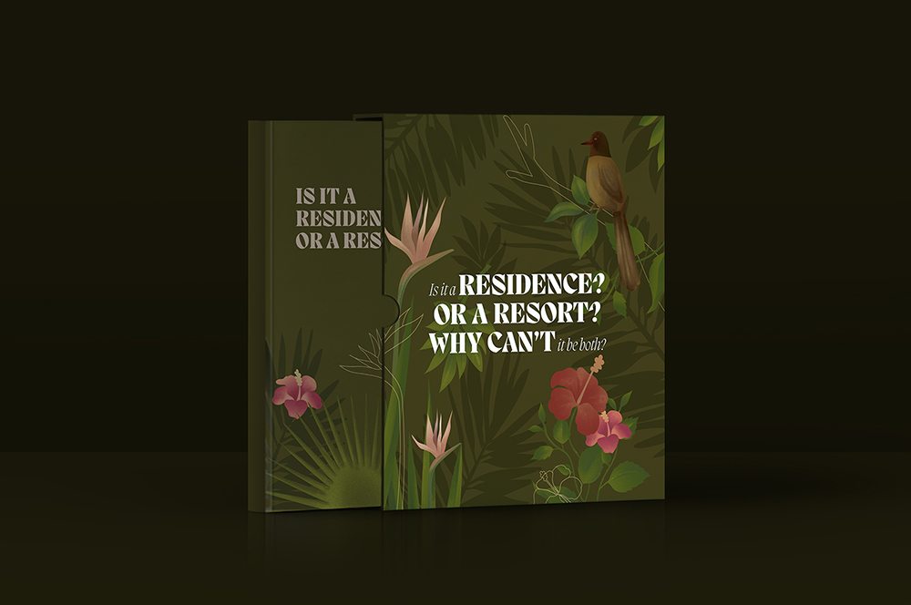
Nishada by My HomeResidential Property Brochure

TummyfullBranding a Homemade Food Tech Venture

Central Square FoundationAnnual Report

MedisyncBranding a B2B knowledge delivery platform
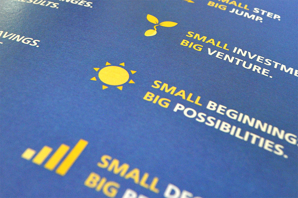
Intuit IndiaWhitepaper Design
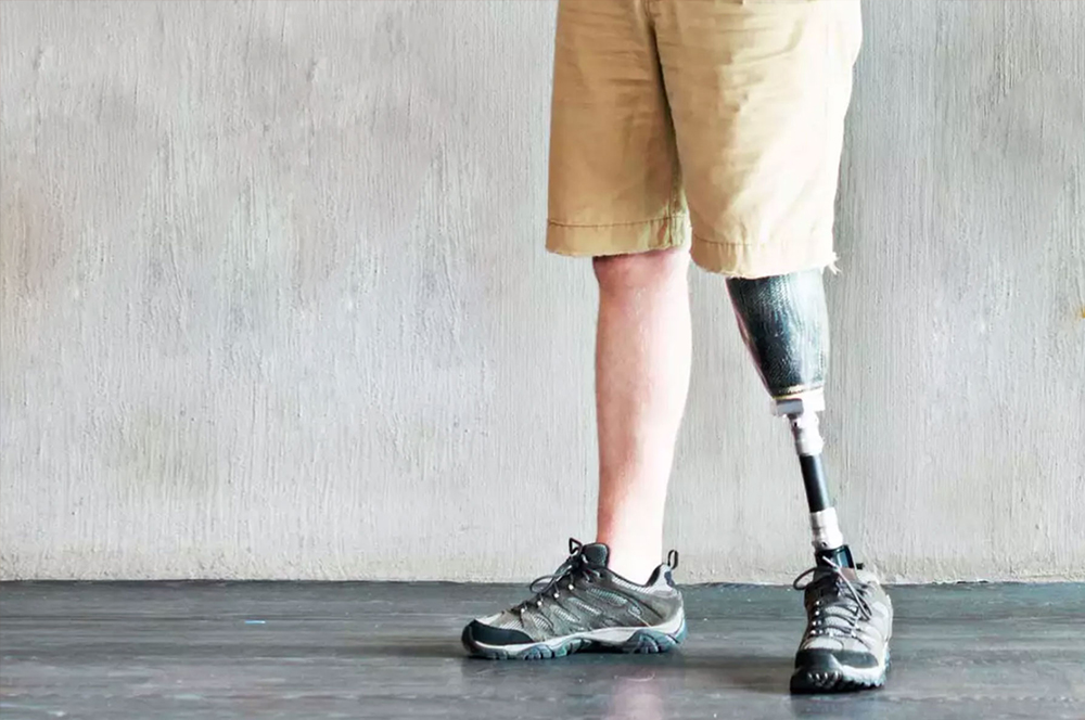
CPOBranding a Chain of Prosthetic Clinics
ORDReal Estate Branding
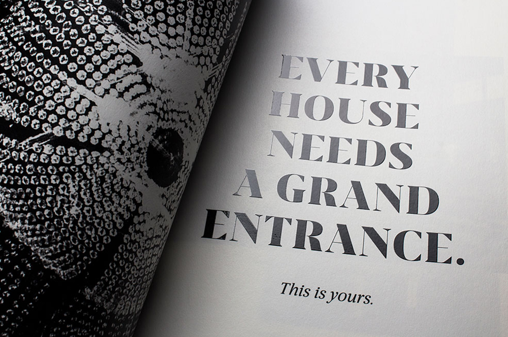
Myscape Isle of SkyResidential Property Brochure
TruSpaceDynamic Real Estate Branding
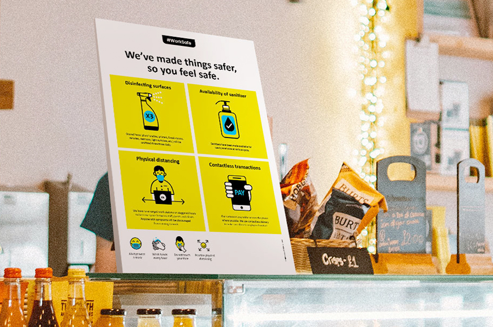
Work Safe Covid19 PostersSelf Initiated Project
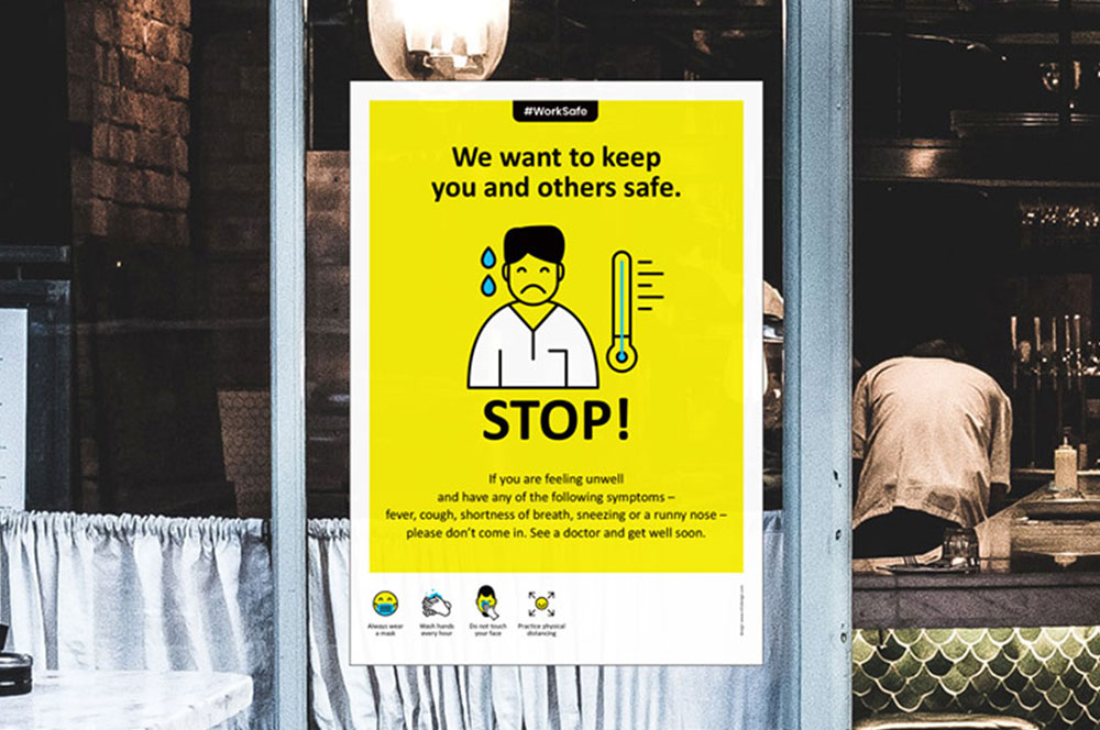
Come & Go SafelyWork Safe Posters
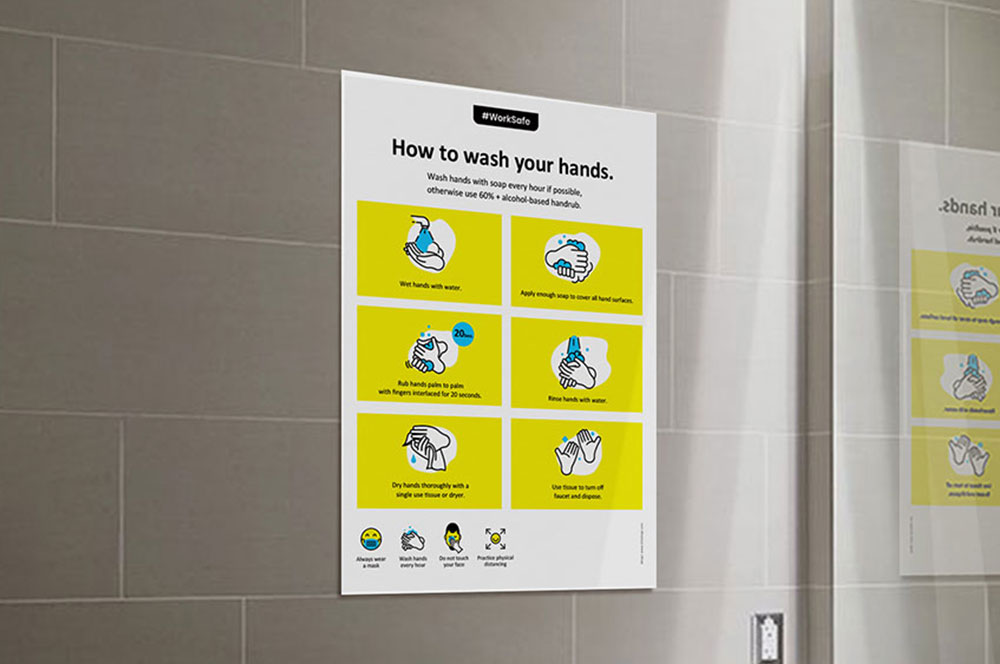
Community SafetyWork Safe Posters
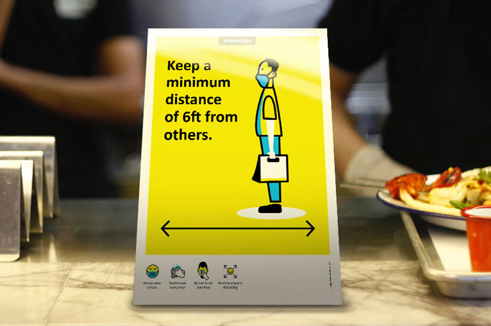
Individual SafetyWork Safe Posters
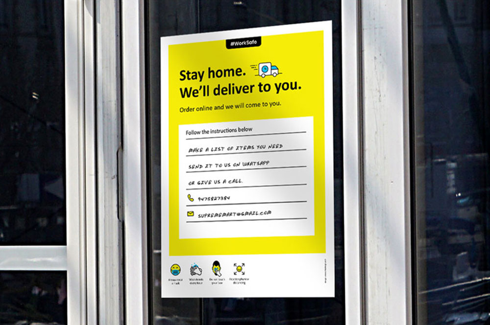
Business & Customer SafetyWork Safe Posters

StudentaccoBranding a Student Accommodation Portal
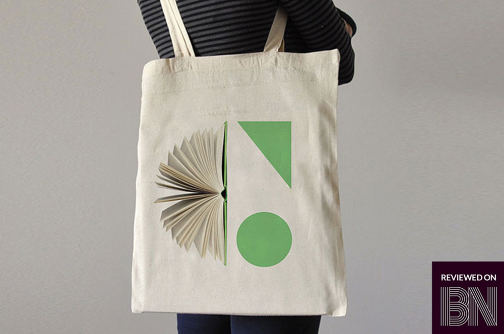
ShrachiDesigning a Notebook Brand for India
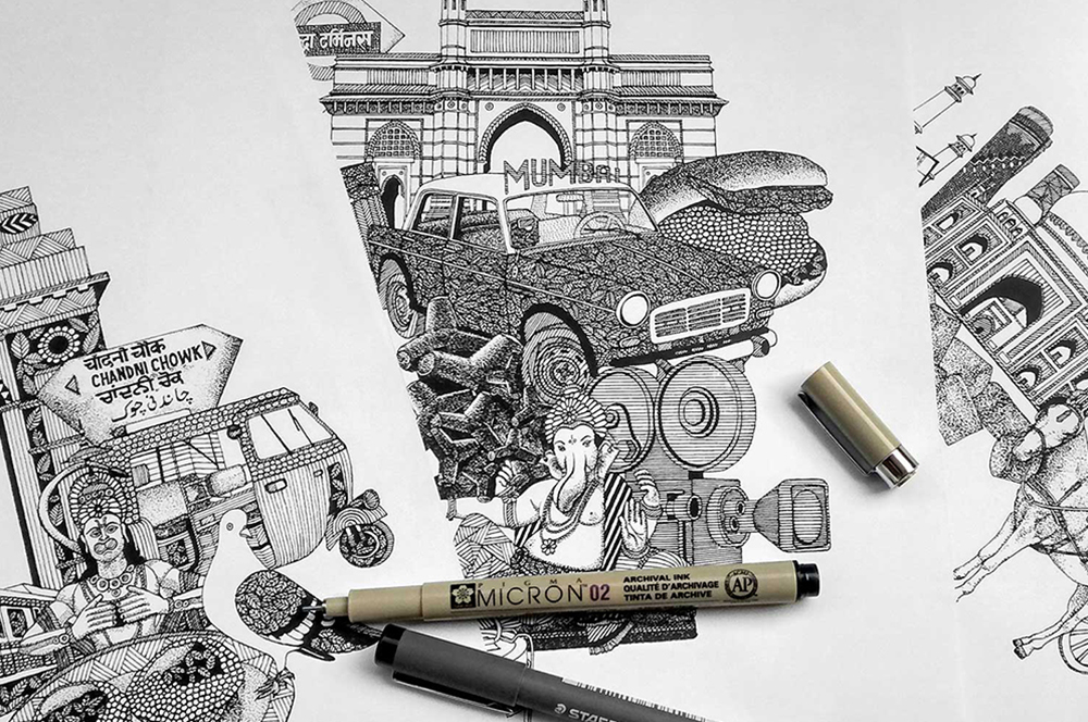
SWOTNotebook Cover Design
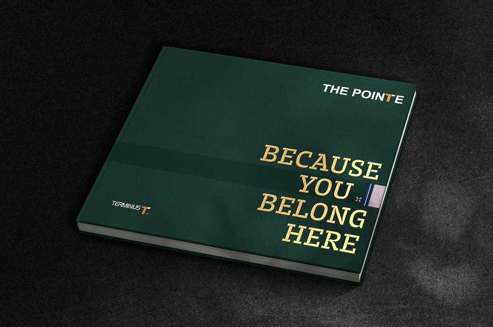
The Pointe by TerminusResidential Property Brochure
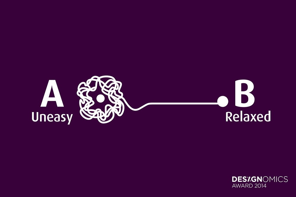
Asian BariatricsBranding a Bariatric Hospital
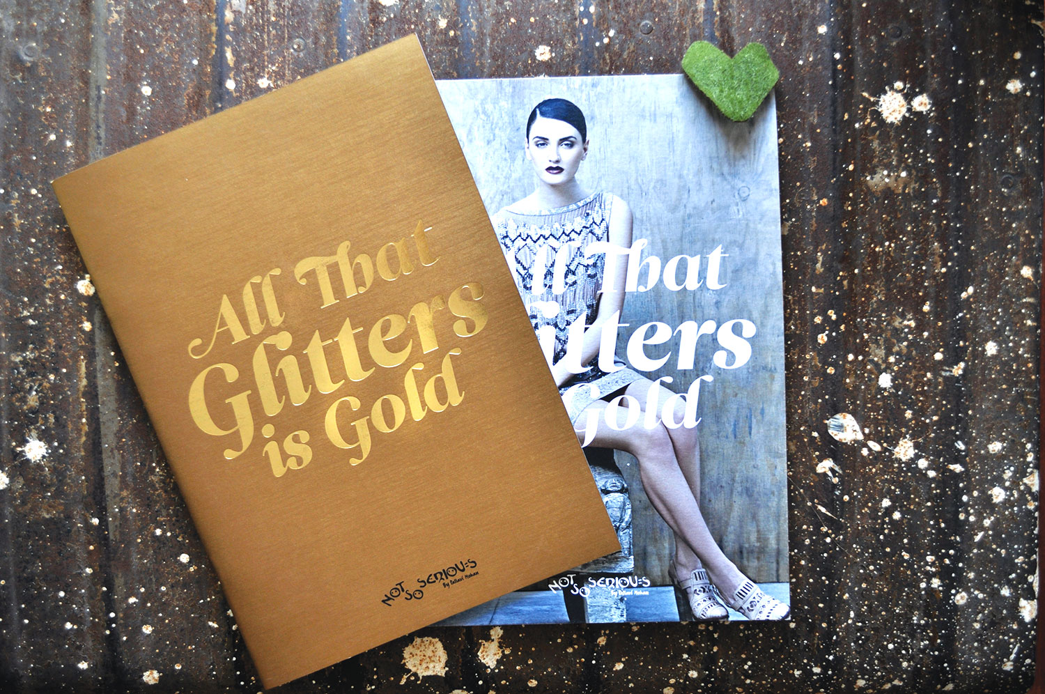
Not So SeriousFashion Lookbook
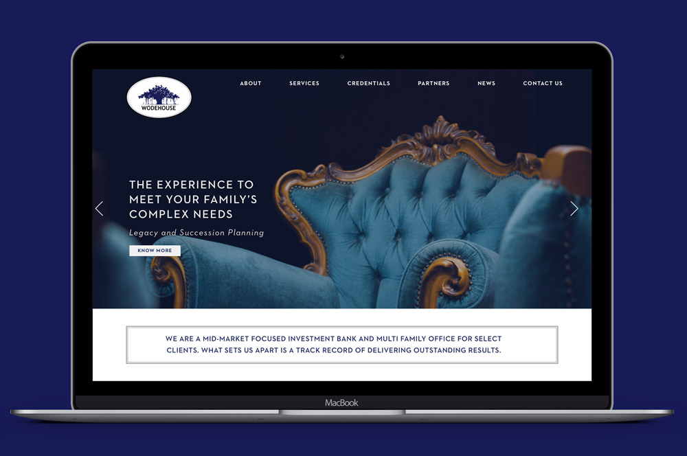
Wodehouse CapitalWebsite Design
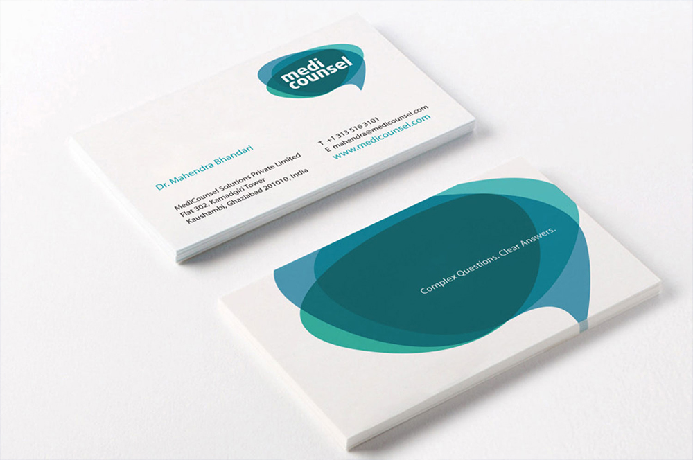
MediCounselBranding a Medical Portal
Subscribe to our Newsletter
Subscribe to our Newsletter
Subscribe to our Newsletter

