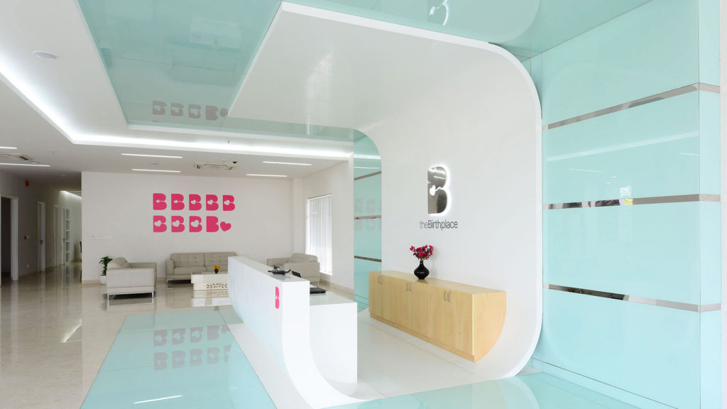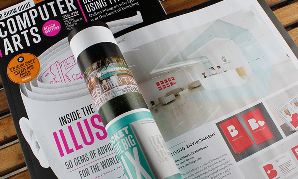
The Birthplace is a series of birthing centres launching across India that celebrate life and new beginnings. Positioned away from hospitals, the concept needed branding that would communicate its focus as a joyful environment where emotions and new relationships are brought to life.
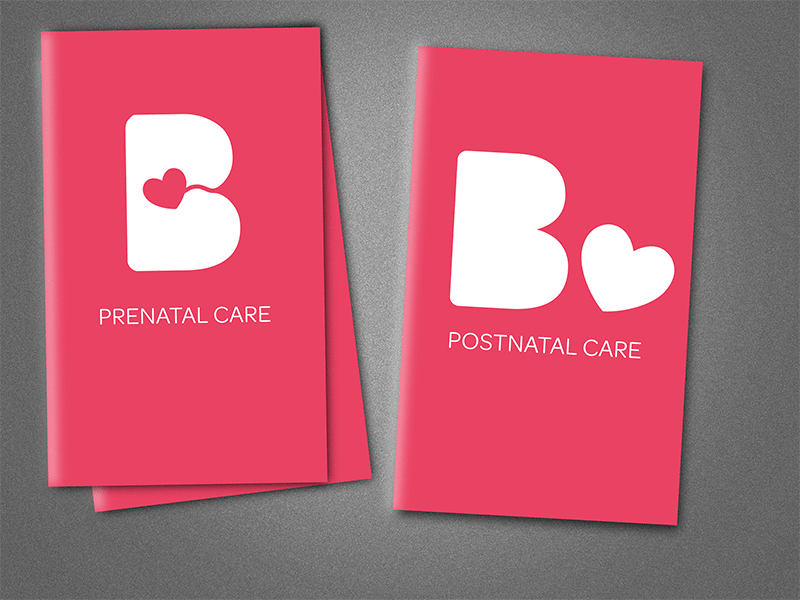
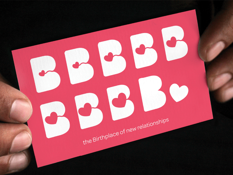
“A simple, fluid letter B features a line that connects its outer protuberance to a blossoming heart inside, representing life growing within the mother’s womb,” explains Neha Tulsian, founder and creative director of NH1 Design. “It is a delicate symbol for one of the deepest and strongest bonds on Earth – a mother and child connected by the nurturing umbilical cord.”
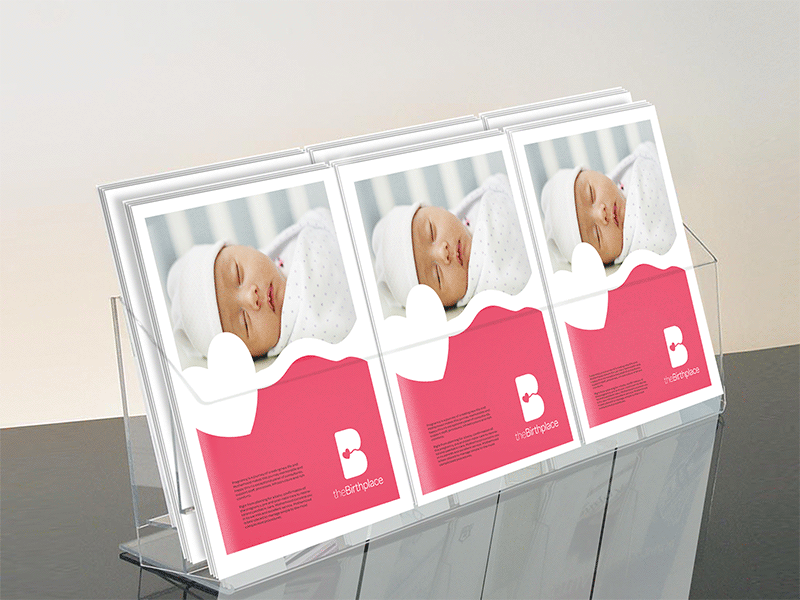
A flexible and dynamic identity system was created, with the heart motif gradually blossoming in size until it’s no longer inside the letter B. Meanwhile, different baby patterns and textures are used across the branding collateral and merchandise.